Tag: ingenuity

The other side of those Road Reflectors

We all know the raised reflector buttons on the lane divider lines of a freeway. They have white or yellow retroreflectors embedded in their edges, so that at night they shine right back at you in the light of your car’s headlamps. Safety and beauty in the same simple device.

But what many may not realize is that they have another design feature, also safety related, and far more ingenious. At least in some freeways – California’s, for sure – the buttons’ other edge – the one facing away from oncoming traffic – has red reflectors in it. Why put reflectors on the side you never shine a light on, the side you can’t even see?

Precisely because of the one circumstance when one would be seeing it: when they drive on the freeway in the wrong direction, having entered via the off ramp instead of the on ramp by some colossal mistake – think DUI, for instance. Now you have a drunken driver going in the wrong direction at night; traffic is sparse, but any moment disaster may strike unless this fool notices his mistake. And now those reflectors return the investment – for this driver will see long lines of red lights shining ahead to infinity; so unusual as to immediately alert him that something is wrong.

And if, like me, you never did that, you can still see the effect if you drive facing straight into the sun when it is low in the sky; you can then see the red reflectors, shining back the in the sunlight, in your rear view mirror!

Elegant design in the back of a Remote Control

Sometimes one runs into elegant design in humble places…

I was sitting in a meeting and fiddling idly with the remote control of the NEC LCD projector. After toying with the laser for a while, I pushed out the battery cover on the back. As expected, it unlatched and slid open, like these things always do. But there was a twist…

NEC LCD Projector remote control The cover slid off, but stayed connected to the unit by a thin rubber ribbon. We’ve seen so many R/C units missing their cover – well, not this one! The only extra part required was the rubber ribbon, which clips into a slot on the R/C itself. Simple, elegant, professionally designed. Good job!You can see in the photos how this works:NEC LCD Projector remote control

NEC LCD Projector remote control

NEC LCD Projector remote controlNEC LCD Projector remote control

Square is beautiful!…

Sometimes you find elegant design in the places you least expect it.

We stayed in the Dan Carmel in Haifa, and the small supplies in the bathroom came in color-coordinated little boxes: shower cap, cotton pads, the usual stuff. Still, they failed to go all the way: they had tall bottles for the shampoo and a round box for the shoeshine sponge:

Hotel Dan Supplies

Which reminded me of a much better attempt at such standardized packaging that I saw in the Hotel Silken in Zaragoza, Spain:

Hotel Silken Supplies

They had ALL the supplies fit in square packages, made of either cardboard Square Eggs at the Silken Hotel in Zaragozaor plastic, and these all fit like a puzzle into a rectangular cardboard tray. Even the shampoo bottles were square and fit the scheme perfectly. It was a delightful design, injecting elegance into this utterly mundane collection of supplies, so I share it here.
These guys had such a thing going for the rectangular form factor, that even the sunny-side-up eggs they served for breakfast were square!

A fishy contraption

While touring the Spreewald in Germany we came upon the strange device in the center of this photo. In fact we saw many of them while punting in the canals of this “Germany’s Venice”.

Spreewald fish box

This is a leaky wooden box hanging on chains with a mechanism to raise and lower it relative to the water level. What the residents of this canal-riddled valley use it for is to store live fish that they’d caught in the river, thus keeping them fresh until they want to eat them. Not sure what the fish think about this temporary lease on life, but one has to admit it’s an ingenious idea, and well suited for daily use when your house’s front lawn terminates in a riverfront!


Coffee-to-go elegance

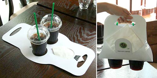
My friend Jeff pointed out to me a novel implementation of a coffee-to-go carrying device, in use in a coffeeshop chain in Germany. The assembled device in use is actually less elegant than the usual little tray-with-handle cardboard carriers we’ve had for a long time; in fact you can’t even plop this one down on a tabletop at destination; you have to unload it with care. What makes this one worthy of mention in the elegant design category is a different aspect.

Cardboard coffee carrier

I refer of course to the extreme simplicity of assembly and disassembly – just two folds in a flat piece of cardboard, and you’re good to go; and at destination, if you’re green-minded, you can “disassemble” it by just flattening it out, and store it for future re-use with minimal fuss. The slit for paper napkins is another nice touch…

Sinn-Frei, via Oh Gizmo!

The amazing Posographe

A riddle: what’s rectangular and flat, can fit in your pocket, and can calculate six-variable functions?

No, not a pocket calculator; I forgot to mention – it has no electronic components whatsoever.

Here, check it out in the latest addition to the HOC collection on my Possibly Interesting web site.

Bialetti’s Brikka: only one extra piece!

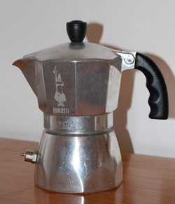
All coffee lovers know the classic Italian “Machinetta“, or Moka pot, that 3-piece stovetop espresso maker: not a competition to the professional espresso machine of a coffee shop, but good for a fast, concentrated caffeine fix at home. These have been around since their invention in 1933 by Alfonso Bialetti, and we have a number of them at home in various sizes (hint: go for the stainless steel ones, they don’t corrode and last forever if you don’t burn the plastic handle).

But on a trip to Italy we were served by some friends with tiny portions Bialetti Brikka coffeemakerof a much stronger, foamy brew; and upon inquiring how they could produce it at home we were shown the Brikka, the machinetta with the “sbuffo” (the dictionary says “gust of wind; puff“, but a fiery snort sounds more appropriate to convey this word’s feel).
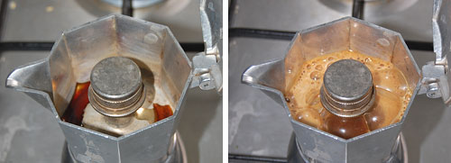
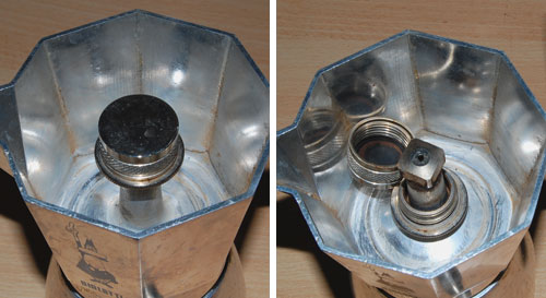
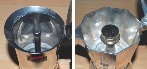
The amazing thing about the Brikka is that it is practically identical to the old Moka, except that it has one additional piece: a heavy steel cup, padded with a rubber gasket, that sits atop the tube from which, through a hole at its top, the hot coffee issues. This means that before the steam in the bottom half can push the water through the coffee powder, it has to achieve a high enough pressure to lift the steel weight; essentially the arrangement you find in a pressure cooker’s regulator valve. Once the correct pressure is reached the valve lifts and the coffee suddenly blasts through in a matter of seconds, accompanied by a loud puffing noise, much stream and bubbling foam. Sbuffo!

Brikka Sbuffo

The photos above capture the moment – mere seconds separate the two.

The Brikka, which Bialetti makes in 2-cup and 4-cup sizes (we’re talking Italian cups – about half a demitasse each), makes far stronger coffee than the Moka, and with some foam to boot. And all by adding one piece to an age-old design!

Brikka mechanism

Note the hole at the top of the tube, exposed with the weight dismantled.

Brikka compared to ordinary Moka

Brikka (right) compared to the open tube in a regular Moka style machine.

What will they think of next, you say? Don’t get me started about Bialetti’s “Mukka Express”, which seems to apply similar ideas to produce Cappuccino in one go (I’m still resisting the temptation to buy one of those).

Keyboard light: no more groping in the dark!

A humorous video review from CNET on the Lenovo Design Matters blog (yep, these guys have a blog where their designers interact with their users – a commendable idea!) compares the Thinkpad X300 to the MacBook Air. Nicely done – take a look.

Interestingly, the reviewer mentions one favorite feature of mine in the Keyboard Light on Lenovo Thinkpadrecent ThinkPad notebooks that many users may be barely aware of: a little white LED in the screen’s frame that illuminates the keyboard. This is useful for when you work on an airplane at night and prefer to leave the overhead reading light off (whether out of consideration for your co-travelers or for your battery life – in the dark you can work at the screen’s minimal backlight intensity).
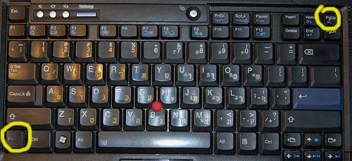
This LED in itself is a great design idea, but I’m even more impressed by how you turn this lamp on: you depress the Fn key and the PgUp key together. Why is this impressive? Because these two keys are located diagonally at the opposite corners of the keyboard; this means you can find them – by touch – in absolute darkness, which is where you’re at if you need a light in the first place.

Incidentally, this is how I discovered this feature during one long flight – I was groping to find the Fn key combination for increasing the backlight level, hoping to have the screen itself illuminate the keyboard, and I accidentally hit the right keys. And there was light!

Activation keys for Thinkpad keyboard light

Retrograde evolution of Post-it note packaging

Everyone uses the 3M Post-it note, and it’s often used as an example of the role of serendipity in product development – and of the wisdom of maintaining a corporate culture that encourages and empowers the pursuit of such serendipity.

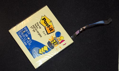
But the Post-it note story has another interesting lesson, and it has to do with the degradation of the design of its packaging. The original version of the ubiquitous 100-note packet was wrapped in cellophane, with the highly original trick that you could open it by grabbing the packet with two hands on opposite sides, and cracking the cellophane open with a single rapid twist, rotating the two ends in opposing directions. This was by design; in fact, I recall it said so explicitly on the packet. It was the fastest, easiest way to open a cellophane wrapping that I ever saw; and whenever I did the little twist I felt a twinge of admiration for its designer (and perhaps a bit of triumphant gloating over the cellophane, a wrapping material noted for its unfriendliness – think “CD Jewel Case”).

3M Post-it note package

So guess what? A few years ago 3M did away with this method. Now they provide the usual thin strip whose end you need to pry loose and pull. Sure, it’s no big deal; but the new method is more complicated to manufacture, slightly harder to use, and, above all, is less elegant .

I’m disappointed in 3M: when you got a good thing, you shouldn’t mess with it. But if you must mess with it, can’t you go forward, not backward, in simplicity and functionality?

Hats off to a cardboard box

And now, a moment of respect for a truly elegant bit of intelligent design: The humble but ubiquitous cardboard boxes in which we buy chewing gum and candy – the ones that latch closed so they won’t spill their content when we leave them in our pockets, purses, or glove compartments. The trick is in the flap A, which latches into the depression B in the photo below.

Latching cardboard box

Folding a cardboard pattern to make a box is trivial, and we learned to do that as children; making it have a hinged lid is not too hard; but making the box have a self-latching arrangement, all from a single piece of cardboard, is a neat trick.

Latching cardboard box - flattened

No idea who invented this originally; can’t find a patent for it, though there are a number of US patents for folding and filling the boxes on a production line (e.g. United States Patent 6223507). Anyway – well done, unknown inventor!

Incidentally, that Wrigley’s Winterfresh chewing gum is one great way to stay awake when you’re drowsy… it is hot enough to wake the dead!

Copyright © 2024 Commonsense Design

Theme by Anders NorenUp ↑