Tag: History

Ode to a round knob

“O knob, thou whose perfect roundness doth . . .”

Nah. A poet I’m not. Still, I would if I could, because the round knob is a fast disappearing species, a trend well worthy of lament.

Round control knobs on an oscilloscope

Throughout the 20th century the round control knob was a mainstay of human interface design for electronic devices. With good reason: it was perfectly suited to humans’ major feature, the opposable thumb. You grasped the knob between that thumb and forefinger and you had superb fine control of the knob’s angular position. If the function called for finer control, you just used a fatter knob. At the machine end of this human/machine interface the knob could rotate a switch, a variable capacitor, or a potentiometer – there were many analog devices back then that lent themselves well to rotary control.

Today most of our input components have gone digital, and are either computer controlled or handled by pushbutton switches. This makes sense in some cases, but there are still many situations when a function is intrinsically analog (say, a volume control on a car radio) yet the designers are making the controls digital (say, by using a pair of + and – pushbuttons). This is pure evil from a human engineering perspective: the round knob is much more intuitive, convenient, and faster to boot. And it really was worthy of the name control: it gave the user a sense of controlling the instrument, instead of fighting it…

I’m sure the electronics driving the volume these days are fully digital, but even so a round knob with some D/A conversion is the correct choice. It must also be more expensive to make, because the radio makers – preferring low cost to user experience – increasingly shy away from it. 🙁

The amazing Posographe

A riddle: what’s rectangular and flat, can fit in your pocket, and can calculate six-variable functions?

No, not a pocket calculator; I forgot to mention – it has no electronic components whatsoever.

Here, check it out in the latest addition to the HOC collection on my Possibly Interesting web site.

A glimpse of the venerable NCSA Mosaic browser

Dominic Tramontana has posted an interesting analysis of how the Reload glyph varies between browsers; take a look! Dominic asked me to post a screen shot I have of NCSA Mosaic, the first graphic web browser developed in 1993 by Marc Andreessen.

The grab I dug up is of a Novell web page, from early 1995. Here it is (click image to see the full page).

NCSA Mosaic browser, 1995

Back then, black on gray was the accepted way to write a web page, and the use of the red “book” images was a really impressive touch, I recall. We’ve come a long way…

The Duomo of Siracusa: the ultimate Reuse

Reuse is good, right? And the notion conjures in most of us an image of linking code modules. Which is why I was astounded to run into the following case, while touring the beautiful island of Sicily.

Siracusa Cathedral (Duomo)

Here you see your intrepid tourist in front of the Duomo (cathedral) of Siracusa, the city where Archimedes lived, engineered, and famously died defending his sand drawings. The baroque facade is a late addition (18th century) and nothing to write home about; but to its left there’s something unique and bizarre…

Below, left, is a close-up of the left wall of the Duomo. Note the embedded Doric columns, visible with their abaci and architrave (don’t worry, I had to look that up myself). These are also visible on the inside of the church, as seen in the photo at right.

Greek columns embedded in Siracusa cathedral

So what’s going on? Well, the church was built in the 7th century AD. The columns, however, predate it by more than a millennium; they are what’s left of a Greek temple dedicated to Athena, which was built in the 5th century BC. Rather than follow the destroy-and-recycle method often applied to preceding cultures, the Christians reused the framework of the temple as is, filling in the spaces between the columns!

Timeless designs last forever

We humans have this obsession with designing new products, even though many of them die out after a while (some, mercifully, after a very short while!) However, every so often a design is found that is simply so good and sensible that it stays around for a long, long time.

So, here’s an example I ran into in the archaeological museum in Agrigento, Sicily, a town founded by the ancient Greeks.

Bronze Fibulas - a timeless design

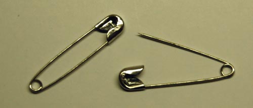
The object on the left is a bronze Fibula, made in the 13th century BC. Not one in a thousand people today would recognize the word “Fibula”, but hardly anyone would fail to identify this as a large safety pin. In fact, I saw not one but many of these, in various museums in Europe: they were widely used for many centuries. The second photo shows one from the 8th Century BC, with a more imaginative design (remember, unlike our safety pins these were also meant for decorative effect as fasteners for cloaks and such).

And for all our digital innovations, and perhaps unlike many of them, I doubt this good ol’ design is going to be supplanted anytime soon…

Safety Pins

Copyright © 2024 Commonsense Design

Theme by Anders NorenUp ↑