Tag: Documentation

Butter and common sense

These days food products come with lots of information, as mandated by our well meaning consumer protection laws. Information, however, does not always enlighten us.

I was looking to try a butter spread that doesn’t harden into a brick in the fridge. There are many such products on the supermarket shelves, each proclaiming its virtues – “Naturally soft!”, “Easy to spread!”, and so forth. What they fail to explain is what about the product makes it resistant to hardening. Is it a mechanical texture? A chemical additive? A food chemist would probably figure it out from the ingredient list, but not us regular mortals.

Lurpak spreadable butterSo I want to give kudos to Arla foods, the Danish maker of Lurpak butter. Their spreadable product bears the following inscription: “Made with specially selected butter, blended with just enough natural rape seed oil to make it easy to spread directly from the fridge“.

This may be less quantitative than the usual ingredient list, but it makes a great deal more sense: you can immediately grasp what was done to the butter, to what extent (what a clear image, “Just enough”!), and that no “unnatural” acts were involved.

And indeed, it does spread well directly from the fridge.
In case you didn’t know…

And now, a nice sighting from Pil and Galia.

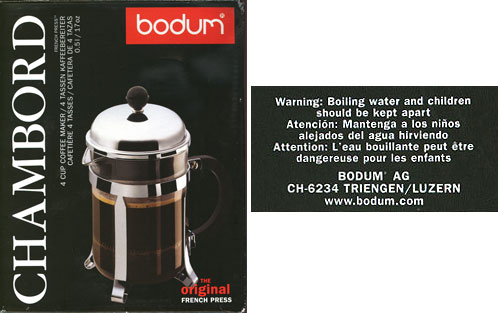
They report buying a coffee press made by Bodum, a leading maker of these ingenious devices. And on the bottom of the box came this enlightening revelation: “Boiling water and children should be kept apart”

Bodum coffee press warning notice

At first I actually thought this was said in jest, a sophisticated attempt to remind people of the danger without sounding too officious; but the other versions made it clear I was giving Bodum an unwarranted benefit of the doubt. The French warning is the silliest: it says that “Boiling water can be dangerous for children”. Which raises two immediate replies (beyond the obvious “Well, Duh!“):

  1. Can be?
  2. Why only children? What about adults?

Oh well, at least the coffee is good.

How to complicate instructions

We already saw how overuse of pictorial instructions can be confusing. Well, I just ran into a wonderful victory of this trend. I passed a large office copier – the Konica 7222 – and here is what I saw on its document feeder:

Konica 7222 Copier - Document feeder

These guys spared no effort in their belt-and-suspenders approach: there is large text, and tiny text, in every language you could desire; there are pictures, and icons, and arrows all over the picture… isn’t it just wonderful? Especially given that no office worker would need any of it except the “Face Up” bit?

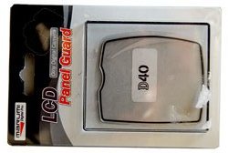
Engrish on a camera LCD screen protector

I bought a screen protector for the LCD display on the back of my Nikon D40, and I just have to share the wonderful text on the back of the package, which reads:

Engrish

I’ve already expressed my incredulity at this sort of stuff; this one is just for your reading enjoyment.

Incidentally, the product itself is excellent, LCD panel guard for Nikon D40far better than the cling-on film type protector I tried before it, which simply fell off one day (in other words, did not have preservation status such as new product). This one is rigid and attaches to the camera at its raised edge. And of course, it always keeps 100% transparency because become UV coating processing work!

Invisible writing on medicines

Here is a box containing some medicine. As the law requires, it has the lot number and expiration date clearly marked. Well, OK, not clearly… in fact, the information is barely visible at all. The law, one can guess, says nothing about the information having to be Legible.

Medication box

It’s not like making the text visible is so difficult… as the next photo proves.

Medication Box

Ultimate clarity, take 2

Remember those gloves with utterly superfluous instructions? Here is a new contender for “most unnecessary instructions”.

Frito-Lay Sunflower Seeds

This package of sunflower seeds, from the USA, bears the directive:

Eating instructions: crack open shells, discard shells, enjoy the seeds!

Nice try, Frito-Lay, but – Uh-oh! – you might still get sued by someone: you forgot to Frito-Lay Sunflower Seeds instructionstell them to chew before swallowing the seeds!
Actually, this one is so silly that I really can’t make up my mind whether they did it because of the usual rampant CYA, or whether someone at Frito has a sense of humor and is taking a jab at the trend of assuming we consumers are idiots. Any opinion?

Don’t you miss Borland’s no-nonsense EULA? (sigh)

Every commercial piece of software we use comes with an End User License Agreement (EULA), which we all merrily accept without reading. After all, who has time to read a rambling document of barely decipherable legalese that we can’t do anything about anyway? Sometime I do glance through them, and my blood pressure shoots up (the part I like best is where it says “Some states do not allow the exclusion of [bla bla], so the above exclusion may not apply to you”, which essentially says “we will abuse you all the way, but if your state prohibits this we will abuse you a little less”). 🙁

So, I sometimes remember fondly the old (1980’s) Borland No-Nonsense License, which said:

You must treat this software just like a book …

…By saying “just like a book,” Borland means, for example, that this software may be used by any number of people, and may be freely moved from one computer location to another, so long as there is no possibility of it being used at one location while it’s being used at another or on a computer network by more than one user at one location. Just like a book can’t be read by two different people in two different places at the same time, neither can the software be used by two different people in two different places at the same time. [you can find the full text here].

Sensible, isn’t it? And fair, too. An agreement decent people might freely enter, and have respect for (check the sentiment expressed here). Our world needs more of this sort of thing!

Incidentally, the distinction between the Borland style and the one prevalent today – what I call People language vs. Lawyer language – is what inspired my own legal blurb on Possibly Interesting.

Worth a thousand words?

Greg Bear’s hyper-imaginative Sci Fi novel “Eon” brings its protagonists to a parallel reality whose highly advanced post-humans use Picting to communicate; that is, they project in mid-air sequences of holographic icons to convey their thoughts.

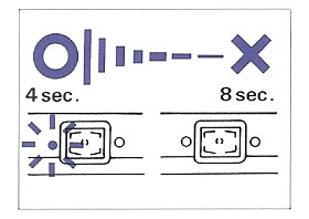
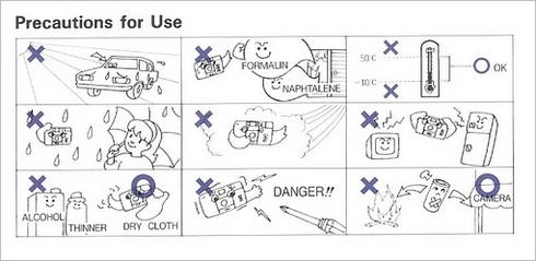
This may work for post-humans… but can become a problem when mere mortals try it with excessive zeal. I refer to the increasingly common practice of using pictures and icons in signage and instruction manuals, even when written text would be far better. The notion that pictures are easier to grasp works fine for signs like “left turn” on a road, or “Danger – High Voltage” on a transformer, which are reasonably self-explanatory. And they are invaluable in instruction manuals when they illustrate some technical complexity explained in the text. The problem begins when those manuals start conveying complex concepts like “Don’t drop this camera on a hard floor”, which they might do by showing a person weeping as the camera smashes to pieces… Konica manual extract

Take this picture, from a Konica camera manual. Can you decipher its meaning? Fortunately the text on the same page explains: it means “The battery should be replaced when the flash takes more than eight seconds to charge”. That’s 15 words, and they are far better than the picture. And from the same manual (this time without a Rosetta stone in the text), the “Don’ts” in this mosaic:

Konica manual extract

The Thermometer I can get, and maybe the “Don’t take a screwdriver to this camera” (or is it, “Don’t stick a screwdriver in the lens?)… but the one in the center eludes me (“Don’t take photos on windy days”??) and the one to its right is a total mystery (“Beware radiation emanating from TV sets and refrigerators”? Or is that a Microwave oven? And since when do fridges emit anything?)

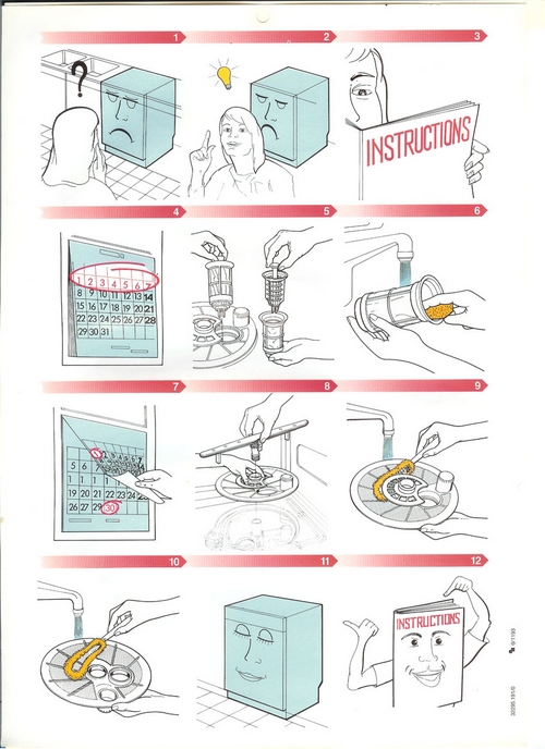
But no manual beats the one we have for our Electrolux dishwasher, which has a pull-out card that starts with exhorting its own virtues (top row, which merely illustrates one word, “RTFM”); then goes on to totally confuse us (is this filter cleanup due daily? Weekly? Daily, but only during the first week of each month?)

Electrolux dishwasher instructions

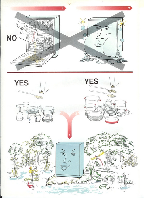
And then it shows this masterly rendition of “Help the environment by only using as much detergent as needed”:

Electrolux dishwasher instructions

Sometimes, I guess, a word (wisely selected) is worth a thousand pictures!

Why Photoshop and Mapmaking don’t mix

Map making is an ancient art, and a great deal of ingenuity has gone over the years into how you can draw the spherical surface of the Earth on a flat piece of paper in a way that still makes sense. That’s where all those map projections like Mercator’s come into play. More recently, to my dismay, I see in the media a much less sensible practice: drawing flat pieces of terrain onto a sphere.

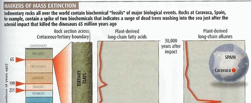
New Scientist map

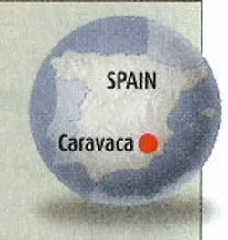
Consider this scan from an article in New Scientist, my favorite science magazine. Note the map at the right. Note how it takes you a disorienting moment to put it in context! At first glance, this is a sphere, hence it must be the earth; but what bizarre continent is it showing? Or is this some archaic proto-continent, long obliterated by continental drift?

Close up of New Scientist map

Of course after a second you register that it is Spain; but if so, what is it doing stretched across an entire hemisphere? You might explain the circle as simply a picture frame – nobody said a map must be rectangular – but if so, why the shading in and below the circle, clearly denoting a three-dimensional sphere?

The explanation is simple, and has to do with the ease and irresistible allure of doing special effects in Photoshop and its ilk, along with the paucity of common sense in the users of such tools. The map insert should have been left flat-shaded; the conflicting 3D cues (and the circle itself, for that matter) add only confusion.

Nor is this an isolated example; we see a lot of this sort of thing going around. Yuck!

The ultimate clarity

Adding clear instructions is part of good product design, right?

So: I went to get a flu shot (I still get the flu each winter, but maybe I’d be getting it twice without this?) As the nurse prepared her syringe, I noticed a cardboard box of disposable vinyl gloves on her table. On the side of this box was a printed statement, which I copied verbatim:

“Intended use: A medical glove is worn on the hand of health care and similar personnel to prevent contamination between health care personnel and the patient’s body, fluids, or environment. This glove also serves for non-medical purpose usage”.

I was so relieved that the manufacturer had had the foresight to instruct the nurse in these enlightening facts. Who knows, without this instruction she might have assumed the gloves had to be stuffed up my nose or something?

Clear instructions are good. Superfluous ones are silly. I don’t trust silly vendors…

Copyright © 2025 Commonsense Design

Theme by Anders NorenUp ↑