Tag: Communication

IVR woes: good idea – poor execution

I was trying to reach the customer service of a company just now. There I was, listening to the endless music of an IVR system, punctuated by the usual happy reminders that I am oh-so-appreciated by them and they’ll get to me real soon (liars!), when something happened. The recording declared that they were very busy so if I could leave my name and number they’ll get back to me. No option to keep waiting.

To their credit, the next step was done professionally – the IVR had me state my name, then key in my phone number, then confirm it when it read it back to me – so I have good reason to believe they will really get back to me. Which is actually better than the silly music. So giving me this way out is a good idea.

The bad part is, if they knew they were busy (and, assuming it’s a FIFO queue, they had the necessary information – my place in line – as soon as they picked up my call) – why wait for long minutes of stupid music before switching to the leave-your-name-and-number routine? They’re giving the customer the combined worst of both solutions!

Sygnet handsfree design flaws, part 2: Control overloading

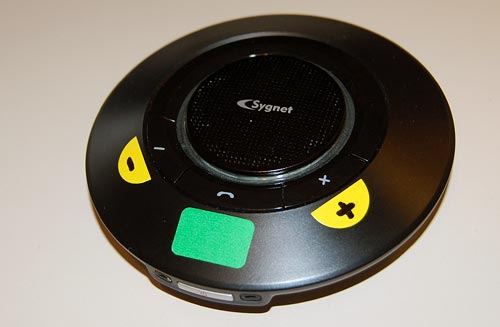
Sygnet Handsfree with stickersBack to my Sygnet Bluetooth Handsfree Carkit model BTS600. We saw its problem with cloaking the controls and indicator lamps… but on top of that, the people at Sygnet played a trick that is becoming very common in this digital era: they overloaded the controls and the lamps.
I use Overloaded in the Object Oriented Programming sense: the use of one operator or function name to perform several different functions depending on context.

The Sygnet device has three operating buttons and more than a dozen actions; so each button can do many different things. For example, the “-” button rejects a call if pressed for 3 seconds while the phone is ringing; it initiates voice recognition dialing if pressed for 3 seconds when the phone isn’t ringing; it cancels the voice recognition if pressed until a beep is heard; it cancels bluetooth device recognition if pressed for 6 seconds; it reduces audio volume; it mutes/unmutes a call when pressed concurrently with the “+” button; and it starts a conference call if pressed for 3 seconds while one call is active and another waiting. The other buttons likewise do a great many things; it’s so complicated that I carry the instructions in the glove compartment at all times! Needless to say, the captions on the device merely identify the buttons, not their functions.

The two indicator lamps, meanwhile, are similarly overused: The blue lamp blinks 3 times every 2 seconds to indicate an active Bluetooth link; it blinks rapidly together with the red lamp when the device recognizes the cellphone; it blinks every 2 seconds when bluetooth is inactive; it stays lit with the red lamp during charging, and without it when charging is completed. So now you need a stopwatch to figure out what it means…

To illustrate how excellent this human engineering is, consider its application in a ballistic missile situation: “Hey, Joe, does two blue blinks followed by a long beep mean a 3 second push on button D launches the missiles unless you first tap on button A, or does it mean the Mr. Coffee needs maintenance?”

So, what can we do about this? Well, by now you know my style. At least I could make the cloaked buttons eminently visible…

Sygnet Handsfree with stickers

Sygnet handsfree design flaws, part 1: Control cloaking

Sygnet Bluetooth HandsfreeWhen I got my Nokia E71 smartphone, I also bought a hands-free device for it: the Sygnet Bluetooth Handsfree Carkit model BTS600. This actually works quite well – it wirelessly identifies the phone on my belt when I get in the car, and until I leave the car all calls are routed to this device. Throw in voice recognition based dialing, and it’s convenient indeed.

Still, the controls of this elegant space age device – it really looks like a miniature flying saucer, doesn’t it? – embody some basic human engineering errors, ones that are all too common in other products; we can call them control cloaking and control overloading.

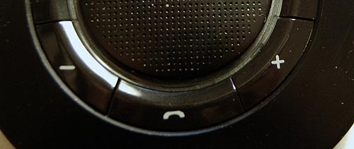
By control cloaking I mean making controls that are all but invisible and indistinguishable from each other. The BTS600 has only four controls: a power switch, and the three marked with +, – and a handset symbol. The user needs to identify the last three rapidly, at a glance, while driving a motor vehicle. So what would you do to make this easy?

I know what I would do: I would design large, obvious buttons, each differing markedly from the others in color (for daytime use) and in shape (for night time driving). Something like the three skyscrapers in the Azrieli Center in Tel Aviv – one round, one triangular and one square, and all impossible to miss…

Not so the good engineers at Sygnet. They made the three buttons flat, and blended them into the device’s surface so elegantly that you can barely make them out – with tiny labels that are hard to read even when parked. And the device’s perfect circular symmetry makes it impossible to locate the buttons by their positions relative to its edges.

Sygnet Handsfree controls

And then there’s the matter of indicator lights. The device has two lamps: blue and red. You’d expect these to be visible from all angles; which would be the case if they protruded outside the casing. But instead they are sunk deep inside, under the clear plastic ring around the speaker grille. Again, very elegant – but quite invisible unless you look straight in.

Don’t miss the control overloading post coming up next!

The considerate envelope

I was interviewed recently by the Columbia Journalism Review for an issue they were putting together about Information Overload, and as promised was then mailed the hardcopy magazine in a manila envelope.

I was heartened to see the stamp in the photo on the envelope.
Stamp on envelope from CJR

Obviously this did not apply in my case – The entire issue was of interest to me, so the page number was not filled in – but I love the idea. Telling the recipient where to look in something mailed to them is a key concept of good email etiquette that I’ve been teaching for years: if you send someone a presentation with 70 slides (which, alas, many do in the corporate world) at least add in the email body “Check slides 45-47, they contain info related to your project”. The CJR uses hardcopy, but they evidently apply the same concept there. Good thinking!

Polycom under siege

The triangular Polycom conference phone is a familiar device; in many companies there is one in every conference room. It is so familiar that few give thought to its miraculous ability to transmit high quality sound from one roomful of jabbering humans to another. In fact, this involves some pretty sophisticated technology for echo cancellation and noise filtering; to quote the Polycom site, “Automatic Gain Control intelligently adjusts the microphone sensitivity based on where participants are seated in the conference room”!

Polycom conference telephone

Image: Wikipedia, by Sweetness46, under Creative Commons license

A telephony engineer I once met explained to me that the microphones at the three ends of the Polycom are exquisitely optimized so the sound enters them just right, glancing off the table surface at the optimal angle, to achieve the best possible sound quality. Isn’t that smart design?

So what do we do, then? Why, we put the poor thing at the center of a round conference table and surround it with an impregnable wall of Notebook screens, as all attendees read their email during the meeting. There goes the exquisite design, the adjustment based on where participants are seated, the echo processing…

One can almost imagine a future generation of phones that can raise themselves on a robotic stalk to peer above the notebooks (OK, so this is more like an R2D2 kind of response than a likely reality). But in fact, I once visited a company where they mounted the Polycom on top of a 12 inch pole in the center of the table. It looked weird, but I’m sure it sounded great…

Lick-and-Stick stamps endangered?

In 1840 Sir Rowland Hill introduced postage stamps to the world, giving us an effective postal system, and a fascinating collecting hobby. The Penny Black, of course, had to be licked to affix it to letter – it was a stamp, wasn’t it? That’s how a stamp should behave!

Self Adhesive Stamps

Well, not any more. These days we see a growing incursion of self-adhesive stamps; in other words, stamps that are in essence peel-off stickers.

These were introduced in Sierra Leone in 1964, apparently to solve problems of sheets sticking together in the tropical climate there. That, at least, is a good reason. But now we see a growing number of countries playing with the new stamps-that-are-not really-stamps…

So is that a problem? Well, there are bigger problems, but note that these stamps waste twice the paper, since their backing has to be discarded, and besides, the lick-and-stick operation was somehow an integral part of letter mailing (not that anyone writes letters these days either, unless they’re bills, it would seem). Also, stamp collectors are pretty unhappy – these stamps can’t be removed by soaking the envelope in water, and the adhesive can cause deterioration in the stamps over time.

I read somewhere that the US postal service refuses to see the collectors’ complaint as an issue, since long term collectability of stamps is not part of their product specification. Now, isn’t that heartless? Isn’t the whole purpose of stamps to enable this lovely obsession that has given pleasure to tens of millions of people, young and old, for well over a century?

A pure waste of time

Just got off the phone at a teleconference meeting hosted by some service in the USA. I was impressed by the logic of the automated system, which went something like this:

“Welcome to the ___ teleconference system. Please enter your passcode”.
<I did>
“The number you entered is <bla bla bla… all 9 digits read slowly>.
Please press one if this is the correct passcode, or two to re-enter the code”.

What on earth could make them think this is a good idea? Why not just test the number and only if it is incorrect ask for it again?!…

Human or IVR? A reverse Turing Test!

I discussed a while ago how Interactive Voice Response (IVR) systems are being designed to be more human like. Well, the reverse is also sometimes true, with human operators becoming more and more computer-like. Consider:

Our car lighted up a “service required” lamp, so I called the 24×7 number provided by our garage, to ask whether the car was due for maintenance. A polite young lady answered:

Young Lady: How may I help you?
Me: Hi. My car claims it needs maintenance but has only 5500 Km on it. I want to know whether this model requires maintenance at 5000 Km?
YL: what is your name please?
Me: Zeldes. [I was assuming she plans to look up my car in some customer database]
YL: Is that your first name?
Me: No, it’s my last name. [Duh!…]
YL: What is your first name?
Me: Nathan. [Strange question: the database would be indexed by last name!]
YL: May I have your phone number? Someone will call you.
Me: [gave my cellular number].
YL: May I have your home number?
Me: No, use my cellular, it’s what I can be reached at.
YL: May I have your home number?

At this point it hit me: I was talking to a computer program! It was implemented in wetware, but the girl was following a preset routine and had no independent thought: a living computer. So I gave her my home number, and she exited that particular program loop and eventually hung up.

And it struck me that the moment she repeated the home number question is when I achieved certainty that there was no sense talking her out of the routine she was bound to; in essence, she had passed at that moment a reverse version of the Turing Test. A human would’ve said “OK, that’ll do then”.

Incidentally, the term “Reverse Turing Test” can be intepreted in many ways – here’s another, more often seen interpretation of this.

FameLab!

Off-topic it may be, but I had a delightful experience last week judging in a round of the FameLab competitionFameLab contestant organized by the British Council in the Jerusalem Science Museum. This international event strives to encourage scientists to communicate their work and their excitement about it to the public; young scientists (mainly graduate students) were invited to present a scientific subject of their choice – in three minutes sharp.

So, I was treated to two dozen fantastic presentations on subjects as diverse as celestial mechanics, protein reactions in cells and the lifestyles of dinosaurs; delivered by talented young people just as diverse in their styles and approaches to communicating their knowledge. Winners will get to compete at the next level, and will be treated to a communication skills workshop that will help them develop their skills.

What a wonderful way to promote science!

I managed to browbeat an Interactive voice response system!

Interactive voice response (IVR) systems are notoriously annoying. As the joke goes, “For a list of all the ways that Technology has failed to improve the quality of your life, please press 3″…

Some IVR systems are better than others; the best will make allowance for the user’s need to get around them. I ran into a good one today. I called Continental Airlines to do a seat assignment, and this IVR setup gives me a bunch of options that don’t include what I want.

On a hunch, I said loudly: “I want to talk to an agent!”
System: “I think you said you want to talk to an agent. But if you give me your flight details first, I can help the agent serve you faster” (or something to that effect).
I play along and give the flight details to the machine.
System: “OK, your flight is confirmed, as follows […] You can hang up now”.
WTF?!! Hey, it promised! So I say, firmly and loudly:
“I want to talk to an agent!”
System: “OK, I’ll transfer you now”.

Got it? I took a stand and the system capitulated! Have to hand it to them, though: they never mentioned the option to talk to a human, but they included the speech recognition to identify when I ask for it. Good job! [well… almost. I was euphoric for of the three seconds until the system helpfully added: “your waiting time will be approximately 25 minutes”. And it was good at its word this time].

Copyright © 2024 Commonsense Design

Theme by Anders NorenUp ↑