 Learning what makes things tick is a major pleasure for a techie… read my opinionated view on how one should teach the structure and function of objects, whether natural or technological, in the latest article on my Possibly Interesting web site.
Tag: Commentary
Hi-Tech Toothbrushes
The first mass-produced toothbrush was made in England by William Addis in England, around 1780. His idea was to attach bristles to a stick, and make a little brush with a long handle, to allow one to brush one’s teeth. You’d think that’s all it takes; you’d think the toothbrush would remain just that, a brush on a straight stick…

Think again. Today, any drugstore has a wall full of toothbrushes, and not one of them is as simple as Addis had envisioned. In fact there are so many types, such a riot of colors and designs, that it’s hard to buy a new brush that looks just like your old one. And to compete with each other, the different makers dream up the weirdest configurations, with multicolored, contorted handle shapes that remind me of sports shoes (another area where form totally diverges from function in the interest of marketing hype), and with heads that must’ve taken real genius to design. The underlying ideas are impressive – brush heads with multiple bristle types sticking every which way to better remove bacteria from every cranny in the target dentition… all seemingly very important, very convincing, lest the consumer remember that a brush is a brush is a brush, and would work just as well if it had a simple monochrome handle and a straight head. The bacteria wouldn’t mind…
Worth a thousand words?
Greg Bear’s hyper-imaginative Sci Fi novel “Eon” brings its protagonists to a parallel reality whose highly advanced post-humans use Picting to communicate; that is, they project in mid-air sequences of holographic icons to convey their thoughts.
This may work for post-humans… but can become a problem when mere mortals try it with excessive zeal. I refer to the increasingly common practice of using pictures and icons in signage and instruction manuals, even when written text would be far better. The notion that pictures are easier to grasp works fine for signs like “left turn” on a road, or “Danger – High Voltage” on a transformer, which are reasonably self-explanatory. And they are invaluable in instruction manuals when they illustrate some technical complexity explained in the text. The problem begins when those manuals start conveying complex concepts like “Don’t drop this camera on a hard floor”, which they might do by showing a person weeping as the camera smashes to pieces… 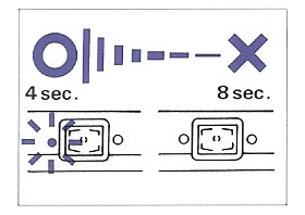
Take this picture, from a Konica camera manual. Can you decipher its meaning? Fortunately the text on the same page explains: it means “The battery should be replaced when the flash takes more than eight seconds to charge”. That’s 15 words, and they are far better than the picture. And from the same manual (this time without a Rosetta stone in the text), the “Don’ts” in this mosaic:
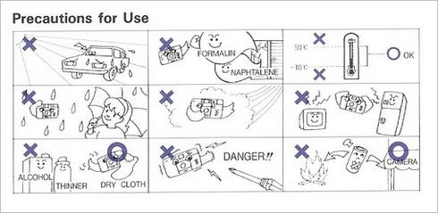
The Thermometer I can get, and maybe the “Don’t take a screwdriver to this camera” (or is it, “Don’t stick a screwdriver in the lens?)… but the one in the center eludes me (“Don’t take photos on windy days”??) and the one to its right is a total mystery (“Beware radiation emanating from TV sets and refrigerators”? Or is that a Microwave oven? And since when do fridges emit anything?)
But no manual beats the one we have for our Electrolux dishwasher, which has a pull-out card that starts with exhorting its own virtues (top row, which merely illustrates one word, “RTFM”); then goes on to totally confuse us (is this filter cleanup due daily? Weekly? Daily, but only during the first week of each month?)
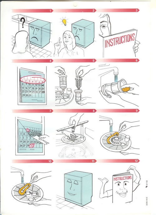
And then it shows this masterly rendition of “Help the environment by only using as much detergent as needed”:
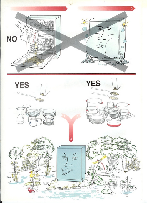
Sometimes, I guess, a word (wisely selected) is worth a thousand pictures!
The evolution of the On/Off power switch symbol
We all know the symbol with a vertical line in a circle: it identifies the On/Off power switch. It occurred to me that this familiar symbol is evolving in a bizarre fashion.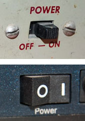
Originally, switches had a lever or slider that could move to either of two physical positions. In those days the switch was marked with the word POWER and its positions with ON and OFF. Then, as switches became smaller and more globalized, the two words were replaced with 1 and 0, as seen even today on many rocker switches.
And then the ubiquity of microprocessors made it more economic to do everything with momentary pushbutton switches; the computer inside could take care of figuring whether you meant ON or OFF. And so, the button now needed an icon that conveys both options; I surmise that is when the familiar “1-inside-a-0” symbol came into existence (if you know otherwise do share in the comments!) This round icon fit nicely on round buttons, and became ubiquitous.

But then we start to see the form shown in the two photos above right: a bastardized version combining the 1-in-a-circle with a 1 in the same symbol. This makes no sense at all – the correct representation would have been 1/0, for On slash Off. Instead we get On slash OnOff. Sloppy thinking…
Such erroneous contractions are often seen in spoken language – as in “IT technology”, which expands to “information technology technology” (there’s even a company by that name, and its slogan, amusingly, is “We make sense of IT“). But now we see the same error invading the more compact space of visual symbols…
The ultimate clarity
Adding clear instructions is part of good product design, right?
So: I went to get a flu shot (I still get the flu each winter, but maybe I’d be getting it twice without this?) As the nurse prepared her syringe, I noticed a cardboard box of disposable vinyl gloves on her table. On the side of this box was a printed statement, which I copied verbatim:
“Intended use: A medical glove is worn on the hand of health care and similar personnel to prevent contamination between health care personnel and the patient’s body, fluids, or environment. This glove also serves for non-medical purpose usage”.
I was so relieved that the manufacturer had had the foresight to instruct the nurse in these enlightening facts. Who knows, without this instruction she might have assumed the gloves had to be stuffed up my nose or something?
Clear instructions are good. Superfluous ones are silly. I don’t trust silly vendors…
