Tag: Automotive

An ingenious feedback loop

The 65 km trip from Jerusalem to Tel Aviv used to take two days on a donkey from biblical days to the 20th century. Then it went down to 3 hours by car in the fifties, then 2 hours, and finally below 60 minutes on the Highway 1 six-lane freeway. Then people bought more cars, and we’re back to 2 hours in the rush hour…

Enter the Fast Lane, which opened last week. This is an added lane on the last 13 km before Tel Aviv. It is open for free to car pools and public transport, and has a Park-and-Ride facility to boot. And all this is funded by tolls collected from the rest of us if we choose to use it.

But what happens in the rush hour, when everyone might want to use the new lane, bringing it to a standstill?

This is where the ingenuity shows. The toll is variable: it is posted on a large electronic sign ahead of the on ramp. When demand is low, it’s a reasonable 7 Shekels (about $2).  When the lane fills up, it grows gradually up to a whopping 75 Shekels – more than enough to deter most drivers. The parameter defining the price is the speed of traffic flow in the fast lane itself, which is measured automatically at  any moment; by using this to set the cost, a minimum speed of 70 kph is guaranteed by the company running the lane.

Here is the sign – in addition to a 7 Shekel price, it informs that traffic ahead  is flowing (hence the low toll).

Fast Lane Toll Sign on Tel Aviv highway

To an engineer, this is an obvious application of negative feedback to control a system; but it is rare to see such an elegant application of this concept where something as unpredictable as traffic congestion is controlled by a feedback loop incorporating automatic sensors and the trade-off between the factors of human impatience and human parsimony…
Pedestrian crossings in antiquity

The “zebra” pedestrian crossing with its rectangular stripes is all too familiar. According to Wikipedia, it was introduced after WW2; but its roots appear much earlier in history…

During our recent tour of Pompeii I saw how the Romans approached the matter, which they did with their usual pragmatic attitude. Pompeii’s streets are paved with large black flagstones, and are flanked by tall sidewalks. And at frequent intervals these are connected by pedestrian crossings like these:

Pedestrian crossing at Pompeii

The similarity to our present day zebra crossing is striking, except that these stripes are as tall as the sidewalk and act as stepping stones. The reason is obvious: when the city was alive – before Vesuvius wiped it out with a belch – the streets must’ve been at various times packed with water, mud, trash and worse. The refined ladies who lived in the exquisite villas we see in ruin today were no doubt eager to keep their dainty sandals and flowing robes above street level as they went about their shopping.

And they had these crossings all over the town – from single-stone versions in smaller alleys to multiple crossings at large intersections, as you see below.

Pedestrian crossing at Pompeii

Pedestrian crossings at Pompeii

The nearer crossing in the last photo attests to another attribute of this design: note the deep narrow grooves along the road which go through the spaces between the stepping stones. The stones were spaced to the same width as the wheels on a standard cart, allowing wheeled traffic to drive through undisturbed, resulting in the eroded ruts you see in the photo.

Preferred Parking for TNG!

I parked at an Intel plant in Israel, and was delighted to note some conveniently located parking spaces marked “Expecting mother”.

ExpectantMom-Parking.jpg

I just love this idea: employees carrying a next-generation employee inside certainly deserve this convenience. Besides, just because we provide parking for the handicapped (and very rightly so) doesn’t mean there aren’t other people in need of special consideration.

Well done, Intel!

Thoughtless signage in lovely Florence

My relatives returned from a trip to wonderful Firenze, and shared some terrible experiences trying to get their rental car back to the rental office in that ancient city’s dense traffic. Which brought to mind my own experience in the matter some years back.

Firenze

I was trying to steer a course through all the one-way streets back to the car drop off location in downtown Florence, and no matter how hard I tried to navigate the narrow streets with my map, I always kept finding myself forced back to the same spot by the one-way street signs. The only way to the rental office seemed to be through a street blocked with a “no entry either way” sign.

It was only after the second or third try that I noticed a tiny text sign under the round no entry sign.

It said “except for car rental returns”.

In pure Italian...

Photo courtesy echiner1, shared on flickr under CC license.

Smart timing of the windshield wipers

Windshield Washer symbolA piece of thoughtful design on the Renault Clio:
When you activate the windshield washer, the fluid is squirted onto the glass and the wipers are activated for four consecutive cycles. This is pretty much standard these days. But in the Clio, they then rest for three seconds, and give the windshield another single wipe.

The added wipe gets rid of the annoying trickle of fluid that often forms at the top center of the windshield after the first wash/wipe action. It’s not hard for the driver to reactivate the wipers, but the Renault designers took care of it for us. Good thinking!

Poor error message design in a car

This morning I get in the good ol’ red Renault Clio, put it in reverse and start backing out, when the car emits a persistent beep.

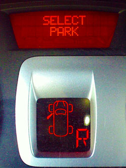
Renault Clio warning displayI stop and scan the dashboard, and there I see a message on the alphanumeric display: Select Park. I do put the gear in Park, and everything is back to normal. I try to reverse again – beep and message return.

This makes very little sense, so I stop, pull out the owner’s manual and look for error messages. There is a pageful of them, but no mention of “Select Park”. I feel like those brisk officers in action dramas that say to their panicky men “Talk to me!”… but the car isn’t talkative, merely cryptic.

After a while I notice the overhead lamp is on, so I realize the door isn’t fully latched; I slam it shut, the car is happy, and I’m off to a day’s work. But the Select Park message is now a nominee for worst car error message ever. Consider:

  1. With the same display they could’ve made it say “Close door“, or “Door open“. Could’ve? Heck, should have!
  2. Note the lower display, which does indicate an open door. Problem is, the Select Park message is so much more prominent and puzzling, that the second display failed to register in my mind altogether.
  3. The beep and text alert only work when you’re in reverse motion. This makes no sense, and had me looking for a cause to do with this specific mode.

Bottom line: error messages should explain causes, either directly (Door is open!) or indirectly (Close the door!). A message that essentially says “Freeze! Something is wrong!” is no good.

It takes guts to be a side mirror

The other day I noticed a car whose side mirror had recently undergone some major trauma, losing its mirror and outer casing, ignominiously showing its guts. Here:

Side Mirror inside mechanism

These electrically-operated mirrors are now ubiquitous, but this brought home the complexity of their inner mechanism, with the wiring, motors, pivots and the chassis that everything must screw onto.

Vintage Side MirrorWhich made me think for a moment of how far forward – or is it backward? – we’ve come from the days of the simple mirrors still seen on vintage cars, as in the photo at right. In the fifties, a mirror was just that – a round sheet of silvered glass fixed in a round metal plate that pivoted on an arm. That was all – 4-5 parts, max, all externally visible. No innards at all. And cheaper to replace, I’m sure, than the bill the owner of the car in the first photo will face.
This growth in complexity is seen in all parts of our cars and other products. So speak up – is this trend a Good Thing (it is really comfy to move the mirror from inside the car, to be sure) or Bad (loss of elegance in design, for one thing)?

Photo courtesy Glen Edelson, shared on flickr under CC license.

Parking lot design snafu

Here is a photo from a parking lot. As you see, one parking spot has been mutilated – apparently, as an afterthought – by sticking two poles in it.

Parking spot with poles

The intent, clearly, is to keep a clear path to the stairs leading to the sidewalk above. A valid idea, but ill-executed in so many ways…

  1. This is a normally full lot. Given that, most drivers would much rather have an extra parking space available, and wiggle their way in between the cars on their way out.
  2. Possibly the idea is to allow access to people in wheelchairs or with baby prams, but if so, they should’ve built a ramp, not a staircase!
  3. The two poles are just far enough from the right edge of the space that sub-compact cars can and often do try to park anyway, thereby blocking the passage even worse than they would have absent the poles. If the designers wanted to ensure free passage, they should’ve used four poles, fencing a passage from the stairs that is wide enough for a person and definitely too narrow for a car.
  4. Of course, if they did that, they could’ve used much less width than is being wasted now…

Not rocket science, but it isn’t only in rocket design that it pays to think before doing things.

Car LED signs and the brotherhood of drivers

Driving on today’s highways can be an aggravating (and dangerous) experience, and it doesn’t help that you can only communicate with the other drivers around you by honking your horn – not exactly a medium conducive to feelings of brotherly love.

So one day, while wishing I could yell at the driver of the truck in front of me to please move a bit to the right so I might overtake it safely, it occurred to me that we badly need a means of car-to-car communication. One idea I had was to install a loudspeaker on every car like police cars have – so we could say “the yellow truck, please move to the right!”, or “Green Toyota, your back wheel is wobbling, better check it before it falls off!” or simply “Thanks!” when someone had slowed down to let us merge.

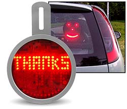
It then occurred to me that this could lead to a real cacophony on the road, so I had a better idea – why not simply add a LED marquee at the back of the car that would allow the driver to broadcast short messages to the car behind – say, “Sorry about that!” or “Keep a safe distance!” or even “You idiot, who taught you to drive?”…

Car LED Sign from Iwoot.comThis would be easy to do at the factory, but when I checked it out today I discovered that it exists as a retrofit: the charmingly named web company iwoot.com (the name stands for I Want One Of Those) sells a “LED Car Sign” that fits in the rear window and has an ingeniously simple controller allowing the driver to change the short messages displayed.

Great minds think alike… 🙂

A gentler car horn?

Car horns are designed to be earsplitting; if the driver in the next lane starts to swerve into your path, you want to be able to alert him with a blast he won’t mistake. For such safety related uses, the high volume and jarring tone are justified.

However, people also use the horn for another purpose – to draw another person’s attention. The driver in front is dozing off when the light changes to green? Honk! You want to ask directions from an absent minded pedestrian on the sidewalk? Honk, honk!

The problem is, we only have one horn, which – as noted already – is designed to be loud. Yet for waking the sleepy driver at the light you don’t need a loud blast; a gentle beep would be quite enough, and reduce the noise pollution on our city streets. And we don’t have a gentle beep in the car!

So, what can we do about this? Many drivers ignore the matter and just use the loud horn. Others, the more considerate ones, try to hit the horn button fleetingly, cutting the blasts short. But it would be most useful to everyone if auto makers were to simply equip their cars with two horns – a loud one for emergency use (activated from the steering wheel as today) and a more quiet one, that would be triggered by a smaller control, for drawing attention without annoying the general population. In fact, this could be designed to emit a pleasant tone or tune that would create goodwill rather than antagonism and road rage at the receiving end…

Copyright © 2024 Commonsense Design

Theme by Anders NorenUp ↑