Tag: Automotive

How many engineers?

See the mechanic working on my Renault Clio.

Do you know what he’s doing? Looks like he’s trying to squeeze his arm into a tiny space between some metal beams in the engine compartment frame. Why is he doing that? Because he wants to replace a burned out light bulb in the headlamp assembly.
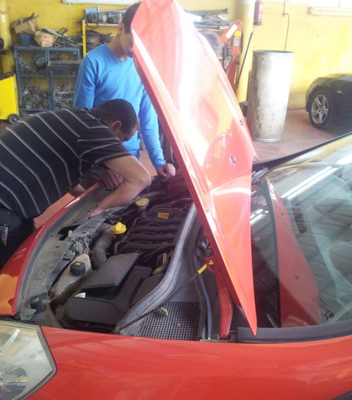
Renault Clio lamp change

Actually I carry spare lamps in the trunk, so I thought I could change the bulb myself. But after a long struggle I decided to take the car in to a garage shop, in the hope that the mechanic there could solve the riddle: how do you access the headlamp’s back side and extract the lamp?

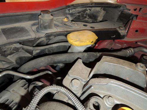
Why, what’s the problem? Here is the problem:
Clio-Lamp-access.jpg

The headlamp is wedged in behind the tube with the yellow cap, and is practically impossible to reach without disassembling the metal beam behind it. Yep… Renault designed this car so you need to take it apart to change a light bulb.

How many design engineers does it take to make it impossible to unscrew a light bulb?
A small difference

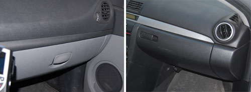
Here we have two glove compartments. The one on the left is from the Renault Clio; the other from a Mazda 3. They serve the same simple function and – not surprisingly – look pretty much the same, if you ignore the nice touch in the Mazda’s, that places the latch closer to the driver.

Glove Compartments

To be precise, they look pretty much the same from the outside. When you open them you see a world of difference.

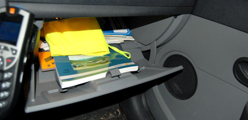
Here is the one from Renault:

Glove Compartment Renault Clio

It goes pretty deep under the dashboard, so you can stick a lot of stuff in there – an advantage for sure. But the angles and the door design are such that the moment you open it, everything is liable to spill out in a mess.

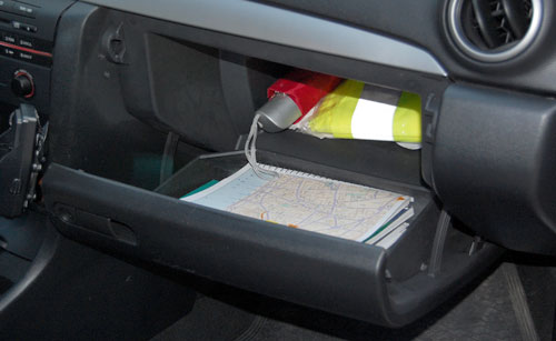
And here is Mazda’s design:

Glove Compartment Mazda 3

Here, there is a deep section behind, and a door designed like a separate deep tray; and the geometry ensures what you put in the inside part stays there, and what you put in the door remains in the door, ready for you to reach in and take what you need.

Two designs for the same function: a poor one and a superb one. And they cost the same to produce, no doubt…

How to make headlamps expensive

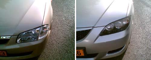
Here are the headlamps of two Mazda cars. On the left, a Mazda 323 from the first half of the past decade, the other a Mazda 3 from the second half. Both fine family cars.

See the difference in design strategy?

Mazda Headlamps

The car on the left has the headlamp split into two parts. The one on the right uses a single assembly.

Why do I care? Because when either lamp gets broken in an accident – and for the outer, the turn signal, this can be even a minor scrape – you need only replace one small cover in the older car, and the entire large assembly in the new one. An assembly they will charge you a ridiculously high sum for.

And yes, some may find the newer design more aesthetic; but the modern highway is a battlefield, not an art museum. We’re better off with cars designed with repair cost in mind. But then, it’s easy to conjecture that that’s what they are – just not in the owner’s interests…

Peugeot’s breakthrough in Crystallogrpahy

snowflake symbolOne of the first scientific facts you learn as a child is that snowflakes, those lovely art creations of nature, have a six-fold symmetry. And they do; the properties of water molecules see to that. Hence the standard symbol for snow (and freezing, and cold in general).
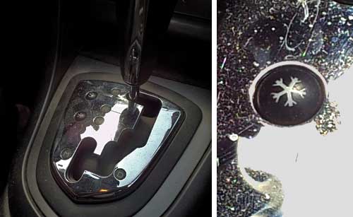
One of the much later facts you learn as a scientist is that crystals almost never have five-fold symmetry. The rare few that do are called quasi-crystals; my countryman Dan Shechtman got a Nobel prize for discovering those.

So imagine my surprise, on traveling in a Peugeot 308 recently, when I looked at the gear shift and saw a button marked with this amazing symbol:

Peugeot 308 Snowflake button

The button apparently activates a special program for driving on snow, a wonderful feature (though not, really, in hot Israel); but what on earth were these French designers thinking with this five-pointed abomination?

At last, a sensible exit sign!

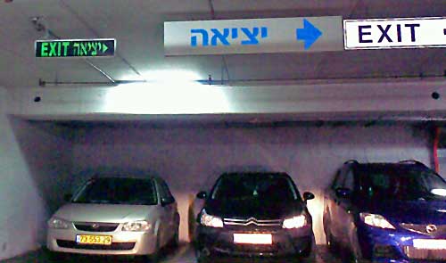
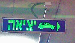
Those depressing multi-story parking structures are an unavoidable part of a driver’s life… and they can get quite annoying when you need to find your way out of one. Sure, there are signs. Here, for example, is one garage that takes no chances on our missing the exit, and advertises it bilingually and redundantly:

Car Park Exit Signs

The only problem is, it fails to say whose exit it is to the right: pedestrians or cars? This is a very common sort of confusion in such car parks, since cars and people exit them from quite different places.

Car Park Exit SignSo here is the right way of doing it! The sign to the right (found on another level of the same car park, strangely enough) leaves no doubt whatsoever: cars should exit to the right. I don’t remember if they had a similarly unambiguous sign for pedestrians, though those are usually marked with a running person for safety reasons. Anyway, isn’t this simple sign design convention something that every parking structure in the world should have?

Where are our car windows going?!

Something weird is happening to car designers.

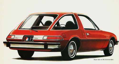
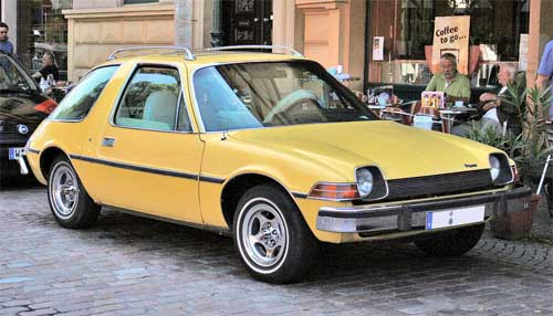
Back in the mid-seventies there was one car in my home town that someone had imported from the US, and I remember how futuristic it had looked to us then.

AMC Pacer car
Photo source: Wikimedia Commons.
Jetsons aircar

This was the remarkably innovative AMC Pacer, and it had those huge wrap-around windows that made it look almost like a glass bubble. It was clear that in the future cars will have windows like this: you only had to think of the aircar of the Jetsons family, the future analog to the Flintstones.

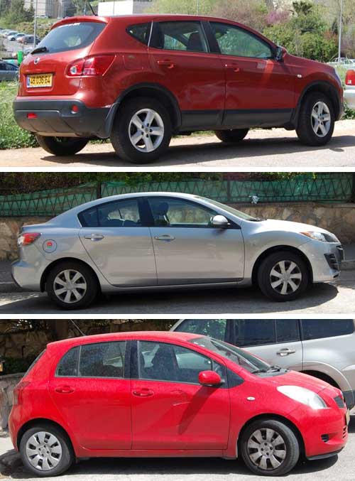
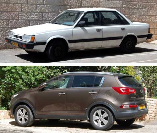
So now the future is here, and not only are bubble cars nowhere to be seen – the windows on our ordinary cars are shrinking at an alarming rate. Compare the two family cars below, an older Subaru and a new Kia. Look at those windows. See the difference?
Subaru and Kia

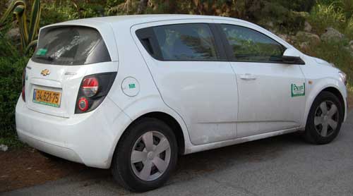
This trend is everywhere. Makers the world over design cars with small windows; if this goes on we will soon have cars with tiny slits to look out through, like in a tank. Here are three more examples:

Cars with small windows

Now, compare the rear end of the Chevrolet in the photo below to the AMC Pacer’s behind in the next photo. See how far the designers have veered off the “future” we had expected?

Chevrolet

AMC Pacer2
Photo courtesy aldenjewel, shared on flickr under CC license.

And what I can’t figure out is, what’s gotten into these designers? Why enclose people in lumpy metal boxes without a good view out? Or is it that car owners prefer it this way – and if so, why? Have they lost interest in the outside world (consider in-car entertainment systems!) – or are they afraid of it, and prefer to hide in their air conditioned cars, with small tinted-glass windows to make them invisible to other people?

Do you have an explanation?

Bike stuntmen, Munich awaits you!

Pedestrian crossing light in MunichI’ve already addressed pedestrian crossing signals in Germany, but here’s a truly surprising one, which I sighted in Munich.

So what does it mean? One can imagine what the intended usage is, but if one were to believe the images literally, this signal tells you when it’s OK to do acrobatic stunts on your bike in the middle of the road, and when it is not…

What a Circus-friendly city Munich must be! 🙂

Cool innovation in a parking garage

I was trying to find a parking spot in the parking garage under the Ramat Aviv shopping mall in Tel Aviv; this is a difficult task much of the time. But it was made very much easier because I discovered they have a truly wonderful system.

Ramat Aviv mall parking space

What you see here is that over each space they have a rod coming out from the ceiling with a lamp at its tip. A red light means the space is occupied; vacant spaces have a green light. So, as you drive around the claustrophobic maze you can see from far away where there is a free spot (and rush to get to it first!).  Simple and ingenious!

As you see in the photo above, all spaces in sight are taken… so did I find a spot? indeed I have… as you can see in the next photo (at mid-left), the occasional green light does materialize!

Ramat Aviv mall parking space

Every comfort for the Baby Executive!

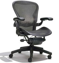
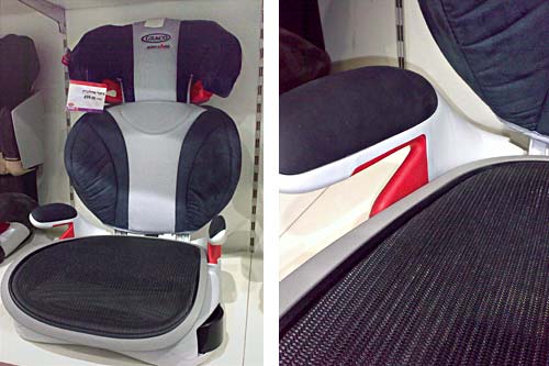
Herman Mille Aeron chairThe Herman Miller Aeron chair is a well known design icon with its unconventional appearance, its ventilated mesh fabric and its level of comfort (only rivalled, naturally, by its price tag). And of course, there are countless clones that emulate its mesh and looks at a lower cost. How far this copycat trend has gone I realized when confronted with the Graco Aerologic, a mesh chair with a classy name of its own. I was so impressed that I snapped some photos for your enjoyment:
Graco Aerologic baby car seat

Note how this chair has the same impressive mesh seat popularized by Herman Miller, as well as fancy faux leather padding on the back. This is a great executive chair… for babies, of course. No baby exec would enter his Rolls without one of these! 🙂

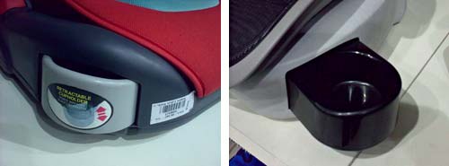
And as a last touch for the successful little angel, the Aerologic also comes with a vital accessory – a retractable cup holder. Two of them, in fact!

Graco Aerologic cupholder

Copyright © 2024 Commonsense Design

Theme by Anders NorenUp ↑