Page 6 of 36

Writing in an unknown tongue

See the hilarious street sign.

Why is it hilarious? Well, if you can read Hebrew you don’t have to ask. For the rest of you, here is the story.

Palermo-streetsign.JPG

Palermo, where this sign hangs, was home to a large and lively Jewish community in the middle ages. Then, in 1492, the Catholic Monarchs (Ferdinand and Isabella, those of Columbus fame) found the time on their busy schedules to decree that all Jews be expelled from all their dominions, Sicily included, and that was that – even today the only Jews to be seen on this lovely island are tourists. Moslems didn’t fare much better, having been expelled in the 13th century.

And it is to this history that we owe the sign, which marks one of the streets of the medieval Giudecca – the Jewish Ghetto. Someone had the neat idea of adding Hebrew and Arab names to streets in that area, in acknowledgement of their history. So far so good.

The joke, however, is that with not a single Jew living there, the Sicilian sign makers evidently relied on someone sending them the Hebrew version of the street name – which they then diligently proceeded to copy, without any idea of how to read the Hebrew script. The result is a hilarious mess of typos, most notable the replacement of the letter Yod with an apostrophe, no less than six times in this example.

I have no idea if the Arabic is any better…

Duh!

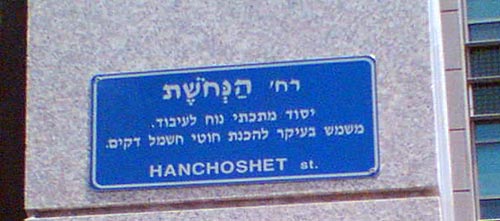
Here is a street sign from Tel Aviv’s Ramat Hachayal area, a vibrant hi-tech hub. The sign hangs on a building at Hanechoshet st., as stated in English.

Hanechoshet street sign, Tel Aviv

The Hebrew is more detailed: it has the street name at the top, followed by the fine print, which explains the name. Nechoshet in Hebrew means copper, and so the text on the sign educates us:

Copper st. / An easily worked metallic element. Serves primarily to make thin electric wires.

Well, Duh!…

The origin of this utterly unneeded explanation can probably be traced to the commendable practice of adding explanations to street names referring to little known persons or events, such as

Rafael Weiss st. / Biblical scholar, 1940-1974.

Not every passerby can be expected to know every biblical scholar, or politician, or artist from bygone generations, so this is somewhat useful.

Knowing when to break a standard mold and leave a field empty in a template is a sign of intelligence…or perhaps a sort of mini Turing Test?

Splash!

Beauty can sometimes appear in the most unusual places.

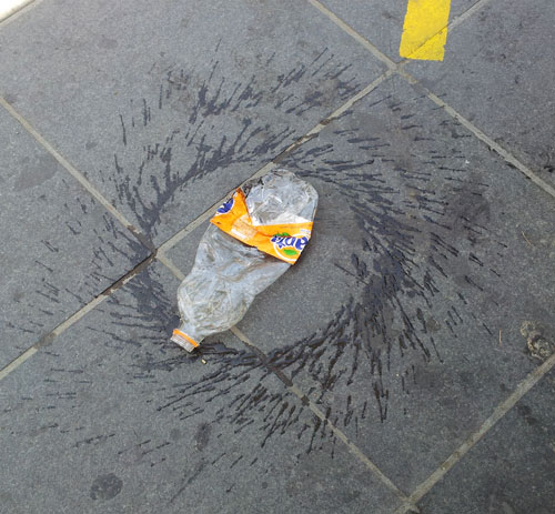
I snapped this photo on a sidewalk near my home:
Splash Circle

As I was watching, a passerby kicked the bottle, and it started spinning, giving me a good idea of what we’re seeing: someone had discarded and squashed the bottle, and someone else set it spinning and splashing its remaining content.

Whatever the details, it’s a lovely pattern!

Form follows dysfunction

Postal form

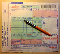
So we had to ship some parcels overseas, and we were given these forms to fill at the post office.

Not surprisingly, the form had four copies, and asked for a lot of shipping and customs information. what was surprising, however, was the incredibly poor functional design of the form’s layout.

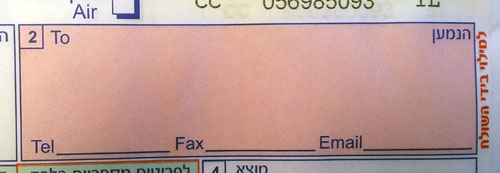
Most obviously silly was the layout of the field for the recipient’s address, which you can see in the photo below:

Postal form addressee field

The small area provided would barely accept any respectable street address, but then they ask you to add telephone, fax and email on the indicated lines. Forget about a.very.long.email.address@long.host.domain.com – you couldn’t even fit short@gmail.com on that tiny line! Same thing for any respectable phone and fax numbers. Nor can you try your hand at miniature calligraphy, because to mark the four copies you must push very hard on the pen…

Every day hundreds of people in the country struggle with this form. Won’t anyone at the PO take pity on us?

The Lawyers’ Balloon

One can hardly imagine a more fun child’s plaything than a toy balloon. These have been around in various forms since the middle ages at least, and are as pleasing to today’s children as ever. And they generally look like the balloon in the illustration below, from the classic children’s book, beloved by generations of Israeli children, “Tale of five balloons”.

Red Balloon illustration by Ora Ayal

Balloon seen at a McDonalds restaurant


But not at McDonalds. I visited one of their ubiquitous locations last week and saw at the counter the balloon you see at the right above. The poor thing was peppered with… legalese.

Legalese on a McDonalds toy balloon

For those of you whose Hebrew is rusty, here’s what it says:

The balloon is made of natural Latex.

WARNING

  • Not suitable for children under 36 months of age.
  • Suffocation risk for children under 8 from uninflated or torn balloons – adult supervision required.
  • Keep uninflated balloons out of the reach of children.
  • An exploded balloon must be immediately thrown into a trashcan.
  • Keep balloons away from the eyes and ears.

Sigh…

Two primordial hunters

Nimrod, by Itzhak DanzigerOne of the most famous sculptures made in Israel is “Nimrod”, created in 1939 by Itzhak Danziger.
A powerful figure in red sandstone, it depicts a naked young man with a falcon on his shoulder and a sword held behind his back, looking intensely ahead.

This is Nimrod, the biblical great-grandson of Noah, king of a number of  cities in Mesopotamia, and traditionally considered the leader of those who built the Tower of Babel. He is also cited as a mighty hunter, the original prototypical hunter of animals.

So what?

So, in October 1988 the National Geographic Magazine published on its cover a photo of a small carving, in mammoth ivory, of a male human head. This was found in Dolní Vestonice in Czechoslovakia, a rich archaeological site that had yielded a number of sculptures, including one of those obese “Venus” figurines. The carving is dated to some 26,000 years ago or earlier, and is the earliest representation of a specific person that has come to us from our ancestors.

And it instantly evoked in me the face of Danziger’s Nimrod, as you can see in the photos below:

Danziger's Nimrod and the ivory head from Dolni Vestonice

Both figures represent hunters (well, we can’t know for sure what the caveman on the left did, but I doubt he was into computer programming). Both hunters come from the dawn of human history. And both have the same indescribable expression on their face.

What a cool coincidence!


An unusual business card design

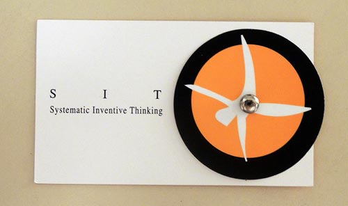
Unusual business cards are not rare; many companies and individuals try to deviate from the traditional white rectangle design in the hope of standing out from the crowd. But today I was handed a card that goes far beyond this. Here it is:

SIT Business Card - front

This card has a rotating wheel that allows different short phrases to be viewed through a cutout in the cardboard. The wheel carries the phrases “SIT International”, “Father and Uncle”, “Facilitator”, and “Builder of Communities”.

Unusual, but at first glance this seemed just one more gimmick. You see metal cards, wooden cards, cards with laser engraving… so this one has a wheel. Nice, but…

And then it hit me: there is a deeper purpose to this design! You see, once the recipient gets the idea that rotating the wheel will reveal more information, it is inevitable that they’ll rotate it in anticipation of each new snippet of insight about the card’s owner. As they do that, their interest goes beyond the mere form of the card; they engage with its content instead. Most information on a business card just slides past you; but through this tiny experience you can’t help internalizing what the phrases say about the person: the fact that he is a father and proud of it; the fact that he values his skill as facilitator; the fact that he does not care about formal titles. The wheel trick gets this knowledge across in a far more engaging manner than just reading a static card would do.

Incidentally, Amnon is the co-founder and manager of a company specializing in innovation methodology, and he told me the design for this card was undertaken as an exercise in applying that methodology; you can read about that in this article.

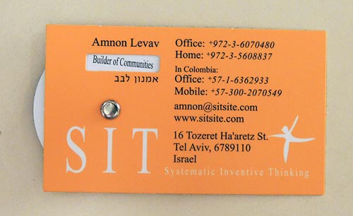
And here is the back side of the card – it’s quite cool that the stylized man of the company logo actually turns somersaults when you rotate his wheel!

SIT Business Card - back

Sugar and Trees

One seldom gives much thought to the humble sugar packet seen in coffee shops (unless one is a sucrologist, at any rate) but there’s an interesting observation related to its design.

A few years ago the age-old form factor of these packets – a rectangle some 7 by 5 cm in size – was supplemented by a new format, a long paper tube about the size of a finger:

Sugar Packets

So – which of these is a better form? At first glance, it hardly matters. But actually the new tubular packaging is superior to the old.

Here’s why:

Sugar Packets - disassembled

Taken apart and flattened out, you can see that while both packets carry the same 5 grams of sugar, the new form uses about 40% less paper!

Sugar-Packets3.jpg

This is clearly visible at the right where the two exploded packets overlay each other. Admittedly it’s only a tiny scrap of paper, but multiplied by the volume of packets used around the globe this can save quite a few trees for sure.

Oh, and the tubular packet has a bonus advantage: it can be used, in a pinch, to stir the coffee!

Timeless Dice


Some designs never change…

Consider this one:

Play Dice

Two instances of the same product exactly – but separated in time by two millennia. The die on the left is one of a collection of bone dice I saw in the archeological museum of Pompeii. The design worked then, and it works now. Nothing to improve…

Here is the lot of them (pardon the poor camera on my then cellphone):

Dice from Pompeii

[Photo credit for the modern die: Double Six Dice by Joy Shrader ]

Copyright © 2024 Commonsense Design

Theme by Anders NorenUp ↑