Page 34 of 36

The Eject button: Location, location, location!

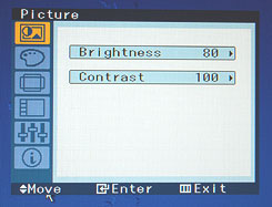
Here is our Toshiba DVD player. It works well enough, but its design does make you wonder…

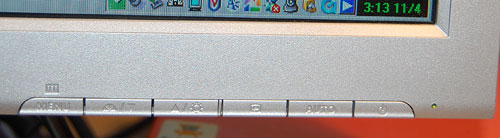
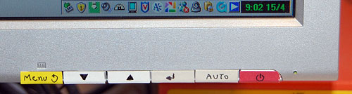
I’ve already extolled its remote control’s virtues (Not). Well, here is the unit itself. You turn it on with the round button at the right; good enough. Then you look for the Eject button, to open the tray. And you look. And you look??? because it is in the wrong location.

Toshiba DVD Eject button location

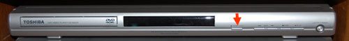
The button is marked in the photo with the red arrow. The point is, that is the last place you’d look for it! It is there to open the disc tray, which is far to the left. You end up reading the button captions – and these are quite tiny and hard to discern, of course – until you find it.

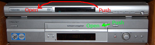
To quantify the extent of this design crime, compare the DVD player with the VCR on which we have it standing. Compare the red and green arrows’ lengths. That’s the difference between Human Centric Design and… whatever it is they did on the DVD unit. See what I mean?

Eject Buttons on Toshiba DVD and on Sony VCR

LCD Monitor adjustment blues

So we’ve made the move to flat computer screens, which have many advantages over their bulky CRT ancestors; but the vendors pulled a fast one on us when it comes to the controls for adjusting the screen’s image.OSD on Samsung SyncMaster 913N monitor

In the good ol’days, every monitor had at least two round knobs, one for contrast, one for brightness. This is as good as it gets from a human engineering perspective. You just twiddle the knobs back and forth until your eyes tell your brain to tell your fingers to stop right there. Today, we have instead an On-screen Display (OSD), which some vendors tout as a good thing; in reality it is slow, unfriendly and confusing. The idea is that you use a line of pushbuttons the navigate a hierarchy of menus just to get to the function you need, and then you need to click a good deal more to effect the adjustment. To make sure this is easy, the buttons are often labeled by cryptic symbols in near-invisible relief (as in the photo below, of my Samsung SyncMaster 913N); and the logic they use, though simple, is far from intuitive. This may be justified – indeed inevitable – for accessing the numerous advanced functions that did not exist in the CRT days; but couldn’t they have left alone those more basic controls?

That’s progress for you (sigh)…

Control buttons on Samsung SyncMaster 913N monitor

So, what can we do about this? Adding analog controls is not realistic on these super-integrated monitors. The only thing left, which actually removes much of the confusion, is to do what the vendor should have done – mark the controls with visible labels, as I’ve done:

Labbeled Control buttons on Samsung SyncMaster 913N monitor

Artsy design is not enough!

The trendy-looking kitchen tool in the photo, made by Koziol, is called “Mia” for some reason. Its purpose is to test Pasta: the frilly head is surprisingly adept at scooping (and holding) a few pieces of short Pasta (penne, fusilli, etc) out of the boiling water; and you use the hook at the other end to fish a strand of spaghetti. Then you can bite them to see if they’re underdone or just right (that is, “Al Dente”, not overcooked and mushy!) And the ring may be for measuring one-serving batches of uncooked spaghetti.

Koziol Mia pasta scoop

A useful little tool, addressing a real need – catching pasta in boiling water with a fork or spoon can be quite vexing. And it has a lovely zoomorphic design, like all of Koziol’s humorous, artsy kitchenware. It even has two depressions for eyes…

BUT… as it came from the store, it had one major design flaw: the deep scoop of the “head” catches not only fusilli, but also a spoonful of boiling water, which can all too easily spill on your hand as you try to grab your tasty catch. As a fishing net analogue, it has no holes!

Koziol Mia pasta scoop improved

So, what can we do about this? Sometimes, what an industrial designer messes up, we can fix by ourselves. I used a fine drill to deepen the eyes until they punched through, making excellent drainage holes without destroying Mia’s funny face.

Schizophrenic books

See the book on the left. It’s been around for centuries, issued by countless publishers, translated into many tongues… and no one ever doubted what it was, because it has a name: Macbeth.

Macbeth and Edison's Eve

Now see the book on the right. This is Edison’s Eve: a magical history of the quest for mechanical life, by Gaby Wood, published in New York by Alfred A. Knopf. An interesting book, actually; but it has one strange aspect: the first half of the book is about the history of lifelike automata – Vaucanson’s duck, the Turk chess player, Edison’s speaking dolls and so on; just as the title promises. The second half is all about little people who appeared in circuses and sideshows in times past, such as the Doll family in the 1920s, which seems rather off-topic. The incongruity was resolved for me abruptly when I noticed a line on the copyright and catalog info page at the back of the frontispiece: “Originally published in Great Britain as Living Dolls by Faber and Faber limited, London”. Now that title makes sense and links the two parts of the book correctly.

So, we have the same book sold in two countries under different names: the original name sensible, the later poorly thought out and confusing (amazingly, the Amazon site says people who bought one also bought the other…) Nor is this a unique case: I’ve seen this with non-fiction a number of times.

I’m sure the publishers had weighty reasons for this mutilation of the book’s name: one can envision considerations of marketing, or potential lawsuits, the usual corporate stuff. But these are books; books deserve respect. You don’t rename Macbeth to “Scandal in Dunsinane”, nor to “Blood, sex and sorcery”, just because it may sell more in some country. Leave our books alone!

Car window wiper mystery

This one has been bothering me for years: why don’t all cars have rear window wipers?

Typically station wagons, hatchbacks and all sorts of minivans and SUVs have one; but ordinary four-door cars almost never do. Yet the need is identical: why, then, discriminate against these?

If you have a good answer, post it in the comments!

FameLab!

Off-topic it may be, but I had a delightful experience last week judging in a round of the FameLab competitionFameLab contestant organized by the British Council in the Jerusalem Science Museum. This international event strives to encourage scientists to communicate their work and their excitement about it to the public; young scientists (mainly graduate students) were invited to present a scientific subject of their choice – in three minutes sharp.

So, I was treated to two dozen fantastic presentations on subjects as diverse as celestial mechanics, protein reactions in cells and the lifestyles of dinosaurs; delivered by talented young people just as diverse in their styles and approaches to communicating their knowledge. Winners will get to compete at the next level, and will be treated to a communication skills workshop that will help them develop their skills.

What a wonderful way to promote science!

Keyboard light: no more groping in the dark!

A humorous video review from CNET on the Lenovo Design Matters blog (yep, these guys have a blog where their designers interact with their users – a commendable idea!) compares the Thinkpad X300 to the MacBook Air. Nicely done – take a look.

Interestingly, the reviewer mentions one favorite feature of mine in the Keyboard Light on Lenovo Thinkpadrecent ThinkPad notebooks that many users may be barely aware of: a little white LED in the screen’s frame that illuminates the keyboard. This is useful for when you work on an airplane at night and prefer to leave the overhead reading light off (whether out of consideration for your co-travelers or for your battery life – in the dark you can work at the screen’s minimal backlight intensity).

This LED in itself is a great design idea, but I’m even more impressed by how you turn this lamp on: you depress the Fn key and the PgUp key together. Why is this impressive? Because these two keys are located diagonally at the opposite corners of the keyboard; this means you can find them – by touch – in absolute darkness, which is where you’re at if you need a light in the first place.

Incidentally, this is how I discovered this feature during one long flight – I was groping to find the Fn key combination for increasing the backlight level, hoping to have the screen itself illuminate the keyboard, and I accidentally hit the right keys. And there was light!

Activation keys for Thinkpad keyboard light

A lesson from a blue hairdryer

One day the ladies in the household decided they’ve had it with our handheld hairdryer, which was indeed weak and ailing. So I went to buy a new one, and decided to follow my first principle for tool acquisition: always buy the most professional, high-quality tool you can afford – it will repay the expense many times over!

I asked the appliance store guy for his best tool, and he offered me a sturdy blue unit that, he said, was what professional hairdressers (sorry, hair styling artists) use. The wattage on the label was indeed higher than any I’ve seen before. I brought it home proudly, only to discover the next day that it was no good to anyone there.

This was a new one for me: how can a tool that professionals prefer be useless to an amateur? In my world of engineering and DIY projects, this would be unthinkable. What difference can it make? A hairdryer is a hairdryer, after all.

Here’s the difference: the hairdryer is a hairdryer, but the hairdresser uses it to dry hair that is on someone else’s head! When you dry your own hair, the dryer must be short enough to fit between your hand and your skull; when you dry someone else you can just step back. The professional tool was longer, not much but just enough to make it awkward to use on oneself.

So, a lesson: always keep an open mind and challenge your own assumptions on the way a design fits its intended use. These errors seem obvious in retrospect – always in retrospect…

Intriguing objects at Possibly Interesting site

Glass cup
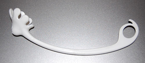
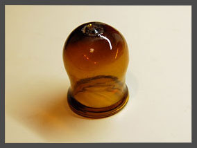
Do you recognize the glass object in this photo? If not, you may want to check Prey to Oblivion, the March article on my Possibly Interesting web site, which has a bunch of everyday objects that were quite familiar a century ago but are now all but forgotten.

To avoid confusion:

  • This here Commonsense Design is my blog, updated with new brief posts a few times a week.
  • Possibly Interesting is my personal web site, where I post hopefully interesting but longer articles once a month.

I figure I should cross-post a link to the blog when an article of interest comes up on the other site.

User-centered design: a serious lapse

And now, from the murky past, a serious lapse in designing for the intended user…Toddler on Bench

When my son was a toddler, many years ago, he had this habit of going into my den in my absence, climbing onto the lab bench and wreaking havoc (here, I once captured him on film reaching for a hammer).

Well, I had to protect kid and gear, and I had this idea to build an anti-toddler alarm system that would raise an alert if the kid went into the den without an accompanying adult. My design had two infrared beams crossing the door at different heights, and a control box complete with a cackle generator (to issue a sound like an angry hen when the alarm was triggered). When it was finished, I painstakingly built four lens assemblies for the IR beams, rigged them around the door frame, and prepared to have some fun. Cool, huh?…

Yah. The thing lasted for less than a day. As soon as the kid (did I say he’s very smart?) went on the prowl he spied the interesting new things on the door frame, decided they were worth studying, and tore them off the door to facilitate examination. I wasn’t in the mood to devise hardened housings, so that was the end of the project.

We tend to think of User-centered design as making life easy for the user. Evidently, you also have to ensure the system can survive its intended users!

Copyright © 2025 Commonsense Design

Theme by Anders NorenUp ↑