Page 33 of 36

Buildings designed for Software Engineers

With the wonders of Google Maps at our service, we can get some interesting insights. Take the photo below, also viewable here. This is the older part of the Microsoft campus at Redmond, where much of the software in the computer I’m writing this on was developed.

Microsoft buildings at Redmond

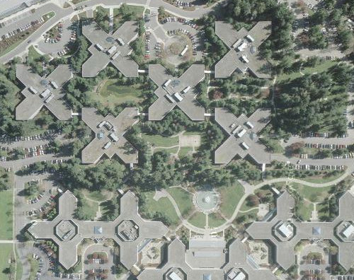
Notice how the buildings all have cross shapes visible in their plans. This is not because of a religious bias in the company’s management. It is, I was told when I visited there, because Bill Gates had decided when he started the company that an effective software engineer needs the peace and quiet made possible by an office with a door. Indeed, while myriads of hi-tech engineers (yours truly included) work in cubicles in the noisy open space made famous by the Dilbert comic strip, Microsoft coders all have their own individual offices with real doors to block out the world when they need to concentrate. Of course such an office requires a window too, or it gets claustrophobic… which explains the shape of the buildings – with a need for so many windows, they had to be made with a convoluted outline, to maximize surface-to-bulk ratio.

For my part, I admire the tenacity – Microsoft moved to Redmond in 1986, and 22 years later they still resist the temptation to compress their engineers into cubes. They have a good thing, and they stick to it!

A glimpse of the venerable NCSA Mosaic browser

Dominic Tramontana has posted an interesting analysis of how the Reload glyph varies between browsers; take a look! Dominic asked me to post a screen shot I have of NCSA Mosaic, the first graphic web browser developed in 1993 by Marc Andreessen.

The grab I dug up is of a Novell web page, from early 1995. Here it is (click image to see the full page).

NCSA Mosaic browser, 1995

Back then, black on gray was the accepted way to write a web page, and the use of the red “book” images was a really impressive touch, I recall. We’ve come a long way…

The evolution of the On/Off power switch symbol

We all know the symbol with a vertical line in a circle: it identifies the On/Off power switch. It occurred to me that this familiar symbol is evolving in a bizarre fashion.On Off Power Switches

Originally, switches had a lever or slider that could move to either of two physical positions. In those days the switch was marked with the word POWER and its positions with ON and OFF. Then, as switches became smaller and more globalized, the two words were replaced with 1 and 0, as seen even today on many rocker switches.

And then the ubiquity of microprocessors made it more economic to do everything with momentary pushbutton switches; the computer inside could take care of figuring whether you meant ON or OFF. And so, the button now needed an icon that conveys both options; I surmise that is when the familiar “1-inside-a-0” symbol came into existence (if you know otherwise do share in the comments!) This round icon fit nicely on round buttons, and became ubiquitous.

OnOff power switches

But then we start to see the form shown in the two photos above right: a bastardized version combining the 1-in-a-circle with a 1 in the same symbol. This makes no sense at all – the correct representation would have been 1/0, for On slash Off. Instead we get On slash OnOff. Sloppy thinking…

Such erroneous contractions are often seen in spoken language – as in “IT technology”, which expands to “information technology technology” (there’s even a company by that name, and its slogan, amusingly, is “We make sense of IT“). But now we see the same error invading the more compact space of visual symbols…

A REAL switch for the wireless radio

In the old days electronic gear had on/off switches that were actually physical devices with two positions, like the light switch on a wall. Nowadays these have become a rare sight: with everything computerized, most state switching is done by pressing pushbuttons and keys, with the switching done by the logic circuitry or microprocessor.

The disadvantage of this solution is that (a) you can’t tell the state of a switch by looking at it, and (b) the act of switching can take a while as the computer goes about its activity. Even the basic act of turning a computer off now takes long moments (in the original home computers you hit the switch and power was simply cut off).

Thinkpad T61 wireless radio switch

Here is a delightful exception to this trend: my latest Notebook, a Lenovo Thinkpad T61, has a slide switch on its outside for switching the Wireless radios on and off. Slide it to the right and the radio pops on instantly (as indicated by a green spot that becomes exposed under the slider). Slide to the left and the radio shuts down. Besides being fast and convenient, this is very useful when flying: if you believe in the inadvisability of having the Wireless on during flight, you can ensure it is off (and will stay off) before even turning the Notebook on. Absent this assertive hard switch, you’d need to turn the computer on, discover you left the radio on when you last put it into standby in the airport, and then you’d need to fumble with soft switches and dialogs to turn it off before the plane crashed. 🙂

The Duomo of Siracusa: the ultimate Reuse

Reuse is good, right? And the notion conjures in most of us an image of linking code modules. Which is why I was astounded to run into the following case, while touring the beautiful island of Sicily.

Siracusa Cathedral (Duomo)

Here you see your intrepid tourist in front of the Duomo (cathedral) of Siracusa, the city where Archimedes lived, engineered, and famously died defending his sand drawings. The baroque facade is a late addition (18th century) and nothing to write home about; but to its left there’s something unique and bizarre…

Below, left, is a close-up of the left wall of the Duomo. Note the embedded Doric columns, visible with their abaci and architrave (don’t worry, I had to look that up myself). These are also visible on the inside of the church, as seen in the photo at right.

Greek columns embedded in Siracusa cathedral

So what’s going on? Well, the church was built in the 7th century AD. The columns, however, predate it by more than a millennium; they are what’s left of a Greek temple dedicated to Athena, which was built in the 5th century BC. Rather than follow the destroy-and-recycle method often applied to preceding cultures, the Christians reused the framework of the temple as is, filling in the spaces between the columns!

Car parts designed to smash up!

Last year we traded in our old Clio, and got the latest model. Nice car, as before, and it looks like the design engineers at Renault have been busy thinking of ways to improve it. Like the side molding on the doors: the new car has a turn indicator lamp right inside it!

Renault Clio

Now, though they’re often touted as “decorative trim”, these moldings have a practical function: they are essentially protective bumpers that absorb the usual nicks and scratches that the side of a car suffers all too often. To put a fragile light fixture in one, where it is guaranteed to break at the first scrape with a tree or a passing car, makes about as much sense as sticking your head out the open car window on the freeway. Of course, once it gets smashed, you can sell the customer a replacement part…

Renault Clio side trim before and after damage

So there, it happened to us! The Clio got hit lightly by another car, and behold… the turn light was shattered, the rest of the molding was fine, and the authorized garage insisted they can only replace both as one piece – not just the lamp, but the entire strip, made more expensive because it contains a lamp. One look at the photo can convince you that the two are actually separate pieces – note the different color of the plastic.

But hey, business is business!

Emergent misfeatures: more than meets the eye

Any wise consumer checks the specification of the purchased item in the store, in order to know what he’s getting. Unfortunately, this does not guarantee a happy deal…

One day we decided to go buy a new TV set. We went to the store and selected a top notch Sony, with impressive specs. We took it home, set it up, put the resident teenagers in front of it… and they expressed major discontent!

It’s not that the picture was bad (it was crisp and vibrant), or that the sound was poor (it was excellent), or that the set failed to live up to the impressive specs on the box. The problem was that when you used the remote to channel-surf, instead of the Zap-Zap-Zap of the old TV, this one went Zapppp…… Zapppp……Zappppp… you see, the TV needed a whole second to blank the screen and bring up the next channel, making rapid switching an impossibility. You’d think a second is no big deal, but I had to agree with the kids: it completely obliterated the user experience of the surf.

Now, this is one thing I could never have foreseen. The feature list on the box did not say, “Optimized for a crummy channel surfing experience”; and having never had a TV that needed to think about obeying the remote, I never thought to check this in the store. It was an undocumented feature in the design – an emergent misfeature, if you will – that the buyer would only find out at home.

Here’s another: we have a Sharp microwave oven that has the useful habit of beeping once when the time is up. Cool. It has the slightly less useful feature of beeping again a minute later if you didn’t notice the first beep. Okay. And then it has the maddeningly stupid feature of beeping three times every minute thereafter, never relenting until you give it your attention. Hey, stupid oven, I heard you, but I’m busy right now – keep the food inside and shut up!

Again, this is an undocumented feature – one no salesman would tell and no buyer would ask, but one that delivers a major annoyance once you get the thing home. These examples showcase how the imagination of a bad designer in inventing misfeatures transcends the buyer’s ability to foresee them…

Come on, designers, have a heart!

Bialetti’s Brikka: only one extra piece!

All coffee lovers know the classic Italian “Machinetta“, or Moka pot, that 3-piece stovetop espresso maker: not a competition to the professional espresso machine of a coffee shop, but good for a fast, concentrated caffeine fix at home. These have been around since their invention in 1933 by Alfonso Bialetti, and we have a number of them at home in various sizes (hint: go for the stainless steel ones, they don’t corrode and last forever if you don’t burn the plastic handle).

But on a trip to Italy we were served by some friends with tiny portions Bialetti Brikka coffeemaker
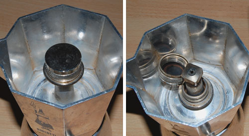
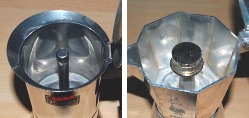
of a much stronger, foamy brew; and upon inquiring how they could produce it at home we were shown the Brikka, the machinetta with the “sbuffo” (the dictionary says “gust of wind; puff“, but a fiery snort sounds more appropriate to convey this word’s feel).

The amazing thing about the Brikka is that it is practically identical to the old Moka, except that it has one additional piece: a heavy steel cup, padded with a rubber gasket, that sits atop the tube from which, through a hole at its top, the hot coffee issues. This means that before the steam in the bottom half can push the water through the coffee powder, it has to achieve a high enough pressure to lift the steel weight; essentially the arrangement you find in a pressure cooker’s regulator valve. Once the correct pressure is reached the valve lifts and the coffee suddenly blasts through in a matter of seconds, accompanied by a loud puffing noise, much stream and bubbling foam. Sbuffo!

Brikka Sbuffo

The photos above capture the moment – mere seconds separate the two.

The Brikka, which Bialetti makes in 2-cup and 4-cup sizes (we’re talking Italian cups – about half a demitasse each), makes far stronger coffee than the Moka, and with some foam to boot. And all by adding one piece to an age-old design!

Brikka mechanism

Note the hole at the top of the tube, exposed with the weight dismantled.

Brikka compared to ordinary Moka

Brikka (right) compared to the open tube in a regular Moka style machine.

What will they think of next, you say? Don’t get me started about Bialetti’s “Mukka Express”, which seems to apply similar ideas to produce Cappuccino in one go (I’m still resisting the temptation to buy one of those).

Smart parking lot design

Parking lots try to cram as many cars in as they can (the ones that charge you to park do, anyway) and so it often happens that you exit the car only to find you’ve overstepped the white line. If you’re conscientious like me, you get back in, restart the motor and wiggle the car the few inches required to fit in your own space. The problem is that you can’t really see the lines in the last stages of the parking maneuver…

Parking lot spaces

So I was in Tel Aviv the other day and saw a simple fix to this problem. Look in the photo: they extended the white line up onto the wall! That way you can see the boundaries in front of you (or back, through the mirror) as you move in.

Handicapped parking spaces
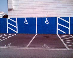
While they were at it, they also did the handicapped spaces – now no one can say (honestly or not) that they didn’t notice the faded symbol on the pavement; if you park in one of these spaces, it stares you right in the face.

Good thinking!

Boundary-crossing innovation: antennas in your skin!

Technology innovation often happens serendipitously, and the kind I like best is when something from one knowledge domain triggers an analogous design in a completely different field. I mean, inventing a plane with wings because you notice that birds have wings is OK, but not a huge leap (the real leap of the early aviation pioneers was ignoring the flapping of bird wings). It’s more interesting if you observe how fish swim and end up inventing sliced bread!

So, here’s one that really crosses domains. My friend Ronny – Prof. Aharon Agranat of the Hebrew University in Jerusalem – and his colleague Prof. Yuri Feldman have just made headlines with the discovery that you can read the state of sweating on human skin at a distance by beaming Sub-Terahertz waves at it and analyzing the reflected waves. This could have useful applications in a variety of fields, from medicine to security, given that sweating patterns correlate to various biomedical conditions. But the part I like is how they arrived at this development…

Ronny and Yuri were looking at new imaging data that showed that the sweat pores in the skin are not straight tubes but helical. Weird design choice??? but some antennas used for communications are also helical. So, click! – as Ronny says in an interview, “When you look at this through the eyes of an electrical engineer, it is very familiar… it immediately ignited the thinking that perhaps they also behave as helical antennas”.

Immediately, that is, if you have that innovative talent to generalize across domains boundaries!

Copyright © 2025 Commonsense Design

Theme by Anders NorenUp ↑