Page 25 of 36

Multi-device remote controls

Used to be, a TV set had a remote control (used to be, farther back, it didn’t; but that’s prehistory). These days, however, everything has a remote control; indeed, I can’t wait for someone to create a tiny remote control for the larger remote control itself! 🙂

Three Remote Control unitsThe proliferation of these gadgets has created a real problem, and home electronics makers are responding by creating R/C units that can control more than one item; most typically, a TV set and the DVD, PVR or VCR feeding it.

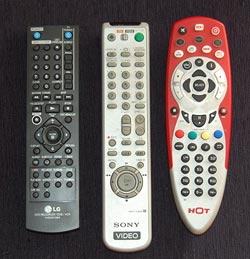
Which is all very well, but how do you make one control work on many devices without confusing the user? There are different ways, and they vary in their usability a great deal. Let me illustrate with three units from my home: the remotes for (left to right) our LG recording DVD, our old Sony VCR, and the HOT cable company’s PVR. The first two can also control our Sony TV; the red one controls the cable box, the TV and a DVD or VCR. And each goes about the choice of function in a different manner, seen in the close-up photo.

Remote Control close ups

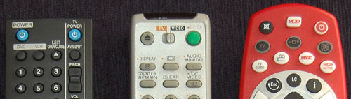
The R/C on the left simply has a section at the right dedicated to controlling the TV, with its own On/Off switch and channel and volume controls. This results in some redundancy with the controls of the DVD (which also has power and channel controls) but it completely eliminates any possibility of confusion.

The VCR controller in the middle incorporates a disappearing species – a mechanical slide switch at the top that determines what device is being controlled. The buttons on this unit change their role depending on the position of the switch, and have color coded dots to indicate whether they apply to the TV. Having to slide the switch is a bit more of a hassle than with the black R/C but at least you get definite visual feedback of which position you’re in.

The red unit works like this: you have to press the button (in the second row) corresponding to the device you wish to control; then, until you press another of these buttons, the unit controls that device. This is for sure the cheapest to produce; it’s all in the electronics. The price you pay is that there is no visual feedback at all; if you forget what you pressed, you will find yourself changing channel or cycling the power on the wrong equipment. There is also no labeling of which buttons work with which device.

All of these units do their job, but to my mind their user friendliness goes down from left to right. Not surprisingly, so does the cost to produce them…

Where have all the cradles gone?

In the early years, when portable electronic devices were considered wonderful miracles of technology, they used to come equipped with cradles. These would at a minimum charge them – the case with the “dumb” cellular phones of the day – and later also provide cabled connectivity to a computer, as in the early Palm Pilots. The cradles were meticulously designed to be functional as well as good looking; I remember a cellphone I had that had a two-slot cradle – one for the phone, the other for charging a spare battery. And it was indeed utterly convenient to plop or push the device into the cradle before bedtime and forget it until the next morning.

So where have all these cradles gone? These days, even the smartest devices charge through one cable and connect through another; connecting a cable is no major problem, but it is still less comfortable than dropping a device into a slot, and it leaves the device flopping about on one’s desk with much less dignity than the cradle afforded. Some manufacturers do make cradles as accessories, or you can get them from third party manufacturers, but they are much less common today.

Palm PDA in a Cradle and HTC smartphone with a charger's cable

Of course, a cradle is less portable; when I had my Palm V I had to buy a separate “travel kit” that replaced the cradle with a cable and plug arrangement. But when I would return home from a trip I’d be greeted by the more permanent arrangement, hooked up to my notebook’s docking station.

I was never certain whether the cradles of yesteryear were eliminated to reduce manufacturing costs, or because users preferred the flimsier cable system. What is your view on this choice?

The ideal fly repellent solution

There are many solutions that claim to repel flying insects; some even work.

For instance, there are chemicals – stuff you put on your skin, stuff you burn like incense – at least this makes sense: we can see how some smelly material may offend the insect’s finer sensibilities. Then there are hi-tech solutions, like the electronic gadgets that supposedly emit a hypersonic sound that mosquitoes can’t stand. We once tried this out – my son sneaked up on a mosquito standing on a wall and turned the gizmo on right next to the critter’s ear (or whatever they have). The insect didn’t even deign to move an antenna; maybe it was deaf (or maybe we were sold the electronic equivalent of snake oil).

Water bag used to repel fliesBut the most amazing device is one I snapped in a restaurant today: a nylon bag filled with water, hanging from the rafters (I’ve also seen them hanging from tree branches occasionally). And this traditional system is in use not only in Israel – as I discovered in Google, the same method is used in the US, Mexico and elsewhere: so it’s really globally known.

I asked the waiter why a water bag will drive flies away, and he said with great certainty that the fly sees its own enlarged reflection in the water and it scares it away. I heard this explanation before; presumably the fly thinks it just met a bigger, meaner fly, and decides that retreat would be prudent.

I have no idea whether anyone confirmed this theory (any input on this is welcome), but whether the explanation is correct or not, you have to admit this is one solution that is perfectly acceptable from all angles: environmentally friendly, harmless to humans, humane even to the flies, and as cheap as it gets.

A gentler car horn?

Car horns are designed to be earsplitting; if the driver in the next lane starts to swerve into your path, you want to be able to alert him with a blast he won’t mistake. For such safety related uses, the high volume and jarring tone are justified.

However, people also use the horn for another purpose – to draw another person’s attention. The driver in front is dozing off when the light changes to green? Honk! You want to ask directions from an absent minded pedestrian on the sidewalk? Honk, honk!

The problem is, we only have one horn, which – as noted already – is designed to be loud. Yet for waking the sleepy driver at the light you don’t need a loud blast; a gentle beep would be quite enough, and reduce the noise pollution on our city streets. And we don’t have a gentle beep in the car!

So, what can we do about this? Many drivers ignore the matter and just use the loud horn. Others, the more considerate ones, try to hit the horn button fleetingly, cutting the blasts short. But it would be most useful to everyone if auto makers were to simply equip their cars with two horns – a loud one for emergency use (activated from the steering wheel as today) and a more quiet one, that would be triggered by a smaller control, for drawing attention without annoying the general population. In fact, this could be designed to emit a pleasant tone or tune that would create goodwill rather than antagonism and road rage at the receiving end…

A really poor choice for a freeway logo…

The Menachem Begin expressway is one of the better engineering projects built in Jerusalem in recent years, providing a rapid path for driving across much of the new city. It has cut my commute time to work by 70%…

Begin Expressway, Jerusalem

Image: Adiel lo, via Wikimedia Commons.

There is only one minor detail about it that I always find amusing yet annoying. The builders picked a logo for it, which is prominently displayed on the signs leading to it. And here it is on the left.

Begin Expressway Logo     Freeway Sign

Now, at first glance it seems highly appropriate for an expressway, showing lanes and an interchange. But when you look closely, you notice:

  1. The symbol is pretty tangled, like a knot really. Hardly the image of a freeway, where the main concept is that you zip right through. The standard freeway road sign, at the right, does a far better job of conveying this idea.
  2. There is no way to travel this path on a freeway interchange. At first I thought you might do it in the UK, where they drive on the wrong side of the road, but even that is not true – there, the road on the logo would cause cars coming from both directions to collide in the middle of the bridge.

What were they thinking!? 🙂

An alien twist on the On/Off Switch symbol

My post about the evolution of the On/Off Switch symbol turned out to be very popular with this blog’s esteemed readers. So, here is a second serving on the subject. This time, something completely different…

Switch on Alaris pump controller

I was visiting someone in a hospital and I saw this piece of medical equipment by Alaris Medical Systems. From what I could gather, it was a controller for a volumetric injection pump that was administering medication to the patient at a programmable rate.

So – look at the symbols around the big key-switch (sorry about the quality of the hurried cellphone photo). Obviously, they’re meant to be conventional icons denoting some functionality – maybe On, Off, and something in between? Or Fast flow, Slow flow, and Manual flow control? The point is that it’s clear that they do mean some three states, and that their distinct simplified forms map to those three meanings somehow, yet for me, as a non-medical person, they could just as easily mean glrrrph, drerp and hoomphla. I’ve completely failed to decipher this symbolism. If you know what it means, add a comment for the benefit of the rest of us.

I assume the nurses that use this gear have been trained in its use… still, one wishes they’d add the meaning in plain English alongside (or instead of) the mysterious icons. But then, that goes to “one word can be worth a thousand pictures”, as I’ve considered here.

Which reminds me of a question I’ve pondered in some idle moments: would an alien visitor make any sense of our ubiquitous arrow symbol? Or do you have to descend from a specific hunter-gatherer background to feel that it must mean motion in the direction of the arrow’s tip?…

CardScan continues to amaze!

A few months ago I wrote about the surprisingly good customer service I received when my CardScan business card scanner died. Well, this was no accident, it seems.

The other day I installed the CardScan software on another computer and I noticed on the welcome dialog during installation the following fine print:

CardScan welcome dialog

I was impressed. I install many software products, and most never go beyond offering a customer service pointer in case of trouble. Mr. Weyman’s invitation is much more positive and proactive, and I may take him up on it one day…

And on the same dialog they also say that you can return the product in the first 30 days for a no-questions-asked refund. These guys really understand customer orientation!

Making LCD monitors crisp

I went to shop for a widescreen LCD monitor. I went from one large store to another; each had at least half a dozen candidates, and it was amazing to see how poor the images on them looked!

Of course, in most cases the immediate cause was that they were being driven at the wrong resolution. As I explained before, a liquid crystal screen must be driven at its native resolution to avoid fuzziness. Since all the screens in a store were driven by one computer, yet had different resolutions, many were mismatched.

Of course one should never buy a monitor sight unseen… so I had the foresight to lug my notebook with me, and the store guys were willing to let me hook it to the screens on display after setting its output to the appropriate mode. But even then, most screens were fuzzy, so much so that it just didn’t make sense. I then discovered that in their complicated OSD menu system, there is usually a “Factory Reset” option. Guess what – in maybe half the cases doing this improved the display quality considerably!

Dell 2208WFP 22 inch LCD monitor
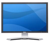
I the end I settled on a Dell 2208WFP, a nicely designed 22 incher. And when I got it hooked up at home, lo and behold, the text was just a little bit fuzzy. I did the Reset thing but to no avail. I played with the brightness and contrast – still no use. And then I explored the menus further and guess what? They had a setting called Sharpness! It was at 50%; I jacked it up and the monitor achieved that exquisite crispness I’d come to expect of Dell monitors.

Now, my experience is that a significant fraction of users spend their time in front of fuzzy displays. Many don’t even realize there’s a problem; in many cases a glaring resolution mismatch causes extreme fuzziness but they have no idea they could fix it in seconds. And then, I’m sure, there must be many who haven’t even bothered to adjust the display’s own controls (being hidden in the OSD makes them easy to miss).

So, look at the screen you’re reading this on and ask yourself: can you do better?

Ergonomic keyboard or Snake oil?

Was at Office Depot and noticed a keyboard on sale that was touted as the Anti-RSI keyboard from A4Tech. Anti-RSI position on A shaped keyboard from A4Tech

This, according to their web site, has an innovative “Natural A shape” layout that allows you to type ergonomically with your wrists held in their natural position, rather than bent at a strained angle. The site shows this convincing-looking diagram:

So I examine the keyboard, and it’s the exact same layout as on a normal one, but the keys are diamond-shaped so the lines between their edges have that “A” shape.

Anti-RSI Keyboard from A4Tech

Which is nice, except that when I type I hit the tops of the keys, not their edges, who for all I care can have any shape at all. In fact, I hold my wrists at the correct angle when using any keyboard, and would do the same on this one.

So… either I’m missing something, or this is nothing but hype.

Any insight, anyone?

World Usability Day 2008

Today, Nov. 13, is World Usability Day, sponsored by the Usability Professionals’ Association.

World Usability Day

This has been running since 2005; each year, on the second Thursday of November, over 225 events are organized in over 40 countries around the world to raise awareness for the general public, and train professionals in the tools and issues central to good usability research, development and practice.

This year the theme is Transportation, with various practitioners and organizations addressing the impact of transport methods and practices on people and on the environment we live in. And while browsing some of this, I found this interesting research report from the UX Alliance on Parking Meters around the world, with a focus on their ease (or not) of operation. Turns out that “… no two parking meters … are completely the same and that the complexity of operating the parking meters varies considerably. There is a world of difference between the auto-detecting parking meter in Tokyo and the complex and error-prone parking ticket dispenser in Amsterdam.” The report, with numerous photos,  is quite interesting and insightful about proper design (or otherwise) – recommended reading!

Copyright © 2025 Commonsense Design

Theme by Anders NorenUp ↑