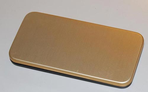
Care to guess what delightfully well-designed product is hidden inside this elegant 5 inch long metal case?
Check it out in the latest article on the Possibly Interesting web site!
Instances of good design
Care to guess what delightfully well-designed product is hidden inside this elegant 5 inch long metal case?

Check it out in the latest article on the Possibly Interesting web site!
Ordered some books today and was surprised to find on the Amazon.com home page a message from Jeff Bezos telling of their new initiative to alleviate “Wrap Rage” – “Amazon Frustration-free packaging“. Apparently they plan to recruit leading manufacturers to put an end to clamshell blister packs, steel-wire ties and excessive cushioning materials.

They aren’t necessarily resorting to Julie Andrews’s “Brown paper packages tied up with strings”, but they will push for smaller, easy-to-open, recyclable cardboard boxes designed to minimize both waste and customer fury. What’s more, these plain boxes are designed to ship as they are, without need for an additional shipping carton. More details here.
What can I say? Good idea! I wish more vendors did that sort of thing.
One of the small pleasures of life is sharing a fine Cappuccino on a weekend morning at home. The only difficulty is, you need a way to produce one, and we don’t have a professional machine at home like they have in a proper coffee shop. We do have the means to make strong espresso – one half of the Cappuccino story – but what of the milk? We had a battery-operated propeller thingy that was supposed to beat milk into a froth, but it left much to be desired.
Enter Tupperware. This innovative manufacturer of kitchen plasticware came up with a gizmo for making foamed milk – the “Magic milk cappuccino maker” – that shines in its ingenious simplicity. It consists of a small plastic jug with a lid that allows through a round metal mesh – a strainer – on a rod. Here’s how this works:
First you fill the bottom third of the jug with milk, put on the lid and microwave for 2 minutes to get the milk hot.
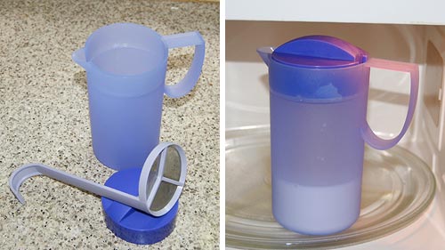
Next you put in the strainer, close the lid, and pump the rod up and down rapidly a few times. The mesh moves through the milk and foams it up in no time – very effectively.
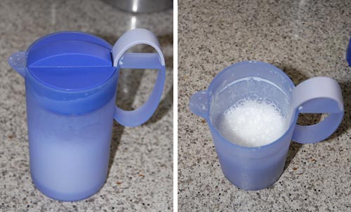
Meanwhile you produce the espresso in your Brikka, put it in the cups and shovel in foam and hot milk from the Tupperware jug. The entire process takes under 5 minutes, most of it waiting for the machinetta to boil. And here we are:
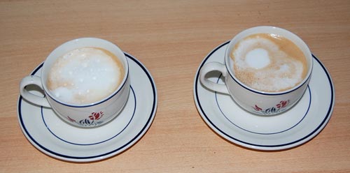
Lovely, lovely Cappuccinos… none of the artwork a barista may make in the foam, but just as pleasant to consume.
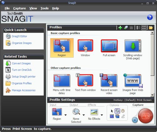
Compare this to Photoshop: powerful and feature rich, but its UI is simple, with minimalist icons in monochrome…
 I found this so distracting that I went and downloaded another shareware product, FastStone Capture (Ver. 6). Check the utterly simple UI to the right:
Note that 99% of the time, these few icons (including “Scrolling window”) cover all you need; the rest is accessible but unobtrusive in a drop down menu at the right, where it can’t distract you. Click a button on this tiny floating toolbar and the capture begins. The same icons exist in the Snagit window, but actually, once you click one there you then need to click the big red round button – which may make you feel powerful, but is a redundant action. Of course it’s a single extra click, but it’s also double the number of clicks required in FastStone.
Interestingly, the development team at Snagit have a blog where they share their thoughts (commendable!) and there I read that “… we felt that the interface shouldn’t be competing for attention, but should fade away and allow people to focus on their content”. Sorry… good thought, but I can’t endorse the execution on it. Nothing about the baroque UI they built brings the word “Fade” to mind. Just compare it to the tiny toolbar of the FastStone tool.
Simpler is better, nowhere more so than in tools you use daily.
We all know the raised reflector buttons on the lane divider lines of a freeway. They have white or yellow retroreflectors embedded in their edges, so that at night they shine right back at you in the light of your car’s headlamps. Safety and beauty in the same simple device.
But what many may not realize is that they have another design feature, also safety related, and far more ingenious. At least in some freeways – California’s, for sure – the buttons’ other edge – the one facing away from oncoming traffic – has red reflectors in it. Why put reflectors on the side you never shine a light on, the side you can’t even see?
Precisely because of the one circumstance when one would be seeing it: when they drive on the freeway in the wrong direction, having entered via the off ramp instead of the on ramp by some colossal mistake – think DUI, for instance. Now you have a drunken driver going in the wrong direction at night; traffic is sparse, but any moment disaster may strike unless this fool notices his mistake. And now those reflectors return the investment – for this driver will see long lines of red lights shining ahead to infinity; so unusual as to immediately alert him that something is wrong.
And if, like me, you never did that, you can still see the effect if you drive facing straight into the sun when it is low in the sky; you can then see the red reflectors, shining back the in the sunlight, in your rear view mirror!
 Amazingly, it only took 2 years from the first large electronic computer, the one-of-a-kind ENIAC, to the appearance of modular, easy-to-maintain hardware that would lend itself to easy mass production. This was the IBM 604 with its now forgotten Pluggable Units.
Check Piercing the unknown, a new historical exhibit at the Possibly Interesting web site!
Sometimes one runs into elegant design in humble places…
I was sitting in a meeting and fiddling idly with the remote control of the NEC LCD projector. After toying with the laser for a while, I pushed out the battery cover on the back. As expected, it unlatched and slid open, like these things always do. But there was a twist…
 The cover slid off, but stayed connected to the unit by a thin rubber ribbon. We’ve seen so many R/C units missing their cover – well, not this one! The only extra part required was the rubber ribbon, which clips into a slot on the R/C itself. Simple, elegant, professionally designed. Good job!You can see in the photos how this works:


Sometimes you find elegant design in the places you least expect it.
We stayed in the Dan Carmel in Haifa, and the small supplies in the bathroom came in color-coordinated little boxes: shower cap, cotton pads, the usual stuff. Still, they failed to go all the way: they had tall bottles for the shampoo and a round box for the shoeshine sponge:

Which reminded me of a much better attempt at such standardized packaging that I saw in the Hotel Silken in Zaragoza, Spain:

They had ALL the supplies fit in square packages, made of either cardboard  or plastic, and these all fit like a puzzle into a rectangular cardboard tray. Even the shampoo bottles were square and fit the scheme perfectly. It was a delightful design, injecting elegance into this utterly mundane collection of supplies, so I share it here.
These guys had such a thing going for the rectangular form factor, that even the sunny-side-up eggs they served for breakfast were square!
They say that form follows function. So – take a look at the form of this strange device, which stands about a meter tall. Can you guess its function?

No, it isn’t a trashcan with dreadlocks.
I saw this thing in the Biosphere at Potsdam. This pleasant museum is smaller and less ambitious (should I say, less pretentious?) than the one in Arizona, and serves very well to exhibit different ecosystems to the visiting public.
The item you see here is a display device for displaying smells. You sniff the end of a tube to get a whiff of the plant shown on the round image below it.
Did you guess?…
Here is an absolutely trivial product feature that turns out to be very nice. This is the latch release for the more recent
I’ve been through more models of Thinkpad than I remember, and until the T4x series they all had two latch releases on the front edge of the lid. Then came the T40, and it only had one, on the right, which actuates both latches through an inner linkage. When I first saw this I was disdainful: who cares, after all? But when I started to use a T41, I realized how useful this feature is. These days we mobile users run around the workplace from meeting to meeting with our notebook; and until someone comes out with the secondary displays we’ve seen on futuristic promotional videos (but never in reality), we often have to open the notebook to check details of our coming meeting while walking towards an elevator… and with the single-latch arrangement, you can hold the machine in your left hand while opening its screen with the right.
Like I said, a trivial detail, but it really is useful. A nice piece of design from
Copyright © 2025 Commonsense Design
Theme by Anders Noren — Up ↑