Category: Good design

Instances of good design

The considerate envelope

I was interviewed recently by the Columbia Journalism Review for an issue they were putting together about Information Overload, and as promised was then mailed the hardcopy magazine in a manila envelope.

I was heartened to see the stamp in the photo on the envelope.
Stamp on envelope from CJR

Obviously this did not apply in my case – The entire issue was of interest to me, so the page number was not filled in – but I love the idea. Telling the recipient where to look in something mailed to them is a key concept of good email etiquette that I’ve been teaching for years: if you send someone a presentation with 70 slides (which, alas, many do in the corporate world) at least add in the email body “Check slides 45-47, they contain info related to your project”. The CJR uses hardcopy, but they evidently apply the same concept there. Good thinking!

Semantinet’s headup

Well, many friends asked to stay current on my adventures outside the cubicle farms, and though it’s early days, here is one thing I’ve been up to: I spend one day each week working with a start-up called Semantinet.

It is an attribute of start-ups that they both empower and expect every person in their small team to contribute directly to the main thing, which is the application of innovative technology to create magic. You work hard, but you can really make a difference, as explained by Paul Graham in his insightful book Hackers and Painters. I like it a lot.

Semantinet headup logoSo, what magic do we make there? Semantinet, as the name hints, applies leading edge semantic search technology to enable a whole new manner of experiencing the web. Its product, headup, is a Firefox add-on that identifies on pages you browse names of entities like people, places, events, books, musical artists, videos, and more; and it shows you on demand a small window with additional information on any of these.

The additional information can be general – like financial data for a company, or albums and tracks for a band. But things get interesting once you personalize headup by pointing it at your accounts in social sites like Facebook, FriendFeed, or Last.fm. Then, headup starts surprising you with information like “your friends that work at this company”, or “upcoming concerts by a band you like in this city”, or “books that both you and this person like”, or “mutual friends you both know”. I call it a “Serendipity Engine”: you never know what it will discover. How does it know? By correlating information that you and others had published in any of numerous social sites. And because Semantinet is a start-up and works at the pace that this enables, new capabilities are added to the product literally every day.

If you use Firefox, give it a try – the application just went out of stealth mode and into public beta last week so you can download it at headup.com. And do share with me any comments and critique – at this early stage you, too, can make a real difference in the evolution of this magical product!

Holes, Honesty and Hand cream

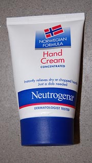
Neutrogena Norwegian Formula hand cream“Truth in advertising” sometimes seems an oxymoron, and the cosmetics industry is hardly where you’d expect to find much of it. So hats off to Neutrogena’s Norwegian Formula hand cream, whose statement on the tube that it “instantly relieves dry or chapped hands – just a dab needed” is absolutely correct. They claim it was devised from the experience of Nordic fishermen with the effect of fish oils; be that as it may, I can attest that this formula really can handle chapped skin that would laugh at your usual hand lotion.

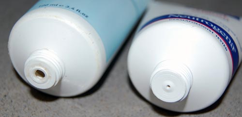
But more to the point, just a dab is really all it takes, and here the manufacturer did something really amazing: it designed the tube to ensure you don’t use more than that dab. Look at the photo below, which compares the tube of this fishy formula with another cream. The hole the cream comes through is barely a pinprick. Obviously, this spares the consumer’s money – at the expense of the vendor’s profit. Wow!

Neutrogena Norwegian Formula and another brand

Which reminds me of the story of the guy who came to a toothpaste company and proposed they give him a megabuck if they like his idea for increasing profits: he then told them to enlarge the hole at the end of the tube, since consumers measure out paste by length, not volume. The guy got his money (though I can find no confirmation that this ever happened – can you?) because the toothpaste manufacturer was not as honest as the makers of the Norwegian hand cream discussed here…

Quality, pure and simple

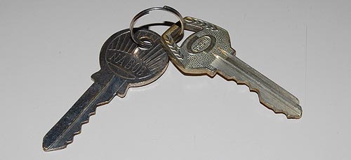
Quality is an elusive attribute, but you usually know it when you see it. For my part, I keep around a small memento that captures it very well, and comes from my years – long ago – as a forensic scientist. My main job at the time was around electron microscopy of invisible evidence, but there was also, at the other end of the complexity spectrum, a lot of straightforward examination of picked and mangled locks. I and my coworkers had ample opportunity to study the locksmith’s domain, and it was then that I put on one ring two simple cylinder lock keys from long forgotten origins that I felt capture the gap between high and low quality. Here they are: one made by Corbin and one by Nabob. Can you tell which is the better quality one?

Two cylinder lock keys

The better one is the Corbin key at the right. The feel for its quality is more obvious when you actually hold it, but the photo may suffice. And it goes more than skin deep, though the design of its bow (the “handle”) is certainly more thoughtful and elegant. Here are all the other ways in which the key at right is better than the one to its left:

  • Thickness. The Corbin key is thicker, hence more durable. In fact, the Nabob key already shows some bending along its blade, though it’s hard to see in the photo; were it in use, it would eventually break.
  • Profile. The Nabob has a flat blade, meaning its lock would admit any flat object to serve as a lock pick. The Corbin has a deeply convoluted cross-section that would make picking far more difficult (though still easy for a professional – these are both simple, low security keys).
  • Number of pins. The Corbin’s lock has six pins; the Nabob has five (reflected in the depressions on the blade). More teeth, more combinations, longer time to pick. (You can see this in my lovely cross-section of a lock, pictured here).
  • Quality of the combination. The teeth in the Nabob are almost the same height, making it far easier to pick with a straight pick. The Corwin has great height variations.

So many differences in such a trivial everyday object… do you wonder why I keep this pair as a representation of quality?

Butter and common sense

These days food products come with lots of information, as mandated by our well meaning consumer protection laws. Information, however, does not always enlighten us.

I was looking to try a butter spread that doesn’t harden into a brick in the fridge. There are many such products on the supermarket shelves, each proclaiming its virtues – “Naturally soft!”, “Easy to spread!”, and so forth. What they fail to explain is what about the product makes it resistant to hardening. Is it a mechanical texture? A chemical additive? A food chemist would probably figure it out from the ingredient list, but not us regular mortals.

Lurpak spreadable butterSo I want to give kudos to Arla foods, the Danish maker of Lurpak butter. Their spreadable product bears the following inscription: “Made with specially selected butter, blended with just enough natural rape seed oil to make it easy to spread directly from the fridge“.

This may be less quantitative than the usual ingredient list, but it makes a great deal more sense: you can immediately grasp what was done to the butter, to what extent (what a clear image, “Just enough”!), and that no “unnatural” acts were involved.

And indeed, it does spread well directly from the fridge.

Multi-device remote controls

Used to be, a TV set had a remote control (used to be, farther back, it didn’t; but that’s prehistory). These days, however, everything has a remote control; indeed, I can’t wait for someone to create a tiny remote control for the larger remote control itself! 🙂
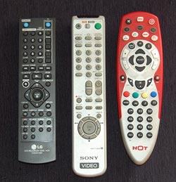
Three Remote Control unitsThe proliferation of these gadgets has created a real problem, and home electronics makers are responding by creating R/C units that can control more than one item; most typically, a TV set and the DVD, PVR or VCR feeding it.

Which is all very well, but how do you make one control work on many devices without confusing the user? There are different ways, and they vary in their usability a great deal. Let me illustrate with three units from my home: the remotes for (left to right) our LG recording DVD, our old Sony VCR, and the HOT cable company’s PVR. The first two can also control our Sony TV; the red one controls the cable box, the TV and a DVD or VCR. And each goes about the choice of function in a different manner, seen in the close-up photo.

Remote Control close ups

The R/C on the left simply has a section at the right dedicated to controlling the TV, with its own On/Off switch and channel and volume controls. This results in some redundancy with the controls of the DVD (which also has power and channel controls) but it completely eliminates any possibility of confusion.

The VCR controller in the middle incorporates a disappearing species – a mechanical slide switch at the top that determines what device is being controlled. The buttons on this unit change their role depending on the position of the switch, and have color coded dots to indicate whether they apply to the TV. Having to slide the switch is a bit more of a hassle than with the black R/C but at least you get definite visual feedback of which position you’re in.

The red unit works like this: you have to press the button (in the second row) corresponding to the device you wish to control; then, until you press another of these buttons, the unit controls that device. This is for sure the cheapest to produce; it’s all in the electronics. The price you pay is that there is no visual feedback at all; if you forget what you pressed, you will find yourself changing channel or cycling the power on the wrong equipment. There is also no labeling of which buttons work with which device.

All of these units do their job, but to my mind their user friendliness goes down from left to right. Not surprisingly, so does the cost to produce them…
The ideal fly repellent solution

There are many solutions that claim to repel flying insects; some even work.

For instance, there are chemicals – stuff you put on your skin, stuff you burn like incense – at least this makes sense: we can see how some smelly material may offend the insect’s finer sensibilities. Then there are hi-tech solutions, like the electronic gadgets that supposedly emit a hypersonic sound that mosquitoes can’t stand. We once tried this out – my son sneaked up on a mosquito standing on a wall and turned the gizmo on right next to the critter’s ear (or whatever they have). The insect didn’t even deign to move an antenna; maybe it was deaf (or maybe we were sold the electronic equivalent of snake oil).

Water bag used to repel fliesBut the most amazing device is one I snapped in a restaurant today: a nylon bag filled with water, hanging from the rafters (I’ve also seen them hanging from tree branches occasionally). And this traditional system is in use not only in Israel – as I discovered in Google, the same method is used in the US, Mexico and elsewhere: so it’s really globally known.

I asked the waiter why a water bag will drive flies away, and he said with great certainty that the fly sees its own enlarged reflection in the water and it scares it away. I heard this explanation before; presumably the fly thinks it just met a bigger, meaner fly, and decides that retreat would be prudent.

I have no idea whether anyone confirmed this theory (any input on this is welcome), but whether the explanation is correct or not, you have to admit this is one solution that is perfectly acceptable from all angles: environmentally friendly, harmless to humans, humane even to the flies, and as cheap as it gets.

CardScan continues to amaze!

A few months ago I wrote about the surprisingly good customer service I received when my CardScan business card scanner died. Well, this was no accident, it seems.

The other day I installed the CardScan software on another computer and I noticed on the welcome dialog during installation the following fine print:

CardScan welcome dialog

I was impressed. I install many software products, and most never go beyond offering a customer service pointer in case of trouble. Mr. Weyman’s invitation is much more positive and proactive, and I may take him up on it one day…

And on the same dialog they also say that you can return the product in the first 30 days for a no-questions-asked refund. These guys really understand customer orientation!

Amazon fighting infuriating packaging!

Ordered some books today and was surprised to find on the Amazon.com home page a message from Jeff Bezos telling of their new initiative to alleviate “Wrap Rage” – “Amazon Frustration-free packaging“. Apparently they plan to recruit leading manufacturers to put an end to clamshell blister packs, steel-wire ties and excessive cushioning materials.

Amazon Frustration Free Packaging compared to regular packaging

They aren’t necessarily resorting to Julie Andrews’s “Brown paper packages tied up with strings”, but they will push for smaller, easy-to-open, recyclable cardboard boxes designed to minimize both waste and customer fury. What’s more, these plain boxes are designed to ship as they are, without need for an additional shipping carton. More details here.

What can I say? Good idea! I wish more vendors did that sort of thing.

Copyright © 2025 Commonsense Design

Theme by Anders NorenUp ↑