Category: Good design

Instances of good design

The moat in Ben Gurion airport

There is no place quite like Israel, and this is reflected in many design decisions made in this country. For instance, consider the Arrivals Hall at Tel Aviv’s Ben Gurion International Airport, which is designed around our family-centric cultural attitude.

While in many airports arriving passengers just go out into the street to pick a taxi, in Israel they go out into a huge arrivals hall. You see, it isn’t exactly about arrivals… it’s about reunion. Its Hebrew name translates as “Welcomers hall”, which reflects the fact that Israelis just love to welcome their friends and relatives when they come from overseas. Entire families show up to pick up their returning kin, and they can’t wait to hug and kiss them! Hence the huge waiting hall. This setup poses a unique design problem: how to allow the arriving passengers, as they file out of the door from Customs with their luggage carts, to come into the hall without this door being jammed with hugging, kissing family groups?

In the beginning, in the old Terminal 1, the police kept the crowd away with a plain crowd control fence; which of course only made my countrymen laugh. Would they let a flimsy fence keep them from embracing auntie a few seconds earlier? The younger kids would simply squeeze through or jump over the barrier. So when they built a proper arrivals hall they replaced the fence with a real moat, a long pool with water fountains in the middle. Moats have effectively kept attackers at bay here since the days of the crusaders, so this actually worked. And when they built the new Terminal 3, they kept the idea, now as a triangular glass fence with water flowing down its edges (a good idea, since kids can’t fall into the moat in this arrangement). You can see one of many sections of this barrier in the photo.

The water barrier at the Ben Gurion International Airport arrivals hall

So now the families wait behind the water, and strain their eyes to see who will be first to spot auntie as she comes out that door at the far end of the enclosed area… and to help them in this, the airport has placed a large screen above the door that shows live video of the people approaching the door on its other, hidden side.

What a family-friendly airport! 🙂

All staplers are not created equal!

Continuing the theme of using the right tool for the job, here’s my take on a tool that is everywhere: the trusty old stapler.

Most everyone uses the usual kind if stapler, either the small size 10 or the regular standard office model. The problem is, neither of these is any good for more than a few pages. Yet they are readily available and people use them, accepting the frequent frustration of misaligned, crooked or ineffective fastening for thicker jobs.

My recommendation: go and buy the two following units, which do a far better job on midsized print jobs. The first is a plier-stapler, a replacement for the standard office model. It uses the same staples, but its grip is far better, its alignment is perfect, and applying the required pressure for a perfect fastening is natural and effortless. No office or home should be without one of these.

Plier Stapler

The second may not be needed in every home, but if you create serious documents you should get one: a heavy duty stapler, one designed to grab – in the case of the one in the photo – 75 pages of paper with ease. Be sure to try before you buy, though – I’ve seen many poorly designed models that were almost useless. But a good make – I’m very happy with my Max model HD-3D, for one – will slice through those fat printouts and photocopy stacks like butter. That’s what you need!

Heavy duty stapler model Max HD-3D

Good fitness advice

Saw the panels below by an elevator. The left one is the familiar elevator control; the one on the right, however, uses fake buttons and reads: “Before you press, think of your health – use the stairs!

Good advice, nicely implemented…

Use The Stairs!

Neat! A shopping cart with a magnifier!

We were in a large drugstore in Germany, when I noticed that all the shopping carts had a large magnifier lens attached to them, like this:

Magnifier on a Shopping Cart

Magnifier on a Shopping CartThe magnifiers were fitted in a sturdy and elegant holder, designed to allow the carts to be stacked in a row as usual.
This was a new one for me… and it took me a moment to figure out the reason: these guys wanted their clients – even the elderly with their imperfect vision – to be able to read the fine print on the medicine packages.

I admit I was impressed that they care!

A wave of the hand

We all know the paper towel dispensers that you crank to get the required length out. The more sophisticated ones dispense with the crank action and use an electric motor actuated by a proximity detector: wave your hand in the air in front of the machine and out comes the preset length of paper with a satisfying whirring sound. Hygienic, neat, and foolproof.

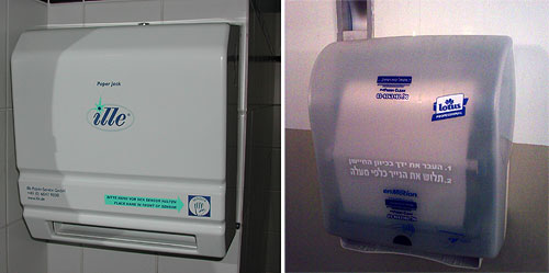
Two paper towel dispensers

But even with this foolproof concept there are different designs. The device at the left in the photo tells you to wave your hand to the right of the paper outlet slot. The one at the right has the sensor centered above the slot’s middle. Why does this matter? because the average person will reach out for where the paper is expected; with the second unit this will trigger the sensor, whereas with the first, it will not. Then you have to start groping and try to figure it out, and maybe notice the frantic effort the vendor made to guide you: the picture of a hand titled “sensor”, the big blue arrow pointing to it, and the text captions that try to make it all clear.

Towel Dispenser markup

All nice and good, but a towel dispenser is not a literary work, and should not rely on texts and explanations. Had they put the sensor in the middle all this would’ve been unnecessary…

A neat switched mains plug

Many small appliances can benefit from an off-device mains switch, and these are often put on the power cable, or – more rarely – on the wall outlet. But in a trip to Germany I witnessed a nice twist on this theme: putting the switch right on the 220V mains plug at the end of the cable. This was done without in any way increasing the size of the standard plug; and of course it means you could retrofit such switches to any device by replacing a plug, a simpler operation than replacing a wall outlet or messing with the cable in between the device and the plug. Nice product!

Switched 220V mains plug

Headup wordpress plugin – add semantic browsing to your blog!

I’ve mentioned the headup publisher widget before. This nifty add-in identifies entities (places, people, companies, books, etc) mentioned in a site it’s installed on, marks them up with a dotted underline, and when you mouse over them a small pop-up comes up with information, news, photos and videos about that place/person/whatever.

That was then. Now Semantinet, the start-up in Herzliya where I work one day each week, has packaged the capability as a WordPress plugin, which means that a blogger can add the capability to any WordPress blog in a mere minute or two. If you have a WordPress blog, you can download the plugin here.

What’s more, the product had evolved, and it now includes a tab called “friends” in addition to the ones for photos, videos, and the rest. This tab – once you connect it to your Facebook account – shows you how the entity being viewed is connected to the people you know, like which of your friends live in the place or work at the company.

Pretty powerful capability – and easier than ever to include. Which is what I just did – mouse over the marked up words anywhere on this blog and see it in action!

Japan 2: Optimized asymmetric staircases

More from Amir’s visit to Japan:

This staircase gives access to the trains at a Tokyo underground station. Given rush hour crowd density, its designers did well to split it in two, to separate the up and down streams of commuters.

Asymmetric Staircase at Ginza underground station, Tokyo

But note how the two sides are of different width. Someone characterized the traffic and found that at peak times more people will be going up than down. Other staircases might have the reverse arrangement, each optimized to its location and usage. These designers took a scarce resource, in this case stairwell width, and allocated it in a totally optimized manner; a very Japanese (and very intelligent) design approach.

Japan 1: Tactile sidewalk strips for the blind

Amir is back from Japan, and sent in some interesting photos attesting to that country’s outstanding and different ways of solving life’s daily problems.

Tactile Sidewalk Strip in Shibuya, Tokyo

For starters, here is yellow path marked out on a Tokyo sidewalk, whose surface is textured with the little rubber bumps that are so annoying at some airport terminals. Turns out these strips are quite common in major cities in Japan.

This is not a way to mark the road to the Wizard of Oz; it has a very practical and worthwhile function: it allows blind or low-vision individuals to find their way safely. The bumps have different patterns where the trail changes direction – they are linear on the straight and round at intersections, allowing the users to sense through their feet where they should pay attention.

In addition, the strips continue in public buildings like railway stations, where they mark the way to the ticket office and other key locations. There are also plaques with Braille directions in strategic locations along the paths. The photo below is from the train station at Kurashiki.

Tactile Strip in railroad station in Kurashiki, Japan

That is one simple, ingenious and commendable practice that other nations ought to emulate!

Smart timing of the windshield wipers

Windshield Washer symbolA piece of thoughtful design on the Renault Clio:

When you activate the windshield washer, the fluid is squirted onto the glass and the wipers are activated for four consecutive cycles. This is pretty much standard these days. But in the Clio, they then rest for three seconds, and give the windshield another single wipe.

The added wipe gets rid of the annoying trickle of fluid that often forms at the top center of the windshield after the first wash/wipe action. It’s not hard for the driver to reactivate the wipers, but the Renault designers took care of it for us. Good thinking!

Copyright © 2024 Commonsense Design

Theme by Anders NorenUp ↑