Category: Good design

Instances of good design

Your mother should know!


A friend pointed me at this image, which seems to have gone viral online:

Laundry Tag

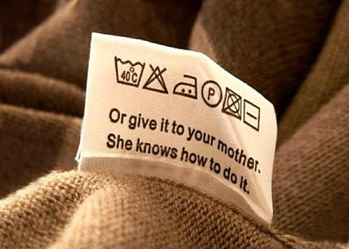
Now, this is pretty hilarious as a joke, but there are some serious comments it brings to mind.

First, the “normal” laundry instructions use icons instead of words, but unless you’re a laundry expert these convey no universally obvious meaning (the leftmost one in this image excepted, but that one uses text). This reinforces an earlier post on this blog: pictographic instructions are not always a good idea!

More important: the reference to mother’s knowledge is something no manufacturer would ever use in an instruction sheet, but it makes a whole lot of sense: sometimes the best way to access knowledge is by relying on others. Depending on the subject, you can learn a great deal from your mother (or father), from your coworkers, from your boss, from your friends… a process that throughout most of human history was the preferred method. Mother would teach daughter how to care for a baby (or, yes, do the laundry), father would teach son how to sow, or fish, or hunt, tribe elders would pass on the group’s history and lore… as the Beatles said: “Though she was born a long, long time ago – your mother should know!”

And even today, much knowledge is moved around this way. And many young people do ask their parents  for advice; the parents  in turn benefit from their kids’ expertise in other areas. No one, incidentally, reads the manufacturer manuals!  These  would get much better results if instead of the reams of multilingual safety appendices that everyone ignores they’d simply say “as to how to use this device safely – you really want to ask your Dad!”…

Android vs. Palm: the lost art of keeping it simple

Back then we had the Palm Pilot. It had a gray lo-res screen and minimal capabilities. No wireless, no GPS, no games, just basic PDA funcfions. Compared to the android phone I use now it was like a stone ax. And yet, that old Palm had a key attribute that is long lost: simplicity of use.

Palm PilotA prime example: the “EDIT” button. Take the common task of modifying a memo or appointment. In Android, you have to open the item, and then hit EDIT to enter a mode where you can make your changes. And when you’re done you hit SAVE. Makes sense? Not really. In PalmOS you opened the item and just started typing. Edit mode and View mode were one and the same. Just like a sheet of paper: you can read it and you can write on it as you wish.

It may look like simple matter, but all those extra clicks do add up and clutter the user experience; what’s more, they detract from elegance – that intangible element which calls for keeping it simple!

Indoor chair, outdoor chair

I was in the campus of the Academic College of Tel Aviv and l noticed a little courtyard with a nice deck and some garden furniture. What caught my eye was that the chairs were tilted against the tables.

DeckChairs1.jpg

The reason became obvious when I saw one chair that had remained upright: it had a puddle of rainwater in its elegantly concave seat.

DeckChairs2.jpg

At first I was annoyed by what seemed an obvious design flaw: surely a small hole drilled in the middle of the seat would have solved this issue – what a stupid way to design an outdoors chair! Then I realized that these were no outdoors products. They were regular chairs that someone had probably repurposed for garden use in sunnier times, proving that one should be more careful with ignoring a product’s spec.

And then I noted a little round mark on the bottom of each seat, in just the location I would’ve drilled that missing hole in. Evidently, the manufacturer had foreseen the dual use of this plastic chair, and had prepared to provide for both uses. Still, the end user had used the wrong version – and had neglected to correct the problem, which a minute with a drill would have easily done.

Wayda go, Logan airport!

We veteran road warriors know the drill: go thru security, then hunt for a power outlet to recharge our computer at as we wait for our flight. This often involves scouting the terminal halls hoping to find the occasional wall socket intended for the janitor’s vacuum cleaner, hoping there would be a vacant chair near it. Of course, these are scarce, and as likely as not to be taken by a fellow traveler.

Power strip at Logan Airport

But on my recent trip to Boston I saw a much different approach to our problem. At Logan International airport, there are rows of seats at each gate with power outlets built right into them – lots of outlets, enough for all of us business travelers – and for those serene kids with iPods and ear buds…

Power strip at Logan Airport

Note the variety of sockets – 110VAC, 5VDC via USB… These guys have thought of everything! Add the hassle-free WiFi they have, and you have the most notebook-friendly airport terminal I’ve ever seen.

Wayda go, Logan!

Cool innovation in a parking garage

I was trying to find a parking spot in the parking garage under the Ramat Aviv shopping mall in Tel Aviv; this is a difficult task much of the time. But it was made very much easier because I discovered they have a truly wonderful system.

Ramat Aviv mall parking space

What you see here is that over each space they have a rod coming out from the ceiling with a lamp at its tip. A red light means the space is occupied; vacant spaces have a green light. So, as you drive around the claustrophobic maze you can see from far away where there is a free spot (and rush to get to it first!).  Simple and ingenious!

As you see in the photo above, all spaces in sight are taken… so did I find a spot? indeed I have… as you can see in the next photo (at mid-left), the occasional green light does materialize!

Ramat Aviv mall parking space

A thorny design problem

And now, a tip of the hat to a nifty solution to the oldest design problem of them all: how do you spread your genes?

I was taking a shortcut through an overgrown field and ended up with a load of seeds stuck to my socks and shoelaces. When I sat down to pluck them out, I found there were two models: the smaller (some 5 mm long) “fuzzy” seeds (right in the photo) actually had many tiny thorns that did the job; but the larger seeds (up to 9 mm in length) were really impressive, each sporting long, needle-sharp spines all over. I wish I had a good stereo microscope to give you better detail, but you can get the idea from the photos below.

Thorny Seeds

So what? So nothing, I guess, except that being an engineer I had to stop and admire the effectiveness of these designs.

And here is another look:

Thorny Seeds

Makes you feel kinda special, to think that these plants would go to all this trouble to evolve seeds that stick like leeches to your socks! 🙂

A friendly sign

We all know the usual “Private Parking” no-parking signs: stark red and white, with wording in fat letters forming threats of the sorry fate – towing, usually – awaiting violators. They’re designed to jar and scare the thoughtless driver. Nothing pretty about these signs, and usually that’s exactly the intent of their owners.

Friendly No Parking SignBut  here you see a sign I saw in Jerusalem on the wall of a house, next to its private parking area. It too says “Private parking – unauthorized vehicles will be towed”. But it does it in a much more friendly way… because of the little rose engraved between the lines. No idea who had this strange idea. Perhaps the owner likes flowers, as attested to by the bed of geraniums right under the sign? I can’t recall ever seeing  a sign forbidding anything that left me in a cheerful mood, but this one  certainly did.

Friendly No Parking Sign close up

Design hidden in a Hanukkah lamp

Here is a brass Hanukkiah, a 9-candle Hanukkah lamp, that we got in the seventies. It was made by Maskit, the pioneering maker of folklore-inspired clothing and art items in Israel’s early years.

Hanukkiah by Maskit

It can accept candles or oil, and is as lovely as it is functional. However, what gets it a place in my design blog is the seemingly abstract pattern on its back plane. We’ve had it in our living room for some years before it suddenly hit me that this was not just an abstract shape. Do you see what it is?

What gave it away, for me, was the butts of the two lions, sticking up in the air. Suddenly I realized that I was seeing a traditional decorative pattern familiar in Judaica art, especially on Hanukkah lamps and on decorations on the Torah Ark in a synagogue: the two lions guarding the tablets of the law. You can see them in the two examples below:

19th century Hanukkiah

Image source

Lions decoration

Image source

The overlay below will help you see it, and then it’s obvious; but what I really admire in this piece is how the artist managed to capture so exquisitely well, in just a few lines, the anatomy of the two lions. Good job!

Maskit Hanukkiah and Lions pattern

An ingenious feedback loop

The 65 km trip from Jerusalem to Tel Aviv used to take two days on a donkey from biblical days to the 20th century. Then it went down to 3 hours by car in the fifties, then 2 hours, and finally below 60 minutes on the Highway 1 six-lane freeway. Then people bought more cars, and we’re back to 2 hours in the rush hour…

Enter the Fast Lane, which opened last week. This is an added lane on the last 13 km before Tel Aviv. It is open for free to car pools and public transport, and has a Park-and-Ride facility to boot. And all this is funded by tolls collected from the rest of us if we choose to use it.

But what happens in the rush hour, when everyone might want to use the new lane, bringing it to a standstill?

This is where the ingenuity shows. The toll is variable: it is posted on a large electronic sign ahead of the on ramp. When demand is low, it’s a reasonable 7 Shekels (about $2).  When the lane fills up, it grows gradually up to a whopping 75 Shekels – more than enough to deter most drivers. The parameter defining the price is the speed of traffic flow in the fast lane itself, which is measured automatically at  any moment; by using this to set the cost, a minimum speed of 70 kph is guaranteed by the company running the lane.

Here is the sign – in addition to a 7 Shekel price, it informs that traffic ahead  is flowing (hence the low toll).

Fast Lane Toll Sign on Tel Aviv highway

To an engineer, this is an obvious application of negative feedback to control a system; but it is rare to see such an elegant application of this concept where something as unpredictable as traffic congestion is controlled by a feedback loop incorporating automatic sensors and the trade-off between the factors of human impatience and human parsimony…

Apple world domination 2: Cool packaging!

I was in an appliance store and noticed a stack of boxes containing Kenwood mixers. All other appliances were in ugly white or brown cardboard boxes with some text printed on them; but these mixers were housed in sleek boxes like this:

Kenwood mixer packaging

This immediately rang a bell: I’ve seen this sort of super-trendy, designer-look packaging before. Of course I have: Apple Computer has been selling their cool products in them for some time! Looks like Apple’s influence on product design, which I’ve remarked on before, is extending to the packaging world too; and if you have any doubt, look at the name of the mixer near the top of the box. Used to be that mixers were called names like Kitchen Chef or Model M-2398A; but this one is called a kMix, no less! Small wonder that the box has the hallmarks of the packaging of an iPod, or an iPhone, as seen below!

Apple Packaging

Photo courtesy astroot, shared on flickr under CC license.

Copyright © 2025 Commonsense Design

Theme by Anders NorenUp ↑