Category: Good design

Instances of good design

Simplicity before Greed

Most cafeterias sell water to their thirsty customers in plastic bottles full of mineral water. The water is no better than the tap water in most countries, its environmental impact is dubious, and of course it turns a tidy profit for the business. As a customer I find it annoying to pay for one of the most common molecules on my planet, but hey, there are bigger problems and like all of you I pull out my wallet and forget about it.

So you can understand my delight when, while visiting the Science Museum in London, I saw this in their cafeteria:

Water pitchers at the Science Museum, London


Self-serve, free and simple… what a delightful practice!

And then there is the wonderful museum itself…  🙂

Tactile sidewalk strips – now in Jerusalem!

I’ve written before about the use of tactile sidewalk strips to help the blind, as seen in Japan. Well, now we have them in Israel too! I was walking under the Calatrava bridge in Jerusalem, and saw this:

Tactile strip for the blind

Tactile strip for the blind
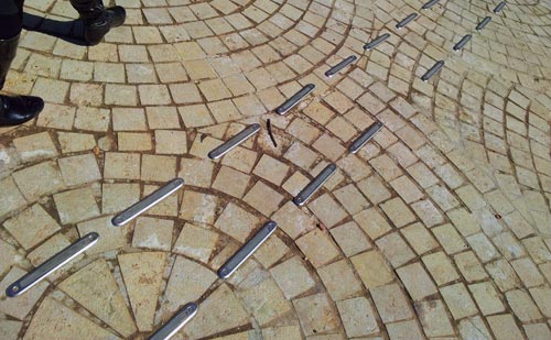
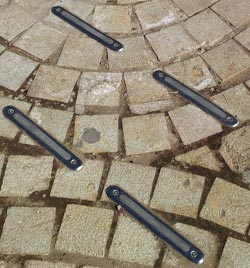
At first I was puzzled, but then I noticed this led towards the Jewish institute for the blind that is located nearby. So, these are raised strips forming a path – in fact, there were a number of paths going in different directions – that the blind can feel with their sticks or even their feet.

Well done!

A building that looks the part

Here is the Physics and Mathematics faculty building in Bashkir State University, in the city of Ufa, capital of the Republic of Bashkortostan, Russia.

See what it looks like?

The Physics and Mathematics faculty building of Bashkir State University

Depends on your age or your affection for the history of computing, I suppose.  This building looks like a logarithmic slide rule, the icon of the exact sciences before the arrival of electronic calculators in the mid-seventies.

If you have no idea what those lovely devices were, here is a pocket model. Or check my collection.

Slide rule

The big question is whether this was intentional? Fellow collector David Rance, who presented it in a collectors’ meeting in Bletchley Park in September, says it was. If so, what a perfect  design for a Physics and Math building!

You can read more in David’s article here.


Most amazing pencil case ever

This is the Ashtanur pencil case. Once you see it, you can’t help wanting one: it is simply too cool!

So I got one, and here it is.

Ashtanur pencil case

These are made by two designers, my friend Ido Mohar and Baruch Mogilevsky, in mimicry of the local flat pita bread – called Ashtanur in Jerusalem, but Laffa in Tel Aviv (Ahh… what do those Tel Avivians know?!…)  They’re made of printed fabric, but the similarity to a folded flat pita with fallafel inside is uncanny. You can get one at Etsy.

Ashtanur pencil case

A cozy home for lost baggage

Every seasoned traveler knows the drill: you go to baggage claim, everyone’s bags arrive except yours, and you start running around to try and locate it. If you’re lucky, you end up finding your suitcase standing, forlorn and confused, with a few other bags in some corner or another. How it got there nobody can tell, and you don’t ask.

Lost Baggage

Imagine my delight when I saw, in Newark airport (if memory serves!) this elegant setup. All the orphaned bags were collected in one place, safely locked but visible to all, so you could claim them with ease.

Good idea!

How to make headlamps expensive

Here are the headlamps of two Mazda cars. On the left, a Mazda 323 from the first half of the past decade, the other a Mazda 3 from the second half. Both fine family cars.

See the difference in design strategy?

Mazda Headlamps

The car on the left has the headlamp split into two parts. The one on the right uses a single assembly.

Why do I care? Because when either lamp gets broken in an accident – and for the outer, the turn signal, this can be even a minor scrape – you need only replace one small cover in the older car, and the entire large assembly in the new one. An assembly they will charge you a ridiculously high sum for.

And yes, some may find the newer design more aesthetic; but the modern highway is a battlefield, not an art museum. We’re better off with cars designed with repair cost in mind. But then, it’s easy to conjecture that that’s what they are – just not in the owner’s interests…

Humorous details in everyday design… bless them!

Form, they say, follows function… which leads to many utilitarian everyday products. But every now and then you run into a design detail that shows inspired abuse of this principle: some unknown designer decides that the product also needs to be lovely, or unconventional, or humorous.

Here’s an example I’ve come across: a drain cover in a very basic drinking fountain.

They could have made this piece the usual way, with regular slits or holes. But the designer felt this circle of funny fishes trying to eat each other will be more pleasing to the thirsty user.

It was pleasing to me – and I wish the anonymous designer with the sense of humor all the best!

One comment on the Samsung vs. Apple litigation

Now, I hate litigation, and like many would rather have companies focus on innovating for the greater good; also, I happen to like Android a lot. Nevertheless, I think many criticizers of Apple in its recent victory over Samsung are missing a key point.

The argument goes, Apple sued Samsung for producing smartphones that are rectangular and with rounded corners – how lame is that?!

iPhone

Yes, that is lame. But Apple also sued about many other alleged infringements, including the application in a handheld device of multi-touch gesture input – the now ubiquitous  “pinch to zoom, flick to scroll” kind of user interface that we all love. And that is a whole different story – one that is hardly lame…

I remember well my first encounter with an iPhone. I remember the feeling of wonder, the ecstasy of experiencing this incredible UI paradigm. It was a  revelation, a true revolution, on a par with the first appearance of the mouse-based WIMP interface (which, as an ironic aside, Apple seems to have copied from Xerox for the Lisa and Macintosh computers in the early 80s). It was pure innovation, and with it Apple enabled the very concepts of Mobility and Computing that we all benefit from today.

And that is what Samsung – and Android – had taken from Apple. The overall concept, the basic paradigm, that the iPhone embodies. And yes, I too would have preferred that Apple adopt a more open mind about sharing their technology, but that is not my choice to make.  Until they do, let no one say that they’re a bunch of spoiled, un-innovative, litigious whiners suing about the rectangle with round corners. I really think we all do owe them more respect than that!

Photo credit: William Hook under CC license on flickr.

Heterodontus Portusjacksoni

The intense pressure of natural selection has given us many magnificent examples of optimized design in nature. Here is a lovely case: the dentition of Heterodontus Portusjacksoni, the Port Jackson shark. I saw these jaws at a nature museum and just had to snap a photo…

Heterodontus Portusjacksoni shark jaws

This shark has unusual teeth – none of the flesh-ripping daggers that the “Jaws” movie brought to fame (while giving sharks a bad name that may help drive them to extinction). It feeds on mollusks, and uses the tiny spiked teeth in front to grab them and the blunt ones in the back to crush them.

But what I found most appealing is the geometrical structure of the entire set, which has a mathematical elegance and hints at a similarly elegant growth mechanism. One can imagine that the whole complexity of these teeth is generated in one continuous process governed by a very simple equation. Just like a fractal…

Math and nature and beauty, all in one chunk of bone! Heterodontus Portusjacksoni shark jaw close-up

At last, a sensible exit sign!

Those depressing multi-story parking structures are an unavoidable part of a driver’s life… and they can get quite annoying when you need to find your way out of one. Sure, there are signs. Here, for example, is one garage that takes no chances on our missing the exit, and advertises it bilingually and redundantly:

Car Park Exit Signs

The only problem is, it fails to say whose exit it is to the right: pedestrians or cars? This is a very common sort of confusion in such car parks, since cars and people exit them from quite different places.

Car Park Exit Sign
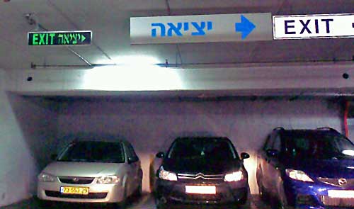
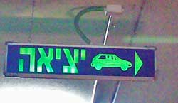
So here is the right way of doing it! The sign to the right (found on another level of the same car park, strangely enough) leaves no doubt whatsoever: cars should exit to the right. I don’t remember if they had a similarly unambiguous sign for pedestrians, though those are usually marked with a running person for safety reasons. Anyway, isn’t this simple sign design convention something that every parking structure in the world should have?

Copyright © 2025 Commonsense Design

Theme by Anders NorenUp ↑