Category: Good design

Instances of good design

Coffee-to-go elegance

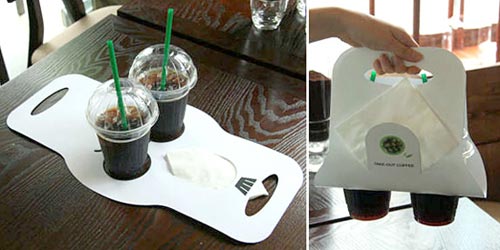
My friend Jeff pointed out to me a novel implementation of a coffee-to-go carrying device, in use in a coffeeshop chain in Germany. The assembled device in use is actually less elegant than the usual little tray-with-handle cardboard carriers we’ve had for a long time; in fact you can’t even plop this one down on a tabletop at destination; you have to unload it with care. What makes this one worthy of mention in the elegant design category is a different aspect.

Cardboard coffee carrier

I refer of course to the extreme simplicity of assembly and disassembly – just two folds in a flat piece of cardboard, and you’re good to go; and at destination, if you’re green-minded, you can “disassemble” it by just flattening it out, and store it for future re-use with minimal fuss. The slit for paper napkins is another nice touch…

Sinn-Frei, via Oh Gizmo!

Divide and Conquer!

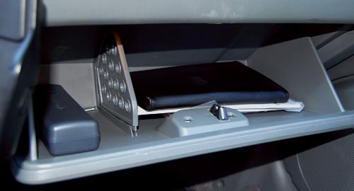
We like our cars to have large glove compartments, but when we cram stuff into them we can’t seem to find anything (a problem especially while driving). I recently drove a Chevrolet Optra, and it had an obvious solution: a divider, to split the compartment in two, like this:

Divided Glove Compartment in Chevrolet Optra

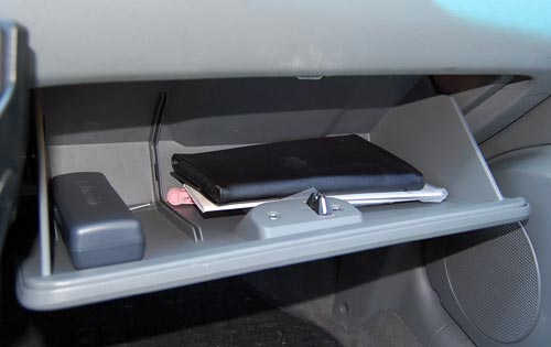
But even nicer, the divider was removable, allowing you to recover the full width at will. Of course, drawers in office furniture have been doing this sort of thing for ages, and I’ve retrofitted homemade dividers to drawers in our home many times – it extends the usefulness of storage space significantly. However, this is the first time I see it in a car. Nice touch!

Glove compartment in Chevrolet Optra, sans divider

The amazing Posographe

A riddle: what’s rectangular and flat, can fit in your pocket, and can calculate six-variable functions?

No, not a pocket calculator; I forgot to mention – it has no electronic components whatsoever.

Here, check it out in the latest addition to the HOC collection on my Possibly Interesting web site.

The Ear and the iPod: a perfect fit!

The wonders of the natural world are many, and the living body includes countless amazing features (and, admittedly, some not-so-amazing ones as well). Today I give due homage to a piece of truly elegant design: the perfect match of the outer ear to the iPod’s earphones!

iPod Earphone

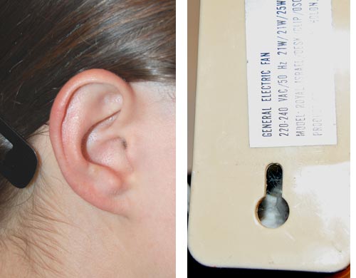
The earphones’ convenient usage stems from the presence of those details of ear anatomy that form a perfect keyhole structure to hold the earbud in place just against the opening of the ear canal. The structure echoes (after a 180 degree turn) that seen on the backs of many wall-mounted household objects, like the fan seen in the photo below.

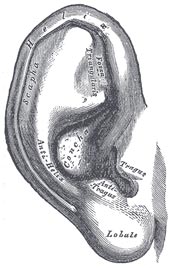
Ear and KeyholeOuter Ear Anatomy

In case you wondered, the small folds in the outer ear’s convolutions that make this possible are called the Tragus and Anti-Tragus, as seen in this detailed illustration from Gray’s Anatomy. They hold the earphone’s round body in a snug fit against the suitably sized Concha.

We humans may not have the most impressive ears (just ask a bat, or a rabbit, or an elephant) but we certainly come pre-customized to hear our favorite music on the go!

Buildings designed for Software Engineers

With the wonders of Google Maps at our service, we can get some interesting insights. Take the photo below, also viewable here. This is the older part of the Microsoft campus at Redmond, where much of the software in the computer I’m writing this on was developed.

Microsoft buildings at Redmond

Notice how the buildings all have cross shapes visible in their plans. This is not because of a religious bias in the company’s management. It is, I was told when I visited there, because Bill Gates had decided when he started the company that an effective software engineer needs the peace and quiet made possible by an office with a door. Indeed, while myriads of hi-tech engineers (yours truly included) work in cubicles in the noisy open space made famous by the Dilbert comic strip, Microsoft coders all have their own individual offices with real doors to block out the world when they need to concentrate. Of course such an office requires a window too, or it gets claustrophobic… which explains the shape of the buildings – with a need for so many windows, they had to be made with a convoluted outline, to maximize surface-to-bulk ratio.

For my part, I admire the tenacity – Microsoft moved to Redmond in 1986, and 22 years later they still resist the temptation to compress their engineers into cubes. They have a good thing, and they stick to it!

A REAL switch for the wireless radio

In the old days electronic gear had on/off switches that were actually physical devices with two positions, like the light switch on a wall. Nowadays these have become a rare sight: with everything computerized, most state switching is done by pressing pushbuttons and keys, with the switching done by the logic circuitry or microprocessor.

The disadvantage of this solution is that (a) you can’t tell the state of a switch by looking at it, and (b) the act of switching can take a while as the computer goes about its activity. Even the basic act of turning a computer off now takes long moments (in the original home computers you hit the switch and power was simply cut off).

Thinkpad T61 wireless radio switch

Here is a delightful exception to this trend: my latest Notebook, a Lenovo Thinkpad T61, has a slide switch on its outside for switching the Wireless radios on and off. Slide it to the right and the radio pops on instantly (as indicated by a green spot that becomes exposed under the slider). Slide to the left and the radio shuts down. Besides being fast and convenient, this is very useful when flying: if you believe in the inadvisability of having the Wireless on during flight, you can ensure it is off (and will stay off) before even turning the Notebook on. Absent this assertive hard switch, you’d need to turn the computer on, discover you left the radio on when you last put it into standby in the airport, and then you’d need to fumble with soft switches and dialogs to turn it off before the plane crashed. 🙂

Bialetti’s Brikka: only one extra piece!

All coffee lovers know the classic Italian “Machinetta“, or Moka pot, that 3-piece stovetop espresso maker: not a competition to the professional espresso machine of a coffee shop, but good for a fast, concentrated caffeine fix at home. These have been around since their invention in 1933 by Alfonso Bialetti, and we have a number of them at home in various sizes (hint: go for the stainless steel ones, they don’t corrode and last forever if you don’t burn the plastic handle).

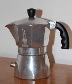
But on a trip to Italy we were served by some friends with tiny portions Bialetti Brikka coffeemakerof a much stronger, foamy brew; and upon inquiring how they could produce it at home we were shown the Brikka, the machinetta with the “sbuffo” (the dictionary says “gust of wind; puff“, but a fiery snort sounds more appropriate to convey this word’s feel).
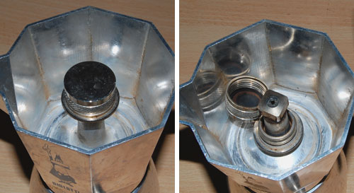
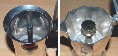
The amazing thing about the Brikka is that it is practically identical to the old Moka, except that it has one additional piece: a heavy steel cup, padded with a rubber gasket, that sits atop the tube from which, through a hole at its top, the hot coffee issues. This means that before the steam in the bottom half can push the water through the coffee powder, it has to achieve a high enough pressure to lift the steel weight; essentially the arrangement you find in a pressure cooker’s regulator valve. Once the correct pressure is reached the valve lifts and the coffee suddenly blasts through in a matter of seconds, accompanied by a loud puffing noise, much stream and bubbling foam. Sbuffo!

Brikka Sbuffo

The photos above capture the moment – mere seconds separate the two.

The Brikka, which Bialetti makes in 2-cup and 4-cup sizes (we’re talking Italian cups – about half a demitasse each), makes far stronger coffee than the Moka, and with some foam to boot. And all by adding one piece to an age-old design!

Brikka mechanism

Note the hole at the top of the tube, exposed with the weight dismantled.

Brikka compared to ordinary Moka

Brikka (right) compared to the open tube in a regular Moka style machine.

What will they think of next, you say? Don’t get me started about Bialetti’s “Mukka Express”, which seems to apply similar ideas to produce Cappuccino in one go (I’m still resisting the temptation to buy one of those).

Smart parking lot design

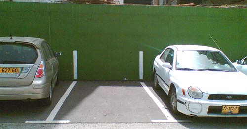
Parking lots try to cram as many cars in as they can (the ones that charge you to park do, anyway) and so it often happens that you exit the car only to find you’ve overstepped the white line. If you’re conscientious like me, you get back in, restart the motor and wiggle the car the few inches required to fit in your own space. The problem is that you can’t really see the lines in the last stages of the parking maneuver…

Parking lot spaces

So I was in Tel Aviv the other day and saw a simple fix to this problem. Look in the photo: they extended the white line up onto the wall! That way you can see the boundaries in front of you (or back, through the mirror) as you move in.

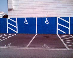
Handicapped parking spacesWhile they were at it, they also did the handicapped spaces – now no one can say (honestly or not) that they didn’t notice the faded symbol on the pavement; if you park in one of these spaces, it stares you right in the face.

Good thinking!

The Eject button: Location, location, location!

Here is our Toshiba DVD player. It works well enough, but its design does make you wonder…

I’ve already extolled its remote control’s virtues (Not). Well, here is the unit itself. You turn it on with the round button at the right; good enough. Then you look for the Eject button, to open the tray. And you look. And you look??? because it is in the wrong location.

Toshiba DVD Eject button location

The button is marked in the photo with the red arrow. The point is, that is the last place you’d look for it! It is there to open the disc tray, which is far to the left. You end up reading the button captions – and these are quite tiny and hard to discern, of course – until you find it.

To quantify the extent of this design crime, compare the DVD player with the VCR on which we have it standing. Compare the red and green arrows’ lengths. That’s the difference between Human Centric Design and… whatever it is they did on the DVD unit. See what I mean?

Eject Buttons on Toshiba DVD and on Sony VCR

Keyboard light: no more groping in the dark!

A humorous video review from CNET on the Lenovo Design Matters blog (yep, these guys have a blog where their designers interact with their users – a commendable idea!) compares the Thinkpad X300 to the MacBook Air. Nicely done – take a look.

Interestingly, the reviewer mentions one favorite feature of mine in the Keyboard Light on Lenovo Thinkpadrecent ThinkPad notebooks that many users may be barely aware of: a little white LED in the screen’s frame that illuminates the keyboard. This is useful for when you work on an airplane at night and prefer to leave the overhead reading light off (whether out of consideration for your co-travelers or for your battery life – in the dark you can work at the screen’s minimal backlight intensity).

This LED in itself is a great design idea, but I’m even more impressed by how you turn this lamp on: you depress the Fn key and the PgUp key together. Why is this impressive? Because these two keys are located diagonally at the opposite corners of the keyboard; this means you can find them – by touch – in absolute darkness, which is where you’re at if you need a light in the first place.

Incidentally, this is how I discovered this feature during one long flight – I was groping to find the Fn key combination for increasing the backlight level, hoping to have the screen itself illuminate the keyboard, and I accidentally hit the right keys. And there was light!

Activation keys for Thinkpad keyboard light

Copyright © 2025 Commonsense Design

Theme by Anders NorenUp ↑