Category: Good design

Instances of good design

Invisible writing on medicines

Here is a box containing some medicine. As the law requires, it has the lot number and expiration date clearly marked. Well, OK, not clearly… in fact, the information is barely visible at all. The law, one can guess, says nothing about the information having to be Legible.

Medication box

It’s not like making the text visible is so difficult… as the next photo proves.

Medication Box

Tools 3: How to test a tool?

Another thing worth knowing is how to test a tool before you buy it.Claw Hammer testing

Different tools have very different methods… for example, I was saved from losing a lot of money because I knew how to test a Curta mechanical calculator before buying it (basically you start with all zeros, subtract a 1, then add it back. The readout should be all nines then all zeros again. This tests much of the inside gearing in two seconds).

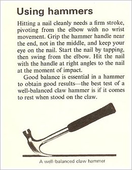
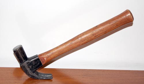
Testing a hand tool can be even simpler. When I started into DIY I had this manual that had a section on hammers, including the paragraph shown at right. I used this test to select a claw hammer, ending up with a Stanley Hercules that has served me well through countless projects, and as you can see below it passes the test well. And if you think this is not very important, I can tell you that this hammer can drive nails right into anything without slipping or bending them, as a low quality tool often would; you supply the momentum, the hammer takes care of convincing the nail it had better go straight in. A real pleasure to use!

Stanley Hercules claw hammer

King of the skyscrapers

Still in NYC, following the auspicious IORG launch, and took the opportunity to visit the Empire State Building.

I was totally unprepared for what I saw.

The Empire State Building

Of course, It’s tall, and the view from the top is incredible, but somehow I was expecting a ‘has been’. After all, this skyscraper was built some 80 years ago, in the great depression, the days when giant apes were swatting at quaint biplanes… the world is full of much taller towers today.

I couldn’t have been more wrong. The Empire State is still the tallest in Manhattan, following 9/11; and it totally dominates the Midtown skyline. But it is its superb architectural design that sets it apart. Its iconic tearraced lines thrust skyward in a perfect platonic expression of UP and STRENGTH that none of the funky new Glass and Gossamer skyscrapers can hold a candle to (speaking of strength, this tower took a direct hit by a twin engined B25 bomber in 1945 with only relatively minor damage).

This assertive presence is complemented by a magnificent attention to detail. All lobbies and corridors are faced in marble. Tasteful art deco ornaments add a twenties touch that is just right. You can make snide phallic jokes all you want, but It’s all simply beautiful, and in a way that no photo can do justice to.

Makes you proud to be an engineer!

Photo courtesy Wally Gobetz, shared on flickr under CC license.

Intelligent freeway signage

In recent years the freeway system in Israel is applying some pretty good leading edge technology (including truly transparent wireless toll collection that is still missing in many countries I visit).

One interesting system can be seen in the Ayalon highway in Tel Aviv. This road has electronic signs that give precise real time information of the driving conditions ahead, including which lanes are jammed and how fast the traffic moves (when it does). Perhaps most impressive are the signs that give a taste of the despair lying ahead, as in “Traffic jammed through La Guardia exit”… not that there’s much you can do about it, admittedly, but at least you know!…

Ayalon Highway in Tel Aviv

Photo: Wikimedia commons.

Of course, behind this capability lies a network of sensors and cameras, and an expert system that integrates them and recommends to the human operator at the road’s control center what messages to send to the signs (I thought the system was entirely automatic, but actually it does give a human final override). The information on the signs and the video from the cameras are also accessible on the Internet: the traffic flow conditions are updated every few minutes, and you can click the camera icons to see the real time video stream – and mouse over the “i” icons to see what text appears on each sign.

Tools 2: Choosing your supplier

So, if quality is critical, how do we find the best tools?

One simple method is to go for the best makers; the ones the pros swear by. In my case I did that by interrogating my machine shop teacher in university, a master craftsman with decades of experience. Basically it went like this:

Nicholson File

Me: what is the best make of hand files?
Master: why do you want to know? These are not for a hobbyist; they’d be too expensive for you anyway.
Me: Oh, I’m just curious.
Master: you aren’t going to buy them, Right?
Me: Perish the thought! I only want to know.
Master: You’re sure?
Me: Cross my heart.
Master: well, the best files are made by Nicholson; but you have to make sure it’s the Dutch Nicholson. Nicholson also has a factory in Canada, those are not quite as good.
Me: Thanks!

And then I’d rush off to buy some Dutch Nicholson files.

Nicholson Files

Those files serve me well to this day, though in all fairness, I suspect the Canadian ones would have served just as well…

Tools 1: Quality matters!

Of all the everyday objects you will own, Tools deserve a place of honor, since they are the ones you use to make otherTools objects. In fact, tools are arguably what distinguished our hominid ancestors from the animals. For my part, as a maker of things for pleasure and work, tools – the workshop kind – have been my lifelong possessions and companions, so I will blog about them for a bit.
The first point I want to share should be obvious, yet as the massive commerce in low grade tools shows it certainly isn’t: when buying a tool, always go for the best quality available. It does make a huge difference.

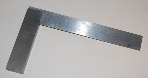
machinist's square

Take the tool in the photo: a machinist’s square for metal work. It was made by Moore and Wright of Sheffield, a maker of precision tools since 1906. Now the first time I bought a machinist square (I was in my teens), it was much prettier than this one, and had a scale of centimeters along the edge too; it only had one drawback: it had an angle just short of 90 degrees. So I took it back to the store and got another, with an aluminum stock; this one was just over 90 degrees. Eventually I went to a better store and got the Moore & Wright: no scale, just an ugly lump of iron that tends to rust – but it still measures a precise straight angle after decades.

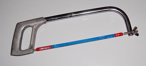
metal saw

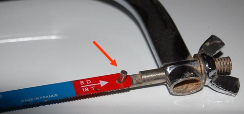
Or take the saw in this photo. I had a cheaper one, and it would use the same blades… only they would pop off the frame every so often. Only when I went and got this more expensive one, made by Eclipse, did the problem go away – and all it took was to have the little rods that go through the blade be longer! Little details like these make a big difference to tool usability and usefulness – and quality is all about the little details.

metal saw - detail

Mazda 3 evolution, take 1: Sometimes they listen!

Recently I replaced my old Mazda 3 with the new model. The two are practically identical – why mess with a good thing? it’s a fine car! – but there are some minor differences, and I’ll be blogging them now and then… they afford us a peek into the design team’s thinking processes.

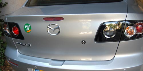
Here is the trunk door on the previous model. The problem is, it is not spring loaded; to open it you had to press the lock button and then claw it open by trying to pry up the bottom edge, which is a tight fit to the bumper below it (on most cars the door at least has some depression, perhaps for the license plate, where you can grasp it; this door is smooth and lacks any such grab point).

Old Mazda 3 trunk door

Quite annoying, and a lovely bit of poor usability. In fact, I saw one of these cars on the road whose enterprising owner had screwed a handle – from a kitchen drawer, by the looks of it – onto this door!

So here is the same door on the new model. Same door – one key difference: now there is a depression in the bumper to allow you to grasp the door.

New Mazda 3 trunk door

People must have been complaining – and the design team at Mazda had been listening. Better late than never!

Ode to a round knob

“O knob, thou whose perfect roundness doth . . .”

Nah. A poet I’m not. Still, I would if I could, because the round knob is a fast disappearing species, a trend well worthy of lament.

Round control knobs on an oscilloscope

Throughout the 20th century the round control knob was a mainstay of human interface design for electronic devices. With good reason: it was perfectly suited to humans’ major feature, the opposable thumb. You grasped the knob between that thumb and forefinger and you had superb fine control of the knob’s angular position. If the function called for finer control, you just used a fatter knob. At the machine end of this human/machine interface the knob could rotate a switch, a variable capacitor, or a potentiometer – there were many analog devices back then that lent themselves well to rotary control.

Today most of our input components have gone digital, and are either computer controlled or handled by pushbutton switches. This makes sense in some cases, but there are still many situations when a function is intrinsically analog (say, a volume control on a car radio) yet the designers are making the controls digital (say, by using a pair of + and – pushbuttons). This is pure evil from a human engineering perspective: the round knob is much more intuitive, convenient, and faster to boot. And it really was worthy of the name control: it gave the user a sense of controlling the instrument, instead of fighting it…

I’m sure the electronics driving the volume these days are fully digital, but even so a round knob with some D/A conversion is the correct choice. It must also be more expensive to make, because the radio makers – preferring low cost to user experience – increasingly shy away from it. 🙁

Water cooler improvement – just don’t cool!

Many times, a small change in a design makes a product a lot better.

You know the modern version of the office water cooler: a vertical unit that dispenses cold (and in many models, also hot) water into disposable cups. Well, I’ve just seen one that made my day. The unit in the photo, a new model from Tami (a.k.a. Tana Water), has a small but smart addition: the button marked “Room Temp”.

Tami Bar 4 water cooler

What’s the big deal? Well, in most models, you push the button and get ice-cold water. This must be very attractive if you’ve just jumped off a camel at a desert oasis on a scalding summer day; but in most offices, which are air conditioned, you don’t need it to be ice-cold, and some prefer it not to be. Their solution in the past was to either try to add a little boiling water, or to sip slowly. So now Tami have added the Room Temp button – you can get the same clean, filtered water, without the extra cooling. A tiny redesign, leading to a better product.

Coffee-to-go elegance

My friend Jeff pointed out to me a novel implementation of a coffee-to-go carrying device, in use in a coffeeshop chain in Germany. The assembled device in use is actually less elegant than the usual little tray-with-handle cardboard carriers we’ve had for a long time; in fact you can’t even plop this one down on a tabletop at destination; you have to unload it with care. What makes this one worthy of mention in the elegant design category is a different aspect.

Cardboard coffee carrier

I refer of course to the extreme simplicity of assembly and disassembly – just two folds in a flat piece of cardboard, and you’re good to go; and at destination, if you’re green-minded, you can “disassemble” it by just flattening it out, and store it for future re-use with minimal fuss. The slit for paper napkins is another nice touch…

Sinn-Frei, via Oh Gizmo!

Copyright © 2024 Commonsense Design

Theme by Anders NorenUp ↑