Category: Design principles

Discussion of design principles

Coffee cans and Bees

Recently Elite, a major manufacturer of chocolate, candy and coffee in Israel, launched a campaign to prepare us all for “the same beloved familiar taste in a new packaging”. Every instant coffee can had a sticker heralding the change, then the new cans came out with stickers extolling it.

Elite coffee cansNow actually, the change is minimal and mostly unimportant, as you can see in the photo of the old can (at left) and the new. They have a slightly modified graphic design, but it’s the same good ol’ coffee we’re all addicted to. But there is one change that caught my eye: the new can is noticeably taller. Since both contain 200g of the same powder, you’d think it was also thinner; and in a sense it is, but not at the base; in fact the bottom and top are of identical diameter. The new can, however, has a “waist” in the middle.

HoneycombSo what? So, canned goods have to be stored, transported, and stocked. They therefore need to be packed close together; ideally you’d want them hexagonal, as the bees had discovered long ago. But even with round cans, you need to try and minimize wasted space. In the home this means minimizing shelf footprint, or base area; you want to be able to put as many of these on a shelf as possible. For shipping and storehouse space you also care about height, of course. But what you really don’t want is to have this sexy curvaceous can that maintains the same footprint but adds height by wasting unusable empty space in the middle.

Oh well, at least they have a new font in their logo.
Honeycomb photo source: Richard Bartz, via Wikimedia commons.

Help is also about what can’t be done

Working in Adobe Photoshop CS4, and I just bumped into a menu item I needed that is grayed out. This does happen: Photoshop has a huge wealth of commands and capabilities, and many depend on the context – for example there are things you can only do in RGB color mode and not in Indexed color mode, and so on.

However, because things are so rich and full of complex dependencies, it is sometimes impossible to figure out WHY a given command is unavailable. It can get quite maddening, in fact. So, here is an idea for the folks at Adobe to consider:

When there is a grayed out menu item, please add a tooltip or status line tip or some such that says “This command is unavailable because…”

This would make life so much easier for us. You’ve put considerable effort into providing help for things that we can do, so also give us some advice when we can’t do what we’d like. Of course this is very context-sensitive – the command may be unavailable for a variety of reasons, and the program knows, internally, what the current reason it.

I can think of one software product that does this, though not on a computer: the TV PVR box we have, provided by Hot cable company, announces every now and then that you can’t preset a recording because there are already two others overlapping the same time slot. But it doesn’t just refuse to record; it announces on screen “to record program X you must cancel one of the following two programs [Y and Z]… please select which one to cancel, or ESC to exit”. It explains the issue and it immediately allows you to fix it.

The same advice applies to a variety of products, not just Adobe’s, of course!

The opposite of Human Engineering

The key idea of Human Engineering is to design the product to fit the humans using it. Makes sense? Sure does, but there are also cases of the opposite approach; Select the human to fit the task or the product!

Obvious examples abound in sports, as with the physical attributes of the horse racing jockey and the basketball player (and while we can’t change the horse’s reaction to a heavier load, we could actually lower the basket if we were designing it to fit the average human…)

A technological example would be the Soviet solution to giving battle tanks a low silhouette: make the tank low, and recruit soldiers of short stature to Cray Wiringcrew them.

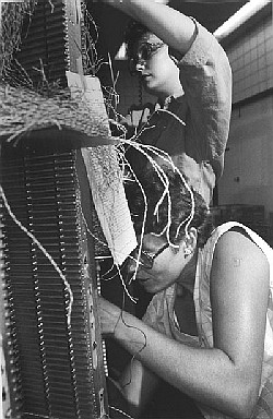
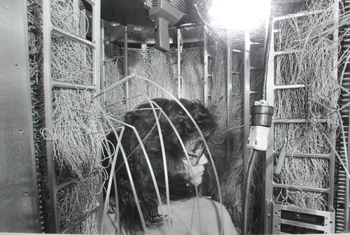
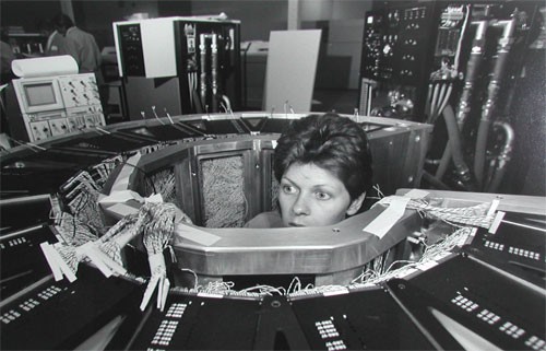
But an example I really like has to do with the construction of the Cray 1 supercomputer in the 1970s. This elegant computer was built in a round form with the electronics modules on the outside and a central cavity surrounded by the wiring connecting them (the same idea, more or less, is used in the human brain). The wires – huge numbers of them – had to be soldered correctly in the narrow central space, a nightmare task. So how did they manage it?

I once met a veteran of Cray Research at the Computer History museum and he explained it to me. Cray hired women for this task – ones selected for their patience and precision – and they put two of them on each machine: a tall girl to solder at the top of the structure and a short one to work the bottom. Unbelievable? Look at these photos!

Cray Wiring

Cray Wiring

Snagit 9 vs. FastStone 6: Simpler is better!

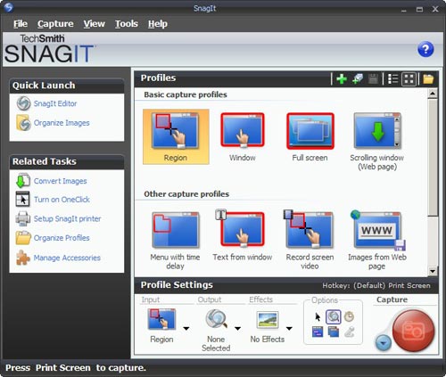
I needed a screen grabber, and based on recommendations from a friend downloaded the trial version of Snagit 9. I was impressed and disappointed.Impressed, because this is one potent package. It can do everything you may ever want to do about image grabbing. I particularly liked the “Scrolling window” option, for capturing a web page longer than one screenful. BUT… this program has an extremely complex and ornate user interface, giving you access to countless possibilities; and these are presented in the most colorful UI I’ve seen since my kids graduated from Fisher-Price. Take a look :

Snagit 9 User Interface

Compare this to Photoshop: powerful and feature rich, but its UI is simple, with minimalist icons in monochrome…

FastStone user interfaceI found this so distracting that I went and downloaded another shareware product, FastStone Capture (Ver. 6). Check the utterly simple UI to the right:

Note that 99% of the time, these few icons (including “Scrolling window”) cover all you need; the rest is accessible but unobtrusive in a drop down menu at the right, where it can’t distract you. Click a button on this tiny floating toolbar and the capture begins. The same icons exist in the Snagit window, but actually, once you click one there you then need to click the big red round button – which may make you feel powerful, but is a redundant action. Of course it’s a single extra click, but it’s also double the number of clicks required  in FastStone.

Interestingly, the development team at Snagit have a blog where they share their thoughts (commendable!) and there I read that “… we felt that the interface shouldn’t be competing for attention, but should fade away and allow people to focus on their content”. Sorry… good thought, but I can’t endorse the execution on it. Nothing about the baroque UI they built brings the word “Fade” to mind. Just compare it to the tiny toolbar of the FastStone tool.

Simpler is better, nowhere more so than in tools you use daily.

The importance of Exuberance in User Experience

Photoshop rules, and gets more powerful and more useful with every new release… but it will never recreate the joy of using Deluxe Paint.

Now, Electronic Arts’ Deluxe Paint was a raster graphics paint program released for the Commodore Amiga in 1985,King Tut, the iconic image of DeluxePaint which fast became the standard on that venerable 16-bit platform. It would typically handle 32-color images at up to 640×400 resolution. Sure, you could do things in it that no other personal computer could do at the time – like the King Tut image that became the hallmark of this program – yet in today’s terms it was utterly weak and primitive. So what’s the big deal?
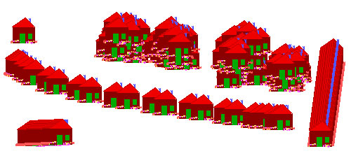
The big deal, IMHO, was the Exuberant feel of its usage, the kind of joy one might feel when grounding the gas pedal in a powerful sports car… In DPaint you could mark a rectangle anywhere on your image, cut it (with one click) to become a brush, then drag and spray it across the screen in wide sweeps to create swatches of colorful shapes, in real time, under your immediate command. The village below was created in seconds from the single house at top left… And then you could set the program for mirror or tile modes that would reflect this action in a kaleidoscopic riot of visual joy. You could create colorful abstract images fast – click! click! click!…

Brush effects in Deluxe Paint

You may still say, what’s the big deal? You can do all that in Photoshop! Well, yes and no. You can achieve the same results (and lots more that was unthinkable in 1985) but you do this by going through a long sequence of steps, as if you’re performing delicate brain surgery. I mean, in DPaint you drew a circle by clicking a button and drawing the circle with one mouse motion. In Photoshop, the instructions for drawing a circle have 7 steps, and step 5 says “In the Stroke dialog box, type a value for Width, and then click the color swatch to display the Adobe Color Picker“. This certainly works, but it does not bring the words joy, or Real time, or Immediate to mind…

The same difference can be seen in comparing an iPhone to a Nokia. The iPhone’s UI is definitely exuberant; the joy of dragging stuff around with your finger and having it respond is very real. On a Nokia, you have to cope with all those teeny buttons… it works, but it just isn’t fun!

Hear that, designers? We need more products with an Exuberant user experience!

Aesthetics and Design: Boeing’s LAR rule saves the day

Passing through an airport I bought the book “Boeing 777: the technological marvel” by Norris and Wagner. This gives many fascinating insights into the novel design methodologies that went into the 777, my favorite jetliner. It also introduced me to one of the ugliest airplane designs ever to disgrace a designer’s sketchpad.

Boeing 767X - the Hunchback of Mukilteo

The Boeing folks were looking to build a plane larger than a 767 and smaller than a 747; one idea they tried was to graft half the cabin of a 757 on the rear half of the larger 767. You can see how endearing the result looks; in fact it earned the nickname “Hunchback of Mukilteo”, after a town near the Boeing facility.

There were many reasons why this version never proceeded off the drawing board, not least among them the disgusted derision of potential customers. But what I like best is that a key reason, according to the book, is that the design failed Boeing’s “LAR rule” – which stands for “Looks About Right”. If that is indeed their guideline, they are a smart company indeed: good design has an ineffable elegance to it, and no engineer should be forced to build something that offends their aesthetic sense.

A lesson from a blue hairdryer

One day the ladies in the household decided they’ve had it with our handheld hairdryer, which was indeed weak and ailing. So I went to buy a new one, and decided to follow my first principle for tool acquisition: always buy the most professional, high-quality tool you can afford – it will repay the expense many times over!

I asked the appliance store guy for his best tool, and he offered me a sturdy blue unit that, he said, was what professional hairdressers (sorry, hair styling artists) use. The wattage on the label was indeed higher than any I’ve seen before. I brought it home proudly, only to discover the next day that it was no good to anyone there.

This was a new one for me: how can a tool that professionals prefer be useless to an amateur? In my world of engineering and DIY projects, this would be unthinkable. What difference can it make? A hairdryer is a hairdryer, after all.

Here’s the difference: the hairdryer is a hairdryer, but the hairdresser uses it to dry hair that is on someone else’s head! When you dry your own hair, the dryer must be short enough to fit between your hand and your skull; when you dry someone else you can just step back. The professional tool was longer, not much but just enough to make it awkward to use on oneself.

So, a lesson: always keep an open mind and challenge your own assumptions on the way a design fits its intended use. These errors seem obvious in retrospect – always in retrospect…

The ultimate clarity

Adding clear instructions is part of good product design, right?

So: I went to get a flu shot (I still get the flu each winter, but maybe I’d be getting it twice without this?) As the nurse prepared her syringe, I noticed a cardboard box of disposable vinyl gloves on her table. On the side of this box was a printed statement, which I copied verbatim:

“Intended use: A medical glove is worn on the hand of health care and similar personnel to prevent contamination between health care personnel and the patient’s body, fluids, or environment. This glove also serves for non-medical purpose usage”.

I was so relieved that the manufacturer had had the foresight to instruct the nurse in these enlightening facts. Who knows, without this instruction she might have assumed the gloves had to be stuffed up my nose or something?

Clear instructions are good. Superfluous ones are silly. I don’t trust silly vendors…

Copyright © 2024 Commonsense Design

Theme by Anders NorenUp ↑