Category: Design history

Historical trends and examples from earlier eras

LCD Monitor adjustment blues

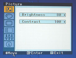
So we’ve made the move to flat computer screens, which have many advantages over their bulky CRT ancestors; but the vendors pulled a fast one on us when it comes to the controls for adjusting the screen’s image.OSD on Samsung SyncMaster 913N monitor

In the good ol’days, every monitor had at least two round knobs, one for contrast, one for brightness. This is as good as it gets from a human engineering perspective. You just twiddle the knobs back and forth until your eyes tell your brain to tell your fingers to stop right there. Today, we have instead an On-screen Display (OSD), which some vendors tout as a good thing; in reality it is slow, unfriendly and confusing. The idea is that you use a line of pushbuttons the navigate a hierarchy of menus just to get to the function you need, and then you need to click a good deal more to effect the adjustment. To make sure this is easy, the buttons are often labeled by cryptic symbols in near-invisible relief (as in the photo below, of my Samsung SyncMaster 913N); and the logic they use, though simple, is far from intuitive. This may be justified – indeed inevitable – for accessing the numerous advanced functions that did not exist in the CRT days; but couldn’t they have left alone those more basic controls?

That’s progress for you (sigh)…

Control buttons on Samsung SyncMaster 913N monitor

So, what can we do about this? Adding analog controls is not realistic on these super-integrated monitors. The only thing left, which actually removes much of the confusion, is to do what the vendor should have done – mark the controls with visible labels, as I’ve done:

Labbeled Control buttons on Samsung SyncMaster 913N monitor

Timeless designs last forever

We humans have this obsession with designing new products, even though many of them die out after a while (some, mercifully, after a very short while!) However, every so often a design is found that is simply so good and sensible that it stays around for a long, long time.

So, here’s an example I ran into in the archaeological museum in Agrigento, Sicily, a town founded by the ancient Greeks.

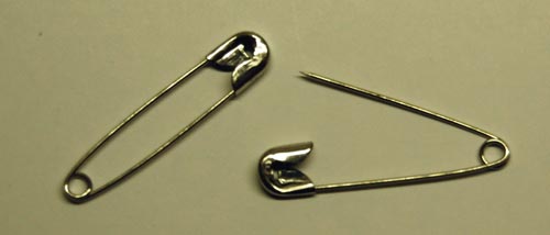
Bronze Fibulas - a timeless design

The object on the left is a bronze Fibula, made in the 13th century BC. Not one in a thousand people today would recognize the word “Fibula”, but hardly anyone would fail to identify this as a large safety pin. In fact, I saw not one but many of these, in various museums in Europe: they were widely used for many centuries. The second photo shows one from the 8th Century BC, with a more imaginative design (remember, unlike our safety pins these were also meant for decorative effect as fasteners for cloaks and such).

And for all our digital innovations, and perhaps unlike many of them, I doubt this good ol’ design is going to be supplanted anytime soon…

Safety Pins

Whatever happened to black ink?

When Johannes Gutenberg gave us the printing press in the 15th century, he also invented a suitable ink to go along with it. His ink was a glossy black, and the idea of printing books in black on white paper has remained ever since, because that is by definition the highest contrast you can get, hence easy to read. Millions of books have appeared since Gutenberg, spanning a huge range of subjects and world views, but they did not differ in ink color one bit as the centuries came and went.

Lately, however, I notice a worrying trend as I browse the shelves in the bookstores I frequent. A small but growing number of books are published in all sorts of smart-aleck color schemes. Ignoring the ones on colored paper – where the color schemes are intentionally artsy – we see books in gray ink, blue ink, brownish ink, all on white paper. And not just a sidebar or special page; the entire book is printed this way, as if the publisher said to himself “Hmmm… how can I improve the reading experience? Ah! Let’s use a lower contrast ink than we might. Sure, gray ink may cost more than the standard black, but what’s a little money compared to the pleasure of giving my readers eye strain headaches?”

Bad, bad idea. Give us books in good old black on white!

Retrograde evolution of Post-it note packaging

Everyone uses the 3M Post-it note, and it’s often used as an example of the role of serendipity in product development – and of the wisdom of maintaining a corporate culture that encourages and empowers the pursuit of such serendipity.

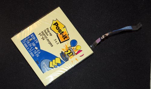
But the Post-it note story has another interesting lesson, and it has to do with the degradation of the design of its packaging. The original version of the ubiquitous 100-note packet was wrapped in cellophane, with the highly original trick that you could open it by grabbing the packet with two hands on opposite sides, and cracking the cellophane open with a single rapid twist, rotating the two ends in opposing directions. This was by design; in fact, I recall it said so explicitly on the packet. It was the fastest, easiest way to open a cellophane wrapping that I ever saw; and whenever I did the little twist I felt a twinge of admiration for its designer (and perhaps a bit of triumphant gloating over the cellophane, a wrapping material noted for its unfriendliness – think “CD Jewel Case”).

3M Post-it note package

So guess what? A few years ago 3M did away with this method. Now they provide the usual thin strip whose end you need to pry loose and pull. Sure, it’s no big deal; but the new method is more complicated to manufacture, slightly harder to use, and, above all, is less elegant .

I’m disappointed in 3M: when you got a good thing, you shouldn’t mess with it. But if you must mess with it, can’t you go forward, not backward, in simplicity and functionality?

Mighty Mouse: the best XY input device out there!

So many XY pointing devices have been developed over the years… I’ve used light pens, graphic tablets, trackballs, touch screens, joysticks, touch pads, trackpoints, even that weird HP desktop machine, the HP-150 from 1983, where you pointed at the screen and your finger intercepted IR beams crisscrossing the raised screen bezel (this last failed miserably – how could they ignore fatigue from repeatedly raising the arm to touch the screen?!)

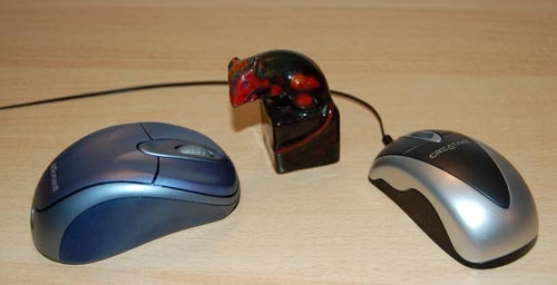
But the king of all XY input devices is without question one of the earliest: the Mouse. Only the QWERTY keyboard has greater tenacity (unfortunately, in this case). Invented in 1963 by Doug Engelbart and later commercialized by Xerox PARC, the mouse remains the most popular device in the family, and this is (IMHO) because it is simply the best – it maps extremely well to the brain-hand-screen-eye-brain closed loop, making its action so intuitive as to be transparent. It just doesn’t get any better than that. And interestingly, the exact shape of the mouse is unimportant: almost like cars, they went from blocky to streamlined as time went by, but are just as good in any shape. It’s the basic “movable box with buttons under the fingertips” that is the winning factor; the rest is window dressing.

Here’s kudos to a great design!

Mice (computer and porcelain)

Copyright © 2024 Commonsense Design

Theme by Anders NorenUp ↑