Category: Design history

Historical trends and examples from earlier eras

Hi-Tech Toothbrushes

The first mass-produced toothbrush was made in England by William Addis in England, around 1780. His idea was to attach bristles to a stick, and make a little brush with a long handle, to allow one to brush one’s teeth. You’d think that’s all it takes; you’d think the toothbrush would remain just that, a brush on a straight stick…

Toothbrushes on display

Think again. Today, any drugstore has a wall full of toothbrushes, and not one of them is as simple as Addis had envisioned. In fact there are so many types, such a riot of colors and designs, that it’s hard to buy a new brush that looks just like your old one. AndToothbrushes to compete with each other, the different makers dream up the weirdest configurations, with multicolored, contorted handle shapes that remind me of sports shoes (another area where form totally diverges from function in the interest of marketing hype), and with heads that must’ve taken real genius to design. The underlying ideas are impressive – brush heads with multiple bristle types sticking every which way to better remove bacteria from every cranny in the target dentition… all seemingly very important, very convincing, lest the consumer remember that a brush is a brush is a brush, and would work just as well if it had a simple monochrome handle and a straight head. The bacteria wouldn’t mind…

Speciation and Competition in Berlin’s traffic lights

Speciation, in evolutionary biology, is the splitting of a species into two different sub-species that cannot interbreed; it is one of the engines powering evolution. One mechanism responsible for this is the appearance of a physical barrier that cuts part of the species off from the rest, as when tectonic activity creates an insurmountable rift or mountain range, or an island breaks off from the mainland. The creatures on either side of the barrier evolve independently, resulting in such wonders as the dwarf elephants that used to exist on mediterranean islands, or the diverse finch species of the Galapagos.

During my recent visit to Berlin I was amused to see the same phenomenon, of sorts, happen to man-made objects – namely, pedestrian traffic lights.

Pedestrian crossing Walk/Don’t walk signals vary between countries, but in each country they usually have one standard design. In Europe they usually follow the European standard of a red standing man and a green walking man.
Now this is also the case in Berlin, except that there they have two designs. In West Berlin, the little men are skinny and utilitarian; but in East Berlin they are stylized, chubby and humorous: the famous Ampelmännchen.

Berlin walk signals

The Ampelmann design was developed in the GDR in 1961, and was used in East Germany while the barrier of the Iron Curtain prevented design standardization with the West. When the Berlin Wall became history, the citizens of that fascinating city had two different signal types; for a while you could tell which part of town you’re in by observing the one in use.

And when a barrier comes down and the two species mix again, it is possible for one to wipe out the other. In Berlin, there were plans to replace the Ampelmann with the EU standard of the skinny, businesslike version. Fortunately this planned extinction of the eastern variety met with a public outcry, and now the funny man in the hat is a protected species; in fact I heard they plan to replace the western version with Ampelmännchen, since they’ve become a kind of city mascot. In one pedestrian crossing I even saw the two little men – East and West – eyeing each other uneasily across the street…

Lick-and-Stick stamps endangered?

In 1840 Sir Rowland Hill introduced postage stamps to the world, giving us an effective postal system, and a fascinating collecting hobby. The Penny Black, of course, had to be licked to affix it to letter – it was a stamp, wasn’t it? That’s how a stamp should behave!

Self Adhesive Stamps

Well, not any more. These days we see a growing incursion of self-adhesive stamps; in other words, stamps that are in essence peel-off stickers.

These were introduced in Sierra Leone in 1964, apparently to solve problems of sheets sticking together in the tropical climate there. That, at least, is a good reason. But now we see a growing number of countries playing with the new stamps-that-are-not really-stamps…

So is that a problem? Well, there are bigger problems, but note that these stamps waste twice the paper, since their backing has to be discarded, and besides, the lick-and-stick operation was somehow an integral part of letter mailing (not that anyone writes letters these days either, unless they’re bills, it would seem). Also, stamp collectors are pretty unhappy – these stamps can’t be removed by soaking the envelope in water, and the adhesive can cause deterioration in the stamps over time.

I read somewhere that the US postal service refuses to see the collectors’ complaint as an issue, since long term collectability of stamps is not part of their product specification. Now, isn’t that heartless? Isn’t the whole purpose of stamps to enable this lovely obsession that has given pleasure to tens of millions of people, young and old, for well over a century?

Pillboxes and Clay balls: inside and outside

I recently bought this box of vitamins, and noticed it had a life size outline of the pills’ actual size. This makes sense, since the box is “safety sealed for your protection”, so people can’t see what’s inside before they buy.

Vitamins box

This reminded me (wonders of associative memory!) of something rather different, yet following the same idea, from the History of Computing (one of my favorite hobbies). I read about it long ago, but recently was delighted to run across the real thing in a small showcase in the Pergamon museum in Berlin. Back in ancient Mesopotamia, around 9,000 years ago, people had this neat idea of recording commercial transactions with clay tokens. Different shaped tokens might represent a sheep, a jug of beer, or a sack of grain… and so you could represent a loan or tax payment by a collection of tokens (SAP was far in the future then, as was Excel; in fact they had yet to invent writing, so they couldn’t use that for their records). Here is a sample of these tokens:

Mesopotamian Clay Tokens

Then, around 3,500BC in ancient Sumer, the idea occurred that it’s better to keep all the tokens in an “envelope”, a hollow ball of clay that could be signed with the parties’ seals, then fired to harden it. These balls of clay are like an authenticated, signed record; their content can’t be altered without breaking the ball. The museum had some of these balls cracked open, with the tokens still in them:

Mesopotamian Clay Balls with Tokens

Mesopotamian Clay Ball with imprinted tokens

And since the clay is not transparent, they would sometimes press the tokens on the outside of the ball before sealing them inside – so you’d know what each ball was about. And now we have an accessible copy of the record on the outside, and a sealed version on the inside… just as with the vitamins box!

The next step is obvious in retrospect: who needs the tokens on the inside? So around 3,300BC they dispensed with the tokens, flattened the ball into a clay tablet and made do with the indentations on this, as in the next photo.

Mesopotamian Clay Tablets

And lastly… surely you can see where this is going? Once they could Early Writing on a Mesopotamian tabletrepresent stuff in the real world by abstract marks on a tablet, they were on the path to real writing, starting with pictographs and ending with true cuneiform. Here is another exhibit from the Pergamon, which seems to be halfway through the transition. Wayda go!

More of the science behind this fascinating history can be found on the web site of Prof. Denise Schmandt-Besserat of the university of Texas, a leading researcher of the origins of writing and counting .
Ode to a round knob

“O knob, thou whose perfect roundness doth . . .”

Nah. A poet I’m not. Still, I would if I could, because the round knob is a fast disappearing species, a trend well worthy of lament.

Round control knobs on an oscilloscope

Throughout the 20th century the round control knob was a mainstay of human interface design for electronic devices. With good reason: it was perfectly suited to humans’ major feature, the opposable thumb. You grasped the knob between that thumb and forefinger and you had superb fine control of the knob’s angular position. If the function called for finer control, you just used a fatter knob. At the machine end of this human/machine interface the knob could rotate a switch, a variable capacitor, or a potentiometer – there were many analog devices back then that lent themselves well to rotary control.

Today most of our input components have gone digital, and are either computer controlled or handled by pushbutton switches. This makes sense in some cases, but there are still many situations when a function is intrinsically analog (say, a volume control on a car radio) yet the designers are making the controls digital (say, by using a pair of + and – pushbuttons). This is pure evil from a human engineering perspective: the round knob is much more intuitive, convenient, and faster to boot. And it really was worthy of the name control: it gave the user a sense of controlling the instrument, instead of fighting it…

I’m sure the electronics driving the volume these days are fully digital, but even so a round knob with some D/A conversion is the correct choice. It must also be more expensive to make, because the radio makers – preferring low cost to user experience – increasingly shy away from it. 🙁

The growing obesity of our Science Fiction

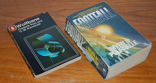
I was putting in order our bookcase of Science Fiction, and noticed an interesting fact best illustrated by the two piles of books in the photo.
One pile has three books, all written after 1980. The other has eight books written in the fifties, the later part of the “Golden Age” of Science Fiction. And the two piles are the same height.

Science Fiction books

Fact is, most paperbacks published recently tend to be much longer than the “Pocket books” of the fifties. They can easily exceed 400 pages, where their predecessors ran happily to 200 or so. And the sad thing is, this does not make them better. The three fat books in the pile at left are certainly good – but the other pile contains absolute classics like Bradbury’s The illustrated man, Clarke’s Childhood’s end, and Asimov’s I, Robot (the wonderful short story collection, not the silly movie); the others, by such masters as Sturgeon, Heinlein, Blish and Wyndham were likewise influential and a joy to read.

Two Science Fiction books

Here, go read Footfall (1985), all 700 pages of it, and Wolfbane (1959), with a mere 160; both are wildly imaginative works, good SciFi indeed, but the GPP (goodness density per page) is on the skinny tome’s side. In fact, it makes me wonder, why did authors become so much more verbose of late? Any ideas?

A glimpse of the venerable NCSA Mosaic browser

Dominic Tramontana has posted an interesting analysis of how the Reload glyph varies between browsers; take a look! Dominic asked me to post a screen shot I have of NCSA Mosaic, the first graphic web browser developed in 1993 by Marc Andreessen.

The grab I dug up is of a Novell web page, from early 1995. Here it is (click image to see the full page).

NCSA Mosaic browser, 1995

Back then, black on gray was the accepted way to write a web page, and the use of the red “book” images was a really impressive touch, I recall. We’ve come a long way…

The evolution of the On/Off power switch symbol

We all know the symbol with a vertical line in a circle: it identifies the On/Off power switch. It occurred to me that this familiar symbol is evolving in a bizarre fashion.On Off Power Switches

Originally, switches had a lever or slider that could move to either of two physical positions. In those days the switch was marked with the word POWER and its positions with ON and OFF. Then, as switches became smaller and more globalized, the two words were replaced with 1 and 0, as seen even today on many rocker switches.

And then the ubiquity of microprocessors made it more economic to do everything with momentary pushbutton switches; the computer inside could take care of figuring whether you meant ON or OFF. And so, the button now needed an icon that conveys both options; I surmise that is when the familiar “1-inside-a-0” symbol came into existence (if you know otherwise do share in the comments!) This round icon fit nicely on round buttons, and became ubiquitous.

OnOff power switches

But then we start to see the form shown in the two photos above right: a bastardized version combining the 1-in-a-circle with a 1 in the same symbol. This makes no sense at all – the correct representation would have been 1/0, for On slash Off. Instead we get On slash OnOff. Sloppy thinking…

Such erroneous contractions are often seen in spoken language – as in “IT technology”, which expands to “information technology technology” (there’s even a company by that name, and its slogan, amusingly, is “We make sense of IT“). But now we see the same error invading the more compact space of visual symbols…

A REAL switch for the wireless radio

In the old days electronic gear had on/off switches that were actually physical devices with two positions, like the light switch on a wall. Nowadays these have become a rare sight: with everything computerized, most state switching is done by pressing pushbuttons and keys, with the switching done by the logic circuitry or microprocessor.

The disadvantage of this solution is that (a) you can’t tell the state of a switch by looking at it, and (b) the act of switching can take a while as the computer goes about its activity. Even the basic act of turning a computer off now takes long moments (in the original home computers you hit the switch and power was simply cut off).

Thinkpad T61 wireless radio switch

Here is a delightful exception to this trend: my latest Notebook, a Lenovo Thinkpad T61, has a slide switch on its outside for switching the Wireless radios on and off. Slide it to the right and the radio pops on instantly (as indicated by a green spot that becomes exposed under the slider). Slide to the left and the radio shuts down. Besides being fast and convenient, this is very useful when flying: if you believe in the inadvisability of having the Wireless on during flight, you can ensure it is off (and will stay off) before even turning the Notebook on. Absent this assertive hard switch, you’d need to turn the computer on, discover you left the radio on when you last put it into standby in the airport, and then you’d need to fumble with soft switches and dialogs to turn it off before the plane crashed. 🙂

The Duomo of Siracusa: the ultimate Reuse

Reuse is good, right? And the notion conjures in most of us an image of linking code modules. Which is why I was astounded to run into the following case, while touring the beautiful island of Sicily.

Siracusa Cathedral (Duomo)

Here you see your intrepid tourist in front of the Duomo (cathedral) of Siracusa, the city where Archimedes lived, engineered, and famously died defending his sand drawings. The baroque facade is a late addition (18th century) and nothing to write home about; but to its left there’s something unique and bizarre…

Below, left, is a close-up of the left wall of the Duomo. Note the embedded Doric columns, visible with their abaci and architrave (don’t worry, I had to look that up myself). These are also visible on the inside of the church, as seen in the photo at right.

Greek columns embedded in Siracusa cathedral

So what’s going on? Well, the church was built in the 7th century AD. The columns, however, predate it by more than a millennium; they are what’s left of a Greek temple dedicated to Athena, which was built in the 5th century BC. Rather than follow the destroy-and-recycle method often applied to preceding cultures, the Christians reused the framework of the temple as is, filling in the spaces between the columns!

Copyright © 2024 Commonsense Design

Theme by Anders NorenUp ↑