Category: Design history

Historical trends and examples from earlier eras

My blogging passes the immersion test!

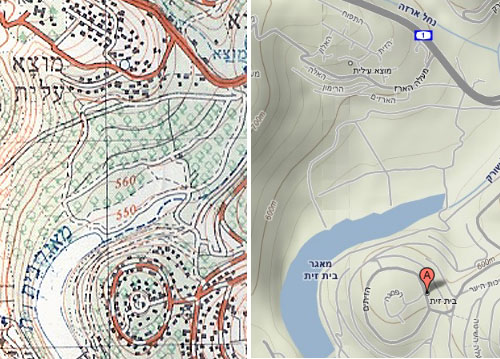
A few days ago I was at the IEC history of computing museum where they also exhibited their progress in map making – from old blueprints and paper maps to modern CAD and GIS software. They had there an old 1960’s map that caught my eye – a 1:50,000 topographic map by the Israel Survey Department. These were the best you could get when I was a kid hiking around the country; every house was correctly shown as a black dot of the exact right shape, and every hill and gully were visible in the contour lines.

I looked at the map and it struck me how much maps’ visual quality has progressed since then, with modern printing techniques. The stark colors used in the 60’s are replaced today with delicate pastels; the topography is enhanced by fine shading; the important details are not drowned out by the density of equally strong contour lines. The information of the old maps was perhaps perfect, but to the modern eye they look, well… old. Unfortunately, as far as I know the maps you can buy today at such a detailed scale use the same old techniques.

Then the next day I came to see a new Israel Survey Department map that was wondrous fine to behold, done in pastel shades and fine shading gradations, reminiscent of what you see in Google Maps but with all the detail of the maps of my youth. And my friend Gadi happened by, and I said unto him, lo, see this map, for it is very finely done, and only the other day had I wished such were made; and he looked upon the map and found it good. And I said to him, surely I should blog about this map and compare it to the older ones, and he said, verily thou shouldst. And I resolved to make it so. And then the matter passed from my mind until my alarm clock went off to wake me for my day’s labors.

The bad news is, evidently the Israel Survey Dept. has yet to produce the fine map I saw in my dream. The good news is, looks like my blogging has reached the point where it passes the immersion test. I’ve found long ago that when I really immerse myself in some practice or task, it makes its way into my dreams. As a forensic scientist, I would dream of Gunshot Residue Particles; as a Thin Films VLSI engineer I would examine LTO defects in dreamland; and when I took to developing software, I would dream at times of bugs – I remember once actually solving a particularly stubborn one in my sleep, a solution that turned out to be valid in real life. So now I dream of searching for stuff to blog about!

Topographic Maps

As for my resolution, I can’t show you the nonexistent topographic map, but I can and hereby do show you a comparison of an old ISD map and a detail of the same area from Google Maps (Terrain option) that illustrates the visual qualities I was dreaming of merging with it.

The opposite of Human Engineering

The key idea of Human Engineering is to design the product to fit the humans using it. Makes sense? Sure does, but there are also cases of the opposite approach; Select the human to fit the task or the product!

Obvious examples abound in sports, as with the physical attributes of the horse racing jockey and the basketball player (and while we can’t change the horse’s reaction to a heavier load, we could actually lower the basket if we were designing it to fit the average human…)

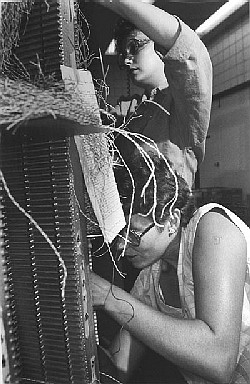
A technological example would be the Soviet solution to giving battle tanks a low silhouette: make the tank low, and recruit soldiers of short stature to Cray Wiringcrew them.

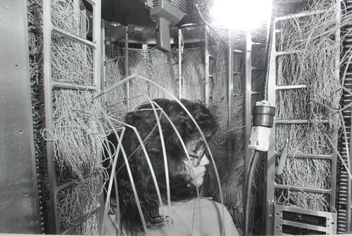
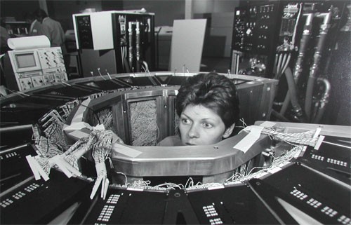
But an example I really like has to do with the construction of the Cray 1 supercomputer in the 1970s. This elegant computer was built in a round form with the electronics modules on the outside and a central cavity surrounded by the wiring connecting them (the same idea, more or less, is used in the human brain). The wires – huge numbers of them – had to be soldered correctly in the narrow central space, a nightmare task. So how did they manage it?

I once met a veteran of Cray Research at the Computer History museum and he explained it to me. Cray hired women for this task – ones selected for their patience and precision – and they put two of them on each machine: a tall girl to solder at the top of the structure and a short one to work the bottom. Unbelievable? Look at these photos!

Cray Wiring

Cray Wiring

The demise of Tinkering

The progress of engineering over the years has brought us many triumphs of human ingenuity, but it has left quite a bit of roadkill behind. One species driven to the brink of extinction is the Tinkerer.

The attitude to Tinkering has always been ambivalent. Look at the dictionary definitions:

tinkerer [noun]

1. a traveling mender of metal household utensils.
2. A clumsy repairer or worker; a meddler.
3. a person who enjoys fixing and experimenting with machines and their parts.
4. a person skilled in various minor kinds of mechanical work; jack-of-all-trades.
5. Scot., Irish English.
a. a gypsy.
b. any itinerant worker.
c. a wanderer.
d. a beggar.

What a mix! On the one hand, a person skilled in fixing things; on the other, a beggar, a clumsy worker…

The truth is, this was an extremely useful person in centuries past. This was the ingenious man who made the rounds of the county, a wanderer indeed, and who knew how to fix everything that had broken down since he last came. All the newfangled contraptions that were useful to the villagers but beyond their ability to fix: sewing machines, radios, bicycles, gramophones, tractors… And this tinkerer had manifold skills – a real jack of all trades – but even more so, he could improvise, making replacement parts from whatever was at hand, working around the missing or broken pieces. Take my favorite definition of engineering – The art of making what you want from things you can get – replace “making” with “fixing”, and you have the Tinkerer’s calling. Above all, this is “a person who enjoys fixing and experimenting…” – someone who loves his work, hence deserving our respect.

And now he’s a threatened species, for two reasons having to do with how we design our technology today: first, because we design it to be discarded at the first failure, so no need to fix it; and second, because with the advent of microprocessors, most items cannot be fixed by improvisation. If your car acts up, you need to get it to an authorized garage where they hook it up to a computer that tells them what to do; no way can you take a screwdriver and a shoestring and fix it… and in any case we specialize so much that no one person can fix the electronics in a sewing machine, a DVD player and a car.

Too bad – those tinkerers had a technological flair to their way of life and their vocation that will be missed – or not, once we forget they ever existed. 🙁

Nokia E71: 40 years of progress in handheld devices

I just got me a Nokia E71 smartphone. It looks like a particularly well-constructed gadget, though I reserve judgment until I’ve used it a while – stay tuned!

However, I can already share one observation: the incredible amount of technology crammed into this tiny device. A few years ago we’d marvel at its slimness if it were only a cellphone; but it isn’t only a cellphone. It’s a cellphone, and it’s a PDA, and it’s a GPS, and it’s an MP3 player, and it’s a video player, and it’s a recorder, and it’s a radio, and it’s a web browser, and it has bluetooth, and it has WiFi, and it has Infrared, and…

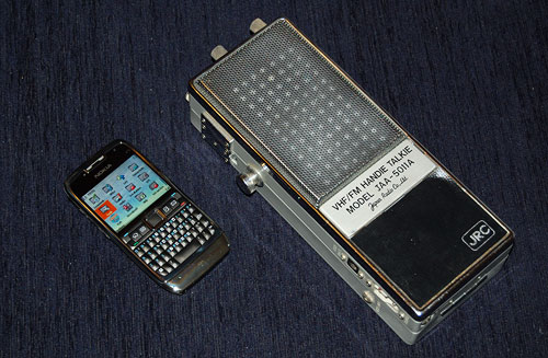
Nokia E71 smartphone and JRC VHF transceiver

You get the idea: this device has everything under the sun, and it’s still tiny. So for comparison, I present it here next to another 2-way communication device, a VHF transceiver made by the Japan Radio Co., Ltd., sometime in the sixties. I won this at a raffle in the annual meeting of the Israel Amateur Radio Club in the early seventies; and at the time I had to get a special license for it, it was such a big deal. It was also considered very miniaturized, since it used transistors and could be held in the hand – just like the Nokia beside it; however, this JRC was not a PDA, and it wasn’t a GPS, and it wasn’t an MP3 player, and it wasn’t a video player, and it wasn’t a recorder, and it wasn’t a radio, and it wasn’t…

You get the idea: back then it was all they could do to pack a radio transmitter and receiver into this 9 inch long box; today, the sky is the limit. And so, one can safely state, we’ve come a long way… and I can’t help but think that, with all respect to Kubla Khan and his stately pleasure dome, it is Nokia’s engineers who should be credited for giving us a miracle of rare device !

Where have all the cradles gone?

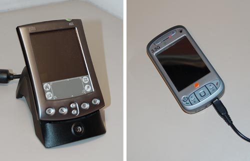
In the early years, when portable electronic devices were considered wonderful miracles of technology, they used to come equipped with cradles. These would at a minimum charge them – the case with the “dumb” cellular phones of the day – and later also provide cabled connectivity to a computer, as in the early Palm Pilots. The cradles were meticulously designed to be functional as well as good looking; I remember a cellphone I had that had a two-slot cradle – one for the phone, the other for charging a spare battery. And it was indeed utterly convenient to plop or push the device into the cradle before bedtime and forget it until the next morning.

So where have all these cradles gone? These days, even the smartest devices charge through one cable and connect through another; connecting a cable is no major problem, but it is still less comfortable than dropping a device into a slot, and it leaves the device flopping about on one’s desk with much less dignity than the cradle afforded. Some manufacturers do make cradles as accessories, or you can get them from third party manufacturers, but they are much less common today.

Palm PDA in a Cradle and HTC smartphone with a charger's cable

Of course, a cradle is less portable; when I had my Palm V I had to buy a separate “travel kit” that replaced the cradle with a cable and plug arrangement. But when I would return home from a trip I’d be greeted by the more permanent arrangement, hooked up to my notebook’s docking station.

I was never certain whether the cradles of yesteryear were eliminated to reduce manufacturing costs, or because users preferred the flimsier cable system. What is your view on this choice?

An alien twist on the On/Off Switch symbol

My post about the evolution of the On/Off Switch symbol turned out to be very popular with this blog’s esteemed readers. So, here is a second serving on the subject. This time, something completely different…

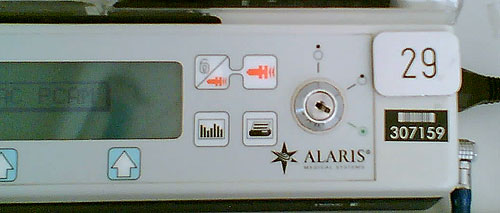
Switch on Alaris pump controller

I was visiting someone in a hospital and I saw this piece of medical equipment by Alaris Medical Systems. From what I could gather, it was a controller for a volumetric injection pump that was administering medication to the patient at a programmable rate.

So – look at the symbols around the big key-switch (sorry about the quality of the hurried cellphone photo). Obviously, they’re meant to be conventional icons denoting some functionality – maybe On, Off, and something in between? Or Fast flow, Slow flow, and Manual flow control? The point is that it’s clear that they do mean some three states, and that their distinct simplified forms map to those three meanings somehow, yet for me, as a non-medical person, they could just as easily mean glrrrph, drerp and hoomphla. I’ve completely failed to decipher this symbolism. If you know what it means, add a comment for the benefit of the rest of us.

I assume the nurses that use this gear have been trained in its use… still, one wishes they’d add the meaning in plain English alongside (or instead of) the mysterious icons. But then, that goes to “one word can be worth a thousand pictures”, as I’ve considered here.

Which reminds me of a question I’ve pondered in some idle moments: would an alien visitor make any sense of our ubiquitous arrow symbol? Or do you have to descend from a specific hunter-gatherer background to feel that it must mean motion in the direction of the arrow’s tip?…

The infamous Caps Lock key

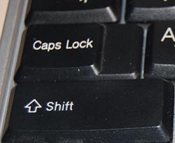
Caps lock key on a modern PC keyboardEveryone knows that the QWERTY keyboard layout sucks, because it carries a legacy from the early typewriter days; still, we’re all locked into its use and live in oblivion of what we’re missing. But we have another legacy from mechanical typewriters that is hard to forget because it bites us daily. i REFER TO THE cAPS lOCK KEY.

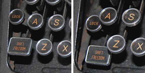
It is interesting to trace the history of this design infamy. Originally, it made a lot of sense: in a mechanical typewriter the Shift keys did just that: they shifted the type mechanism vertically so the type bars would hit the paper with the uppercase letters; and the Shift Lock key would keep the keys locked in this position. This key had to sit right above the Shift key, because it physically latched it in a depressed position; hitting Shift again would release the lock. It was very easy to see (and feel) whether Shift was locked or not, because both keys would be depressed when the lock was engaged. The photos below are from an antiquated Royal typewriter; you can see how the Lock key holds down the Shift key on the right (and note the quaint caption on the latter key – Shift / Freedom, in allusion to releasing the Lock).

Shift Lock in an old typewriter

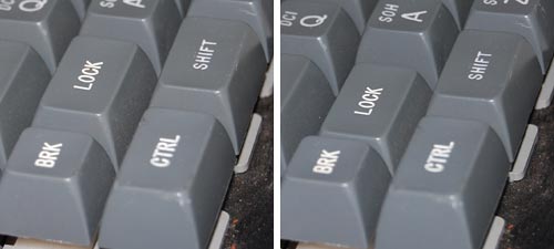
Early computer keyboards carried this idea forward, with a Shift Lock or Caps Lock key that had two physical positions: depressed for Lock, and flush with the other keys when released. You could therefore tell when you were in Caps mode, and would notice immediately if you hit the lock accidentally while touch typing. The delightful Commodore 64 had this feature, among others; the photos show a keyboard that came with the collection of homebrew boards described here, from the late 70s.

Two-position Caps Lock in a 1970s keyboard

Later, as keyboard makers sacrificed quality for cheap manufacturing, the more complex and different two-state key was replaced with a momentary key like all the others, with electronics to implement toggle action. Gone was the tactile feedback. Now a simple brush of the finger could accidentally lock you in Caps mode. Worse still, the position of the Lock key next to the left Shift key, which made sense a century ago, was retained – placing this relatively little used key right in harm’s way.

I don’t see manufacturers giving us back the 2-position key (it would cost them a few cents, after all), but the least they could do is move this stupid key to the top row, next to the Scroll Lock, where it will remain unused, unnoticed, and harmless.

So, what can we do about this? Well, one thing we can do is disable the offending key. No need to tear it out – I used KeyTweak, a free key remapping utility, to disable it on my Windows XP system. Good riddance!

Also, if you use MS Word, you may be unaware that depressing Shift+F3 repeatedly will change any selected text to lowercase, uppercase, and sentence case; a very useful feature after YOU’VE ACCIDENTALLY HIT sHIFT lOCK AND CONTINUED TYPING.

Babylonian memory technology

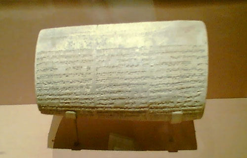
A gem I saw in a museum recently: this is a large cuneiform-inscribed cylinder, maybe 3-4 inches thick, which describes the building activities of king Nebuchadnezzar (better known in the bible for his opposite exploit when he destroyed Jerusalem in 587 BC).

Babylonian Cuneiform Cylinder

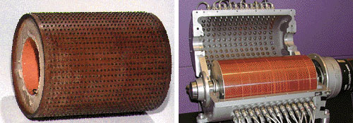
Anyway, in one of those moments of associative memory, it struck me how similar this looked to the contact-studded drum memory devices of the ABC, or Atanasoff-Berry Computer, one of the earliest electronic computers (1941), pictured below at the left. One is also reminded of the magnetic drums that served computers for memory in the 1950s, like the one to its right.

Computer Memory Drums

The idea of using a drum for computer storage makes good sense in terms of allowing it to be scanned easily by rotating it; but the Babylonians probably used this form because it allows you to cram much text (and many construction exploits, if you’re a busy king like Nebuchadnezzar, he of the hanging gardens of Babylon) into a relatively compact object.

Also worth noting: The king’s memory cylinder is still readable after more than 26 centuries; so, can you read your 5-1/4 inch floppies any longer?

Where old projectors go to die

overhead projectorsI was visiting a hospital, and passed by a seminar room where my eye caught the items in the photo, sitting on a custom stand in the corner.

Remember these? Used to be, they were so ubiquitous that they were instantly recognizable: an overhead foil projector and a circular magazine slide projector.

These days, no one uses them anymore… it’s been years since I even saw one of these. It’s PowerPoint everywhere. In fact this seminar room had a new LCD projector fixed to the ceiling. But these academic institutions are conservative: they throw nothing out. These useless devices may well linger there for years. And so, we are afforded a peek into a not all that distant past..

Copyright © 2024 Commonsense Design

Theme by Anders NorenUp ↑