Category: Design history

Historical trends and examples from earlier eras

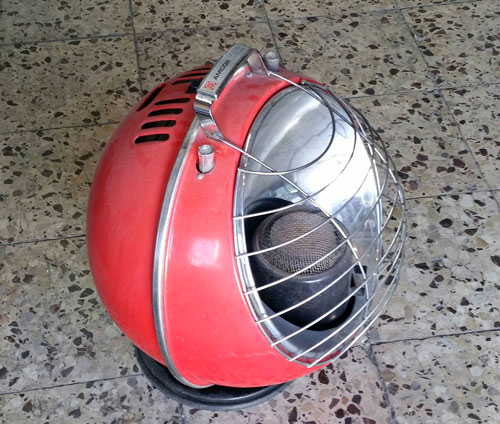
A Googie Kerosene Heater!

Kerosene heaters are smelly, require much maintenance, and are dangerous if used carelessly; on the other hand they create a lot of heat, are independent of utility feeds, and for us older folks they actually have a nostalgia evoked by the conditioned association of the kerosene smell and the pleasant warmth of years past. Be that as it may, they are seldom seen today, and those that are around are mostly stored for backup in case of winter power outages. They also tend to be bulky and ugly…

So here is one that is neither, a vintage unit sighted at the Jaffa flea market: a perfect compact  sphere, in the mid 20th century style.

Googie Kerosene Heater

Not sure how safe it is – seems it would toll over if bumped – but you gotta love the red color and the nice Googie design!


The ancients had it right

These days the preference for shoddy, cheap, use-and-discard products is all over the place. Here is an example:

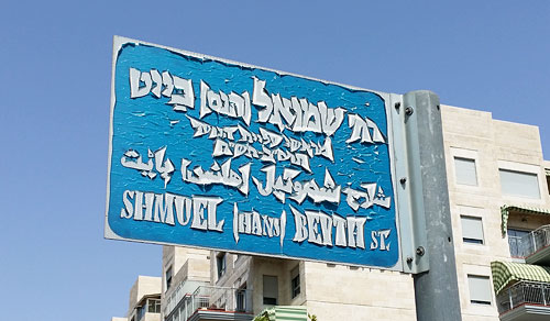
Street sign

This sorry street sign in Jerusalem has taken on a very “artistic” look – because it is made from a blue layer of stick-on plastic sheet over a metal plate. Over time the plastic started to shrink and curl, with this amusing result.

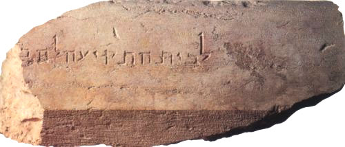
And it occurs to me that the ancients who lived in our city had a better method. Take this stone, which was part of the temple enclosure parapet in the second temple period (around the time of Christ). It too carries a Hebrew inscription, identifying the location of “the house of trumpeting” – the location where the priest stood who blew the ram horn to announce the entry of the Sabbath.

The house of trumpeting inscription, Temple mount, Jerusalem

This stone took a big fall when the Romans destroyed the temple, but the lettering on it is crisp and legible after two millennia.

Sigh…


The original Alice

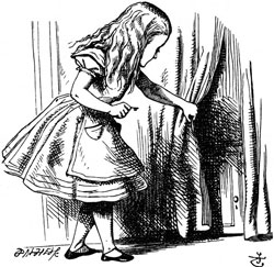
Alice by John TennielSay “Alice in wonderland”, and the image that comes to mind (well, at least in the generations that used to read books) is a little girl in a tidy Victorian knee-length puffed sleeve dress with a pinafore, and long blond hair – the girl in the image at right. This comes from the famous illustrations by John Tenniel, a successful professional illustrator that Carroll retained to illustrate the book. The illustrations by Tenniel became iconic, although they bear no resemblance to Alice Liddell, the lead character’s namesake, who was not blonde in the least.

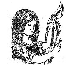
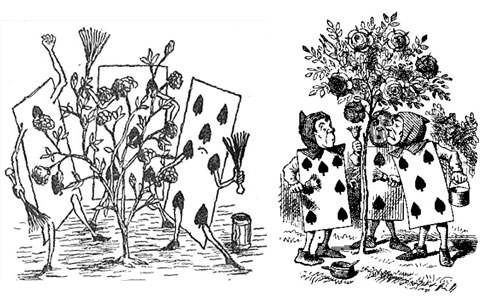
Alice by John TennielAnd then there is a different Alice altogether, the one envisioned by Carroll himself and found in the illustrations he drew by his own hand for the handwritten draft of the book, “Alice’s adventures underground”. I have a book showing these, and the comparison is interesting. Here, for example, is the same picture of Alice holding the golden key to the tiny door behind the curtain at the bottom of the rabbit hole. No blond hair, no fancy clothing.

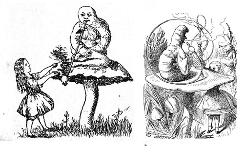
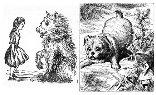
So here, for your enjoyment, are some comparisons of the Carroll and Tenniel realizations of some scenes in the book:

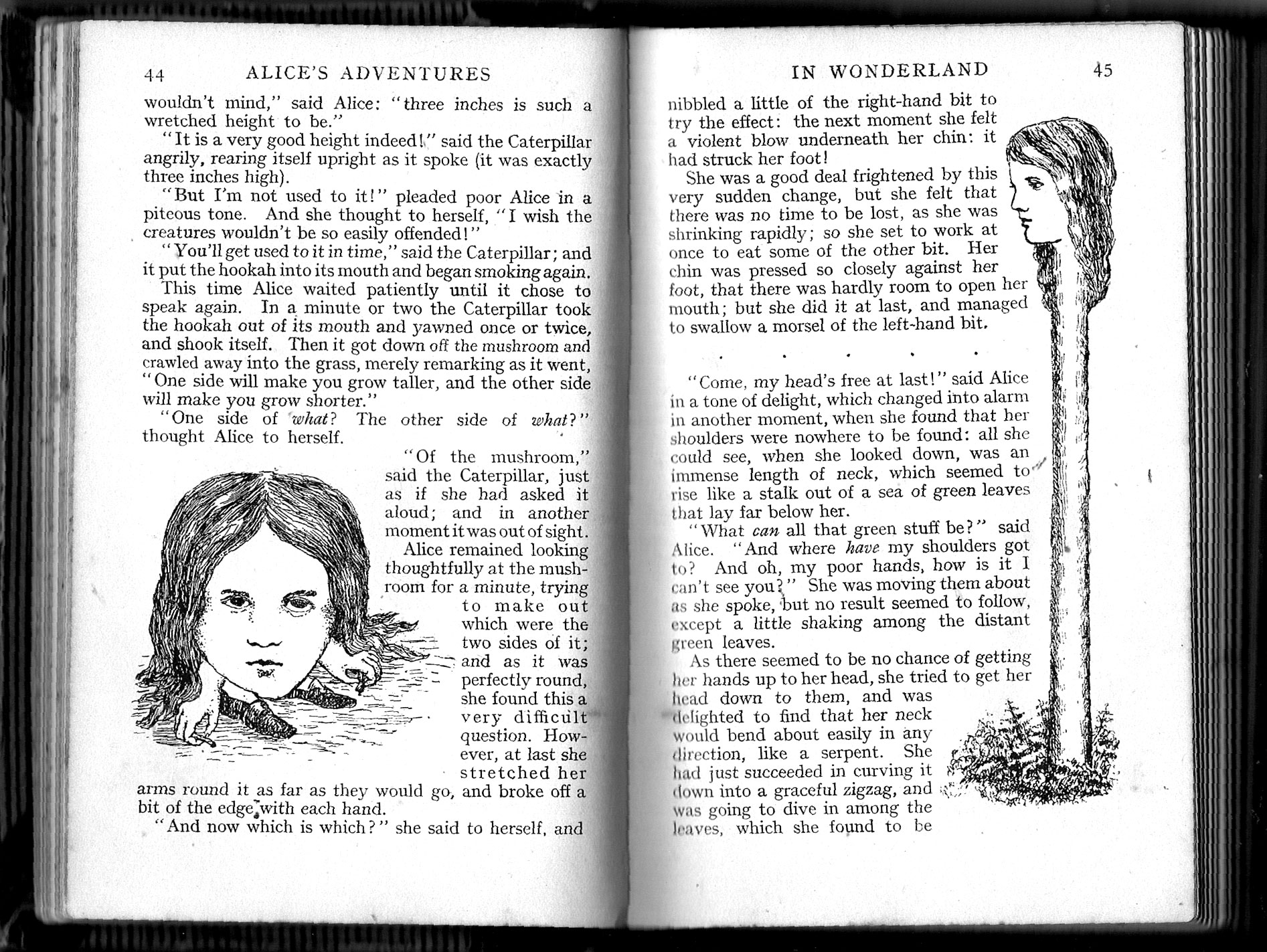
Alice and Caterpillar

Alice and puppy

Gardener playing cards

As we can see, Tenniel was definitely a more capable illustrator; but he followed Carroll’s lead — indeed, Carroll supervised him closely, since he was paying him a hefty fee.

And although most of the Tenniel drawings are based on Carroll’s, there are some of the latter that did not make it into the printed book. Like these two:

Alice images from Carroll's original drawings

A beautiful instrument

This Barometer was made in Florence some 100 years ago, and served my late grandfather, first in Italy, then in Israel; it ended up on my wall, a family heirloom to delight the heart of any engineer.

Barometer

It is a large (23 cm across) Aneroid Barometer, an instrument to measure atmospheric pressure by means of the compression of an evacuated metal capsule (the silvery part with concentric corrugations). Back in the day you would set the golden arrow to cover the black one in the evening, and when leaving home in the morning you’d tap the glass to see which way the black arrow would slightly move from under it – denoting whether the pressure is rising or falling, i.e. whether the weather was getting sunnier or rainier.

What makes this instrument so lovely is the inside mechanism, which is made of springs, hinges, rods and chains that convey the movement to the pointer – and these are made of many beautifully burnished alloys of brass and steel, as you can see below (click either photo to enlarge it).

Barometer mechanism

The say some modern smartphones include a barometric sensor… but they can’t hold a candle to my grandpa’s barometer when it comes to sheer elegance and beauty!

Form and Materials: swords of yesteryear

Form follows function; but often both must follow the available materials.

Consider the image that comes to mind at a statement like

The great king raised his mighty sword to smite his enemies.

Surely, you imagine a sword structured something like this:

Sword

Photo courtesy Søren Niedziella, shared on flickr under CC license.

This, after all, is just about what a proper King’s sword would have to look like to serve him well.

Right?

Well, how about this instead?

Khopesh sword

Photo courtesy Dbachmann, shared on Wikimedia Commons under CC license.

Would you recognize this as a sword? If you were an Egyptian or Mesopotamian soldier some 4000 years ago, you certainly would. In fact, this was what a standard battle sword looked like between 2000 and 1300 BC. This one, missing its hilt at the right end, is from 1750 BC.

These weapons were in use across the ancient near east, and were called Khopesh in Egyptian. Their only sharpened edge was the outer side of the curved part at the left. You used this edge to beat on people, much like you’d use a club; stabbing was not even an option.

So, what’s going on here? A sword should be long, thin, sharp and pointy, so you can stick it into people at arm’s length; why make one that looks like a short, thick, bent metal rod that can only be used to clobber your enemies?

This is where a key fact comes in: we’re talking Bronze Age, when iron (and much less steel) was unavailable. Weapon designers were constrained by a metal that was too soft for anything long and thin; nor would it stay sharp for long. A one-sided “sickle sword” like the Khopesh could have a thick backside that would give the bronze both durability and hitting momentum.

Over the years the design varied somewhat; notably the sharp part grew longer at the expense of the handle, as in the sword below:

Khopesh sword

Incidentally, I wasn’t kidding about the king: below you see a PR image of Ramesses III smiting his enemies with a curved sword just like this one. He grabs the smaller-than-life enemies by the hair and is ready to smite them with the sword’s edge (the kings of those days, unlike today’s ornamental ones, were pretty hands-on where smiting was concerned). In fact, this image makes sense of the fact that “smite” is defined in the dictionary as “to strike with a heavy blow or blows” – strike, not skewer as with later sword designs. The guy on the right is more than a king – he is the Akkadian God Nergal, no less, and he holds a sickle sword in his left hand, its blade resting on the ground.

Ramesses III and Nergal

But then came the iron age, and it became possible to craft sharp long blades that wouldn’t break; and the bronze Khopesh went the way of the flint axe, doomed by a new technology that enabled new forms and new functionality.

That’s Progress for you…
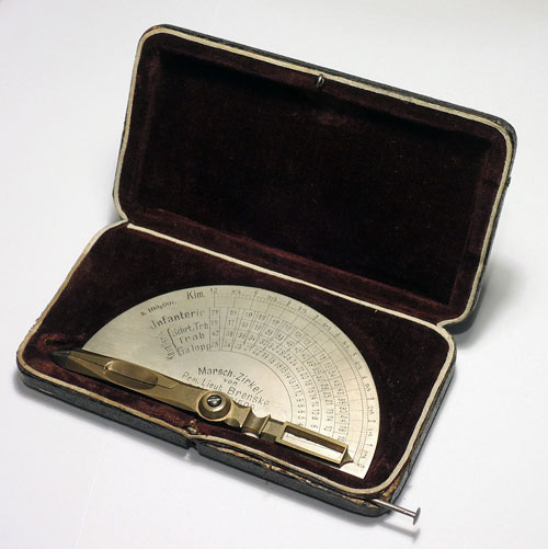
A curious slide rule design

For some reason, inventors in the first half of the 20th century thought that incorporating a slide rule into a mechanical pencil was a great idea. In reality, these combination devices were of dubious utility, gives their low precision as calculators… but they are certainly ingeniously designed.

Pencil Sliderules

I describe three of them,  including one extremely rare device, in a new article on my history of computing site.

Enjoy!

Independence Day pins: a case study in deteriorating design

Unlike the US, Israel doesn’t celebrate its Independence Day by sending its president to fight invading aliens in huge spaceships (our presidents are too advanced in years for that). We do, however, have other traditions, and one of the earliest of these has been for the Jewish National Fund to issue each year a small lapel pin celebrating the young state’s birthday. Since my childhood these would be sold for a small donation to the JNF’s activity, and I’ve kept some of them and bought some others later, making a nice little collection.

Here they are. Each row stands for one decade; the oldest pin I have, with the stylized number eight, is from 1956; the newest, #40, is from 1988.

Israeli independence day lapel pins                                        Click photo to enlarge

And as I look at the series, I’m amazed to see that while the state of Israel has progressed from humble and austere beginnings to become today’s vibrant “start-up nation”, these pins have moved in the opposite direction: their design and quality of manufacture have degenerated considerably with the advancing years!

Like this:

Israeli independence day lapel pins

This photo shows the pins from years 20, 25 and 38. See what I mean? The leftmost pin is cast in a solid bronze alloy; all the years before it use embossed metal too. But year 25 uses a flat metal disk with a paper sticker, as do subsequent years (and years 31 and 37 shamelessly recycle the same design on the paper!); then, in year 38, we see a move to the el-cheapo buttons used for political rallies and countless other mundane uses.

And it gets worse. Year 39 had three versions: the cheap button, a flimsy plastic “paperclip”, and a disposable paper sticker!

Israeli independence day lapel pins

Incidentally, year 10 also had a choice; but not between flimsy and disposable. In that year there were two respectable, embossed metal pins – one in tinplate and one in bronze.

Israeli independence day lapel pins

Consider the change in raw materials in this sequence:

Israeli independence day lapel pins

Bronze in year 10 (this was the only material in use in the first decade), tinplate in year 16, and the yucky plastic in year 39.

Lastly, consider the complexity of structure in the year 14 pin from 1962 (the wooden backplane was meant to celebrate the JNF’s highly successful reforestation efforts), in contrast to the trivial technique in the paper sticker from 1987.

Israeli independence day lapel pins

Of course, we see this decline of craftsmanship in many manufactured goods in our modern world – and here it is captured nicely in a microcosm of ID lapel pins!

Two primordial hunters

Nimrod, by Itzhak DanzigerOne of the most famous sculptures made in Israel is “Nimrod”, created in 1939 by Itzhak Danziger.

A powerful figure in red sandstone, it depicts a naked young man with a falcon on his shoulder and a sword held behind his back, looking intensely ahead.

This is Nimrod, the biblical great-grandson of Noah, king of a number of  cities in Mesopotamia, and traditionally considered the leader of those who built the Tower of Babel. He is also cited as a mighty hunter, the original prototypical hunter of animals.

So what?

So, in October 1988 the National Geographic Magazine published on its cover a photo of a small carving, in mammoth ivory, of a male human head. This was found in Dolní Vestonice in Czechoslovakia, a rich archaeological site that had yielded a number of sculptures, including one of those obese “Venus” figurines. The carving is dated to some 26,000 years ago or earlier, and is the earliest representation of a specific person that has come to us from our ancestors.

And it instantly evoked in me the face of Danziger’s Nimrod, as you can see in the photos below:

Danziger's Nimrod and the ivory head from Dolni Vestonice

Both figures represent hunters (well, we can’t know for sure what the caveman on the left did, but I doubt he was into computer programming). Both hunters come from the dawn of human history. And both have the same indescribable expression on their face.

What a cool coincidence!


Timeless Dice


Some designs never change…

Consider this one:

Play Dice

Two instances of the same product exactly – but separated in time by two millennia. The die on the left is one of a collection of bone dice I saw in the archeological museum of Pompeii. The design worked then, and it works now. Nothing to improve…

Here is the lot of them (pardon the poor camera on my then cellphone):

Dice from Pompeii

[Photo credit for the modern die: Double Six Dice by Joy Shrader ]

Copyright © 2025 Commonsense Design

Theme by Anders NorenUp ↑