Category: Bad design

Instances of bad design

Plug and Gag: hardware that thinks it’s software?

These days nobody is surprised to see a software product expect tens or even hundreds of free Megabytes on the disk – a far cry from the frugal eighties, when entire operating systems would fit on a floppy or two, but this is life and we accept it philosophically. But when a piece of Hardware makes similar expectations, I begin to be annoyed. And increasingly, they do.

For example, I recently installed for a friend a new printer, the Hewlett Packard Deskjet HP-F2280 printer/scanner/copier. I put the CD-ROM that came with it into the drive, and then had to stick around for more than 15 minutes, and interact with a zillion dialogs, while the product installed an endless stream of stuff on the hard drive. Fifteen minutes for what ought to be the installation of a device driver?!?!!

Leaving aside the question of speed – this computer was running at over 2 GHz, so I’d expect it to need 15 minutes to solve massive mathematical problems, not to copy some silly software from a CD – there is the question of manners. It is not good manners to sell someone a printer, and then to blast hundreds of megabytes of software onto their hard disk, without so much as a pretty please. And HP has the nerve to claim in the System Requirements that you need “450 MB available hard disk space” to install the printer under Windows XP. For Vista, you need 700MB.

Think about it: 700 Megabytes? 700 MB is enough to store all the text of the Britannica; it’s the sort of space you’d expect for a complete development environment, or for a powerful video editing program. But a printer?!

Sheer Chutzpah, that’s what it is.

Snagit 9 vs. FastStone 6: Simpler is better!

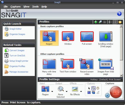
I needed a screen grabber, and based on recommendations from a friend downloaded the trial version of Snagit 9. I was impressed and disappointed.Impressed, because this is one potent package. It can do everything you may ever want to do about image grabbing. I particularly liked the “Scrolling window” option, for capturing a web page longer than one screenful. BUT… this program has an extremely complex and ornate user interface, giving you access to countless possibilities; and these are presented in the most colorful UI I’ve seen since my kids graduated from Fisher-Price. Take a look :

Snagit 9 User Interface

Compare this to Photoshop: powerful and feature rich, but its UI is simple, with minimalist icons in monochrome…

FastStone user interfaceI found this so distracting that I went and downloaded another shareware product, FastStone Capture (Ver. 6). Check the utterly simple UI to the right:

Note that 99% of the time, these few icons (including “Scrolling window”) cover all you need; the rest is accessible but unobtrusive in a drop down menu at the right, where it can’t distract you. Click a button on this tiny floating toolbar and the capture begins. The same icons exist in the Snagit window, but actually, once you click one there you then need to click the big red round button – which may make you feel powerful, but is a redundant action. Of course it’s a single extra click, but it’s also double the number of clicks required  in FastStone.

Interestingly, the development team at Snagit have a blog where they share their thoughts (commendable!) and there I read that “… we felt that the interface shouldn’t be competing for attention, but should fade away and allow people to focus on their content”. Sorry… good thought, but I can’t endorse the execution on it. Nothing about the baroque UI they built brings the word “Fade” to mind. Just compare it to the tiny toolbar of the FastStone tool.

Simpler is better, nowhere more so than in tools you use daily.

Something is wrong with our Notebook LCD screens, part 3

And now, following Parts 1 and 2, here is the last installment…

These days, more and more Notebooks come with displays branded by the makers as VibrantView, or CrystaslBrite, or OptiClear… exciting names indeed. What they all refers to is glossy LCD screens, which would be much better described as GlareMirror, or UglyReflector, or maybe just RazzleDazzle

Glossy screen on a Notebook computer

Photo source: Marco Wessel, under Creative Commons license.

The underlying idea is to remove the matte anti-glare layer on the older screens, a change which results in better definition and more vibrant colors, plus better outdoors visibility. All commendable attributes, except that the price you pay is a mirror-like surface that reflects windows, light fixtures and other bright objects, a problem that motivated the original matte layer to begin with. Solutions? Work in a totally dark room, or try to yank the screen around until you find a reflection-free angle. Note that the last works for a single viewer – these screens are most annoying when someone shows you something on their screen: maybe they found the glare-free position, but you, looking from the side or over their shoulder, will get the full blast of annoying reflections.

Now if the matte screens were bad – if their colors really sucked, or their focus was totally fuzzy, I can see the possible value of a trade-off; but TFT LCD’s have reached maturity years ago, and are a delight to use. So what got into the vendors’ heads, to throw in the glossy finish – not as a  rare option, but as a mainstream technology?

Something is wrong with our Notebook LCD screens, part 2

We discussed the recent trend that is eliminating the optimal resolution in notebook computer screens. Another undesirable trend is the move to widescreen displays. These days it is almost impossible to buy a notebook PC with the traditional 4:3 screen form factor; all new models boast a “wide” screen with a 16:10 form factor such as WXGA (1280×800) and WSXGA (1680×1050). In fact Lenovo, makers of the Thinkpad I use, have just proudly declared that they’re dropping all 4:3 screens in their new line of notebooks.

And what are they proud of? What’s so cool about giving us less effective screens?

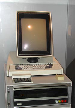
Xerox Alto system16:10 is a perfect choice if you want to watch movies, which come increasingly in wide formats. However, business notebooks are not intended primarily for this enjoyable purpose. They are meant to do business on, primarily word processing, email, presentations, and the like. And for this purpose, widescreen is totally inadequate. Documents are invariably taller than they are wide, like the paper pages they emulate; even presentation slides have a 4:3 aspect ratio. That’s why the venerable Xerox Alto (at right), sporting the granddaddy of all of today’s Personal Computer interfaces, had a “portrait” form factor screen: because you could process a whole page at once.

Now ideally, a wide screen might accommodate two pages side by side; and that works fine with a large external monitor. But Notebook screens are kept small for portability, and there is no way you can comfortably read two pages on a 14″ or even a 15″ screen. So you have to use the screen for one page, and since these screens are shorter (top to bottom) for a given diagonal size than the 4:3 type, you end up seeing less lines on a document at a given page width. You get more area at the edges of the screen, which you don’t need, and less height, which you do.

Like I already said, something is very wrong…

Something is wrong with our Notebook LCD screens, part 1

Something very odd is happening to the LCD screens on the Notebook computers that play such a major role in our existence.
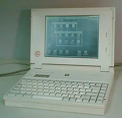
386 notebook with monochrome LCD scrreen

The first aptly named “laptops” had small, low-contrast monochrome screens that had “eye strain” written all over them (well, not all of them did – the Grid Compass, in 1982, had a lovely bright orange-on-black display). Then came the first color screens, like Passive Matrix and DSTN, which were also pretty poor; and the  screen grew slowly in size, though there was still much plastic surrounding it. And finally Active matrix TFT screens achieved affordable prices and became the standard, and their size attained the width of a the keyboard while resolutions reached 1024×768. We were at a sweet spot, with notebooks whose keyboard and screen were so good that one could use them ergonomically without even wanting an external screen. For anyone who grew through the earlier clunky technologies, this was notebook nirvana.

And then…

… In the last few years, we are drifting away from that bliss. New notebooks have screens that make less and less sense. In this post series I’ll look at a number of issues with these.

For starters: Native resolution.

As I said, a sweet spot for screen resolution was (IMHO) 1024×768 pixels (XGA) on a 14″, 4:3 screen. The trend in the last 4 years is to go ever higher: 1400×1050 (SXGA+), for instance, and beyond. Obviously, the higher the resolution, the more things you can show – more spreadsheet columns, larger unscaled hi-res images, more windows, more emails… but then, at a given screen size (say, 14″) these things are smaller in absolute size; text and icons become small enough to cause significant eye fatigue, especially for anyone over forty.

Now, in principle you can try to fix this problem by driving the screen at a lower resolution. Some users actually try that, with sorry results, because one thing about LCD screens (as opposed to CRTs) is that you must use them at their native resolution. This is because an LCD, unlike a CRT, can’t increase the physical pixel size. Reducing resolution from 1400×1050 to (say) 1024×768 means that each pixel must now span a square of approximately 1.37 by 1.37 physical pixels; but this is a physical impossibility in an LCD, where each pixel is a discrete physical electronic device. The display driver now attempts to solve the problem by shading the “half pixels” in intermediate colors and shades, and this results in an unacceptable degree of fuzziness of the entire screen.

A better solution is to set applications to use larger fonts, and/or to change the overall DPI setting in the display properties in Windows. This will indeed cause text and other elements on screen to become larger. However, it will not get you back to where you were with the 1024-wide screen, because not all elements will scale – for example, icons will become blocky, and images on web pages will remain tiny while text grows, badly distorting the layout of many pages. Basically, you’re jumping through hoops to make a hi-res screen simulate a lower-res screen – poorly.

Of course, some users may need the added pixels – programmers, graphic artists, even accountants… but they would be better off using a physically larger screen, either by buying a 15″ or 17″ notebook, or by using a large external screen. Ordinary users, however, are better off with the portability of 14″ (or less) and the unscaled text and crisp focus of the XGA screen. Not that anyone’s asking them… new notebooks have screens of 1400 or even 1680 pixels across. Since these must cost more to produce, while being harder on the eyes, it’s unclear why the vendors don’t offer low res screens as at least an option; but in fact XGA notebooks are now rarer than hens’ teeth. Go figure…
How to complicate instructions

We already saw how overuse of pictorial instructions can be confusing. Well, I just ran into a wonderful victory of this trend. I passed a large office copier – the Konica 7222 – and here is what I saw on its document feeder:

Konica 7222 Copier - Document feeder

These guys spared no effort in their belt-and-suspenders approach: there is large text, and tiny text, in every language you could desire; there are pictures, and icons, and arrows all over the picture… isn’t it just wonderful? Especially given that no office worker would need any of it except the “Face Up” bit?

Automatic car window controls

Electric car windows have become the norm these days; and one feature on them is “Auto”, where you can open or close a window all the way with only a momentary push on the actuator button. A useful feature, too.

What I find strange is the stinginess with which this feature is applied. In most cars, you only get it on the driver’s window, sometimes only for opening it. My Mazda 3 is of the rare few that have two-way (open and close) Auto on the driver’s switches for all 4 windows. Why is this useful? because it allows you to close all windows when you leave the car with two 2-finger clicks!

Speaking of which, we could use a “close all windows” button – a very useful function that I have yet to see on any car (I did see cars where the windows close automatically when you lock the car, but that can be a safety issue, I suppose).

Invisible writing on medicines

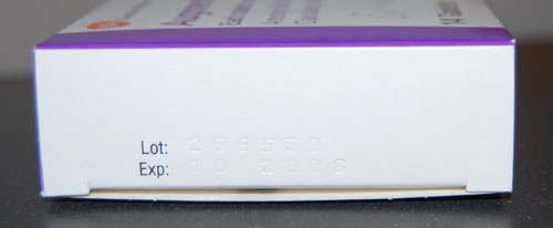
Here is a box containing some medicine. As the law requires, it has the lot number and expiration date clearly marked. Well, OK, not clearly… in fact, the information is barely visible at all. The law, one can guess, says nothing about the information having to be Legible.

Medication box

It’s not like making the text visible is so difficult… as the next photo proves.

Medication Box

Ultimate clarity, take 2

Remember those gloves with utterly superfluous instructions? Here is a new contender for “most unnecessary instructions”.

Frito-Lay Sunflower Seeds

This package of sunflower seeds, from the USA, bears the directive:

Eating instructions: crack open shells, discard shells, enjoy the seeds!

Nice try, Frito-Lay, but – Uh-oh! – you might still get sued by someone: you forgot to Frito-Lay Sunflower Seeds instructionstell them to chew before swallowing the seeds!

Actually, this one is so silly that I really can’t make up my mind whether they did it because of the usual rampant CYA, or whether someone at Frito has a sense of humor and is taking a jab at the trend of assuming we consumers are idiots. Any opinion?

A crash on the U-bahn: Windows and Non-PC applications

I was in Berlin, where they have a subway system that, though it dates back to 1902, is as effective as it is pleasant (part of this last may have to do with the fact that the tunnels are close to the surface, so there is less of the “going down to the bowels of the earth” feeling you get in systems like that in London; you descend a few steps down – or, in some cases, up, as some areas have the train above street level – and you are ready to travel).

Berlin U-bahn Monitor

Anyway, on the carriages they have ceiling-mounted screens that show a variety of local news and entertainment. Good idea. And then, one day, I look at the screen and I see that most recognizable of computer entities: the Windows error message dialog box. It stayed there for the entire trip, informing the fascinated travelers that it was “Unable to locate DLL”.

This of course elicited a few sniggers from the crowd, but there is a Berlin U-bahn Monitor with Windows error messagemore serious lesson here. If they figured Windows was the best tool to use on a public transport system, they’re welcome to use it; though Windows is, by definition, a system for the PC, and that stands for Personal Computer, not for Public Conveyance. However, when a dialog like this appears on my Personal Computer, as it does on occasion, I can take action, if only to hit the Vulcan Nerve Pinch key combination. But on a train there is no keyboard with Ctrl-Alt-Del, nor a Reset button. So why show us this useless gobbledygook? The system in this case ought NOT to show the dialog about the DLL; it should instead erase the screen and display a humorous image related to the situation and a message such as “We’re sorry, there is a malfunction. This is being addressed. Thank you for your patience”. Alternatively, the screen might simply switch itself off on program malfunction. Anything but the incongruous error message box.

Using Windows for non-PC applications may or may not be a good move, but it is happening in many places; at least there should be a version of Windows optimized for such non-interactive situations!

Copyright © 2025 Commonsense Design

Theme by Anders NorenUp ↑