Category: Bad design

Instances of bad design

Sygnet handsfree design flaws, part 1: Control cloaking

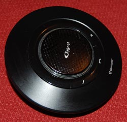
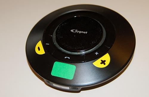
Sygnet Bluetooth HandsfreeWhen I got my Nokia E71 smartphone, I also bought a hands-free device for it: the Sygnet Bluetooth Handsfree Carkit model BTS600. This actually works quite well – it wirelessly identifies the phone on my belt when I get in the car, and until I leave the car all calls are routed to this device. Throw in voice recognition based dialing, and it’s convenient indeed.

Still, the controls of this elegant space age device – it really looks like a miniature flying saucer, doesn’t it? – embody some basic human engineering errors, ones that are all too common in other products; we can call them control cloaking and control overloading.

By control cloaking I mean making controls that are all but invisible and indistinguishable from each other. The BTS600 has only four controls: a power switch, and the three marked with +, – and a handset symbol. The user needs to identify the last three rapidly, at a glance, while driving a motor vehicle. So what would you do to make this easy?

I know what I would do: I would design large, obvious buttons, each differing markedly from the others in color (for daytime use) and in shape (for night time driving). Something like the three skyscrapers in the Azrieli Center in Tel Aviv – one round, one triangular and one square, and all impossible to miss…

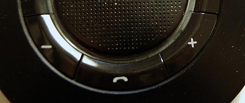
Not so the good engineers at Sygnet. They made the three buttons flat, and blended them into the device’s surface so elegantly that you can barely make them out – with tiny labels that are hard to read even when parked. And the device’s perfect circular symmetry makes it impossible to locate the buttons by their positions relative to its edges.

Sygnet Handsfree controls

And then there’s the matter of indicator lights. The device has two lamps: blue and red. You’d expect these to be visible from all angles; which would be the case if they protruded outside the casing. But instead they are sunk deep inside, under the clear plastic ring around the speaker grille. Again, very elegant – but quite invisible unless you look straight in.

Don’t miss the control overloading post coming up next!

Adobe Photoshop’s little infamy

It’s hard to speak ill of Adobe Photoshop. Even its painful price tag is well justified by this application’s incredible power, which I’ve been barely scratching in my many years as a faithful user. Still, there is one inexplicable sin its designers have committed.

Tastes vary, which is why Microsoft have included in their Windows OS the ability to customize the GUI’s elements. For my part, I do three things whenever I install Windows for my use: get rid of that incongruous green hill on the desktop, revert to the more businesslike classic (“Windows 95”) look, and make the menu font easier on the eyes by turning it Bold and, on high-res screens, enlarging it by a point. Since the whole idea is that this font tweak affects all programs running under Windows, I’m all set.

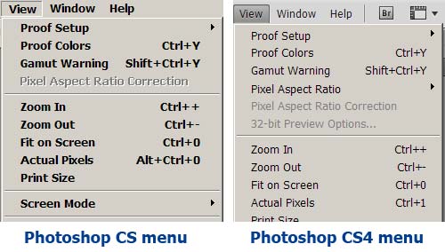
So what happens when I upgraded from Photoshop CS to version CS2? The menus are a tiny, skinny Normal font. The good folks at Adobe decided to violate the basic guideline that all apps must comply with the Windows UI preferences. The user’s preferences. My preferences. “So why do we care”, they say, “if you get a headache from peering at a tiny font? That’s none of our concern!”

Photoshop CS and CS4 Menus

But that’s not the end of the story; because in CS2 they also added the option, in Photoshop’s Preferences, to choose the UI Font Size! What Adobe hath taken away, Adobe now giveth back! Hallelujah! I select Large, restart the application as directed, and… various elements of the UI – Palette captions, for instance – are indeed larger. Except the menus. They remain tiny. Looks like they applied this “UI Font Size” setting to only part of the UI but not to the one they initially messed with.

And now I moved ahead to CS4, and I was hoping they’d seen the error of their ways and given us back control over our menus, one way or another. So I was hoping… but of course they hadn’t.

Take note, Adobe… that is bad, bad programming practice.

Quality, pure and simple

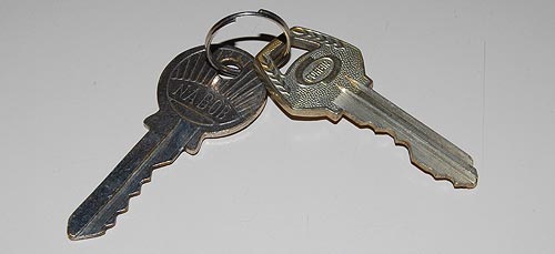
Quality is an elusive attribute, but you usually know it when you see it. For my part, I keep around a small memento that captures it very well, and comes from my years – long ago – as a forensic scientist. My main job at the time was around electron microscopy of invisible evidence, but there was also, at the other end of the complexity spectrum, a lot of straightforward examination of picked and mangled locks. I and my coworkers had ample opportunity to study the locksmith’s domain, and it was then that I put on one ring two simple cylinder lock keys from long forgotten origins that I felt capture the gap between high and low quality. Here they are: one made by Corbin and one by Nabob. Can you tell which is the better quality one?

Two cylinder lock keys

The better one is the Corbin key at the right. The feel for its quality is more obvious when you actually hold it, but the photo may suffice. And it goes more than skin deep, though the design of its bow (the “handle”) is certainly more thoughtful and elegant. Here are all the other ways in which the key at right is better than the one to its left:

  • Thickness. The Corbin key is thicker, hence more durable. In fact, the Nabob key already shows some bending along its blade, though it’s hard to see in the photo; were it in use, it would eventually break.
  • Profile. The Nabob has a flat blade, meaning its lock would admit any flat object to serve as a lock pick. The Corbin has a deeply convoluted cross-section that would make picking far more difficult (though still easy for a professional – these are both simple, low security keys).
  • Number of pins. The Corbin’s lock has six pins; the Nabob has five (reflected in the depressions on the blade). More teeth, more combinations, longer time to pick. (You can see this in my lovely cross-section of a lock, pictured here).
  • Quality of the combination. The teeth in the Nabob are almost the same height, making it far easier to pick with a straight pick. The Corwin has great height variations.

So many differences in such a trivial everyday object… do you wonder why I keep this pair as a representation of quality?

No, I don’t know anyone in the Ashmore Islands!

Two of the least pleasant-to-use GUI controls are the scrollable list box and its cousin the drop-down list, especially when they have many items listed. Of course, that’s exactly when they are indispensable… you can’t use radio buttons for 50 choices, so if you need to let the user choose a state of the union, a drop down list is inevitable. Likewise for countries of the world, or for their currencies.

But the way these geographic-oriented controls are implemented in software and web sites is really annoying.

Drop-down List of countriesTake the image at right, the list you have to go through to select a country for a new contact in Outlook and other applications: it opens on a list of ten countries, of which one – Argentina – may be even remotely likely to be inhabited by business contacts of yours. You can scroll down, of course… and in the next ten you find even greater concentrations of business partners, like the entry for the Ashmore and Cartier Islands, which are a group of small uninhabited tropical islands in the Indian Ocean!
Not that I have anything against the inhabitants of Ocean islands, or of Angola, Antigua, or Anguilla, but given the statistics, why should I have to scroll past them – and past Cook Islands, and Namibia, and Nauru, and Palmyra Atoll, for that matter – on my way to find the US, or the UK, where I really have many more contacts and affairs?

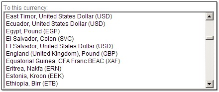
Or look at the next screen grab, from a web site for computing currency exchange rates. Do I really need to have Equatorial Guinea’s CFA Franc, the Eritrean Nakfa, and the Ethiopian Birr pushing down the Euro and the US Dollar farther away from the British Pound, just because of the accident of alphabetic order?

List Box of currencies

Obviously, the people of Estonia do care about the Kroon (and I care about the Israeli Shekel, also far from the heart of global finances). But what is needed is a list that gives the most common choices – the Dollar, the Pound, the Euro – by default at the top of the list, where 99% of users will benefit. And then we need personalization, so each of us in the rest of the world can put their country, or those they deal with, at the very top.

This can be done in many ways. One’s home country can be extracted from Windows Regional settings and put up front. Web sites may use cookies to remember which currencies you converted last time. Local software tools can keep my choices in the Windows registry. Smarter tools may learn from your past choices and bump them up the list in future. The techniques exist; it’s just that someone should step out of the silly box and dump the alphabetic order in favor of what makes users more productive and less annoyed!

Multi-device remote controls

Used to be, a TV set had a remote control (used to be, farther back, it didn’t; but that’s prehistory). These days, however, everything has a remote control; indeed, I can’t wait for someone to create a tiny remote control for the larger remote control itself! 🙂

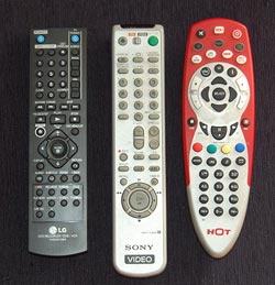
Three Remote Control unitsThe proliferation of these gadgets has created a real problem, and home electronics makers are responding by creating R/C units that can control more than one item; most typically, a TV set and the DVD, PVR or VCR feeding it.

Which is all very well, but how do you make one control work on many devices without confusing the user? There are different ways, and they vary in their usability a great deal. Let me illustrate with three units from my home: the remotes for (left to right) our LG recording DVD, our old Sony VCR, and the HOT cable company’s PVR. The first two can also control our Sony TV; the red one controls the cable box, the TV and a DVD or VCR. And each goes about the choice of function in a different manner, seen in the close-up photo.

Remote Control close ups

The R/C on the left simply has a section at the right dedicated to controlling the TV, with its own On/Off switch and channel and volume controls. This results in some redundancy with the controls of the DVD (which also has power and channel controls) but it completely eliminates any possibility of confusion.

The VCR controller in the middle incorporates a disappearing species – a mechanical slide switch at the top that determines what device is being controlled. The buttons on this unit change their role depending on the position of the switch, and have color coded dots to indicate whether they apply to the TV. Having to slide the switch is a bit more of a hassle than with the black R/C but at least you get definite visual feedback of which position you’re in.

The red unit works like this: you have to press the button (in the second row) corresponding to the device you wish to control; then, until you press another of these buttons, the unit controls that device. This is for sure the cheapest to produce; it’s all in the electronics. The price you pay is that there is no visual feedback at all; if you forget what you pressed, you will find yourself changing channel or cycling the power on the wrong equipment. There is also no labeling of which buttons work with which device.

All of these units do their job, but to my mind their user friendliness goes down from left to right. Not surprisingly, so does the cost to produce them…

A really poor choice for a freeway logo…

The Menachem Begin expressway is one of the better engineering projects built in Jerusalem in recent years, providing a rapid path for driving across much of the new city. It has cut my commute time to work by 70%…

Begin Expressway, Jerusalem

Image: Adiel lo, via Wikimedia Commons.

There is only one minor detail about it that I always find amusing yet annoying. The builders picked a logo for it, which is prominently displayed on the signs leading to it. And here it is on the left.

Begin Expressway Logo     Freeway Sign

Now, at first glance it seems highly appropriate for an expressway, showing lanes and an interchange. But when you look closely, you notice:

  1. The symbol is pretty tangled, like a knot really. Hardly the image of a freeway, where the main concept is that you zip right through. The standard freeway road sign, at the right, does a far better job of conveying this idea.
  2. There is no way to travel this path on a freeway interchange. At first I thought you might do it in the UK, where they drive on the wrong side of the road, but even that is not true – there, the road on the logo would cause cars coming from both directions to collide in the middle of the bridge.

What were they thinking!? 🙂

Polycom under siege

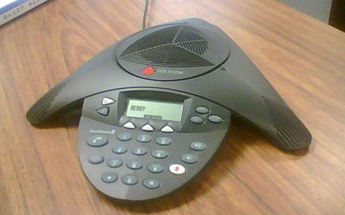
The triangular Polycom conference phone is a familiar device; in many companies there is one in every conference room. It is so familiar that few give thought to its miraculous ability to transmit high quality sound from one roomful of jabbering humans to another. In fact, this involves some pretty sophisticated technology for echo cancellation and noise filtering; to quote the Polycom site, “Automatic Gain Control intelligently adjusts the microphone sensitivity based on where participants are seated in the conference room”!

Polycom conference telephone

Image: Wikipedia, by Sweetness46, under Creative Commons license

A telephony engineer I once met explained to me that the microphones at the three ends of the Polycom are exquisitely optimized so the sound enters them just right, glancing off the table surface at the optimal angle, to achieve the best possible sound quality. Isn’t that smart design?

So what do we do, then? Why, we put the poor thing at the center of a round conference table and surround it with an impregnable wall of Notebook screens, as all attendees read their email during the meeting. There goes the exquisite design, the adjustment based on where participants are seated, the echo processing…

One can almost imagine a future generation of phones that can raise themselves on a robotic stalk to peer above the notebooks (OK, so this is more like an R2D2 kind of response than a likely reality). But in fact, I once visited a company where they mounted the Polycom on top of a 12 inch pole in the center of the table. It looked weird, but I’m sure it sounded great…

The tachometer – the most useless car component…

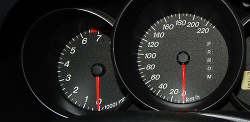
Modern car dashboards have numerous indicators and controls. Some are necessary: without a fuel gauge, for instance, we’d be in frequent trouble. Others are optional but quite useful: the rear collision warning beeper is a good recent arrival. But one indicator is totally unnecessary, yet present in a great many car models: the Tachometer, or engine RPM indicator.

Car Tachometer and Speedometer

This meter is very impressive, to be sure, and on a race car would be quite useful to help the driver wring the ultimate performance without destroying the engine. But this meter, at left in the photo, is not from a Formula 1 car; it’s from my faithful but mundane Mazda 3, with which I navigate the congested roads daily to get to work. You think I constantly glance at the tachometer to set the gears so my engine’s not redlining, when I’m stuck in traffic jams half the time? Even if I were so inclined, this car has an automatic transmission!

Fact is, nobody uses this indicator on a family car; yet the manufacturers put them in – adding just a little bit extra to the waste of energy and resources needed to produce the car. I suspect this is another of the cases where fashion, vanity and marketing get together to override commonsense design – we get this meter because it looks flashy, fashionable, macho… hey, I have an RPM gauge like the race track pros!

Millions made – none needed 🙁

LCD TV screens: can’t they just switch on?

One problem with CRT-based television sets and computer monitors was that they took a long moment to turn on, because of the inherent necessity to heat up the filament of the picture tube. How fortunate, then, that the new generation of flat screen displays does not have a filament, allowing them to turn on practically instantly.

But allowing is not the same as doing it. We bought this little 22″ LCD TV recently, made by MAG, and when you turn it on it takes a full 8 seconds before the picture shows up on the screen. And the last two of those seconds are devoted to showing the manufacturer’s logo! Opinions about User Experience may vary, but no one would argue that staring at a dark screen, with or without a logo on it, can really enhance that experience.

MAG LCD TV with logo on screen

With all respect, MAG designers, you’re welcome to etch your logo on the screen bezel in all its glory (as you have); but when I hit that On/Off switch, I want the screen to light up in 2 seconds, max. I know you could do it, if you set your minds to it!

The infamous Caps Lock key

Caps lock key on a modern PC keyboardEveryone knows that the QWERTY keyboard layout sucks, because it carries a legacy from the early typewriter days; still, we’re all locked into its use and live in oblivion of what we’re missing. But we have another legacy from mechanical typewriters that is hard to forget because it bites us daily. i REFER TO THE cAPS lOCK KEY.

It is interesting to trace the history of this design infamy. Originally, it made a lot of sense: in a mechanical typewriter the Shift keys did just that: they shifted the type mechanism vertically so the type bars would hit the paper with the uppercase letters; and the Shift Lock key would keep the keys locked in this position. This key had to sit right above the Shift key, because it physically latched it in a depressed position; hitting Shift again would release the lock. It was very easy to see (and feel) whether Shift was locked or not, because both keys would be depressed when the lock was engaged. The photos below are from an antiquated Royal typewriter; you can see how the Lock key holds down the Shift key on the right (and note the quaint caption on the latter key – Shift / Freedom, in allusion to releasing the Lock).

Shift Lock in an old typewriter

Early computer keyboards carried this idea forward, with a Shift Lock or Caps Lock key that had two physical positions: depressed for Lock, and flush with the other keys when released. You could therefore tell when you were in Caps mode, and would notice immediately if you hit the lock accidentally while touch typing. The delightful Commodore 64 had this feature, among others; the photos show a keyboard that came with the collection of homebrew boards described here, from the late 70s.

Two-position Caps Lock in a 1970s keyboard

Later, as keyboard makers sacrificed quality for cheap manufacturing, the more complex and different two-state key was replaced with a momentary key like all the others, with electronics to implement toggle action. Gone was the tactile feedback. Now a simple brush of the finger could accidentally lock you in Caps mode. Worse still, the position of the Lock key next to the left Shift key, which made sense a century ago, was retained – placing this relatively little used key right in harm’s way.

I don’t see manufacturers giving us back the 2-position key (it would cost them a few cents, after all), but the least they could do is move this stupid key to the top row, next to the Scroll Lock, where it will remain unused, unnoticed, and harmless.

So, what can we do about this? Well, one thing we can do is disable the offending key. No need to tear it out – I used KeyTweak, a free key remapping utility, to disable it on my Windows XP system. Good riddance!

Also, if you use MS Word, you may be unaware that depressing Shift+F3 repeatedly will change any selected text to lowercase, uppercase, and sentence case; a very useful feature after YOU’VE ACCIDENTALLY HIT sHIFT lOCK AND CONTINUED TYPING.

Copyright © 2025 Commonsense Design

Theme by Anders NorenUp ↑