Category: Bad design

Instances of bad design

More waste of time

Last year I reported on the inefficient design of a teleconference system, as far as respect for the user’s time is concerned.

Today I sat through a really lovely case of this design issue. This system, speaking with a booming, ebullient voice, took me through the following:

System: Welcome to the conference center!

System: Please enter your passcode followed by the pound sign!

[I did]

System: Please hold while your passcode is being verified!

System (1 second later): Your passcode has been accepted!

System: You can press Star-Zero At any time during the conference to receive additional assistance!

System: At the tone please say your name then press the pound key!

[I did]

System: At the tone, you will be placed into the conference as the third participant!

Obviously, it would’ve been enough if after the second line – once I input the correct passcode – the system had connected me. All the rest of this monologue is useless (OK, in some situations, asking me to say my name may be useful too; but none of the rest).

And in fact, when I was placed into the conference, another participant who had just run this gauntlet of useless chatter said “I wanted to yell at the system “Just SHUT UP!”

Not that the system would have listened…  🙁

Tiny phone, humongous software

I already praised my Nokia E71 smartphone, that marvel of miniaturized power. Well, today I tried to update Nokia PC Suite, the software that runs on my notebook to allow it to sync with the smartphone.

And as I was clicking through the installation process, something caught my eye in the dialog below:

Nokia PC Suite Installation Dialog

It was the number in parentheses: 290MB. That’s 290 million eights of binary digits.

And in case anyone thought this tool can calculate the answer to the question of Life, the Universe and Everything, or something equally formidable that might justify a size that not long ago would have sufficed for an entire operating system, the dialog explains: with this tool, you can connect your phone to a PC and access mobile content. I remember a tool I had long ago that did the same sort of thing; it was called LapLink and had fit on a floppy disk.

To be fair to Nokia, they aren’t the only ones pushing bloatware with their hardware; but the irony of a cool, tiny phone coming with a huge piece of support code is hard to ignore.

Use consistent terminology, WebEx!

Used to be, at the beginning of every (face to face) meeting ten minutes would be wasted on getting the slide projector going. Today many meetings are virtual, but the same time is still wasted while people try to log into the shared meeting workspace…

A case in point: I’ve just participated in a meeting using WebEx to share documents across the world. Nice. But the meeting started ten minutes late, because it took me that time to wade through the invitation email and figure out what I had to do. Now, I’m not perfect, but I’m an experienced IT engineer… so what was this delay about?

The meeting invite email (which was quite lengthy, and included no less than seven links, of which I only needed two) told me to dial into a tollfree phone number to join the audio part. When I did that I was cheerfully welcomed by a machine that told me to dial my “access code or meeting number followed by the pound sign”. I started to scan the email frantically looking for a meeting number or an access code; none were to be seen. The message contained various long numbers, mostly inside the link URLs, so I tried those in random order. The one that finally worked was the last one I tried (naturally) and it was the number the message referred to as my “Session number“.

So yes, maybe I’m naive, but if they want me to dial a session number, couldn’t the recording say “Please dial your session number“? Or, better yet, “Please dial the session number found near the top of your invitation email”?

The confused calendar of my E71

Here then is my sleek Nokia E71, and I really like it overall. But nobody’s perfect, right?…

Nokia E71 smartphoneTake the calendar application that came on this handheld. It has a number of shortcomings (more on these later) and one amusing quirk: most of the time when you click the calendar button it displays an empty screen with the phrase (no entries) at the center. Then, less than a second later, the actual entries for the day (in my hectic life, alas, there are always entries…) show up.

Obviously there are two routines involved, one to query the database for entries, the other to display “no entries” if there are none. It would take a minute to code it so the second routine would wait for the first to complete before shooting its big mouth off… and it would take the most rudimentary QA to discover this issue.

Sloppy!

Those conservative business cards…

Business cards have been around for a long time – very long, if you count visiting cards – so we should not be surprised if they tend to have an innate inertia to them. Still, business has changed so much in recent years – isn’t it time that the cards paid attention?

I was scanning a batch of business cards I got in a conference recently when I noticed an interesting fact: they may come in many designs and colors, but 90% of cards will have the contact information in the following order:

Physical address
Phone number
Fax number
Mobile number
Email address
Web site URL (if any)

Now this is interesting, because it has two attributes:

  1. It follows the approximate historical order the various technologies appeared in (first we had office buildings, then telephones, then faxes, etc.)
  2. It gives the items in reverse order in terms of usefulness, the least useful at the top: in today’s virtual, mobile, global world, we would most often use email to reach people, or a cellphone if they have one; faxes are not yet gone but may soon be, and physical addresses are only of marginal use in a “work anywhere” culture.

I had a friend, a master blogger and geek, who once said if he had his way he’d simply put on his card his name and “Google me!” – now that’s modern thinking for you! The closest you get to this are Moo minicards, those miniature cards that barely have room for a name, job role and email address.

Now that I noticed this I checked my own new card that I made after leaving Intel – and guess what, I had it almost right in terms of descending importance:

Name
Web site URL
Email address
Physical address
Mobile number (the only phone I use)
Fax number

Only the physical address stayed higher than it should be…

Dumb icons

The idea with the use of graphic icons as controls in web pages and applications is the they are a compact, fast way to represent an action. And that they do, very effectively, subject to one condition: the icon’s image should represent the action in question (Duh!)

So, an icon that causes the page to print should have a small picture of a printer. It should not have a picture of a hippopotamus. Right?

Well – consider the web site of the Israel Discount Bank. A customer can log in and see their account, which is useful indeed. And there are icons like these:

IDB site icons

Surely you can tell what each of these is supposed to do.

But then, there are also these icons, right above the account activity table:

IDB site icons

Care to guess what they mean?

Actually, the middle one means “Select columns”. Not that there’s any likelihood you’d figure that on your first encounter, but at least in later visits you will be reminded of this meaning. So what does the icon on the right mean? From comparing it to the one next to it, it would seem to be “Delete column selection”? But no – it means “Cancel filtering of data”. Totally unrelated to the image.

And the leftmost icon is a beaut: it means “Show all accounts”. A hippopotamus would depict that sentiment just as effectively.

Can’t these people think?

IVR woes: good idea – poor execution

I was trying to reach the customer service of a company just now. There I was, listening to the endless music of an IVR system, punctuated by the usual happy reminders that I am oh-so-appreciated by them and they’ll get to me real soon (liars!), when something happened. The recording declared that they were very busy so if I could leave my name and number they’ll get back to me. No option to keep waiting.

To their credit, the next step was done professionally – the IVR had me state my name, then key in my phone number, then confirm it when it read it back to me – so I have good reason to believe they will really get back to me. Which is actually better than the silly music. So giving me this way out is a good idea.

The bad part is, if they knew they were busy (and, assuming it’s a FIFO queue, they had the necessary information – my place in line – as soon as they picked up my call) – why wait for long minutes of stupid music before switching to the leave-your-name-and-number routine? They’re giving the customer the combined worst of both solutions!

Standardization of charge indicators (Not!)

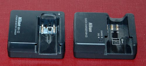
These days we all have at least half a dozen gadgets whose batteries require charging, and they each come with their own charger (incompatible with all the others, of course). Now, I won’t push for standardizing the chargers – can’t aim that high – but here is a more modest goal: can we please standardize the status indicator LEDs on them?

Nikon camera battery chargers

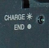
Here are two chargers that came with my two Nikon cameras, the old point and shoot and the newer DSLR. No, they are not interchangeable, even though the batteries are both Li-Ion and of the same voltage. Both have a LED indicator that blinks during charging and stops blinking when done; however, in one it stays lit when there’s no battery inserted, and in the other it stays unlit.

Nikon D40 battery charger closeupBut the bigger problem is remembering what’s what when you come back later and the light is stable. You see, in these, this means charge complete; but in my cordless shaver it means that it isn’t; there, blinking indicates a full charge. Different vendor, and they probably just flip a coin at design time…

My own solution was documenting it all on a post-it note stuck near these chargers; but then Nikon must have realized that this is an issue, because in the later camera – my D40 DSLR – they labeled the charger itself to remove any doubt. Good move!

Little Big KVM switch from LevelOne

I have a desktop and a docked notebook on the same desk, which I never use concurrently, so I decided to reclaim precious desk surface by keeping only one screen, keyboard and mouse and switching them between the two machines with a KVM switch.

LevelOne KVM-0221 KVM switch

An online check discovered the cute KVM-0221 2-Port USB KVM Switch from LevelOne. It does what I need, it looks good, and – crucial for my desk reclaim purpose – it is tiny at a 100 x 65 mm footprint. So I ordered it.

And when I wired it, lo and behold: its footprint area was maybe 4 times the above. You can see why in the next photo:

LevelOne KVM-0221 KVM switch wiring

Here is the problem: in a day and age where small devices have the form factor we see in routers, i.e. a low box with all connectors at the back and all controls at the front, this device has the controls on the flat top and the connectors on all four sides! There is no way you can stash it neatly away at the edge of your desk, or fix it to the wall, or stack it under some other equipment. This cute little switch wants to have its own place in the sun, and let no other object dare to come close!

The two biggest plugs, by the way, also come from LevelOne – they are specially made to contain both video and USB lines – but I can’t imagine that they couldn’t have been made at half their length. Apparently, footprint was not on the LevelOne designers’ mind…

Sygnet handsfree design flaws, part 2: Control overloading

Sygnet Handsfree with stickersBack to my Sygnet Bluetooth Handsfree Carkit model BTS600. We saw its problem with cloaking the controls and indicator lamps… but on top of that, the people at Sygnet played a trick that is becoming very common in this digital era: they overloaded the controls and the lamps.

I use Overloaded in the Object Oriented Programming sense: the use of one operator or function name to perform several different functions depending on context.

The Sygnet device has three operating buttons and more than a dozen actions; so each button can do many different things. For example, the “-” button rejects a call if pressed for 3 seconds while the phone is ringing; it initiates voice recognition dialing if pressed for 3 seconds when the phone isn’t ringing; it cancels the voice recognition if pressed until a beep is heard; it cancels bluetooth device recognition if pressed for 6 seconds; it reduces audio volume; it mutes/unmutes a call when pressed concurrently with the “+” button; and it starts a conference call if pressed for 3 seconds while one call is active and another waiting. The other buttons likewise do a great many things; it’s so complicated that I carry the instructions in the glove compartment at all times! Needless to say, the captions on the device merely identify the buttons, not their functions.

The two indicator lamps, meanwhile, are similarly overused: The blue lamp blinks 3 times every 2 seconds to indicate an active Bluetooth link; it blinks rapidly together with the red lamp when the device recognizes the cellphone; it blinks every 2 seconds when bluetooth is inactive; it stays lit with the red lamp during charging, and without it when charging is completed. So now you need a stopwatch to figure out what it means…

To illustrate how excellent this human engineering is, consider its application in a ballistic missile situation: “Hey, Joe, does two blue blinks followed by a long beep mean a 3 second push on button D launches the missiles unless you first tap on button A, or does it mean the Mr. Coffee needs maintenance?”

So, what can we do about this? Well, by now you know my style. At least I could make the cloaked buttons eminently visible…

Sygnet Handsfree with stickers

Copyright © 2025 Commonsense Design

Theme by Anders NorenUp ↑