Category: Bad design

Instances of bad design

We aren’t all noobs!

One gripe I have with the help systems in many consumer software applications: they’re written with the assumption that we users are all clueless newbies.

Take the Microsoft Office tools: they have many advanced and powerful capabilities; it is both interesting and useful to know what exactly they do. But the Help system only gives you the step-by-step “How To”. Say you want to try the Auto-Summarize feature of MS Word, and are curious what exactly it does (I mean, beyond automatically creating a summary). How does the feature work? What algorithm is involved? How does it identify the important parts of the document? Knowing this is not only interesting; it can let us users know what to expect, and how to use the feature better. But all we are served is a sequence of steps like

  1. On the Tools menu, click AutoSummarize.
  2. Select the type of summary you want.

And so on. Necessary and useful for the computer-naive types, but not sufficient for the technical or curious.

I sometimes imagine the day when I’ll run into a button (perhaps in Word 2015?) that says “Stop world hunger”, and when I check it up in Help it will only say

  1. To stop world hunger, click the button Stop world hunger.

C’mon, folks, you develop awesome code – let us know what is going on behind the scenes. At least give us a link to this information after the stuff the noobs use is listed…

Thoughtless signage in lovely Florence

My relatives returned from a trip to wonderful Firenze, and shared some terrible experiences trying to get their rental car back to the rental office in that ancient city’s dense traffic. Which brought to mind my own experience in the matter some years back.

Firenze

I was trying to steer a course through all the one-way streets back to the car drop off location in downtown Florence, and no matter how hard I tried to navigate the narrow streets with my map, I always kept finding myself forced back to the same spot by the one-way street signs. The only way to the rental office seemed to be through a street blocked with a “no entry either way” sign.

It was only after the second or third try that I noticed a tiny text sign under the round no entry sign.

It said “except for car rental returns”.

In pure Italian...

Photo courtesy echiner1, shared on flickr under CC license.

Coffee cans and Bees

Recently Elite, a major manufacturer of chocolate, candy and coffee in Israel, launched a campaign to prepare us all for “the same beloved familiar taste in a new packaging”. Every instant coffee can had a sticker heralding the change, then the new cans came out with stickers extolling it.

Elite coffee cansNow actually, the change is minimal and mostly unimportant, as you can see in the photo of the old can (at left) and the new. They have a slightly modified graphic design, but it’s the same good ol’ coffee we’re all addicted to. But there is one change that caught my eye: the new can is noticeably taller. Since both contain 200g of the same powder, you’d think it was also thinner; and in a sense it is, but not at the base; in fact the bottom and top are of identical diameter. The new can, however, has a “waist” in the middle.

HoneycombSo what? So, canned goods have to be stored, transported, and stocked. They therefore need to be packed close together; ideally you’d want them hexagonal, as the bees had discovered long ago. But even with round cans, you need to try and minimize wasted space. In the home this means minimizing shelf footprint, or base area; you want to be able to put as many of these on a shelf as possible. For shipping and storehouse space you also care about height, of course. But what you really don’t want is to have this sexy curvaceous can that maintains the same footprint but adds height by wasting unusable empty space in the middle.
Oh well, at least they have a new font in their logo.

Honeycomb photo source: Richard Bartz, via Wikimedia commons.

Poor error message design in a car

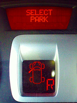
This morning I get in the good ol’ red Renault Clio, put it in reverse and start backing out, when the car emits a persistent beep.

Renault Clio warning displayI stop and scan the dashboard, and there I see a message on the alphanumeric display: Select Park. I do put the gear in Park, and everything is back to normal. I try to reverse again – beep and message return.

This makes very little sense, so I stop, pull out the owner’s manual and look for error messages. There is a pageful of them, but no mention of “Select Park”. I feel like those brisk officers in action dramas that say to their panicky men “Talk to me!”… but the car isn’t talkative, merely cryptic.

After a while I notice the overhead lamp is on, so I realize the door isn’t fully latched; I slam it shut, the car is happy, and I’m off to a day’s work. But the Select Park message is now a nominee for worst car error message ever. Consider:

  1. With the same display they could’ve made it say “Close door“, or “Door open“. Could’ve? Heck, should have!
  2. Note the lower display, which does indicate an open door. Problem is, the Select Park message is so much more prominent and puzzling, that the second display failed to register in my mind altogether.
  3. The beep and text alert only work when you’re in reverse motion. This makes no sense, and had me looking for a cause to do with this specific mode.

Bottom line: error messages should explain causes, either directly (Door is open!) or indirectly (Close the door!). A message that essentially says “Freeze! Something is wrong!” is no good.

Google Mail attachment guidelines: tell it like it is!

I sent a friend an email with an attached Zip file. It bounced, with a message from “System Administrator” that read

Your message did not reach some or all of the intended recipients.

Subject: xxxxxxxxxxxxxxxx
The following recipient(s) could not be reached: xxxxxxxxxxxxxxx …

552 5.7.0 review our attachment guidelines. u14sm9443132gvf.20

I figured maybe the note is from my friend’s system – maybe the file was too large? So I resent it to him to another mail address, with the same outcome. Then it occurred to me to mail the file to myself… long story short, eventually I went to the source of all wisdom – ironically, Google – and discovered that Google Mail, through which I was sending, has a policy forbidding any zip file that contains an executable (which my attachment, quite lawfully, did).

So I sent the file via yousendit, and that was that. But it did occur to me that I would’ve saved a lot of time had Google Mail elected to phrase their bounce message in human-friendly informative terms, such as:

Your message did not reach some or all of the intended recipients.
– – –

It was blocked by GMail’l outgoing mail server, because it has a zip attachment containing an executable file. GMail does not allow this. For more info, see http://…..

Not as succinct as u14sm9443132gvf.20, but rather more useful, don’t you think?

Parking lot design snafu

Here is a photo from a parking lot. As you see, one parking spot has been mutilated – apparently, as an afterthought – by sticking two poles in it.

Parking spot with poles

The intent, clearly, is to keep a clear path to the stairs leading to the sidewalk above. A valid idea, but ill-executed in so many ways…

  1. This is a normally full lot. Given that, most drivers would much rather have an extra parking space available, and wiggle their way in between the cars on their way out.
  2. Possibly the idea is to allow access to people in wheelchairs or with baby prams, but if so, they should’ve built a ramp, not a staircase!
  3. The two poles are just far enough from the right edge of the space that sub-compact cars can and often do try to park anyway, thereby blocking the passage even worse than they would have absent the poles. If the designers wanted to ensure free passage, they should’ve used four poles, fencing a passage from the stairs that is wide enough for a person and definitely too narrow for a car.
  4. Of course, if they did that, they could’ve used much less width than is being wasted now…

Not rocket science, but it isn’t only in rocket design that it pays to think before doing things.

A loop of helpful helplessness

I called someone in the US and he wasn’t at his desk; the system helpfully informed me that the guy was not available but that I could

…please leave a message – or, during business hours, press zero for assistance.

It was during business hours.

I pressed zero.

The system cheerfully told me:

Please hold! Someone will be with you shortly!

It was, technically, right. Quite shortly afterward, a nice woman picked up and I told her who I needed to talk to. She said:

All I can do is transfer you to his line, sir.

Which is exactly where I came from.

Whoever designed this flow spared no effort to  integrate humans and machines into a single loop of helpless helpfulness. Or is it helpful helplessness?…

Automated customer service…

My account on a social networking group froze me out, so I wrote their support an email explaining that I can’t log in, with details of how this came about. I got a wonderful reply indeed:

Please follow the following steps:

1. Log in to your account

Wonderful! I replied “You’re joking, right?” and reiterated the situation. This time I got a reply from a real human (she signed it with a name, not “The help team”) who politely apologized for the automated response and proceeded to help.

So, instead of blogging about a silly support person, I’m blogging about a silly automated surrogate of a support person. Of course it’s hardly news that machines shouldn’t be trusted with solving our problems – remember:

Dave Bowman: Open the pod bay doors, HAL.

HAL: I’m sorry Dave, I’m afraid I can’t do that.

Oh well… all’s well that ends well (though not for Frank Poole).

More disempowered power sockets

A couple of weeks ago we saw a poorly designed twin mains socket. Whoever designed that one wasn’t very bright, but he was a genius compared to the person who mounted the socket strip we see here:

Mains socket strip mounted above a conduit

Mains socket strip and plugI found this setup in an office building. Ignore the shoddy execution of the cable conduit below, but ask yourself, what was this electrician thinking, when he mounted the power strip in this specific position above the conduit?!

If the issue isn’t obvious to you, The photo at right shows where the problem is. This one goes beyond poor design, beyond incompetence, to open entire new vistas of poor craftsmanship.

Disempowered Power Socket

Single and Double 220V mains sockets

Here are two mains power sockets from around our home. One is a standard grounded 220V socket. The second is obviously much better: in the same space, for the same trouble, it takes two plugs! In the USA this is of course standard practice; all wall socket panels have two sockets. Here, though, this is less common, perhaps because our plugs are larger. So – isn’t that twin socket neat?

Twin mains socket in useWell, it would have been, if the designer had been thinking. You can see the problem in the next photo: most grounded mains plugs have the cable coming out the side – and this means the second socket in this panel is obstructed by this cable. All it would take to fix this is to build the panel the other way around, with the ground connections on the outside rather than facing the center, or better yet, place the two plugs side by side with the cables going down towards the floor. Cost and complexity of production would have been identical; usefulness would have doubled.

Shame!

Copyright © 2025 Commonsense Design

Theme by Anders NorenUp ↑