Category: Bad design

Instances of bad design

Mini, Maxi, Silly

As a conscientious techie I do what many car owners don’t: I chCoolant reservoireck the oil and other fluids in our cars once a month, rain or shine. But our latest car, the 2007 Renault Clio, seems determined to foil this good intention.

It used to be simple: A fluid would either have a straight dipstick with marks for Max and Min, or a clear reservoir with lines marking these two limit levels. The new Clio, however, abuses these age old concepts.

Renault Clio 2007 Engine compartmentRenault Clio 2007 Brake fluid reservoir

Like most modern cars its engine compartment is as densely packed with systems as an animal’s belly is with entrails; and the clear reservoirs for coolant and brake fluid are so positioned that there is no way on earth you can see all the level lines without either a dentist’s mirror or X-Ray vision. You can see the Maxi lines, but the Minis are hopelessly hidden (see photos).

As Obelix would’ve said: Ils sont fous, ces ingenieurs!

Renault Clio 2007 coolant reservoir

Fit, misfit and unfit

Our kitchen light fixture started to char its plastic housing, so we went and bought a new China-made one, equipped with two concentric fluorescent lamps like its predecessor. It was only later, after much climbing ladders and drilling holes overhead, that the problem appeared: try as we might, fitting the two lamps seemed impossible to do. Then it became clear that it actually was impossible!

Googie lamp

The fixture had three equidistant radial arms to place the lamps on, and these each had metal protrusions to locate the neon rings in position. The problem was, no matter how we pushed and bent, the smaller ring would simply not fit – its diameter was wrong. Note that the two lamps came in the same fitted cardboard box with the fixture, right from the manufacturer!

At first we were so upset we decided to replace the contraption; but it then struck me that as it hangs there with off-center skewed rings it does have a retro charm reminiscent of the Googie style (think Jetsons or retro Sci Fi ray gun designs). So for now, the lamp stays. Still it does boggle the mind that they’d sell a lamp that can’t be assembled, as if by design.

Aesthetics and Design: Boeing’s LAR rule saves the day

Passing through an airport I bought the book “Boeing 777: the technological marvel” by Norris and Wagner. This gives many fascinating insights into the novel design methodologies that went into the 777, my favorite jetliner. It also introduced me to one of the ugliest airplane designs ever to disgrace a designer’s sketchpad.

Boeing 767X - the Hunchback of Mukilteo

The Boeing folks were looking to build a plane larger than a 767 and smaller than a 747; one idea they tried was to graft half the cabin of a 757 on the rear half of the larger 767. You can see how endearing the result looks; in fact it earned the nickname “Hunchback of Mukilteo”, after a town near the Boeing facility.

There were many reasons why this version never proceeded off the drawing board, not least among them the disgusted derision of potential customers. But what I like best is that a key reason, according to the book, is that the design failed Boeing’s “LAR rule” – which stands for “Looks About Right”. If that is indeed their guideline, they are a smart company indeed: good design has an ineffable elegance to it, and no engineer should be forced to build something that offends their aesthetic sense.

Worth a thousand words?

Greg Bear’s hyper-imaginative Sci Fi novel “Eon” brings its protagonists to a parallel reality whose highly advanced post-humans use Picting to communicate; that is, they project in mid-air sequences of holographic icons to convey their thoughts.

This may work for post-humans… but can become a problem when mere mortals try it with excessive zeal. I refer to the increasingly common practice of using pictures and icons in signage and instruction manuals, even when written text would be far better. The notion that pictures are easier to grasp works fine for signs like “left turn” on a road, or “Danger – High Voltage” on a transformer, which are reasonably self-explanatory. And they are invaluable in instruction manuals when they illustrate some technical complexity explained in the text. The problem begins when those manuals start conveying complex concepts like “Don’t drop this camera on a hard floor”, which they might do by showing a person weeping as the camera smashes to pieces… Konica manual extract

Take this picture, from a Konica camera manual. Can you decipher its meaning? Fortunately the text on the same page explains: it means “The battery should be replaced when the flash takes more than eight seconds to charge”. That’s 15 words, and they are far better than the picture. And from the same manual (this time without a Rosetta stone in the text), the “Don’ts” in this mosaic:

Konica manual extract

The Thermometer I can get, and maybe the “Don’t take a screwdriver to this camera” (or is it, “Don’t stick a screwdriver in the lens?)… but the one in the center eludes me (“Don’t take photos on windy days”??) and the one to its right is a total mystery (“Beware radiation emanating from TV sets and refrigerators”? Or is that a Microwave oven? And since when do fridges emit anything?)

But no manual beats the one we have for our Electrolux dishwasher, which has a pull-out card that starts with exhorting its own virtues (top row, which merely illustrates one word, “RTFM”); then goes on to totally confuse us (is this filter cleanup due daily? Weekly? Daily, but only during the first week of each month?)

Electrolux dishwasher instructions

And then it shows this masterly rendition of “Help the environment by only using as much detergent as needed”:

Electrolux dishwasher instructions

Sometimes, I guess, a word (wisely selected) is worth a thousand pictures!

Car parts designed to smash up!

Last year we traded in our old Clio, and got the latest model. Nice car, as before, and it looks like the design engineers at Renault have been busy thinking of ways to improve it. Like the side molding on the doors: the new car has a turn indicator lamp right inside it!

Renault Clio

Now, though they’re often touted as “decorative trim”, these moldings have a practical function: they are essentially protective bumpers that absorb the usual nicks and scratches that the side of a car suffers all too often. To put a fragile light fixture in one, where it is guaranteed to break at the first scrape with a tree or a passing car, makes about as much sense as sticking your head out the open car window on the freeway. Of course, once it gets smashed, you can sell the customer a replacement part…

Renault Clio side trim before and after damage

So there, it happened to us! The Clio got hit lightly by another car, and behold… the turn light was shattered, the rest of the molding was fine, and the authorized garage insisted they can only replace both as one piece – not just the lamp, but the entire strip, made more expensive because it contains a lamp. One look at the photo can convince you that the two are actually separate pieces – note the different color of the plastic.

But hey, business is business!

Emergent misfeatures: more than meets the eye

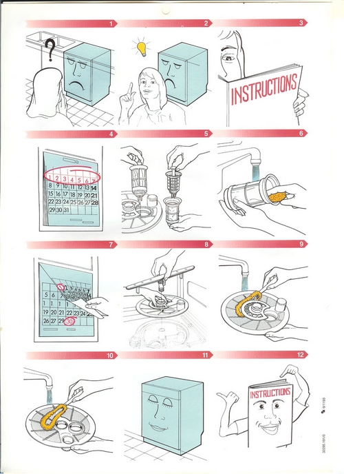
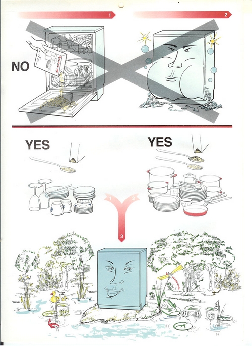
Any wise consumer checks the specification of the purchased item in the store, in order to know what he’s getting. Unfortunately, this does not guarantee a happy deal…

One day we decided to go buy a new TV set. We went to the store and selected a top notch Sony, with impressive specs. We took it home, set it up, put the resident teenagers in front of it… and they expressed major discontent!

It’s not that the picture was bad (it was crisp and vibrant), or that the sound was poor (it was excellent), or that the set failed to live up to the impressive specs on the box. The problem was that when you used the remote to channel-surf, instead of the Zap-Zap-Zap of the old TV, this one went Zapppp…… Zapppp……Zappppp… you see, the TV needed a whole second to blank the screen and bring up the next channel, making rapid switching an impossibility. You’d think a second is no big deal, but I had to agree with the kids: it completely obliterated the user experience of the surf.

Now, this is one thing I could never have foreseen. The feature list on the box did not say, “Optimized for a crummy channel surfing experience”; and having never had a TV that needed to think about obeying the remote, I never thought to check this in the store. It was an undocumented feature in the design – an emergent misfeature, if you will – that the buyer would only find out at home.

Here’s another: we have a Sharp microwave oven that has the useful habit of beeping once when the time is up. Cool. It has the slightly less useful feature of beeping again a minute later if you didn’t notice the first beep. Okay. And then it has the maddeningly stupid feature of beeping three times every minute thereafter, never relenting until you give it your attention. Hey, stupid oven, I heard you, but I’m busy right now – keep the food inside and shut up!

Again, this is an undocumented feature – one no salesman would tell and no buyer would ask, but one that delivers a major annoyance once you get the thing home. These examples showcase how the imagination of a bad designer in inventing misfeatures transcends the buyer’s ability to foresee them…

Come on, designers, have a heart!
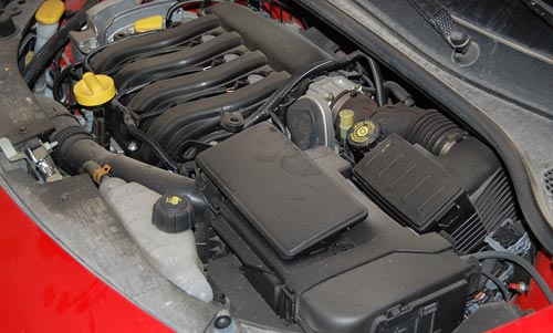
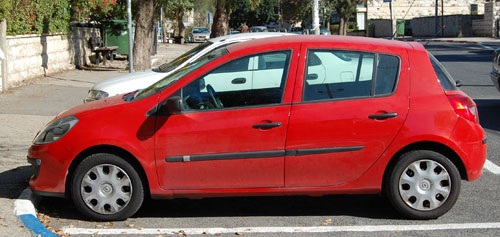
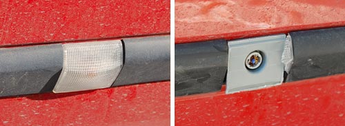
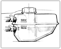
The Eject button: Location, location, location!

Here is our Toshiba DVD player. It works well enough, but its design does make you wonder…

I’ve already extolled its remote control’s virtues (Not). Well, here is the unit itself. You turn it on with the round button at the right; good enough. Then you look for the Eject button, to open the tray. And you look. And you look??? because it is in the wrong location.

Toshiba DVD Eject button location

The button is marked in the photo with the red arrow. The point is, that is the last place you’d look for it! It is there to open the disc tray, which is far to the left. You end up reading the button captions – and these are quite tiny and hard to discern, of course – until you find it.

To quantify the extent of this design crime, compare the DVD player with the VCR on which we have it standing. Compare the red and green arrows’ lengths. That’s the difference between Human Centric Design and… whatever it is they did on the DVD unit. See what I mean?

Eject Buttons on Toshiba DVD and on Sony VCR

LCD Monitor adjustment blues

So we’ve made the move to flat computer screens, which have many advantages over their bulky CRT ancestors; but the vendors pulled a fast one on us when it comes to the controls for adjusting the screen’s image.OSD on Samsung SyncMaster 913N monitor

In the good ol’days, every monitor had at least two round knobs, one for contrast, one for brightness. This is as good as it gets from a human engineering perspective. You just twiddle the knobs back and forth until your eyes tell your brain to tell your fingers to stop right there. Today, we have instead an On-screen Display (OSD), which some vendors tout as a good thing; in reality it is slow, unfriendly and confusing. The idea is that you use a line of pushbuttons the navigate a hierarchy of menus just to get to the function you need, and then you need to click a good deal more to effect the adjustment. To make sure this is easy, the buttons are often labeled by cryptic symbols in near-invisible relief (as in the photo below, of my Samsung SyncMaster 913N); and the logic they use, though simple, is far from intuitive. This may be justified – indeed inevitable – for accessing the numerous advanced functions that did not exist in the CRT days; but couldn’t they have left alone those more basic controls?

That’s progress for you (sigh)…

Control buttons on Samsung SyncMaster 913N monitor

So, what can we do about this? Adding analog controls is not realistic on these super-integrated monitors. The only thing left, which actually removes much of the confusion, is to do what the vendor should have done – mark the controls with visible labels, as I’ve done:

Labbeled Control buttons on Samsung SyncMaster 913N monitor

Artsy design is not enough!

The trendy-looking kitchen tool in the photo, made by Koziol, is called “Mia” for some reason. Its purpose is to test Pasta: the frilly head is surprisingly adept at scooping (and holding) a few pieces of short Pasta (penne, fusilli, etc) out of the boiling water; and you use the hook at the other end to fish a strand of spaghetti. Then you can bite them to see if they’re underdone or just right (that is, “Al Dente”, not overcooked and mushy!) And the ring may be for measuring one-serving batches of uncooked spaghetti.

Koziol Mia pasta scoop

A useful little tool, addressing a real need – catching pasta in boiling water with a fork or spoon can be quite vexing. And it has a lovely zoomorphic design, like all of Koziol’s humorous, artsy kitchenware. It even has two depressions for eyes…

BUT… as it came from the store, it had one major design flaw: the deep scoop of the “head” catches not only fusilli, but also a spoonful of boiling water, which can all too easily spill on your hand as you try to grab your tasty catch. As a fishing net analogue, it has no holes!

Koziol Mia pasta scoop improved

So, what can we do about this? Sometimes, what an industrial designer messes up, we can fix by ourselves. I used a fine drill to deepen the eyes until they punched through, making excellent drainage holes without destroying Mia’s funny face.

Car window wiper mystery

This one has been bothering me for years: why don’t all cars have rear window wipers?

Typically station wagons, hatchbacks and all sorts of minivans and SUVs have one; but ordinary four-door cars almost never do. Yet the need is identical: why, then, discriminate against these?

If you have a good answer, post it in the comments!

Copyright © 2025 Commonsense Design

Theme by Anders NorenUp ↑