Author: Nathan Zeldes

http://www.nzeldes.com

The HP150 Touch Screen: a cautionary tale

Not all cool ideas are actually good.

Back in 1983, around the time the IBM PC made its debut, my boss at Intel had acquired a very innovative personal computer: the Hewlett Packard 150.

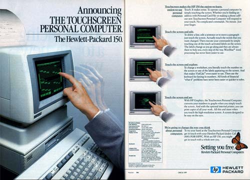
I remember it well; it was a really cool machine – at least in the context of its day: it had an 8MHz (yes, 0.008 GHz) CPU and 256KB (0.000256 GB) memory, as well as two floppy disks of 270KB each. It also had that solid look and feel that the better companies gave their machines when they could charge thousands of dollars for them. But what made it super cool was the screen, and the ad here shows you how proud HP was of developing it:

HP 150 poster

Photo source: Vintage Computing and Gaming.

The HP 150 had the first Touch Screen I’ve ever seen on a commercial computer. It was actually a regular nine inch green CRT, with a bezel that had holes all around it with IR emitters and detectors in them; sticking a finger at the screen would block some IR rays and tell the computer where you were pointing. And this is where the designers had failed: they forgot that the human arm is not designed to be held in the air, poking at a surface in front of one’s face. The resultant muscle fatigue was known as Gorilla Arm…

That alone was enough to relegate this screen to the junk heap of failed ideas, and touch screens would have to wait for tablets and devices that can lie flat on a tabletop or be held in one’s hand.

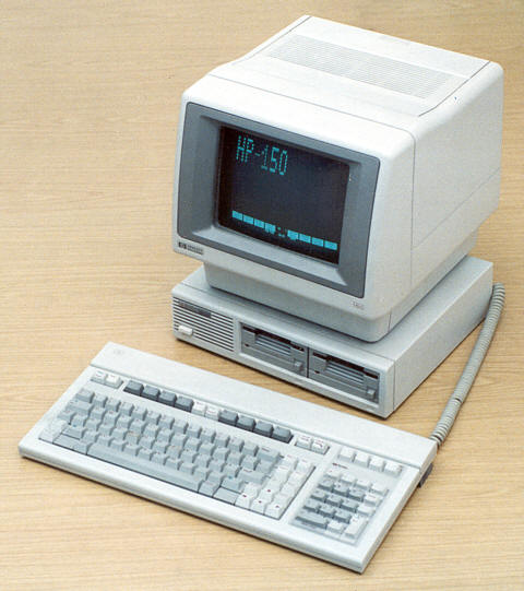
Still, you have to admit it was a good looking machine!

HP 150 computer
Photo source: Computer museum, Stuttgart University.


An extinct keyboard layout

While taking in the wonderful Israel Perosnal Computer Museum in Haifa I came face to face with the Intelligent Systems Compucolor II, a bizarre 1977 home computer built into a repurposed 13″ TV set.

Intelligent Systems CompuColor II home computer

What drew my attention was the strange keboard layout: the arrow keys were clustered at the top right corner. This is in contrast to what you will see on every keyboard in the present century, where these keys are invariably at the bottom right of the keyboard.

CompuColor II Arrow keysSo, here we see a layout that has disappeared without any living descendants: an extinct primordial denizen of the keyboard universe. And for good reason: the standard location puts the arrows nearest the user, where the CompuColor II had them farthest away. It’s bad enough that the mechanical issues of old typewriters forced on us the QWERTY layout, with the most used keys out on the top letter row; since those typewriters did not have arrow keys, there is no reason to apply the same counter-ergonomic approach to them too!

It is interesting to note that unlike today’s notebooks, where space is at a premium, the keyboard in these photos has lots of free space around it, and is no doubt made of individual switches; so there was no reason to put the arrows in this awkward position. Someone just hadn’t thought it through. And of course those were early years for home computing, with each manufacturer trying their own ideas, resulting in an Ediacaran Fauna of weird form factors (remember the venerable Commodore 64, whith only two arrow keys that you SHIFTed to move in the remaining directions?). Small wonder, then, that most of these experiments – like this one – left no trace except as museum fossils!

One comment on the Samsung vs. Apple litigation

Now, I hate litigation, and like many would rather have companies focus on innovating for the greater good; also, I happen to like Android a lot. Nevertheless, I think many criticizers of Apple in its recent victory over Samsung are missing a key point.

The argument goes, Apple sued Samsung for producing smartphones that are rectangular and with rounded corners – how lame is that?!

iPhone

Yes, that is lame. But Apple also sued about many other alleged infringements, including the application in a handheld device of multi-touch gesture input – the now ubiquitous  “pinch to zoom, flick to scroll” kind of user interface that we all love. And that is a whole different story – one that is hardly lame…

I remember well my first encounter with an iPhone. I remember the feeling of wonder, the ecstasy of experiencing this incredible UI paradigm. It was a  revelation, a true revolution, on a par with the first appearance of the mouse-based WIMP interface (which, as an ironic aside, Apple seems to have copied from Xerox for the Lisa and Macintosh computers in the early 80s). It was pure innovation, and with it Apple enabled the very concepts of Mobility and Computing that we all benefit from today.

And that is what Samsung – and Android – had taken from Apple. The overall concept, the basic paradigm, that the iPhone embodies. And yes, I too would have preferred that Apple adopt a more open mind about sharing their technology, but that is not my choice to make.  Until they do, let no one say that they’re a bunch of spoiled, un-innovative, litigious whiners suing about the rectangle with round corners. I really think we all do owe them more respect than that!

Photo credit: William Hook under CC license on flickr.
Peugeot’s breakthrough in Crystallogrpahy

snowflake symbolOne of the first scientific facts you learn as a child is that snowflakes, those lovely art creations of nature, have a six-fold symmetry. And they do; the properties of water molecules see to that. Hence the standard symbol for snow (and freezing, and cold in general).
One of the much later facts you learn as a scientist is that crystals almost never have five-fold symmetry. The rare few that do are called quasi-crystals; my countryman Dan Shechtman got a Nobel prize for discovering those.

So imagine my surprise, on traveling in a Peugeot 308 recently, when I looked at the gear shift and saw a button marked with this amazing symbol:

Peugeot 308 Snowflake button

The button apparently activates a special program for driving on snow, a wonderful feature (though not, really, in hot Israel); but what on earth were these French designers thinking with this five-pointed abomination?

Form contradicts Function!?!!

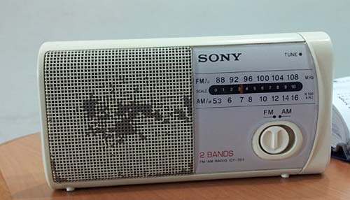
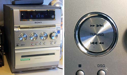
Sure thing, Form should follow Function… but some designers haven’t heard of that. Like the Sony designers responsible for the two weird design choices below.

Round knobs are round because they need to be gripped and rotated… an optimal design for our opposable-thumb grip.

But the radio below has a round knob whose function is to slide right and left between two positions. There are wonderful switch designs for that, some going back to the Industrial Revolution… and their oblong form reflects the lateral movement. Not here, though…

Confusing Round Knob on a Sony radio

And then there’s this little stereo system I use in my home office:

Sony Stereo System with odd knobs

This has four shiny round knobs, of which one – at the right – actually rotates to control the sound volume. The other three are flush with the panel and are actually two-way momentary push-button switches – you push the top or bottom part of the control for a “click” that might advance the tuning or track up or down. The use of a round form here is an abomination, and each time I use them I go into a tiny cognitive dissonance. Fortunately, the sound quality is good enough to put me in a forgiving mood…

Heterodontus Portusjacksoni

The intense pressure of natural selection has given us many magnificent examples of optimized design in nature. Here is a lovely case: the dentition of Heterodontus Portusjacksoni, the Port Jackson shark. I saw these jaws at a nature museum and just had to snap a photo…

Heterodontus Portusjacksoni shark jaws

This shark has unusual teeth – none of the flesh-ripping daggers that the “Jaws” movie brought to fame (while giving sharks a bad name that may help drive them to extinction). It feeds on mollusks, and uses the tiny spiked teeth in front to grab them and the blunt ones in the back to crush them.

But what I found most appealing is the geometrical structure of the entire set, which has a mathematical elegance and hints at a similarly elegant growth mechanism. One can imagine that the whole complexity of these teeth is generated in one continuous process governed by a very simple equation. Just like a fractal…

Math and nature and beauty, all in one chunk of bone! Heterodontus Portusjacksoni shark jaw close-up

How not to design a sign

I came upon this well-meaning sign at a university guest house. Can’t fault its call for responsible behavior, but what were they thinking when they created it?

Poorly designed sign

It never ceases to amaze me how little attention people pay to creating text that is easy to read. You see PowerPoint slides with red text on a blue background, which is an incredibly poor choice for visual contrast. And here they were perhaps thinking that the visually cluttered garden in the background would make the lettering easy on the eyes!

Though,  to be fair, they probably weren’t thinking at all…

Education and Fun in a boxful of seeds

Children in Oregon can enjoy giant redwood forests… but here in the holy land a semi-arid climate and millennia of human abuse force us to make do with less. Still, the humble grasses, weeds, wildflowers and thorny shrubs that we do have make an exuberant comeback every spring; and they remind me of an unforgettable nature study assignment given us by my elementary school teacher long ago.

The idea was simple: we had to collect as many different fruits of wild plants as we could find. These we had to pack in small cellophane sachets and bring them to class. Sounded trivial… until, a few weeks later, I had close to 100 different specimens, enough to fill a shoebox (the universal storage solution in those pre-Ikea days). That box is long gone, but I stopped at a nearby field and shot two photos of species that must’ve been in it back then.

Plant fruitPlant fruit

In addition to the obvious fun of having to hunt through the fields, we learned two lessons: that there is a huge diversity of plant life (after all, we filled our boxes within walking distance of our homes); and that plants were fascinating! We were afforded a first hand look into nature’s manifold ingenious ways to solve the problem of seed dispersal; you can bet we also took the time to open the fruits and see how they worked…

In case you doubt this is interesting, here is a section through the fruit of the unremarkable-looking plant in the left photo. See the burrs that attach to passing animals (or kids!); the skin that is designed to break open when dry; and the seeds that would spill out at that time. Fascinating – yes, even for an adult!…

Seed pods

At last, a sensible exit sign!

Those depressing multi-story parking structures are an unavoidable part of a driver’s life… and they can get quite annoying when you need to find your way out of one. Sure, there are signs. Here, for example, is one garage that takes no chances on our missing the exit, and advertises it bilingually and redundantly:

Car Park Exit Signs

The only problem is, it fails to say whose exit it is to the right: pedestrians or cars? This is a very common sort of confusion in such car parks, since cars and people exit them from quite different places.

Car Park Exit SignSo here is the right way of doing it! The sign to the right (found on another level of the same car park, strangely enough) leaves no doubt whatsoever: cars should exit to the right. I don’t remember if they had a similarly unambiguous sign for pedestrians, though those are usually marked with a running person for safety reasons. Anyway, isn’t this simple sign design convention something that every parking structure in the world should have?

Copyright © 2024 Commonsense Design

Theme by Anders NorenUp ↑