Author: Nathan Zeldes

http://www.nzeldes.com

Weirdest napkin ring design ever?

I was at a fancy home and kitchenware store and saw the box in the photo here, containing – it says on the front – “Salt & Pepper Napkin Rings”. This sounded weirdly intriguing, like “Oregano & Thyme Spark Plugs”, so I took a closer look. Turns out this is one of the stranger design ideas I’ve had the pleasure of meeting.

Salt & Pepper Napkin Rings BoxNapkin rings, in case you haven’t dined in the fancy places that use them (I don’t, but my grandmother used to have them before paper napkins appeared), are used around linen napkins when setting a table. What do they have to do with condiments? Well, as you can see in the close up, each of these rings has two inner compartments that can be filled with salt and pepper, giving each diner a personal set of shakers… combined into one unit (a dubious idea IMO), integrated into the napkin ring (a terrible idea IMHO).

Salt & Pepper Napkin Rings

So why is this a bad idea? Many reasons, from the hassle of having to keep them all filled, to the inevitable spills when a ring is overturned, to the difficulty keeping one condiment in while pouring the other out… but primarily, because why on earth do it? A Swiss Army Knife has its benefits when you’re a Swiss soldier, or a boy scout… but not every set of disparate functions need to be designed into an uneasy coexistence!

Have to hand it to them, at least… if you ignore the two plastic stoppers, the ring is surprisingly elegant looking! 🙂

A new way for elevators to crash

Crashed ElevatorWhen Elisha Otis invented the ‘safety elevator’ mechanism in 1852, elevator crashes have become a rare event indeed. But these days “crash” has a new meaning, which Otis couldn’t have foreseen. Consider the elevator in the photo, from the Azrieli towers in Tel Aviv. It has a wonderful new control system with a large computer screen to tell you what’s going on.

And, as you can see in the photo below, it has crashed…

Crashed Elevator controller

Too bad the weary traveler has no way to follow any of these cryptic instructions.

In fact, we run all too often into this situation: a  computer-embedded system that sends admin-level error messages at a user that has neither the ability nor the expertise to address them. A simple blinking red light captioned  “malfunction – call maintenance at tel. 1234567” would at least be actionable!

A cozy home for lost baggage

Every seasoned traveler knows the drill: you go to baggage claim, everyone’s bags arrive except yours, and you start running around to try and locate it. If you’re lucky, you end up finding your suitcase standing, forlorn and confused, with a few other bags in some corner or another. How it got there nobody can tell, and you don’t ask.

Lost Baggage

Imagine my delight when I saw, in Newark airport (if memory serves!) this elegant setup. All the orphaned bags were collected in one place, safely locked but visible to all, so you could claim them with ease.

Good idea!

Stupid tape measure!

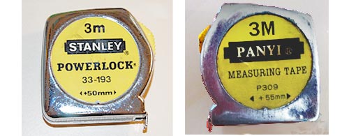
Here are two retractable tape measures. The one on the left is a classic by Stanley, the other, made by Panyi,  clearly a cheaper clone. Looks the same, works the same… except for one small difference.

Notice the difference?

Tape measures by Stanley and Panyi

This type of tape measure has a stated offset printed on it, equal to the width of its metal case, to allow taking inner measurements. In the Stanley unit, the number is +50 mm, a clean round number that’s easy to add to the number you read on the tape. I also have a Stanley tape of different design that uses +60 mm… again, a nice round number.

But the cheap knock-off uses +55 mm – far less easy to rapidly add in your head. Couldn’t the manufacturer bother to add or subtract 5 mm to the case size?…

Bad, bad designer!

Guest post: Elevator button usability

Today we have a guest post from our loyal reader George Trudeau of Hyannis, Massachusetts.

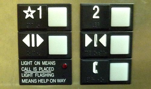
George sent me this photo:

Elevator Buttons

And here is the story:

I went to a Doctor appointment and took the elevator up to the second floor office by pressing the great big 2.

When I left the office, I was still thinking more about my appointment than how to operate an elevator, so I pressed the button under the 2, the doors closed, and I returned to my thoughts. Eventually I realized nothing was happening so I pressed the button under the 2 again… It even has arrows pointing to it.

If I wanted to go sideways I might have pressed the right button the first time.

Nice catch! Not only is the up/down direction represented sideways, but the line in the  “Close doors” icon does look like a “1”  in the same style of the “2”. Of course, you have to be distracted to make this mistake… but usability is about ensuring proper user interpretation even when distracted!

How to make headlamps expensive

Here are the headlamps of two Mazda cars. On the left, a Mazda 323 from the first half of the past decade, the other a Mazda 3 from the second half. Both fine family cars.

See the difference in design strategy?

Mazda Headlamps

The car on the left has the headlamp split into two parts. The one on the right uses a single assembly.

Why do I care? Because when either lamp gets broken in an accident – and for the outer, the turn signal, this can be even a minor scrape – you need only replace one small cover in the older car, and the entire large assembly in the new one. An assembly they will charge you a ridiculously high sum for.

And yes, some may find the newer design more aesthetic; but the modern highway is a battlefield, not an art museum. We’re better off with cars designed with repair cost in mind. But then, it’s easy to conjecture that that’s what they are – just not in the owner’s interests…

All shine, no legibility

Here is the control panel of a counter-top cold/hot Tami 4 water bar. Push a button – you get hot water. Push another – here’s a refreshing cup of cold water.

But… which button?!Shiny buttons on a Tami 4 bar

Of course, that’s why the buttons – all seven of them, for there’s a lot more you can make this glorified water faucet do – are labeled! The problem is, only one – wisely perhaps, the one labeled “Extra hot” – can be easily read. The others have the label printed on mirror-like shiny surfaces in light gray, which means you need just the right angle of lighting and viewing to make the text out at all. See the photo – the legends on the right are visible (though at very low contrast) while of the two on the left the top one is just barely readable and the bottom one is totally invisible.

They say writing was invented in the fertile crescent in the 4th millennium BC… but we had to wait till our day and age to invent invisible writing.

Yuck!…

Humorous details in everyday design… bless them!

Form, they say, follows function… which leads to many utilitarian everyday products. But every now and then you run into a design detail that shows inspired abuse of this principle: some unknown designer decides that the product also needs to be lovely, or unconventional, or humorous.

Here’s an example I’ve come across: a drain cover in a very basic drinking fountain.

They could have made this piece the usual way, with regular slits or holes. But the designer felt this circle of funny fishes trying to eat each other will be more pleasing to the thirsty user.

It was pleasing to me – and I wish the anonymous designer with the sense of humor all the best!

Copyright © 2024 Commonsense Design

Theme by Anders NorenUp ↑