Author: Nathan Zeldes

http://www.nzeldes.com

Mighty Mouse: the best XY input device out there!

So many XY pointing devices have been developed over the years… I’ve used light pens, graphic tablets, trackballs, touch screens, joysticks, touch pads, trackpoints, even that weird HP desktop machine, the HP-150 from 1983, where you pointed at the screen and your finger intercepted IR beams crisscrossing the raised screen bezel (this last failed miserably – how could they ignore fatigue from repeatedly raising the arm to touch the screen?!)

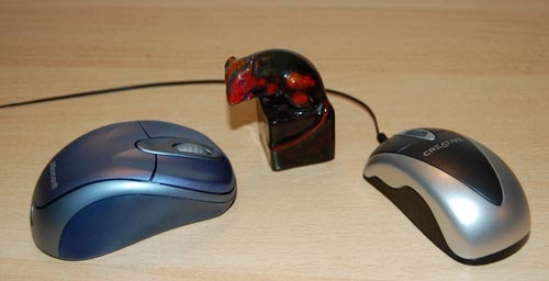
But the king of all XY input devices is without question one of the earliest: the Mouse. Only the QWERTY keyboard has greater tenacity (unfortunately, in this case). Invented in 1963 by Doug Engelbart and later commercialized by Xerox PARC, the mouse remains the most popular device in the family, and this is (IMHO) because it is simply the best – it maps extremely well to the brain-hand-screen-eye-brain closed loop, making its action so intuitive as to be transparent. It just doesn’t get any better than that. And interestingly, the exact shape of the mouse is unimportant: almost like cars, they went from blocky to streamlined as time went by, but are just as good in any shape. It’s the basic “movable box with buttons under the fingertips” that is the winning factor; the rest is window dressing.

Here’s kudos to a great design!

Mice (computer and porcelain)

The ultimate clarity

Adding clear instructions is part of good product design, right?

So: I went to get a flu shot (I still get the flu each winter, but maybe I’d be getting it twice without this?) As the nurse prepared her syringe, I noticed a cardboard box of disposable vinyl gloves on her table. On the side of this box was a printed statement, which I copied verbatim:

“Intended use: A medical glove is worn on the hand of health care and similar personnel to prevent contamination between health care personnel and the patient’s body, fluids, or environment. This glove also serves for non-medical purpose usage”.

I was so relieved that the manufacturer had had the foresight to instruct the nurse in these enlightening facts. Who knows, without this instruction she might have assumed the gloves had to be stuffed up my nose or something?

Clear instructions are good. Superfluous ones are silly. I don’t trust silly vendors…

Can’t they hire ONE Englishman to proof their manuals?

Everyone’s had their laughs with instruction manuals written in Engrish; indeed, they can get quite hilarious. What bugs me, though, is the fact that these are seen not only in low quality products from second-rate or nameless producers. I can understand how a product that costs a couple of bucks would not have a manual written to the editorial standards of the Britannica… but what about leading vendors that produce expensive, top-quality consumer products?

I mean, look at the note below, which came as an insert in the instruction manual of my Lenovo Thinkpad docking station. That’s from the vendor IBM passed its notebook business to. And they tell us their product is “for use only”? And “not portable device”?

Lenovo manual insert

These are serious people, heaven knows. They make incredibly sophisticated machines that I’m proud to use. They have a company that is the fourth largest personal computer maker in the world, with 19,000 employees – so can’t they hire one single English speaker among them, to proof read their manual copy? Or do it remotely with someone living in the West, who’d get the copy in the mail and edit out the more blatant errors in a matter of hours? (Make me an offer, Lenovo guys!)

Invisible buttonware

One evening a neighbor knocks on my door. She just got a new cellular phone, and she has a basic question: which key does she press to accept an incoming call?

Now this lady is not a youngster, but she’s used cellphones before; surely she must know that you press the key with the green handset image? Well, yes, she knows, but she can’t figure out which key that is. I think, Huh??? … But then I look at her instrument, and I see what she means. What used to be an image of a handset has degenerated into a tiny thin squiggle, similar to other tiny thin squiggles on some other keys. And yes, perhaps she could discern that this squiggle is a bit greenish, especially if she had a magnifier…

Cellular phone key comparison

The problem is all too visible in the left photo, which is of my own Nokia 6230i: the four keys at the top have identical looking thin marks, and the colors of the bottom two, though red and green, are very hard to discern at a glance (which is the way they should be discerned; especially when you’re driving with the phone in a hands-free cradle). Compare this to the other photo, from a different model. That’s what good human engineering should provide!

So, what can we do about this? If you work at a cellphone manufacturer, by all means have a word or two with your design department… I don’t, so all I could do was fix my own problem. Here is what I did to my Nokia. Problem solved.

Nokia cellphone with stickers

The first post

A new blog… like a newborn baby: you have high hopes for it, but you can’t really imagine what it will turn out like. You just have to nurture it as best you can, then wait and see.

I’m a technologist. I grew up immersed in the wonderful hobby of amateur radio, graduated in applied science, worked all my life in high tech settings. And I’ve always had this fascination with Human Factors Engineering; that is, applying the basic technologies in a way that makes sense from a human perspective, that makes its use by people easy and intuitive and efficient and – inevitably, to my way of thinking – enjoyable. Unfortunately, while I can strive for this goal in my own products at work and at home, I keep running into commercial products that violate it in diverse and bizarre ways, and into trends that make promising technology evolve into a real pain.

I hope to make this blog into a channel where I can share my thoughts – opinionated ones, in many cases, but still relevant, I hope – about improving the design of many everyday products that surround us, and about the less common cases where a really good design makes my day.

I hope you, my readers, will find all this sufficiently interesting to chime in and make this a lively dialog, maybe even one that can make product developers pay attention to our need for more usable products. Welcome to my blog!

Copyright © 2025 Commonsense Design

Theme by Anders NorenUp ↑