Author: Nathan Zeldes

http://www.nzeldes.com

Car window wiper mystery

This one has been bothering me for years: why don’t all cars have rear window wipers?

Typically station wagons, hatchbacks and all sorts of minivans and SUVs have one; but ordinary four-door cars almost never do. Yet the need is identical: why, then, discriminate against these?

If you have a good answer, post it in the comments!

FameLab!

Off-topic it may be, but I had a delightful experience last week judging in a round of the FameLab competitionFameLab contestant organized by the British Council in the Jerusalem Science Museum. This international event strives to encourage scientists to communicate their work and their excitement about it to the public; young scientists (mainly graduate students) were invited to present a scientific subject of their choice – in three minutes sharp.
So, I was treated to two dozen fantastic presentations on subjects as diverse as celestial mechanics, protein reactions in cells and the lifestyles of dinosaurs; delivered by talented young people just as diverse in their styles and approaches to communicating their knowledge. Winners will get to compete at the next level, and will be treated to a communication skills workshop that will help them develop their skills.

What a wonderful way to promote science!

Keyboard light: no more groping in the dark!

A humorous video review from CNET on the Lenovo Design Matters blog (yep, these guys have a blog where their designers interact with their users – a commendable idea!) compares the Thinkpad X300 to the MacBook Air. Nicely done – take a look.

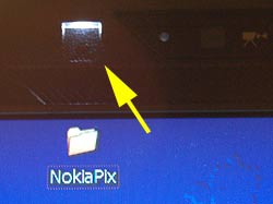
Interestingly, the reviewer mentions one favorite feature of mine in the Keyboard Light on Lenovo Thinkpadrecent ThinkPad notebooks that many users may be barely aware of: a little white LED in the screen’s frame that illuminates the keyboard. This is useful for when you work on an airplane at night and prefer to leave the overhead reading light off (whether out of consideration for your co-travelers or for your battery life – in the dark you can work at the screen’s minimal backlight intensity).
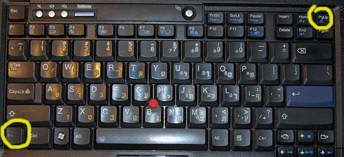
This LED in itself is a great design idea, but I’m even more impressed by how you turn this lamp on: you depress the Fn key and the PgUp key together. Why is this impressive? Because these two keys are located diagonally at the opposite corners of the keyboard; this means you can find them – by touch – in absolute darkness, which is where you’re at if you need a light in the first place.

Incidentally, this is how I discovered this feature during one long flight – I was groping to find the Fn key combination for increasing the backlight level, hoping to have the screen itself illuminate the keyboard, and I accidentally hit the right keys. And there was light!

Activation keys for Thinkpad keyboard light

A lesson from a blue hairdryer

One day the ladies in the household decided they’ve had it with our handheld hairdryer, which was indeed weak and ailing. So I went to buy a new one, and decided to follow my first principle for tool acquisition: always buy the most professional, high-quality tool you can afford – it will repay the expense many times over!

I asked the appliance store guy for his best tool, and he offered me a sturdy blue unit that, he said, was what professional hairdressers (sorry, hair styling artists) use. The wattage on the label was indeed higher than any I’ve seen before. I brought it home proudly, only to discover the next day that it was no good to anyone there.

This was a new one for me: how can a tool that professionals prefer be useless to an amateur? In my world of engineering and DIY projects, this would be unthinkable. What difference can it make? A hairdryer is a hairdryer, after all.

Here’s the difference: the hairdryer is a hairdryer, but the hairdresser uses it to dry hair that is on someone else’s head! When you dry your own hair, the dryer must be short enough to fit between your hand and your skull; when you dry someone else you can just step back. The professional tool was longer, not much but just enough to make it awkward to use on oneself.

So, a lesson: always keep an open mind and challenge your own assumptions on the way a design fits its intended use. These errors seem obvious in retrospect – always in retrospect…

Intriguing objects at Possibly Interesting site

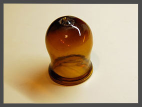
Glass cupDo you recognize the glass object in this photo? If not, you may want to check Prey to Oblivion, the March article on my Possibly Interesting web site, which has a bunch of everyday objects that were quite familiar a century ago but are now all but forgotten.

To avoid confusion:

  • This here Commonsense Design is my blog, updated with new brief posts a few times a week.
  • Possibly Interesting is my personal web site, where I post hopefully interesting but longer articles once a month.

I figure I should cross-post a link to the blog when an article of interest comes up on the other site.

User-centered design: a serious lapse

And now, from the murky past, a serious lapse in designing for the intended user…Toddler on Bench

When my son was a toddler, many years ago, he had this habit of going into my den in my absence, climbing onto the lab bench and wreaking havoc (here, I once captured him on film reaching for a hammer).

Well, I had to protect kid and gear, and I had this idea to build an anti-toddler alarm system that would raise an alert if the kid went into the den without an accompanying adult. My design had two infrared beams crossing the door at different heights, and a control box complete with a cackle generator (to issue a sound like an angry hen when the alarm was triggered). When it was finished, I painstakingly built four lens assemblies for the IR beams, rigged them around the door frame, and prepared to have some fun. Cool, huh?…

Yah. The thing lasted for less than a day. As soon as the kid (did I say he’s very smart?) went on the prowl he spied the interesting new things on the door frame, decided they were worth studying, and tore them off the door to facilitate examination. I wasn’t in the mood to devise hardened housings, so that was the end of the project.

We tend to think of User-centered design as making life easy for the user. Evidently, you also have to ensure the system can survive its intended users!

Timeless designs last forever

We humans have this obsession with designing new products, even though many of them die out after a while (some, mercifully, after a very short while!) However, every so often a design is found that is simply so good and sensible that it stays around for a long, long time.

So, here’s an example I ran into in the archaeological museum in Agrigento, Sicily, a town founded by the ancient Greeks.

Bronze Fibulas - a timeless design

The object on the left is a bronze Fibula, made in the 13th century BC. Not one in a thousand people today would recognize the word “Fibula”, but hardly anyone would fail to identify this as a large safety pin. In fact, I saw not one but many of these, in various museums in Europe: they were widely used for many centuries. The second photo shows one from the 8th Century BC, with a more imaginative design (remember, unlike our safety pins these were also meant for decorative effect as fasteners for cloaks and such).

And for all our digital innovations, and perhaps unlike many of them, I doubt this good ol’ design is going to be supplanted anytime soon…

Safety Pins

Why Photoshop and Mapmaking don’t mix

Map making is an ancient art, and a great deal of ingenuity has gone over the years into how you can draw the spherical surface of the Earth on a flat piece of paper in a way that still makes sense. That’s where all those map projections like Mercator’s come into play. More recently, to my dismay, I see in the media a much less sensible practice: drawing flat pieces of terrain onto a sphere.

New Scientist map

Consider this scan from an article in New Scientist, my favorite science magazine. Note the map at the right. Note how it takes you a disorienting moment to put it in context! At first glance, this is a sphere, hence it must be the earth; but what bizarre continent is it showing? Or is this some archaic proto-continent, long obliterated by continental drift?

Close up of New Scientist map

Of course after a second you register that it is Spain; but if so, what is it doing stretched across an entire hemisphere? You might explain the circle as simply a picture frame – nobody said a map must be rectangular – but if so, why the shading in and below the circle, clearly denoting a three-dimensional sphere?

The explanation is simple, and has to do with the ease and irresistible allure of doing special effects in Photoshop and its ilk, along with the paucity of common sense in the users of such tools. The map insert should have been left flat-shaded; the conflicting 3D cues (and the circle itself, for that matter) add only confusion.

Nor is this an isolated example; we see a lot of this sort of thing going around. Yuck!

Paying all over again: non-transferable accessories

I upgraded recently to a Lenovo Thinkpad T61, from an IBM T42. Good road warrior that I am, I had the T42 accessoried to the hilt, notably with a bunch of extra batteries to last me through the long flights across the Atlantic. Since the new machine was also a Thinkpad, you’d think I would simply reuse the accessories in the new machine, right?…

Thinkpad Batteries

Wrong. The power supply can’t be used because it has a different output voltage – you can’t argue with that. The 3M privacy screen can’t be used because the screen’s a different size – fair enough. But the batteries?!!ThinkpadBatteries2

The batteries are very similar, but their plugs differ. Intentionally.

Look at the photos to compare the Bay Batteries of the two machines; exactly the same dimensions, same voltage too… but the plug is just different enough to prevent reuse. Hard not to harbor cynical thoughts about the reason…  🙁

Whatever happened to black ink?

When Johannes Gutenberg gave us the printing press in the 15th century, he also invented a suitable ink to go along with it. His ink was a glossy black, and the idea of printing books in black on white paper has remained ever since, because that is by definition the highest contrast you can get, hence easy to read. Millions of books have appeared since Gutenberg, spanning a huge range of subjects and world views, but they did not differ in ink color one bit as the centuries came and went.

Lately, however, I notice a worrying trend as I browse the shelves in the bookstores I frequent. A small but growing number of books are published in all sorts of smart-aleck color schemes. Ignoring the ones on colored paper – where the color schemes are intentionally artsy – we see books in gray ink, blue ink, brownish ink, all on white paper. And not just a sidebar or special page; the entire book is printed this way, as if the publisher said to himself “Hmmm… how can I improve the reading experience? Ah! Let’s use a lower contrast ink than we might. Sure, gray ink may cost more than the standard black, but what’s a little money compared to the pleasure of giving my readers eye strain headaches?”

Bad, bad idea. Give us books in good old black on white!

Copyright © 2024 Commonsense Design

Theme by Anders NorenUp ↑