Author: Nathan Zeldes

http://www.nzeldes.com

King of the skyscrapers

Still in NYC, following the auspicious IORG launch, and took the opportunity to visit the Empire State Building.

I was totally unprepared for what I saw.

The Empire State Building

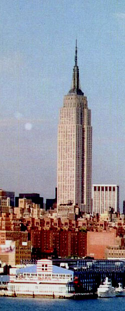
Of course, It’s tall, and the view from the top is incredible, but somehow I was expecting a ‘has been’. After all, this skyscraper was built some 80 years ago, in the great depression, the days when giant apes were swatting at quaint biplanes… the world is full of much taller towers today.

I couldn’t have been more wrong. The Empire State is still the tallest in Manhattan, following 9/11; and it totally dominates the Midtown skyline. But it is its superb architectural design that sets it apart. Its iconic tearraced lines thrust skyward in a perfect platonic expression of UP and STRENGTH that none of the funky new Glass and Gossamer skyscrapers can hold a candle to (speaking of strength, this tower took a direct hit by a twin engined B25 bomber in 1945 with only relatively minor damage).

This assertive presence is complemented by a magnificent attention to detail. All lobbies and corridors are faced in marble. Tasteful art deco ornaments add a twenties touch that is just right. You can make snide phallic jokes all you want, but It’s all simply beautiful, and in a way that no photo can do justice to.

Makes you proud to be an engineer!

Photo courtesy Wally Gobetz, shared on flickr under CC license.

Information Overload Research Group launched!

Quite off topic, but how exciting! After months of preparation, the group I co-founded is now alive and kicking!

The Information Overload Research Group (IORG) is a non-profit association of researchers interested in solving theglobal problem of Information Overload. It prides itself on bringing together key people from industry, academia, consultancies and software vendors who bring their diverse points of view to bear on the problem – thereby creating a collaboration that far exceeds what each can do alone.

iorg-banner-500.jpg

So, I’m in New York City now (quite a city, that!) and yesterday we’ve held a wonderful conference at the Penn Club where we formally announced and launched our group, and delighted in meeting some scores of like-minded researchers and practitioners, and listening to some fascinating lectures. Jonathan Spira of Basex , my fellow director on the IORG board, gave a perspective on the nature and extent of the problem; Mark Hurst, author of Bit Literacy, shared his approach to attaining an empty Inbox; Maggie Jackson lectured and then signed her new book, Distracted; and Prof. David Levy of the university of Washington spoke of his research into the phenomenon of ” No Time to Think”, giving us a scary historical perspective into the degradation of Contemplative Scholarship in academia in recent times.

There were also two panels, one to discuss what corporations were doing about it all (that was where I spoke) and one for visionary vendors who presented amazing new products they’re introducing.

I usually blog about my work elsewhere, but I thought I’d share this!

Backlit cellphone keys – not such a good idea!

Have you had the experience, as a child, of discovering the optical properties of oiled paper?

I remember it well… I was an avid reader as a kid, and when a smudge of oil from some snack would get onto my books I’d notice that the translucent oily spot that looked darker than the paper would become lighter when you held the page up to the light. Before long it occurred to me that if the shade of oiled paper can go from darker to lighter as you raised the page, there must exist an intermediate position where the spot would become invisible as its shade became identical to the dry paper’s. Sure enough, so there was!

We met the hard to read keyboard on my Nokia 6230i before. Well, apparently the keyboard designers at Nokia were also trying to emulate the oil/paper experiment from my childhood…

Nokia 6230i keys in daylight

Like many handheld devices these days, the keyboard on this phone is backlit. The numbers are translucent, and a strong white light can shine through. Seemingly a great idea, for night time use. Now in bright daylight this works fairly well. The backlight gets washed out in the sunlight and although the transparent digits are of a lower contrast than a black ink would have provided, you can see them well in dark gray on silver (since the keys are silver and reflect ambient light in unpredictable ways, the contrast admittedly varies, as seen in the photos; I’ve already commented on the advisability of plain black on white for optimal viewing). But once evening starts to fall…

Nokia 6230i backlit keys in low ambient light
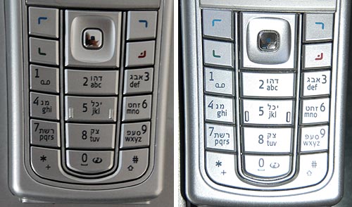
The third photo shows what happens in lower ambient light. There is an intermediate light level when the transition from dark numerals on bright silver to white backlit numerals on dark silver just evens out, and the numbers become almost invisible. In fact, since the backlight source is localized, different keys reach this point at different light levels; in the photo the “7” is in day mode, the “0” is in night mode, and the 5 is barely visible – just like the oil spot on those old books.

Now imagine trying to distinguish these keys while driving, with the phone in a hands-free cradle, where you can’t touch-type and you need your attention on the road.

So, what can we do about this? Well, we could prefer black keys with white digits – then the day and night contrast would be the same so there would be no crossover point of invisibility. Another good idea (which I recall seeing on some devices) is to make the backlight come on only in truly low light conditions. And of course, we should test the devices we buy in all situations, not just in the bright showroom where we normally make buying decisions…

Pillboxes and Clay balls: inside and outside

I recently bought this box of vitamins, and noticed it had a life size outline of the pills’ actual size. This makes sense, since the box is “safety sealed for your protection”, so people can’t see what’s inside before they buy.

Vitamins box

This reminded me (wonders of associative memory!) of something rather different, yet following the same idea, from the History of Computing (one of my favorite hobbies). I read about it long ago, but recently was delighted to run across the real thing in a small showcase in the Pergamon museum in Berlin. Back in ancient Mesopotamia, around 9,000 years ago, people had this neat idea of recording commercial transactions with clay tokens. Different shaped tokens might represent a sheep, a jug of beer, or a sack of grain… and so you could represent a loan or tax payment by a collection of tokens (SAP was far in the future then, as was Excel; in fact they had yet to invent writing, so they couldn’t use that for their records). Here is a sample of these tokens:

Mesopotamian Clay Tokens

Then, around 3,500BC in ancient Sumer, the idea occurred that it’s better to keep all the tokens in an “envelope”, a hollow ball of clay that could be signed with the parties’ seals, then fired to harden it. These balls of clay are like an authenticated, signed record; their content can’t be altered without breaking the ball. The museum had some of these balls cracked open, with the tokens still in them:

Mesopotamian Clay Balls with Tokens

Mesopotamian Clay Ball with imprinted tokens

And since the clay is not transparent, they would sometimes press the tokens on the outside of the ball before sealing them inside – so you’d know what each ball was about. And now we have an accessible copy of the record on the outside, and a sealed version on the inside… just as with the vitamins box!

The next step is obvious in retrospect: who needs the tokens on the inside? So around 3,300BC they dispensed with the tokens, flattened the ball into a clay tablet and made do with the indentations on this, as in the next photo.

Mesopotamian Clay Tablets

And lastly… surely you can see where this is going? Once they could Early Writing on a Mesopotamian tablet
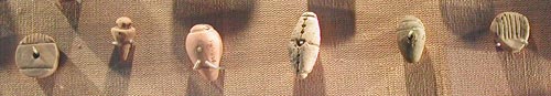
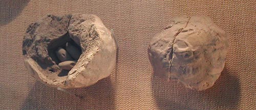
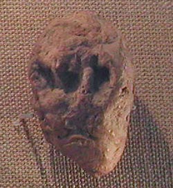
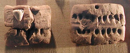
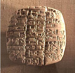
represent stuff in the real world by abstract marks on a tablet, they were on the path to real writing, starting with pictographs and ending with true cuneiform. Here is another exhibit from the Pergamon, which seems to be halfway through the transition. Wayda go!

More of the science behind this fascinating history can be found on the web site of Prof. Denise Schmandt-Besserat of the university of Texas, a leading researcher of the origins of writing and counting .

Car parts designed to smash up, take II

We saw how Our car had a turn indicator lamp in the side trim, where it was vulnerable to damage. Even more interesting is the turn signal on some newer cars, which is put on the most smash-worthy part of any automobile: the side rear view mirror. And not at the base of the mirror like in this red Citroen C4; but at its outer edge, as in this blue Mercedes!

They used to speak of “Planned obsolescence”; looks like today’s automakers are unwilling to wait for their parts to wear out, so now they’re actively soliciting breakage by design…

Side mirrors with turn signals

Intelligent freeway signage

In recent years the freeway system in Israel is applying some pretty good leading edge technology (including truly transparent wireless toll collection that is still missing in many countries I visit).

One interesting system can be seen in the Ayalon highway in Tel Aviv. This road has electronic signs that give precise real time information of the driving conditions ahead, including which lanes are jammed and how fast the traffic moves (when it does). Perhaps most impressive are the signs that give a taste of the despair lying ahead, as in “Traffic jammed through La Guardia exit”… not that there’s much you can do about it, admittedly, but at least you know!…

Ayalon Highway in Tel Aviv

Photo: Wikimedia commons.

Of course, behind this capability lies a network of sensors and cameras, and an expert system that integrates them and recommends to the human operator at the road’s control center what messages to send to the signs (I thought the system was entirely automatic, but actually it does give a human final override). The information on the signs and the video from the cameras are also accessible on the Internet: the traffic flow conditions are updated every few minutes, and you can click the camera icons to see the real time video stream – and mouse over the “i” icons to see what text appears on each sign.

The left-handed staircases of the Kerrs

When we toured Scotland we visited an ancient building with a curious design feature: it had a staircase that ran in a counterclockwise spiral, opposite to the standard design.

We were told that there are a number of such buildings in Scotland, all built by the same family. Apparently the Kerr family tended to have many left-handed sons, and they built a number of their castles and buildings (notably Ferniehirst Castle, in the 15th century) with counterclockwise spiral staircases, the idea being that a left handed person could defend them more easily (and perhaps also confuse the more common right handed enemies? although it seems that the latter would have some advantage on the attack).

Such a degree of custom design, geared to a genetic trait of one family, is interesting. It is also told that once they committed the architecture this way, they handled the fact that not all their fighting men were lefties by training those who weren’t to fight with the sword in their left hand anyway. Customize the building to the family, then customize the retainers to the building…

Tools 2: Choosing your supplier

So, if quality is critical, how do we find the best tools?

One simple method is to go for the best makers; the ones the pros swear by. In my case I did that by interrogating my machine shop teacher in university, a master craftsman with decades of experience. Basically it went like this:

Nicholson File

Me: what is the best make of hand files?
Master: why do you want to know? These are not for a hobbyist; they’d be too expensive for you anyway.
Me: Oh, I’m just curious.
Master: you aren’t going to buy them, Right?
Me: Perish the thought! I only want to know.
Master: You’re sure?
Me: Cross my heart.
Master: well, the best files are made by Nicholson; but you have to make sure it’s the Dutch Nicholson. Nicholson also has a factory in Canada, those are not quite as good.
Me: Thanks!

And then I’d rush off to buy some Dutch Nicholson files.

Nicholson Files

Those files serve me well to this day, though in all fairness, I suspect the Canadian ones would have served just as well…

A pure waste of time

Just got off the phone at a teleconference meeting hosted by some service in the USA. I was impressed by the logic of the automated system, which went something like this:

“Welcome to the ___ teleconference system. Please enter your passcode”.
<I did>
“The number you entered is <bla bla bla… all 9 digits read slowly>.
Please press one if this is the correct passcode, or two to re-enter the code”.

What on earth could make them think this is a good idea? Why not just test the number and only if it is incorrect ask for it again?!…

Tools 1: Quality matters!

Of all the everyday objects you will own, Tools deserve a place of honor, since they are the ones you use to make otherTools 
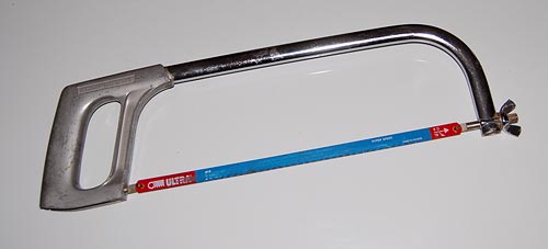
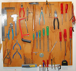
objects. In fact, tools are arguably what distinguished our hominid ancestors from the animals. For my part, as a maker of things for pleasure and work, tools – the workshop kind – have been my lifelong possessions and companions, so I will blog about them for a bit.

The first point I want to share should be obvious, yet as the massive commerce in low grade tools shows it certainly isn’t: when buying a tool, always go for the best quality available. It does make a huge difference.

machinist's square

Take the tool in the photo: a machinist’s square for metal work. It was made by Moore and Wright of Sheffield, a maker of precision tools since 1906. Now the first time I bought a machinist square (I was in my teens), it was much prettier than this one, and had a scale of centimeters along the edge too; it only had one drawback: it had an angle just short of 90 degrees. So I took it back to the store and got another, with an aluminum stock; this one was just over 90 degrees. Eventually I went to a better store and got the Moore & Wright: no scale, just an ugly lump of iron that tends to rust – but it still measures a precise straight angle after decades.

metal saw

Or take the saw in this photo. I had a cheaper one, and it would use the same blades… only they would pop off the frame every so often. Only when I went and got this more expensive one, made by Eclipse, did the problem go away – and all it took was to have the little rods that go through the blade be longer! Little details like these make a big difference to tool usability and usefulness – and quality is all about the little details.

metal saw - detail

Copyright © 2025 Commonsense Design

Theme by Anders NorenUp ↑