Author: Nathan Zeldes

http://www.nzeldes.com

LCD TV screens: can’t they just switch on?

One problem with CRT-based television sets and computer monitors was that they took a long moment to turn on, because of the inherent necessity to heat up the filament of the picture tube. How fortunate, then, that the new generation of flat screen displays does not have a filament, allowing them to turn on practically instantly.

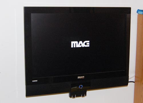
But allowing is not the same as doing it. We bought this little 22″ LCD TV recently, made by MAG, and when you turn it on it takes a full 8 seconds before the picture shows up on the screen. And the last two of those seconds are devoted to showing the manufacturer’s logo! Opinions about User Experience may vary, but no one would argue that staring at a dark screen, with or without a logo on it, can really enhance that experience.

MAG LCD TV with logo on screen

With all respect, MAG designers, you’re welcome to etch your logo on the screen bezel in all its glory (as you have); but when I hit that On/Off switch, I want the screen to light up in 2 seconds, max. I know you could do it, if you set your minds to it!

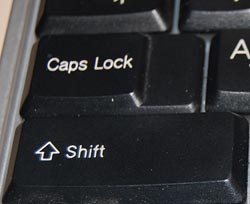
The infamous Caps Lock key

Caps lock key on a modern PC keyboardEveryone knows that the QWERTY keyboard layout sucks, because it carries a legacy from the early typewriter days; still, we’re all locked into its use and live in oblivion of what we’re missing. But we have another legacy from mechanical typewriters that is hard to forget because it bites us daily. i REFER TO THE cAPS lOCK KEY.

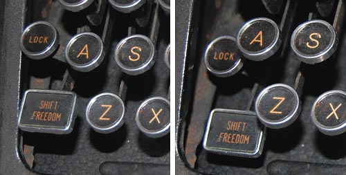
It is interesting to trace the history of this design infamy. Originally, it made a lot of sense: in a mechanical typewriter the Shift keys did just that: they shifted the type mechanism vertically so the type bars would hit the paper with the uppercase letters; and the Shift Lock key would keep the keys locked in this position. This key had to sit right above the Shift key, because it physically latched it in a depressed position; hitting Shift again would release the lock. It was very easy to see (and feel) whether Shift was locked or not, because both keys would be depressed when the lock was engaged. The photos below are from an antiquated Royal typewriter; you can see how the Lock key holds down the Shift key on the right (and note the quaint caption on the latter key – Shift / Freedom, in allusion to releasing the Lock).

Shift Lock in an old typewriter

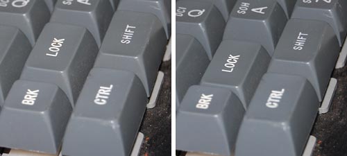
Early computer keyboards carried this idea forward, with a Shift Lock or Caps Lock key that had two physical positions: depressed for Lock, and flush with the other keys when released. You could therefore tell when you were in Caps mode, and would notice immediately if you hit the lock accidentally while touch typing. The delightful Commodore 64 had this feature, among others; the photos show a keyboard that came with the collection of homebrew boards described here, from the late 70s.

Two-position Caps Lock in a 1970s keyboard

Later, as keyboard makers sacrificed quality for cheap manufacturing, the more complex and different two-state key was replaced with a momentary key like all the others, with electronics to implement toggle action. Gone was the tactile feedback. Now a simple brush of the finger could accidentally lock you in Caps mode. Worse still, the position of the Lock key next to the left Shift key, which made sense a century ago, was retained – placing this relatively little used key right in harm’s way.

I don’t see manufacturers giving us back the 2-position key (it would cost them a few cents, after all), but the least they could do is move this stupid key to the top row, next to the Scroll Lock, where it will remain unused, unnoticed, and harmless.

So, what can we do about this? Well, one thing we can do is disable the offending key. No need to tear it out – I used KeyTweak, a free key remapping utility, to disable it on my Windows XP system. Good riddance!

Also, if you use MS Word, you may be unaware that depressing Shift+F3 repeatedly will change any selected text to lowercase, uppercase, and sentence case; a very useful feature after YOU’VE ACCIDENTALLY HIT sHIFT lOCK AND CONTINUED TYPING.

Plug and Gag: hardware that thinks it’s software?

These days nobody is surprised to see a software product expect tens or even hundreds of free Megabytes on the disk – a far cry from the frugal eighties, when entire operating systems would fit on a floppy or two, but this is life and we accept it philosophically. But when a piece of Hardware makes similar expectations, I begin to be annoyed. And increasingly, they do.

For example, I recently installed for a friend a new printer, the Hewlett Packard Deskjet HP-F2280 printer/scanner/copier. I put the CD-ROM that came with it into the drive, and then had to stick around for more than 15 minutes, and interact with a zillion dialogs, while the product installed an endless stream of stuff on the hard drive. Fifteen minutes for what ought to be the installation of a device driver?!?!!

Leaving aside the question of speed – this computer was running at over 2 GHz, so I’d expect it to need 15 minutes to solve massive mathematical problems, not to copy some silly software from a CD – there is the question of manners. It is not good manners to sell someone a printer, and then to blast hundreds of megabytes of software onto their hard disk, without so much as a pretty please. And HP has the nerve to claim in the System Requirements that you need “450 MB available hard disk space” to install the printer under Windows XP. For Vista, you need 700MB.

Think about it: 700 Megabytes? 700 MB is enough to store all the text of the Britannica; it’s the sort of space you’d expect for a complete development environment, or for a powerful video editing program. But a printer?!

Sheer Chutzpah, that’s what it is.

Cappuccino for two

One of the small pleasures of life is sharing a fine Cappuccino on a weekend morning at home. The only difficulty is, you need a way to produce one, and we don’t have a professional machine at home like they have in a proper coffee shop. We do have the means to make strong espresso – one half of the Cappuccino story – but what of the milk? We had a battery-operated propeller thingy that was supposed to beat milk into a froth, but it left much to be desired.

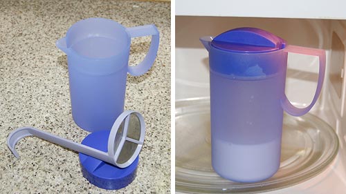
Enter Tupperware. This innovative manufacturer of kitchen plasticware came up with a gizmo for making foamed milk – the “Magic milk cappuccino maker” – that shines in its ingenious simplicity. It consists of a small plastic jug with a lid that allows through a round metal mesh – a strainer – on a rod. Here’s how this works:

First you fill the bottom third of the jug with milk, put on the lid and microwave for 2 minutes to get the milk hot.

Tupperware Magic Milk Cappuccino Maker

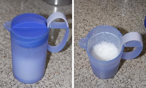
Next you put in the strainer, close the lid, and pump the rod up and down rapidly a few times. The mesh moves through the milk and foams it up in no time – very effectively.

Tupperware Magic Milk Cappuccino Maker

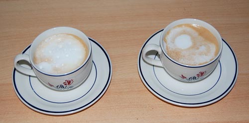
Meanwhile you produce the espresso in your Brikka, put it in the cups and shovel in foam and hot milk from the Tupperware jug. The entire process takes under 5 minutes, most of it waiting for the machinetta to boil. And here we are:

Homemade Cappuccino

Lovely, lovely Cappuccinos… none of the artwork a barista may make in the foam, but just as pleasant to consume.

Snagit 9 vs. FastStone 6: Simpler is better!

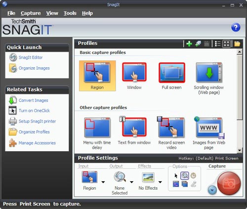
I needed a screen grabber, and based on recommendations from a friend downloaded the trial version of Snagit 9. I was impressed and disappointed.Impressed, because this is one potent package. It can do everything you may ever want to do about image grabbing. I particularly liked the “Scrolling window” option, for capturing a web page longer than one screenful. BUT… this program has an extremely complex and ornate user interface, giving you access to countless possibilities; and these are presented in the most colorful UI I’ve seen since my kids graduated from Fisher-Price. Take a look :

Snagit 9 User Interface

Compare this to Photoshop: powerful and feature rich, but its UI is simple, with minimalist icons in monochrome…

FastStone user interfaceI found this so distracting that I went and downloaded another shareware product, FastStone Capture (Ver. 6). Check the utterly simple UI to the right:
Note that 99% of the time, these few icons (including “Scrolling window”) cover all you need; the rest is accessible but unobtrusive in a drop down menu at the right, where it can’t distract you. Click a button on this tiny floating toolbar and the capture begins. The same icons exist in the Snagit window, but actually, once you click one there you then need to click the big red round button – which may make you feel powerful, but is a redundant action. Of course it’s a single extra click, but it’s also double the number of clicks required  in FastStone.

Interestingly, the development team at Snagit have a blog where they share their thoughts (commendable!) and there I read that “… we felt that the interface shouldn’t be competing for attention, but should fade away and allow people to focus on their content”. Sorry… good thought, but I can’t endorse the execution on it. Nothing about the baroque UI they built brings the word “Fade” to mind. Just compare it to the tiny toolbar of the FastStone tool.

Simpler is better, nowhere more so than in tools you use daily.

In case you didn’t know…

And now, a nice sighting from Pil and Galia.

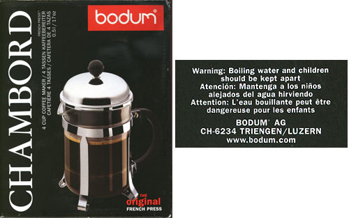
They report buying a coffee press made by Bodum, a leading maker of these ingenious devices. And on the bottom of the box came this enlightening revelation: “Boiling water and children should be kept apart”

Bodum coffee press warning notice

At first I actually thought this was said in jest, a sophisticated attempt to remind people of the danger without sounding too officious; but the other versions made it clear I was giving Bodum an unwarranted benefit of the doubt. The French warning is the silliest: it says that “Boiling water can be dangerous for children”. Which raises two immediate replies (beyond the obvious “Well, Duh!“):

  1. Can be?
  2. Why only children? What about adults?

Oh well, at least the coffee is good.

The other side of those Road Reflectors

We all know the raised reflector buttons on the lane divider lines of a freeway. They have white or yellow retroreflectors embedded in their edges, so that at night they shine right back at you in the light of your car’s headlamps. Safety and beauty in the same simple device.

But what many may not realize is that they have another design feature, also safety related, and far more ingenious. At least in some freeways – California’s, for sure – the buttons’ other edge – the one facing away from oncoming traffic – has red reflectors in it. Why put reflectors on the side you never shine a light on, the side you can’t even see?

Precisely because of the one circumstance when one would be seeing it: when they drive on the freeway in the wrong direction, having entered via the off ramp instead of the on ramp by some colossal mistake – think DUI, for instance. Now you have a drunken driver going in the wrong direction at night; traffic is sparse, but any moment disaster may strike unless this fool notices his mistake. And now those reflectors return the investment – for this driver will see long lines of red lights shining ahead to infinity; so unusual as to immediately alert him that something is wrong.

And if, like me, you never did that, you can still see the effect if you drive facing straight into the sun when it is low in the sky; you can then see the red reflectors, shining back the in the sunlight, in your rear view mirror!

Elegant design in the back of a Remote Control

Sometimes one runs into elegant design in humble places…

I was sitting in a meeting and fiddling idly with the remote control of the NEC LCD projector. After toying with the laser for a while, I pushed out the battery cover on the back. As expected, it unlatched and slid open, like these things always do. But there was a twist…

NEC LCD Projector remote control The cover slid off, but stayed connected to the unit by a thin rubber ribbon. We’ve seen so many R/C units missing their cover – well, not this one! The only extra part required was the rubber ribbon, which clips into a slot on the R/C itself. Simple, elegant, professionally designed. Good job!You can see in the photos how this works:NEC LCD Projector remote control

NEC LCD Projector remote control

NEC LCD Projector remote controlNEC LCD Projector remote control

Square is beautiful!…

Sometimes you find elegant design in the places you least expect it.

We stayed in the Dan Carmel in Haifa, and the small supplies in the bathroom came in color-coordinated little boxes: shower cap, cotton pads, the usual stuff. Still, they failed to go all the way: they had tall bottles for the shampoo and a round box for the shoeshine sponge:

Hotel Dan Supplies

Which reminded me of a much better attempt at such standardized packaging that I saw in the Hotel Silken in Zaragoza, Spain:

Hotel Silken Supplies

They had ALL the supplies fit in square packages, made of either cardboard Square Eggs at the Silken Hotel in Zaragozaor plastic, and these all fit like a puzzle into a rectangular cardboard tray. Even the shampoo bottles were square and fit the scheme perfectly. It was a delightful design, injecting elegance into this utterly mundane collection of supplies, so I share it here.

These guys had such a thing going for the rectangular form factor, that even the sunny-side-up eggs they served for breakfast were square!

Copyright © 2024 Commonsense Design

Theme by Anders NorenUp ↑