Author: Nathan Zeldes

http://www.nzeldes.com

A proud Wikipedian!

Yesterday I was at a meet of the Israel Innovation Forum hosted at IBM, and over coffee I notice this guy whose name tag reads

David Shay

Wikipedia

At first I thought he must be one of the few people who actually work at Wikipedia as employees; but he assured me there are only 15 of those, all in the US. No, he told me, he simply writes for the Hebrew Wikipedia. I asked whether he’s part of some special group appointed to manage the local version, and he said no, he simply writes and edits articles, like anyone else. I do that occasionally myself, but David does a lot more of it.

When we exchanged business cards I found that he actually has a regular day job at a regular company; he just felt good proclaiming himself on his badge as a Wikipedian. And maybe he’s right – though people seldom bother to check who wrote the article they are referencing, the impact you can make on humanity by writing online can be much greater than whatever you can do in a regular job (well, unless you’re a major inventor, scientist, or world leader, I suppose).

Wayda go, David!

Those conservative business cards…

Business cards have been around for a long time – very long, if you count visiting cards – so we should not be surprised if they tend to have an innate inertia to them. Still, business has changed so much in recent years – isn’t it time that the cards paid attention?

I was scanning a batch of business cards I got in a conference recently when I noticed an interesting fact: they may come in many designs and colors, but 90% of cards will have the contact information in the following order:

Physical address
Phone number
Fax number
Mobile number
Email address
Web site URL (if any)

Now this is interesting, because it has two attributes:

  1. It follows the approximate historical order the various technologies appeared in (first we had office buildings, then telephones, then faxes, etc.)
  2. It gives the items in reverse order in terms of usefulness, the least useful at the top: in today’s virtual, mobile, global world, we would most often use email to reach people, or a cellphone if they have one; faxes are not yet gone but may soon be, and physical addresses are only of marginal use in a “work anywhere” culture.

I had a friend, a master blogger and geek, who once said if he had his way he’d simply put on his card his name and “Google me!” – now that’s modern thinking for you! The closest you get to this are Moo minicards, those miniature cards that barely have room for a name, job role and email address.

Now that I noticed this I checked my own new card that I made after leaving Intel – and guess what, I had it almost right in terms of descending importance:

Name
Web site URL
Email address
Physical address
Mobile number (the only phone I use)
Fax number

Only the physical address stayed higher than it should be…

Dumb icons

The idea with the use of graphic icons as controls in web pages and applications is the they are a compact, fast way to represent an action. And that they do, very effectively, subject to one condition: the icon’s image should represent the action in question (Duh!)

So, an icon that causes the page to print should have a small picture of a printer. It should not have a picture of a hippopotamus. Right?

Well – consider the web site of the Israel Discount Bank. A customer can log in and see their account, which is useful indeed. And there are icons like these:

IDB site icons

Surely you can tell what each of these is supposed to do.

But then, there are also these icons, right above the account activity table:

IDB site icons

Care to guess what they mean?

Actually, the middle one means “Select columns”. Not that there’s any likelihood you’d figure that on your first encounter, but at least in later visits you will be reminded of this meaning. So what does the icon on the right mean? From comparing it to the one next to it, it would seem to be “Delete column selection”? But no – it means “Cancel filtering of data”. Totally unrelated to the image.

And the leftmost icon is a beaut: it means “Show all accounts”. A hippopotamus would depict that sentiment just as effectively.

Can’t these people think?

IVR woes: good idea – poor execution

I was trying to reach the customer service of a company just now. There I was, listening to the endless music of an IVR system, punctuated by the usual happy reminders that I am oh-so-appreciated by them and they’ll get to me real soon (liars!), when something happened. The recording declared that they were very busy so if I could leave my name and number they’ll get back to me. No option to keep waiting.

To their credit, the next step was done professionally – the IVR had me state my name, then key in my phone number, then confirm it when it read it back to me – so I have good reason to believe they will really get back to me. Which is actually better than the silly music. So giving me this way out is a good idea.

The bad part is, if they knew they were busy (and, assuming it’s a FIFO queue, they had the necessary information – my place in line – as soon as they picked up my call) – why wait for long minutes of stupid music before switching to the leave-your-name-and-number routine? They’re giving the customer the combined worst of both solutions!

Standardization of charge indicators (Not!)

These days we all have at least half a dozen gadgets whose batteries require charging, and they each come with their own charger (incompatible with all the others, of course). Now, I won’t push for standardizing the chargers – can’t aim that high – but here is a more modest goal: can we please standardize the status indicator LEDs on them?

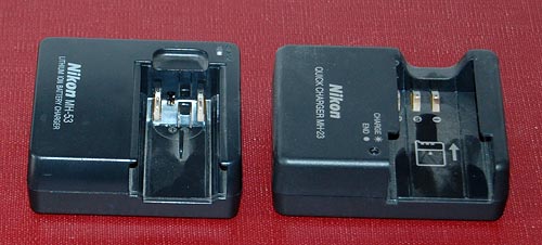
Nikon camera battery chargers

Here are two chargers that came with my two Nikon cameras, the old point and shoot and the newer DSLR. No, they are not interchangeable, even though the batteries are both Li-Ion and of the same voltage. Both have a LED indicator that blinks during charging and stops blinking when done; however, in one it stays lit when there’s no battery inserted, and in the other it stays unlit.

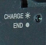
Nikon D40 battery charger closeupBut the bigger problem is remembering what’s what when you come back later and the light is stable. You see, in these, this means charge complete; but in my cordless shaver it means that it isn’t; there, blinking indicates a full charge. Different vendor, and they probably just flip a coin at design time…

My own solution was documenting it all on a post-it note stuck near these chargers; but then Nikon must have realized that this is an issue, because in the later camera – my D40 DSLR – they labeled the charger itself to remove any doubt. Good move!

Web site redesign!

My loyal readers know that in addition to this blog I maintain Nathan’s Possibly Interesting Web Site, where I share my history of computing collection, software, and various articles. I built it some years ago as a personal web site, and am happy to have it as just that.

However, now that I am starting into my new career, I faced a problem – you can’t talk business to people and when they Google you they reach a collection of slide rules! I needed a site devoted to my areas of professional expertise and service offerings. So I wrote one. As of this week http://www.nzeldes.com is the professional site, and the Possibly Interesting site links off of it under “Personal site”, or you can bookmark it if you wish at http://www.nzeldes.com/possiblyinteresting.htm. I have every intent to keep it alive and growing at its usual steady rate of one page a month.

You’re also welcome to send in feedback on the new site’s design and content via its contact page; this is a first revision, and will be developed as things progress.

My blogging passes the immersion test!

A few days ago I was at the IEC history of computing museum where they also exhibited their progress in map making – from old blueprints and paper maps to modern CAD and GIS software. They had there an old 1960’s map that caught my eye – a 1:50,000 topographic map by the Israel Survey Department. These were the best you could get when I was a kid hiking around the country; every house was correctly shown as a black dot of the exact right shape, and every hill and gully were visible in the contour lines.

I looked at the map and it struck me how much maps’ visual quality has progressed since then, with modern printing techniques. The stark colors used in the 60’s are replaced today with delicate pastels; the topography is enhanced by fine shading; the important details are not drowned out by the density of equally strong contour lines. The information of the old maps was perhaps perfect, but to the modern eye they look, well… old. Unfortunately, as far as I know the maps you can buy today at such a detailed scale use the same old techniques.

Then the next day I came to see a new Israel Survey Department map that was wondrous fine to behold, done in pastel shades and fine shading gradations, reminiscent of what you see in Google Maps but with all the detail of the maps of my youth. And my friend Gadi happened by, and I said unto him, lo, see this map, for it is very finely done, and only the other day had I wished such were made; and he looked upon the map and found it good. And I said to him, surely I should blog about this map and compare it to the older ones, and he said, verily thou shouldst. And I resolved to make it so. And then the matter passed from my mind until my alarm clock went off to wake me for my day’s labors.

The bad news is, evidently the Israel Survey Dept. has yet to produce the fine map I saw in my dream. The good news is, looks like my blogging has reached the point where it passes the immersion test. I’ve found long ago that when I really immerse myself in some practice or task, it makes its way into my dreams. As a forensic scientist, I would dream of Gunshot Residue Particles; as a Thin Films VLSI engineer I would examine LTO defects in dreamland; and when I took to developing software, I would dream at times of bugs – I remember once actually solving a particularly stubborn one in my sleep, a solution that turned out to be valid in real life. So now I dream of searching for stuff to blog about!

Topographic Maps

As for my resolution, I can’t show you the nonexistent topographic map, but I can and hereby do show you a comparison of an old ISD map and a detail of the same area from Google Maps (Terrain option) that illustrates the visual qualities I was dreaming of merging with it.

Blast from the Past

Today I had the pleasure of attending the opening of the Computing and Communications museum of the Israel Electric Company. The IEC has been around for almost a century and has kept pace with computing advances since its early days; curator Dlila Shapira did a great job rounding up some lovely vintage pieces from the “big iron” era and later.

No less interesting than the equipment on display were the speeches of some veteran managers of the computing division. One gentleman told us how when he first arrived on board as a programmer his first task was to glue shut holes that had been punched in error onto punched cards; a bottle of the liquid used was on display, and here it is.

Punched Cards and correction fluid

Also on display were storage devices of yesteryear. In the photo below you see a removable hard disk pack from a Prime computer system of the 1980’s; the dozen 12-inch platters together hold 300MB. For comparison, you see on the glass case another removabe storage unit, namely a 2.0 GB – 2000MB – Disk-on-key from today. We’ve come a long way…

300MB Disk Pack from the 80's

Little Big KVM switch from LevelOne

I have a desktop and a docked notebook on the same desk, which I never use concurrently, so I decided to reclaim precious desk surface by keeping only one screen, keyboard and mouse and switching them between the two machines with a KVM switch.

LevelOne KVM-0221 KVM switch

An online check discovered the cute KVM-0221 2-Port USB KVM Switch from LevelOne. It does what I need, it looks good, and – crucial for my desk reclaim purpose – it is tiny at a 100 x 65 mm footprint. So I ordered it.

And when I wired it, lo and behold: its footprint area was maybe 4 times the above. You can see why in the next photo:

LevelOne KVM-0221 KVM switch wiring

Here is the problem: in a day and age where small devices have the form factor we see in routers, i.e. a low box with all connectors at the back and all controls at the front, this device has the controls on the flat top and the connectors on all four sides! There is no way you can stash it neatly away at the edge of your desk, or fix it to the wall, or stack it under some other equipment. This cute little switch wants to have its own place in the sun, and let no other object dare to come close!

The two biggest plugs, by the way, also come from LevelOne – they are specially made to contain both video and USB lines – but I can’t imagine that they couldn’t have been made at half their length. Apparently, footprint was not on the LevelOne designers’ mind…

Sygnet handsfree design flaws, part 2: Control overloading

Sygnet Handsfree with stickersBack to my Sygnet Bluetooth Handsfree Carkit model BTS600. We saw its problem with cloaking the controls and indicator lamps… but on top of that, the people at Sygnet played a trick that is becoming very common in this digital era: they overloaded the controls and the lamps.

I use Overloaded in the Object Oriented Programming sense: the use of one operator or function name to perform several different functions depending on context.

The Sygnet device has three operating buttons and more than a dozen actions; so each button can do many different things. For example, the “-” button rejects a call if pressed for 3 seconds while the phone is ringing; it initiates voice recognition dialing if pressed for 3 seconds when the phone isn’t ringing; it cancels the voice recognition if pressed until a beep is heard; it cancels bluetooth device recognition if pressed for 6 seconds; it reduces audio volume; it mutes/unmutes a call when pressed concurrently with the “+” button; and it starts a conference call if pressed for 3 seconds while one call is active and another waiting. The other buttons likewise do a great many things; it’s so complicated that I carry the instructions in the glove compartment at all times! Needless to say, the captions on the device merely identify the buttons, not their functions.

The two indicator lamps, meanwhile, are similarly overused: The blue lamp blinks 3 times every 2 seconds to indicate an active Bluetooth link; it blinks rapidly together with the red lamp when the device recognizes the cellphone; it blinks every 2 seconds when bluetooth is inactive; it stays lit with the red lamp during charging, and without it when charging is completed. So now you need a stopwatch to figure out what it means…

To illustrate how excellent this human engineering is, consider its application in a ballistic missile situation: “Hey, Joe, does two blue blinks followed by a long beep mean a 3 second push on button D launches the missiles unless you first tap on button A, or does it mean the Mr. Coffee needs maintenance?”

So, what can we do about this? Well, by now you know my style. At least I could make the cloaked buttons eminently visible…

Sygnet Handsfree with stickers

Copyright © 2024 Commonsense Design

Theme by Anders NorenUp ↑