Author: Nathan Zeldes

http://www.nzeldes.com

The demise of Tinkering, Take 2

I’ve lamented before the disappearance in our time of the Tinkerer, that fix-everything general technology expert of ages past. I ran into a demonstration of how far he’s gone the other day when shopping online for a new bluetooth hands-free cellphone car kit (my old one conked out, and fixing it would of course have cost more than buying new – another sign of our times).

I found on Amazon the Motorola T305 Bluetooth Speaker, and dug into its customer reviews. Turns out it has excellent audio quality, but there was a recurring complaint: people hated its big, intense blue light, which at night would blink very distractingly at the edge of the driver’s field of vision. Motorola Bluetooth Handsfree speaker model T305

The discussion among reviewers was about whether the blue light was terribly distracting, mildly distracting, or maybe you could get used to it after a while. What amazed me is that none of the reviewers I read (admittedly, only a sample of almost 300 of them) had done the obvious thing – solve the problem by tinkering with the device. This could be done in two minutes, tops: all you’d need is to cover the light with a sticker, which can be cut to measure from paper, or some masking tape, or – if you’re so inclined – a thin gold foil with inlaid silver patterns. Anything opaque to light would do. Or if you still want to see the light, but at lower intensity, you could punch a small hole in the sticker, or use a semi-transparent dark material instead of tape. Once you did that you’d have the great sound quality and none of the annoyance.

The fact that this obvious idea never occurred to anyone is disturbing indeed. We’ve become so accustomed to ready made products that the notion of improving them to serve us better is entirely gone! 🙁

Newark airport signage… one more time!

We saw that Newark Liberty International airport has some serious problems keeping its electronic signs straight… here, and here. Well, here’s a third and (for now) last installment.

Baggage claim sign at Newark

This is the baggage claim area at the Continental domestic terminal where I landed coming in from San Francisco.

See the nice colorful sign identifying this baggage carousel, number 8,  as the one where luggage from flight CO449 is about to appear.

See the nice empty belt on carousel 8.

See the nice people thronging carousel 7 further back.

They’re retrieving their luggage, newly arrived  from flight CO 449 from San Francisco.

How nice…

Grand Prize for Engrish

We’ve discussed Engrish before… it’s always hilarious, but this one beats them all. Read it through!Engrish shirt tag by Azouri

This is from a very nice flannel shirt imported by Azouri Clothing Ltd, and manufactured in China.

The amazing part is that in addition to mangling the spelling and grammar, as in “You can’t using bleash”, which is fairly normal, these folks invented some linguistic innovations that – at first glance – seem to reflect some serious erudition, like “hydrograph”, “wield”, “fumigator” and “micro therm smoothing” (“ironing” to the rest of us). It sounds like the output of an English professor who was locked in a dungeon for decades until he went mad…

And if you can decipher “powder of in dusion bleach”, do share!

Shrinking print magazines

I discussed the growing obesity of our paperbacks before… and now, a look at our print magazines, with show the exact opposite trend.

This trend is visible in many magazines (Fast Company is a good example), but I illustrate it with an old favorite, Scientific American. Here are three issues from my shelves. See the difference?

Scientific American issues from 1969, 1983 and 2009
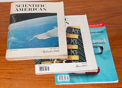
The issues shown are from September 1969, June 1983, and October 2009. The difference in thickness is striking indeed: 10.6, 5.3 and 2.2 millimeters respectively. As far as pages go, the counts are 288, 156 and 72. What happened??

One difference is article length: a typical article in 1969 would run to some 20 pages long, including about 8 pages of advertisements. In 1983 it would have 11 pages including 1 page of ads. In 2009, 8 pages with no ads at all. The number of articles (“features”, in today’s terminology) has also changed, going down from 10 to 8 to 7.

In other words, in the merry Sixties readers were treated to ten 12-page-long (net) articles and lots of ads; in the eighties, they had eight ten-pagers and fewer ads; and today we can read a paltry seven articles with 8 pages each, and almost no advertising.

Scientific American issues from 1969, 1983, and 2009Is this good or bad? Admittedly there’s some attractiveness in ad-free reading; on the other hand, clearly it’s bad for the publisher, and may explain the paucity of real content. It may also explain the cost per page: issue price rose from $1 to $2.50 to $5.99, which is almost constant in normalized present day dollars; but we get less and less pages and articles for this investment.

For my part, I miss the fat issues… and even some of the old ads, which in this particular publication could be fairly interesting themselves (e.g. see the ad here).

More silliness at Newark

We saw how the electronic boards at Newark Liberty airport made the ridiculous omission of adjusting for the Daylight Savings move. Evidently this is not an exception: something is very wrong with that airport’s electronic signage.

These guys have an “Airtrain”, an internal elevated light rail system for moving between terminals. The train has two parallel tracks, and there are electronic signs at the stations to indicate which is which. Thus, the sign in the photo indicates that the train on the left goes to terminals A,B, and Parking areas 1 through 3; the other train goes to P4 and to the train link to NYC.

Newark Liberty Airport Airtrain sign

Except that they also had a backup system. They placed a uniformed woman with a loud voice that announced repeatedly: if you want to go to terminals A, B, and P1-P3 you must take the train on the right. The signs, so convenient and visible, were displaying the wrong information.

You’d think the lady, who was no doubt equipped with a cellular phone, could set the error straight in a jiffy by calling some control room; but that didn’t occur to anyone. And after all, who are you gonna trust: a computerized board, or a well-meaning person of your own species?

Mr. Babbage’s marvelous engine

In the US, where I just gave a lecture at a conference on Information Load and Overload, and of course I found the time to visit the wonderful Computer History Museum in Mountain View. This is always a delight, but this time they surpassed themselves: they demonstrated the newly built Difference Engine #2 in action!

Charles Babbage’s incredible but never-built 19th century calculating machine was first realized in the nineties by the Science Museum in London, and now Microsoft millionaire Nathan Myhrvold commissioned this second replica. This one is complete with the printing mechanism; you crank the handle at one end, sequential values of 7th order polynomial functions are computed by the whirring mechanism, and ready-to-use plaster casts for printing the numbers in table form come out the other end, complete with multi-column formatting. The dance of the mechanism is really a thing of beauty; a visit to the museum is very recommended.

I saw it, and I have the photo to prove it!

Nathan and the Babbage Difference Engine reconstruction

A time lapse at Newark

Had to take a flight out of Newark airport on the morning after the move from daylight saving to winter time. The preceding evening I took good care to set my alarm clock and wristwatch back the required hour, and took off to the airport in the morning. And when I got there, I was amused to see the many and wonderful electronic displays that are all over the place all showing an hour late.

Now, these boards and clocks are all computer controlled, and you’d think they’d let the computers handle the time shift; my own Notebook and Smartphone both did without human intervention. But even if they installed systems based on human clock-setters, like they did with the big clocks of earlier eras, surely they could’ve done the job right – and, if not, corrected the mess when it became all too visible in the morning?…

Evolution of airplane movie technology

Flying to the States on a Continental 777, my favorite jetliner, alternating my attention between my notebook and the video screen in the seat back in front of me. The latter is a new model, fitted to every seat in the cabin. The technology has been evolving ever since I stared flying to America back in the eighties.

At first they introduced real movie screens, one at the front of each cabin, with a projector that would show one single movie at a time. Your viewing pleasure was a matter of luck – a tall passenger in front, or a poor seat location, could wipe it out – but passengers loved it: a movie – in the sky? Wow!

Then came TV screens jutting out under the ceiling, giving better viewing to more passengers; still one movie at a time, chosen by the airline. The passengers had no choice of content or screening time.

More recently we got personal screens, with multiple movies to choose from. Typically we’d have a dozen movies, but they all ran in synch – all started at the same time, and if you switched on in the middle you saw half the movie. Of course on a transatlantic flight there was time enough to take in the missing half in the next cycle. So – each passenger now had the choice of which movie to see but not when.

So this flight, they’ve installed larger, wider screens and with them unbelievable choice. There are hundreds of movies and TV episodes to choose from, and each traveler can start any of them at any time, and even pause, rewind or FF during the movie. Perfect choice.

What will they think of next, then?

Check out my new Infomation Overload blog!

Yep… I started a second blog, this time one dedicated to my work specialty and passion: fighting Information Overload. It’s called “Challenge Information Overload” and you’re most welcome to read it here.

I plan to continue posting here on the Commonsense Design blog, albeit possibly at a somewhat lower update rate (there are only so many hours in a day :-)).

Headup wordpress plugin – add semantic browsing to your blog!

I’ve mentioned the headup publisher widget before. This nifty add-in identifies entities (places, people, companies, books, etc) mentioned in a site it’s installed on, marks them up with a dotted underline, and when you mouse over them a small pop-up comes up with information, news, photos and videos about that place/person/whatever.

That was then. Now Semantinet, the start-up in Herzliya where I work one day each week, has packaged the capability as a WordPress plugin, which means that a blogger can add the capability to any WordPress blog in a mere minute or two. If you have a WordPress blog, you can download the plugin here.

What’s more, the product had evolved, and it now includes a tab called “friends” in addition to the ones for photos, videos, and the rest. This tab – once you connect it to your Facebook account – shows you how the entity being viewed is connected to the people you know, like which of your friends live in the place or work at the company.

Pretty powerful capability – and easier than ever to include. Which is what I just did – mouse over the marked up words anywhere on this blog and see it in action!

Copyright © 2025 Commonsense Design

Theme by Anders NorenUp ↑