Author: Nathan Zeldes

http://www.nzeldes.com

Bike stuntmen, Munich awaits you!

Pedestrian crossing light in MunichI’ve already addressed pedestrian crossing signals in Germany, but here’s a truly surprising one, which I sighted in Munich.

So what does it mean? One can imagine what the intended usage is, but if one were to believe the images literally, this signal tells you when it’s OK to do acrobatic stunts on your bike in the middle of the road, and when it is not…

What a Circus-friendly city Munich must be! 🙂

Plug and Gag, Take 2

A while ago I took HP to task for their tendency to fill your hard disk with hundreds of Megs of software when all you need is a printer driver. I am happy to report that they’ve improved their ways… sort of.

Back then, I wrote:

It is not good manners to sell someone a printer, and then to blast hundreds of megabytes of software onto their hard disk, without so much as a pretty please.

So now I bought a new HP printer and this time it did say pretty please. It asked me whether I wanted a full installation or a minimal installation. Hooray! Of course I opted for the minimal one… I would report happiness, except that the minimal installation – the bare essentials, according to HP – filled 461 Megabytes of my hard drive. Want to guess what a full install would have required?  🙁

What would they need 461MB for? Well, I haven’t even begun to explore the content of this unwanted bloatware, but I can report that the installation process included animated videos showing how to plug the darn machine into the power socket, and so forth (and these are still on my drive, in case I might forget how that is done…)

Plus ça change, plus c’est la même chose, I guess…

Nothing new under the sun

Everyone knows that sport fans can get violent in their excitement… there is even a Wikipedia article listing violent spectator incidents in sports. This being an aspect of human nature, it is not surprising that the custom of berating and clobbering the opposite team’s supporters goes back to earlier times. Still, I was quite amused when I saw this fresco in the archeological museum of Naples:

Pompeii amphitheatre violence

This picture, from the wall of a house in Pompeii, depicts a memorable historical event from AD 59, which is described by Tacitus in his Annals (Book XIV, 17):

About the same date, a trivial incident led to a serious affray between the inhabitants of the colonies of Nuceria and Pompeii, at a gladiatorial show presented by Livineius Regulus … During an exchange of raillery, typical of the petulance of country towns, they resorted to abuse, then to stones, and finally to steel; the superiority lying with the populace of Pompeii, where the show was being exhibited.

And indeed, the fresco shows the agitated fans running inside and around the stadium, with some first victims already on the ground. The actual casualty count was higher by far:

As a result, many of the Nucerians were carried maimed and wounded to the capital, while a very large number mourned the deaths of children or of parents.

The outcome, in fact, was dire for the Pompeiians: the emperor (the infamous Nero) delegated to the senate, and the ruling was that

the Pompeians as a community were debarred from holding any similar assembly for ten years, and the associations which they had formed illegally were dissolved. Livineius and the other fomenters of the outbreak were punished with exile.

Nothing new under the sun…

Image: Wikimedia.

Cool innovation in a parking garage

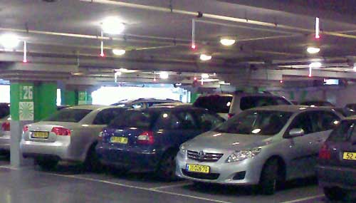
I was trying to find a parking spot in the parking garage under the Ramat Aviv shopping mall in Tel Aviv; this is a difficult task much of the time. But it was made very much easier because I discovered they have a truly wonderful system.

Ramat Aviv mall parking space

What you see here is that over each space they have a rod coming out from the ceiling with a lamp at its tip. A red light means the space is occupied; vacant spaces have a green light. So, as you drive around the claustrophobic maze you can see from far away where there is a free spot (and rush to get to it first!).  Simple and ingenious!

As you see in the photo above, all spaces in sight are taken… so did I find a spot? indeed I have… as you can see in the next photo (at mid-left), the occasional green light does materialize!

Ramat Aviv mall parking space

A thorny design problem

And now, a tip of the hat to a nifty solution to the oldest design problem of them all: how do you spread your genes?

I was taking a shortcut through an overgrown field and ended up with a load of seeds stuck to my socks and shoelaces. When I sat down to pluck them out, I found there were two models: the smaller (some 5 mm long) “fuzzy” seeds (right in the photo) actually had many tiny thorns that did the job; but the larger seeds (up to 9 mm in length) were really impressive, each sporting long, needle-sharp spines all over. I wish I had a good stereo microscope to give you better detail, but you can get the idea from the photos below.

Thorny Seeds

So what? So nothing, I guess, except that being an engineer I had to stop and admire the effectiveness of these designs.

And here is another look:

Thorny Seeds

Makes you feel kinda special, to think that these plants would go to all this trouble to evolve seeds that stick like leeches to your socks! 🙂

The abused art of form design

People who design forms never cease to amaze.

This was very obvious in the era of paper forms. You’d get forms with fields that are patently too small for their content; like this snippet from one I recently filled:

Name ______________________________ E-mail ___________

Cellular: _____________________________________________

What were they thinking?? Many email addresses won’t fit on that short line; and the next line is far too long for a phone number. Why not switch the slots?

This situation is very common, especially when it comes to addresses; you often end up overflowing the allotted space, which can result in barely legible data. Which is really weird, because with a five minute effort the form’s designer could have made things right for thousands of users later on. Don’t they see how ridiculous it all is?!

Another problem is forms that get photocopied and/or faxed so many times that they’re barely legible at all; strangely, bureaucrats seem not to mind getting back forms whose fixed portion is smudged and illegible. Evidently it’s the act of forcing us to submit a formal form that counts, not whether you can read it…

And now, we are paperless; you’d think all would be well with electronic forms… but no. Some organizations I deal with actually mail you a scan of a smudged photocopy of a paper form, and ask you to print it out, fill it with pen and fax it back, adding to the smudging. And even when they send an editable electronic version, they never use the features available in the  Word or PDF formats to steer the filling of the right fields. Instead, they just send around a plain document and expect you to type in the data; and since they use underlines to denote fields, we end up with forms like this:

First Name __________John Smith________________________

Address: ________100 Main street_______________________

and so on…

At least in this last case, you can put things right – put the word processor in Overwrite mode and replace the underlines with your text, or just delete the underlines, ending with:

First Name: John Smith

Address: 100 Main street

Then, if you import a scan of your signature in, you can send the filled form back as an attachment and be done with it!

A friendly sign

We all know the usual “Private Parking” no-parking signs: stark red and white, with wording in fat letters forming threats of the sorry fate – towing, usually – awaiting violators. They’re designed to jar and scare the thoughtless driver. Nothing pretty about these signs, and usually that’s exactly the intent of their owners.

Friendly No Parking SignBut  here you see a sign I saw in Jerusalem on the wall of a house, next to its private parking area. It too says “Private parking – unauthorized vehicles will be towed”. But it does it in a much more friendly way… because of the little rose engraved between the lines. No idea who had this strange idea. Perhaps the owner likes flowers, as attested to by the bed of geraniums right under the sign? I can’t recall ever seeing  a sign forbidding anything that left me in a cheerful mood, but this one  certainly did.

Friendly No Parking Sign close up

Lavazza’s confusion

Lavazza Espresso point machineI was visiting an office where they had one of these delightful Espresso machines, an Espresso Point by Lavazza, and tried to make me a cup.

I put in a paper cup and a coffee cartridge, pushed the button at the right of the panel next to the size I wanted, and instead of that steaming coffee, I got a blinking red light at the left (marked below with an arrow).

I tried to puzzle the meaning of this light. It had the icon you see, with a coffee cup and an X. What did it mean? Obviously in a large beverage dispensing machine it would stand for “I’m out of cups”; but this machine did not store cups. It might mean “You forgot to put in the cup” – only I hadn’t. What else? “Smash a cup before I agree to make coffee”?

After much futile experimentation a local came and said “Oh, the machine is out of water”, and she proceeded to pour some in at the top. I could finally enjoy my coffee.

Lavazza Espresso Point machine - control Panel

But what a stupid design choice… the cup with the X has no relation to missing water; and indeed, the fact that the cup looks identical to those in the icons at the right side of the panel only reinforces the mis-interpretation.

Shame on you, Lavazza designers!

Sic transit gloria mundi

In a world of rapidly advancing technology it is the fate of any given product to go down from the latest and greatest to a commodity in a few years. The fancy box my first electronic calculator came in probably cost more to make than an entire calculator costs today – and today’s unit, though far more powerful, is sold in an ignominious blister package…

I found a good illustration of such a trend when putting in order some of the accumulated techno-junk in my basement. A load of old software backups allowed me to view a history of the packaging of a once excellent innovation, the soon to be forgotten 3.5-inch micro-floppy disk.

When these rigid diskettes hit the market in the early eighties, popularized by the original Mac and Amiga computers, they were a great improvement over their flimsier 5.25-inch predecessors. They were also expensive enough to warrant packaging in very nice cardboard boxes, ones that would double as easy to browse diskette libraries. Like this elaborate package by Maxell:

Diskette Box - mid-eighties

Then prices inched lower, and by the nineties Maxell made the same product in this box, which was a tad harder to flip the disks in but was made of two cardboard parts instead of the earlier three:

Diskette Box - nineties

And lastly, in the previous decade and up till their gasping breath when flash sticks drove them out entirely, floppies were downgraded to the cheapest one-piece box type possible, as seen below.

Diskette Box - 21st century

Thus passes the glory of the world…

Another ridiculous serving suggestion

I’ve discussed before the silliness that results when overcautious lawyers and thoughtless designers cooperate to create silly “serving suggestions”… and here is a lovely new example.

Serving Suggestion
Salt package

In itself this salad may be a good serving suggestion for a package of cucumbers (or of parsley, perhaps)… but this is not what this image is displayed on. Instead, it is shown on the package in the photo at right.

Yes, this is a package of plain table salt!

I can’t wait for a producer of mineral water to think up a “serving suggestion” for plain water. Until then, this one will remain a winner on my list of pointless package legalese.

Copyright © 2025 Commonsense Design

Theme by Anders NorenUp ↑