Author: Nathan Zeldes

http://www.nzeldes.com

At last, a sensible exit sign!

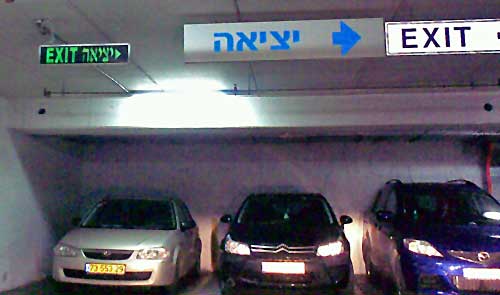
Those depressing multi-story parking structures are an unavoidable part of a driver’s life… and they can get quite annoying when you need to find your way out of one. Sure, there are signs. Here, for example, is one garage that takes no chances on our missing the exit, and advertises it bilingually and redundantly:

Car Park Exit Signs

The only problem is, it fails to say whose exit it is to the right: pedestrians or cars? This is a very common sort of confusion in such car parks, since cars and people exit them from quite different places.

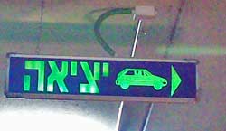
Car Park Exit SignSo here is the right way of doing it! The sign to the right (found on another level of the same car park, strangely enough) leaves no doubt whatsoever: cars should exit to the right. I don’t remember if they had a similarly unambiguous sign for pedestrians, though those are usually marked with a running person for safety reasons. Anyway, isn’t this simple sign design convention something that every parking structure in the world should have?
Your mother should know!


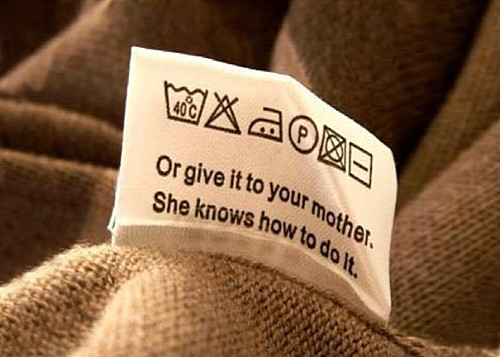
A friend pointed me at this image, which seems to have gone viral online:

Laundry Tag

Now, this is pretty hilarious as a joke, but there are some serious comments it brings to mind.

First, the “normal” laundry instructions use icons instead of words, but unless you’re a laundry expert these convey no universally obvious meaning (the leftmost one in this image excepted, but that one uses text). This reinforces an earlier post on this blog: pictographic instructions are not always a good idea!

More important: the reference to mother’s knowledge is something no manufacturer would ever use in an instruction sheet, but it makes a whole lot of sense: sometimes the best way to access knowledge is by relying on others. Depending on the subject, you can learn a great deal from your mother (or father), from your coworkers, from your boss, from your friends… a process that throughout most of human history was the preferred method. Mother would teach daughter how to care for a baby (or, yes, do the laundry), father would teach son how to sow, or fish, or hunt, tribe elders would pass on the group’s history and lore… as the Beatles said: “Though she was born a long, long time ago – your mother should know!”

And even today, much knowledge is moved around this way. And many young people do ask their parents  for advice; the parents  in turn benefit from their kids’ expertise in other areas. No one, incidentally, reads the manufacturer manuals!  These  would get much better results if instead of the reams of multilingual safety appendices that everyone ignores they’d simply say “as to how to use this device safely – you really want to ask your Dad!”…

Grace Hopper as Susan Calvin

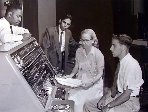
Rear Admiral Grace Hopper (1906-1992) was one of the legendary pioneers of computing in the 20th century; among other achievements she had written the first compiler. Here is a well-known photo of her with some colleagues at the console of a Univac-1 computer back in 1957.

Grace Hopper next to Univac 1 console,1957

And whenever I see this photo, I am reminded vividly of Dr. Susan Calvin, Robopsychologist at U.S. Robots and Mechanical Men Corporation, as featured in Isaac Asimov’s I, Robot. I don’t mean the silly action movie starring Will Smith; that had Dr. Calvin as a sexy young chick. In the book (which is much different and way better) Calvin is a strict, prim, spinsterish lady who clearly feels more at home with robots than among humans, whom she treats with a dispassionate aloofness most of the time. She is also the smartest human in the book, by a large margin; an ultimate Geek, in fact.

There are those who claim that Hopper was Asimov’s model for his heroine; be that as it may, if I had to imagine Susan Calvin (the real one, so to speak), I would go no farther than Grace Hopper in this picture. There she sits, the only woman in a male-dominated environment, professional and intelligent and focused on her technological specialty.

Hats off to both these grand ladies of Geekdom, past and future!

Where are our car windows going?!

Something weird is happening to car designers.

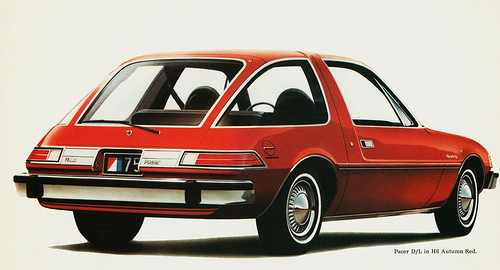
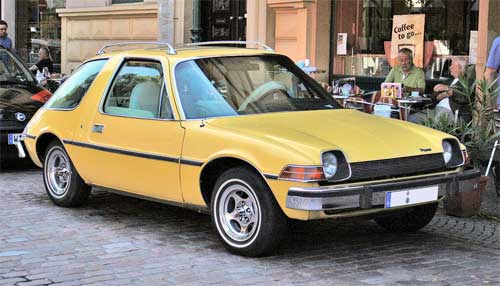
Back in the mid-seventies there was one car in my home town that someone had imported from the US, and I remember how futuristic it had looked to us then.

AMC Pacer car
Photo source: Wikimedia Commons.
Jetsons aircar

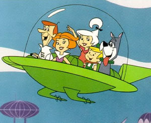
This was the remarkably innovative AMC Pacer, and it had those huge wrap-around windows that made it look almost like a glass bubble. It was clear that in the future cars will have windows like this: you only had to think of the aircar of the Jetsons family, the future analog to the Flintstones.

So now the future is here, and not only are bubble cars nowhere to be seen – the windows on our ordinary cars are shrinking at an alarming rate. Compare the two family cars below, an older Subaru and a new Kia. Look at those windows. See the difference?
Subaru and Kia

This trend is everywhere. Makers the world over design cars with small windows; if this goes on we will soon have cars with tiny slits to look out through, like in a tank. Here are three more examples:

Cars with small windows

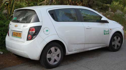
Now, compare the rear end of the Chevrolet in the photo below to the AMC Pacer’s behind in the next photo. See how far the designers have veered off the “future” we had expected?

Chevrolet

AMC Pacer2
Photo courtesy aldenjewel, shared on flickr under CC license.

And what I can’t figure out is, what’s gotten into these designers? Why enclose people in lumpy metal boxes without a good view out? Or is it that car owners prefer it this way – and if so, why? Have they lost interest in the outside world (consider in-car entertainment systems!) – or are they afraid of it, and prefer to hide in their air conditioned cars, with small tinted-glass windows to make them invisible to other people?

Do you have an explanation?

Android vs. Palm: the lost art of keeping it simple

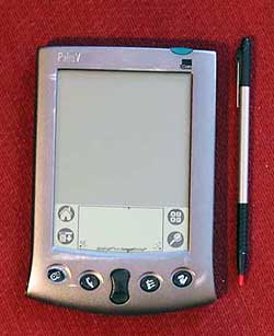
Back then we had the Palm Pilot. It had a gray lo-res screen and minimal capabilities. No wireless, no GPS, no games, just basic PDA funcfions. Compared to the android phone I use now it was like a stone ax. And yet, that old Palm had a key attribute that is long lost: simplicity of use.

Palm PilotA prime example: the “EDIT” button. Take the common task of modifying a memo or appointment. In Android, you have to open the item, and then hit EDIT to enter a mode where you can make your changes. And when you’re done you hit SAVE. Makes sense? Not really. In PalmOS you opened the item and just started typing. Edit mode and View mode were one and the same. Just like a sheet of paper: you can read it and you can write on it as you wish.

It may look like simple matter, but all those extra clicks do add up and clutter the user experience; what’s more, they detract from elegance – that intangible element which calls for keeping it simple!

Indoor chair, outdoor chair

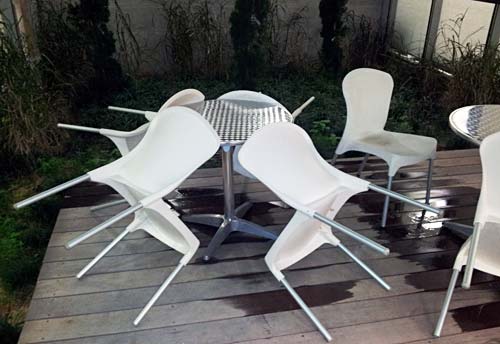
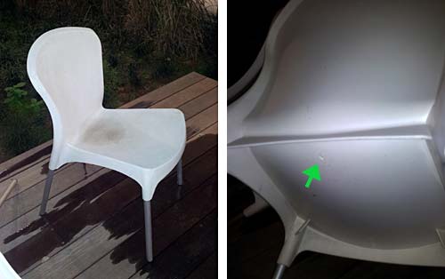
I was in the campus of the Academic College of Tel Aviv and l noticed a little courtyard with a nice deck and some garden furniture. What caught my eye was that the chairs were tilted against the tables.

DeckChairs1.jpg

The reason became obvious when I saw one chair that had remained upright: it had a puddle of rainwater in its elegantly concave seat.

DeckChairs2.jpg

At first I was annoyed by what seemed an obvious design flaw: surely a small hole drilled in the middle of the seat would have solved this issue – what a stupid way to design an outdoors chair! Then I realized that these were no outdoors products. They were regular chairs that someone had probably repurposed for garden use in sunnier times, proving that one should be more careful with ignoring a product’s spec.

And then I noted a little round mark on the bottom of each seat, in just the location I would’ve drilled that missing hole in. Evidently, the manufacturer had foreseen the dual use of this plastic chair, and had prepared to provide for both uses. Still, the end user had used the wrong version – and had neglected to correct the problem, which a minute with a drill would have easily done.

Target practice

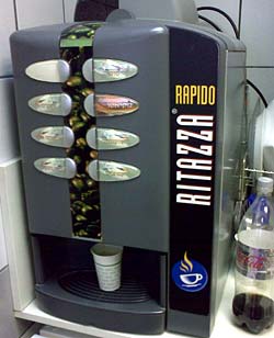
Coffee machineWe all know these automatic coffee machines: you place a paper cup under the nozzle, hit a button, and out comes a flow of some sort of coffee or chocolate drink. The machine at right is a good example.
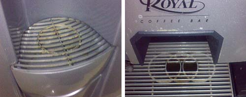
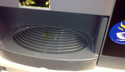
The problem with such manual cup placement is that you risk misaligning the cup to the nozzle hidden in the machine’s innards; that’s why the surface you place the cup on is a grille, to allow any spilled liquid to collect out of sight. The machine in this photo has such a grille, elegantly formed into an ellipse. But it has a glaring design flaw…

Below you see two such grilles from two other machines. Both have a circle showing you the target, the optimal location to place your cup in; one even has the targets for either one or two cups.

Coffee machine targets

But the machine shown at the top of this post has no such target – or rather, it does have a tagret arrangement of sorts – concentric ellipses – which has nothing to do with where to place a cup. And indeed, when I snapped it it had a nice coffee stain to show for this design oversight…

CoffeeTargets2.jpg

Form follows Function

Form follows Function, as we all know… but function can change, leaving the form out of context.

Consider the long, rather dilapidated building with the vaulted, tilting roof seen behind this parking lot in downtown Jerusalem. What does its form tell you?

Orion Cinema building in Jerusalem

In its heyday, in the 1940s and 50s, this strange form was dictated by the building’s function: it housed a luxurious, large movie theater, the Orion Cinema. The long, narrow, slanting form was due to the rising rows of seats.

Today these large cinema halls are a thing of the past, driven out of business by home video and the smaller, more modern halls of multi-theater complexes in shopping malls, whose function is not visible externally any more. And the grand old Orion building now houses a McDonalds… whose function has nothing to do with its form either. The younger generation who eat in it have no idea that it was one of their city’s major entertainment venues 70 years ago… and would certainly not recognize the building’s odd shape. Oh well…

Food labeling we’d like to see…

Most food products have nutrition information labels that tell you in minute detail what they contain, from calorie count to milligrams of Sodium. All very edifying, to be sure, but boooring!

So the other day I saw this box of cookies, and below the logo of the English Cake bakery it says – in Hebrew – “Very tasty“!

English Cake cookies

Isn’t this something they should add to every food label? We could have cookies labeled “Very tasty“, “Tasty“, “So-so“, or “Yecch!“, just like the “Hot”, “Medium” and and “Mild” on Salsa jars. Now, wouldn’t that be useful to us consumers? 🙂

Wayda go, Logan airport!

We veteran road warriors know the drill: go thru security, then hunt for a power outlet to recharge our computer at as we wait for our flight. This often involves scouting the terminal halls hoping to find the occasional wall socket intended for the janitor’s vacuum cleaner, hoping there would be a vacant chair near it. Of course, these are scarce, and as likely as not to be taken by a fellow traveler.

Power strip at Logan Airport

But on my recent trip to Boston I saw a much different approach to our problem. At Logan International airport, there are rows of seats at each gate with power outlets built right into them – lots of outlets, enough for all of us business travelers – and for those serene kids with iPods and ear buds…

Power strip at Logan Airport

Note the variety of sockets – 110VAC, 5VDC via USB… These guys have thought of everything! Add the hassle-free WiFi they have, and you have the most notebook-friendly airport terminal I’ve ever seen.

Wayda go, Logan!

Copyright © 2025 Commonsense Design

Theme by Anders NorenUp ↑