Year: 2008

Cappuccino for two

One of the small pleasures of life is sharing a fine Cappuccino on a weekend morning at home. The only difficulty is, you need a way to produce one, and we don’t have a professional machine at home like they have in a proper coffee shop. We do have the means to make strong espresso – one half of the Cappuccino story – but what of the milk? We had a battery-operated propeller thingy that was supposed to beat milk into a froth, but it left much to be desired.

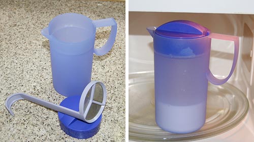
Enter Tupperware. This innovative manufacturer of kitchen plasticware came up with a gizmo for making foamed milk – the “Magic milk cappuccino maker” – that shines in its ingenious simplicity. It consists of a small plastic jug with a lid that allows through a round metal mesh – a strainer – on a rod. Here’s how this works:

First you fill the bottom third of the jug with milk, put on the lid and microwave for 2 minutes to get the milk hot.

Tupperware Magic Milk Cappuccino Maker

Next you put in the strainer, close the lid, and pump the rod up and down rapidly a few times. The mesh moves through the milk and foams it up in no time – very effectively.

Tupperware Magic Milk Cappuccino Maker

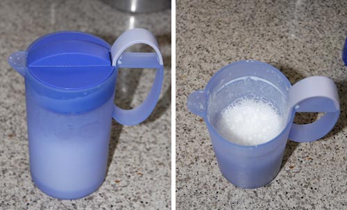
Meanwhile you produce the espresso in your Brikka, put it in the cups and shovel in foam and hot milk from the Tupperware jug. The entire process takes under 5 minutes, most of it waiting for the machinetta to boil. And here we are:

Homemade Cappuccino

Lovely, lovely Cappuccinos… none of the artwork a barista may make in the foam, but just as pleasant to consume.

Snagit 9 vs. FastStone 6: Simpler is better!

I needed a screen grabber, and based on recommendations from a friend downloaded the trial version of Snagit 9. I was impressed and disappointed.Impressed, because this is one potent package. It can do everything you may ever want to do about image grabbing. I particularly liked the “Scrolling window” option, for capturing a web page longer than one screenful. BUT… this program has an extremely complex and ornate user interface, giving you access to countless possibilities; and these are presented in the most colorful UI I’ve seen since my kids graduated from Fisher-Price. Take a look :

Snagit 9 User Interface

Compare this to Photoshop: powerful and feature rich, but its UI is simple, with minimalist icons in monochrome…

FastStone user interfaceI found this so distracting that I went and downloaded another shareware product, FastStone Capture (Ver. 6). Check the utterly simple UI to the right:

Note that 99% of the time, these few icons (including “Scrolling window”) cover all you need; the rest is accessible but unobtrusive in a drop down menu at the right, where it can’t distract you. Click a button on this tiny floating toolbar and the capture begins. The same icons exist in the Snagit window, but actually, once you click one there you then need to click the big red round button – which may make you feel powerful, but is a redundant action. Of course it’s a single extra click, but it’s also double the number of clicks required  in FastStone.

Interestingly, the development team at Snagit have a blog where they share their thoughts (commendable!) and there I read that “… we felt that the interface shouldn’t be competing for attention, but should fade away and allow people to focus on their content”. Sorry… good thought, but I can’t endorse the execution on it. Nothing about the baroque UI they built brings the word “Fade” to mind. Just compare it to the tiny toolbar of the FastStone tool.

Simpler is better, nowhere more so than in tools you use daily.

In case you didn’t know…

And now, a nice sighting from Pil and Galia.

They report buying a coffee press made by Bodum, a leading maker of these ingenious devices. And on the bottom of the box came this enlightening revelation: “Boiling water and children should be kept apart”

Bodum coffee press warning notice

At first I actually thought this was said in jest, a sophisticated attempt to remind people of the danger without sounding too officious; but the other versions made it clear I was giving Bodum an unwarranted benefit of the doubt. The French warning is the silliest: it says that “Boiling water can be dangerous for children”. Which raises two immediate replies (beyond the obvious “Well, Duh!“):

  1. Can be?
  2. Why only children? What about adults?

Oh well, at least the coffee is good.

The other side of those Road Reflectors

We all know the raised reflector buttons on the lane divider lines of a freeway. They have white or yellow retroreflectors embedded in their edges, so that at night they shine right back at you in the light of your car’s headlamps. Safety and beauty in the same simple device.

But what many may not realize is that they have another design feature, also safety related, and far more ingenious. At least in some freeways – California’s, for sure – the buttons’ other edge – the one facing away from oncoming traffic – has red reflectors in it. Why put reflectors on the side you never shine a light on, the side you can’t even see?

Precisely because of the one circumstance when one would be seeing it: when they drive on the freeway in the wrong direction, having entered via the off ramp instead of the on ramp by some colossal mistake – think DUI, for instance. Now you have a drunken driver going in the wrong direction at night; traffic is sparse, but any moment disaster may strike unless this fool notices his mistake. And now those reflectors return the investment – for this driver will see long lines of red lights shining ahead to infinity; so unusual as to immediately alert him that something is wrong.

And if, like me, you never did that, you can still see the effect if you drive facing straight into the sun when it is low in the sky; you can then see the red reflectors, shining back the in the sunlight, in your rear view mirror!

Elegant design in the back of a Remote Control

Sometimes one runs into elegant design in humble places…

I was sitting in a meeting and fiddling idly with the remote control of the NEC LCD projector. After toying with the laser for a while, I pushed out the battery cover on the back. As expected, it unlatched and slid open, like these things always do. But there was a twist…

NEC LCD Projector remote control The cover slid off, but stayed connected to the unit by a thin rubber ribbon. We’ve seen so many R/C units missing their cover – well, not this one! The only extra part required was the rubber ribbon, which clips into a slot on the R/C itself. Simple, elegant, professionally designed. Good job!You can see in the photos how this works:NEC LCD Projector remote control

NEC LCD Projector remote control

NEC LCD Projector remote controlNEC LCD Projector remote control

Square is beautiful!…

Sometimes you find elegant design in the places you least expect it.

We stayed in the Dan Carmel in Haifa, and the small supplies in the bathroom came in color-coordinated little boxes: shower cap, cotton pads, the usual stuff. Still, they failed to go all the way: they had tall bottles for the shampoo and a round box for the shoeshine sponge:

Hotel Dan Supplies

Which reminded me of a much better attempt at such standardized packaging that I saw in the Hotel Silken in Zaragoza, Spain:

Hotel Silken Supplies

They had ALL the supplies fit in square packages, made of either cardboard Square Eggs at the Silken Hotel in Zaragoza
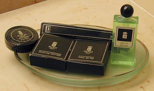
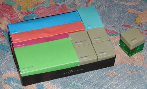
or plastic, and these all fit like a puzzle into a rectangular cardboard tray. Even the shampoo bottles were square and fit the scheme perfectly. It was a delightful design, injecting elegance into this utterly mundane collection of supplies, so I share it here.

These guys had such a thing going for the rectangular form factor, that even the sunny-side-up eggs they served for breakfast were square!

Something is wrong with our Notebook LCD screens, part 3

And now, following Parts 1 and 2, here is the last installment…

These days, more and more Notebooks come with displays branded by the makers as VibrantView, or CrystaslBrite, or OptiClear… exciting names indeed. What they all refers to is glossy LCD screens, which would be much better described as GlareMirror, or UglyReflector, or maybe just RazzleDazzle

Glossy screen on a Notebook computer

Photo source: Marco Wessel, under Creative Commons license.

The underlying idea is to remove the matte anti-glare layer on the older screens, a change which results in better definition and more vibrant colors, plus better outdoors visibility. All commendable attributes, except that the price you pay is a mirror-like surface that reflects windows, light fixtures and other bright objects, a problem that motivated the original matte layer to begin with. Solutions? Work in a totally dark room, or try to yank the screen around until you find a reflection-free angle. Note that the last works for a single viewer – these screens are most annoying when someone shows you something on their screen: maybe they found the glare-free position, but you, looking from the side or over their shoulder, will get the full blast of annoying reflections.

Now if the matte screens were bad – if their colors really sucked, or their focus was totally fuzzy, I can see the possible value of a trade-off; but TFT LCD’s have reached maturity years ago, and are a delight to use. So what got into the vendors’ heads, to throw in the glossy finish – not as a  rare option, but as a mainstream technology?

Can you guess what this device does?

They say that form follows function. So – take a look at the form of this strange device, which stands about a meter tall. Can you guess its function?

Smell Display Device at teh Potsdam Biosphere

No, it isn’t a trashcan with dreadlocks.

I saw this thing in the Biosphere at Potsdam. This pleasant museum is smaller and less ambitious (should I say, less pretentious?) than the one in Arizona, and serves very well to exhibit different ecosystems to the visiting public.

The item you see here is a display device for displaying smells. You sniff the end of a tube to get a whiff of the plant shown on the round image below it.

Did you guess?…

Something is wrong with our Notebook LCD screens, part 2

We discussed the recent trend that is eliminating the optimal resolution in notebook computer screens. Another undesirable trend is the move to widescreen displays. These days it is almost impossible to buy a notebook PC with the traditional 4:3 screen form factor; all new models boast a “wide” screen with a 16:10 form factor such as WXGA (1280×800) and WSXGA (1680×1050). In fact Lenovo, makers of the Thinkpad I use, have just proudly declared that they’re dropping all 4:3 screens in their new line of notebooks.

And what are they proud of? What’s so cool about giving us less effective screens?

Xerox Alto system
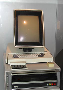
16:10 is a perfect choice if you want to watch movies, which come increasingly in wide formats. However, business notebooks are not intended primarily for this enjoyable purpose. They are meant to do business on, primarily word processing, email, presentations, and the like. And for this purpose, widescreen is totally inadequate. Documents are invariably taller than they are wide, like the paper pages they emulate; even presentation slides have a 4:3 aspect ratio. That’s why the venerable Xerox Alto (at right), sporting the granddaddy of all of today’s Personal Computer interfaces, had a “portrait” form factor screen: because you could process a whole page at once.

Now ideally, a wide screen might accommodate two pages side by side; and that works fine with a large external monitor. But Notebook screens are kept small for portability, and there is no way you can comfortably read two pages on a 14″ or even a 15″ screen. So you have to use the screen for one page, and since these screens are shorter (top to bottom) for a given diagonal size than the 4:3 type, you end up seeing less lines on a document at a given page width. You get more area at the edges of the screen, which you don’t need, and less height, which you do.

Like I already said, something is very wrong…

Copyright © 2025 Commonsense Design

Theme by Anders NorenUp ↑