Year: 2008

Making LCD monitors crisp

I went to shop for a widescreen LCD monitor. I went from one large store to another; each had at least half a dozen candidates, and it was amazing to see how poor the images on them looked!

Of course, in most cases the immediate cause was that they were being driven at the wrong resolution. As I explained before, a liquid crystal screen must be driven at its native resolution to avoid fuzziness. Since all the screens in a store were driven by one computer, yet had different resolutions, many were mismatched.

Of course one should never buy a monitor sight unseen… so I had the foresight to lug my notebook with me, and the store guys were willing to let me hook it to the screens on display after setting its output to the appropriate mode. But even then, most screens were fuzzy, so much so that it just didn’t make sense. I then discovered that in their complicated OSD menu system, there is usually a “Factory Reset” option. Guess what – in maybe half the cases doing this improved the display quality considerably!

Dell 2208WFP 22 inch LCD monitor
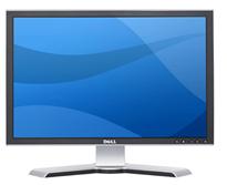
I the end I settled on a Dell 2208WFP, a nicely designed 22 incher. And when I got it hooked up at home, lo and behold, the text was just a little bit fuzzy. I did the Reset thing but to no avail. I played with the brightness and contrast – still no use. And then I explored the menus further and guess what? They had a setting called Sharpness! It was at 50%; I jacked it up and the monitor achieved that exquisite crispness I’d come to expect of Dell monitors.

Now, my experience is that a significant fraction of users spend their time in front of fuzzy displays. Many don’t even realize there’s a problem; in many cases a glaring resolution mismatch causes extreme fuzziness but they have no idea they could fix it in seconds. And then, I’m sure, there must be many who haven’t even bothered to adjust the display’s own controls (being hidden in the OSD makes them easy to miss).

So, look at the screen you’re reading this on and ask yourself: can you do better?

Ergonomic keyboard or Snake oil?

Was at Office Depot and noticed a keyboard on sale that was touted as the Anti-RSI keyboard from A4Tech. Anti-RSI position on A shaped keyboard from A4Tech

This, according to their web site, has an innovative “Natural A shape” layout that allows you to type ergonomically with your wrists held in their natural position, rather than bent at a strained angle. The site shows this convincing-looking diagram:

So I examine the keyboard, and it’s the exact same layout as on a normal one, but the keys are diamond-shaped so the lines between their edges have that “A” shape.

Anti-RSI Keyboard from A4Tech

Which is nice, except that when I type I hit the tops of the keys, not their edges, who for all I care can have any shape at all. In fact, I hold my wrists at the correct angle when using any keyboard, and would do the same on this one.

So… either I’m missing something, or this is nothing but hype.

Any insight, anyone?

World Usability Day 2008

Today, Nov. 13, is World Usability Day, sponsored by the Usability Professionals’ Association.

World Usability Day

This has been running since 2005; each year, on the second Thursday of November, over 225 events are organized in over 40 countries around the world to raise awareness for the general public, and train professionals in the tools and issues central to good usability research, development and practice.

This year the theme is Transportation, with various practitioners and organizations addressing the impact of transport methods and practices on people and on the environment we live in. And while browsing some of this, I found this interesting research report from the UX Alliance on Parking Meters around the world, with a focus on their ease (or not) of operation. Turns out that “… no two parking meters … are completely the same and that the complexity of operating the parking meters varies considerably. There is a world of difference between the auto-detecting parking meter in Tokyo and the complex and error-prone parking ticket dispenser in Amsterdam.” The report, with numerous photos,  is quite interesting and insightful about proper design (or otherwise) – recommended reading!

Polycom under siege

The triangular Polycom conference phone is a familiar device; in many companies there is one in every conference room. It is so familiar that few give thought to its miraculous ability to transmit high quality sound from one roomful of jabbering humans to another. In fact, this involves some pretty sophisticated technology for echo cancellation and noise filtering; to quote the Polycom site, “Automatic Gain Control intelligently adjusts the microphone sensitivity based on where participants are seated in the conference room”!

Polycom conference telephone

Image: Wikipedia, by Sweetness46, under Creative Commons license

A telephony engineer I once met explained to me that the microphones at the three ends of the Polycom are exquisitely optimized so the sound enters them just right, glancing off the table surface at the optimal angle, to achieve the best possible sound quality. Isn’t that smart design?

So what do we do, then? Why, we put the poor thing at the center of a round conference table and surround it with an impregnable wall of Notebook screens, as all attendees read their email during the meeting. There goes the exquisite design, the adjustment based on where participants are seated, the echo processing…

One can almost imagine a future generation of phones that can raise themselves on a robotic stalk to peer above the notebooks (OK, so this is more like an R2D2 kind of response than a likely reality). But in fact, I once visited a company where they mounted the Polycom on top of a 12 inch pole in the center of the table. It looked weird, but I’m sure it sounded great…

Amazon fighting infuriating packaging!

Ordered some books today and was surprised to find on the Amazon.com home page a message from Jeff Bezos telling of their new initiative to alleviate “Wrap Rage” – “Amazon Frustration-free packaging“. Apparently they plan to recruit leading manufacturers to put an end to clamshell blister packs, steel-wire ties and excessive cushioning materials.

Amazon Frustration Free Packaging compared to regular packaging

They aren’t necessarily resorting to Julie Andrews’s “Brown paper packages tied up with strings”, but they will push for smaller, easy-to-open, recyclable cardboard boxes designed to minimize both waste and customer fury. What’s more, these plain boxes are designed to ship as they are, without need for an additional shipping carton. More details here.

What can I say? Good idea! I wish more vendors did that sort of thing.

The tachometer – the most useless car component…

Modern car dashboards have numerous indicators and controls. Some are necessary: without a fuel gauge, for instance, we’d be in frequent trouble. Others are optional but quite useful: the rear collision warning beeper is a good recent arrival. But one indicator is totally unnecessary, yet present in a great many car models: the Tachometer, or engine RPM indicator.

Car Tachometer and Speedometer

This meter is very impressive, to be sure, and on a race car would be quite useful to help the driver wring the ultimate performance without destroying the engine. But this meter, at left in the photo, is not from a Formula 1 car; it’s from my faithful but mundane Mazda 3, with which I navigate the congested roads daily to get to work. You think I constantly glance at the tachometer to set the gears so my engine’s not redlining, when I’m stuck in traffic jams half the time? Even if I were so inclined, this car has an automatic transmission!

Fact is, nobody uses this indicator on a family car; yet the manufacturers put them in – adding just a little bit extra to the waste of energy and resources needed to produce the car. I suspect this is another of the cases where fashion, vanity and marketing get together to override commonsense design – we get this meter because it looks flashy, fashionable, macho… hey, I have an RPM gauge like the race track pros!

Millions made – none needed 🙁

LCD TV screens: can’t they just switch on?

One problem with CRT-based television sets and computer monitors was that they took a long moment to turn on, because of the inherent necessity to heat up the filament of the picture tube. How fortunate, then, that the new generation of flat screen displays does not have a filament, allowing them to turn on practically instantly.

But allowing is not the same as doing it. We bought this little 22″ LCD TV recently, made by MAG, and when you turn it on it takes a full 8 seconds before the picture shows up on the screen. And the last two of those seconds are devoted to showing the manufacturer’s logo! Opinions about User Experience may vary, but no one would argue that staring at a dark screen, with or without a logo on it, can really enhance that experience.

MAG LCD TV with logo on screen

With all respect, MAG designers, you’re welcome to etch your logo on the screen bezel in all its glory (as you have); but when I hit that On/Off switch, I want the screen to light up in 2 seconds, max. I know you could do it, if you set your minds to it!

The infamous Caps Lock key

Caps lock key on a modern PC keyboardEveryone knows that the QWERTY keyboard layout sucks, because it carries a legacy from the early typewriter days; still, we’re all locked into its use and live in oblivion of what we’re missing. But we have another legacy from mechanical typewriters that is hard to forget because it bites us daily. i REFER TO THE cAPS lOCK KEY.

It is interesting to trace the history of this design infamy. Originally, it made a lot of sense: in a mechanical typewriter the Shift keys did just that: they shifted the type mechanism vertically so the type bars would hit the paper with the uppercase letters; and the Shift Lock key would keep the keys locked in this position. This key had to sit right above the Shift key, because it physically latched it in a depressed position; hitting Shift again would release the lock. It was very easy to see (and feel) whether Shift was locked or not, because both keys would be depressed when the lock was engaged. The photos below are from an antiquated Royal typewriter; you can see how the Lock key holds down the Shift key on the right (and note the quaint caption on the latter key – Shift / Freedom, in allusion to releasing the Lock).

Shift Lock in an old typewriter

Early computer keyboards carried this idea forward, with a Shift Lock or Caps Lock key that had two physical positions: depressed for Lock, and flush with the other keys when released. You could therefore tell when you were in Caps mode, and would notice immediately if you hit the lock accidentally while touch typing. The delightful Commodore 64 had this feature, among others; the photos show a keyboard that came with the collection of homebrew boards described here, from the late 70s.

Two-position Caps Lock in a 1970s keyboard

Later, as keyboard makers sacrificed quality for cheap manufacturing, the more complex and different two-state key was replaced with a momentary key like all the others, with electronics to implement toggle action. Gone was the tactile feedback. Now a simple brush of the finger could accidentally lock you in Caps mode. Worse still, the position of the Lock key next to the left Shift key, which made sense a century ago, was retained – placing this relatively little used key right in harm’s way.

I don’t see manufacturers giving us back the 2-position key (it would cost them a few cents, after all), but the least they could do is move this stupid key to the top row, next to the Scroll Lock, where it will remain unused, unnoticed, and harmless.

So, what can we do about this? Well, one thing we can do is disable the offending key. No need to tear it out – I used KeyTweak, a free key remapping utility, to disable it on my Windows XP system. Good riddance!

Also, if you use MS Word, you may be unaware that depressing Shift+F3 repeatedly will change any selected text to lowercase, uppercase, and sentence case; a very useful feature after YOU’VE ACCIDENTALLY HIT sHIFT lOCK AND CONTINUED TYPING.

Plug and Gag: hardware that thinks it’s software?

These days nobody is surprised to see a software product expect tens or even hundreds of free Megabytes on the disk – a far cry from the frugal eighties, when entire operating systems would fit on a floppy or two, but this is life and we accept it philosophically. But when a piece of Hardware makes similar expectations, I begin to be annoyed. And increasingly, they do.

For example, I recently installed for a friend a new printer, the Hewlett Packard Deskjet HP-F2280 printer/scanner/copier. I put the CD-ROM that came with it into the drive, and then had to stick around for more than 15 minutes, and interact with a zillion dialogs, while the product installed an endless stream of stuff on the hard drive. Fifteen minutes for what ought to be the installation of a device driver?!?!!

Leaving aside the question of speed – this computer was running at over 2 GHz, so I’d expect it to need 15 minutes to solve massive mathematical problems, not to copy some silly software from a CD – there is the question of manners. It is not good manners to sell someone a printer, and then to blast hundreds of megabytes of software onto their hard disk, without so much as a pretty please. And HP has the nerve to claim in the System Requirements that you need “450 MB available hard disk space” to install the printer under Windows XP. For Vista, you need 700MB.

Think about it: 700 Megabytes? 700 MB is enough to store all the text of the Britannica; it’s the sort of space you’d expect for a complete development environment, or for a powerful video editing program. But a printer?!

Sheer Chutzpah, that’s what it is.

Copyright © 2025 Commonsense Design

Theme by Anders NorenUp ↑