Tag Archive for 'User Experience'

CardScan continues to amaze!

A few months ago I wrote about the surprisingly good customer service I received when my CardScan business card scanner died. Well, this was no accident, it seems.

The other day I installed the CardScan software on another computer and I noticed on the welcome dialog during installation the following fine print:

CardScan welcome dialog

I was impressed. I install many software products, and most never go beyond offering a customer service pointer in case of trouble. Mr. Weyman’s invitation is much more positive and proactive, and I may take him up on it one day…

And on the same dialog they also say that you can return the product in the first 30 days for a no-questions-asked refund. These guys really understand customer orientation!

Amazon fighting infuriating packaging!

Ordered some books today and was surprised to find on the Amazon.com home page a message from Jeff Bezos telling of their new initiative to alleviate “Wrap Rage” – “Amazon Frustration-free packaging“. Apparently they plan to recruit leading manufacturers to put an end to clamshell blister packs, steel-wire ties and excessive cushioning materials.

Amazon Frustration Free Packaging compared to regular packaging

They aren’t necessarily resorting to Julie Andrews’s “Brown paper packages tied up with strings”, but they will push for smaller, easy-to-open, recyclable cardboard boxes designed to minimize both waste and customer fury. What’s more, these plain boxes are designed to ship as they are, without need for an additional shipping carton. More details here.

What can I say? Good idea! I wish more vendors did that sort of thing.

LCD TV screens: can’t they just switch on?

One problem with CRT-based television sets and computer monitors was that they took a long moment to turn on, because of the inherent necessity to heat up the filament of the picture tube. How fortunate, then, that the new generation of flat screen displays does not have a filament, allowing them to turn on practically instantly.

But allowing is not the same as doing it. We bought this little 22″ LCD TV recently, made by MAG, and when you turn it on it takes a full 8 seconds before the picture shows up on the screen. And the last two of those seconds are devoted to showing the manufacturer’s logo! Opinions about User Experience may vary, but no one would argue that staring at a dark screen, with or without a logo on it, can really enhance that experience.

MAG LCD TV with logo on screen

With all respect, MAG designers, you’re welcome to etch your logo on the screen bezel in all its glory (as you have); but when I hit that On/Off switch, I want the screen to light up in 2 seconds, max. I know you could do it, if you set your minds to it!

Snagit 9 vs. FastStone 6: Simpler is better!

I needed a screen grabber, and based on recommendations from a friend downloaded the trial version of Snagit 9. I was impressed and disappointed.Impressed, because this is one potent package. It can do everything you may ever want to do about image grabbing. I particularly liked the “Scrolling window” option, for capturing a web page longer than one screenful. BUT… this program has an extremely complex and ornate user interface, giving you access to countless possibilities; and these are presented in the most colorful UI I’ve seen since my kids graduated from Fisher-Price. Take a look :

Snagit 9 User Interface

Compare this to Photoshop: powerful and feature rich, but its UI is simple, with minimalist icons in monochrome…

FastStone user interfaceI found this so distracting that I went and downloaded another shareware product, FastStone Capture (Ver. 6). Check the utterly simple UI to the right:

Note that 99% of the time, these few icons (including “Scrolling window”) cover all you need; the rest is accessible but unobtrusive in a drop down menu at the right, where it can’t distract you. Click a button on this tiny floating toolbar and the capture begins. The same icons exist in the Snagit window, but actually, once you click one there you then need to click the big red round button – which may make you feel powerful, but is a redundant action. Of course it’s a single extra click, but it’s also double the number of clicks required  in FastStone.

Interestingly, the development team at Snagit have a blog where they share their thoughts (commendable!) and there I read that “… we felt that the interface shouldn’t be competing for attention, but should fade away and allow people to focus on their content”. Sorry… good thought, but I can’t endorse the execution on it. Nothing about the baroque UI they built brings the word “Fade” to mind. Just compare it to the tiny toolbar of the FastStone tool.

Simpler is better, nowhere more so than in tools you use daily.

The importance of Exuberance in User Experience

Photoshop rules, and gets more powerful and more useful with every new release… but it will never recreate the joy of using Deluxe Paint.

Now, Electronic Arts’ Deluxe Paint was a raster graphics paint program released for the Commodore Amiga in 1985,King Tut, the iconic image of DeluxePaint which fast became the standard on that venerable 16-bit platform. It would typically handle 32-color images at up to 640×400 resolution. Sure, you could do things in it that no other personal computer could do at the time – like the King Tut image that became the hallmark of this program – yet in today’s terms it was utterly weak and primitive. So what’s the big deal?

The big deal, IMHO, was the Exuberant feel of its usage, the kind of joy one might feel when grounding the gas pedal in a powerful sports car… In DPaint you could mark a rectangle anywhere on your image, cut it (with one click) to become a brush, then drag and spray it across the screen in wide sweeps to create swatches of colorful shapes, in real time, under your immediate command. The village below was created in seconds from the single house at top left… And then you could set the program for mirror or tile modes that would reflect this action in a kaleidoscopic riot of visual joy. You could create colorful abstract images fast – click! click! click!…

Brush effects in Deluxe Paint

You may still say, what’s the big deal? You can do all that in Photoshop! Well, yes and no. You can achieve the same results (and lots more that was unthinkable in 1985) but you do this by going through a long sequence of steps, as if you’re performing delicate brain surgery. I mean, in DPaint you drew a circle by clicking a button and drawing the circle with one mouse motion. In Photoshop, the instructions for drawing a circle have 7 steps, and step 5 says “In the Stroke dialog box, type a value for Width, and then click the color swatch to display the Adobe Color Picker“. This certainly works, but it does not bring the words joy, or Real time, or Immediate to mind…

The same difference can be seen in comparing an iPhone to a Nokia. The iPhone’s UI is definitely exuberant; the joy of dragging stuff around with your finger and having it respond is very real. On a Nokia, you have to cope with all those teeny buttons… it works, but it just isn’t fun!

Hear that, designers? We need more products with an Exuberant user experience!

A crash on the U-bahn: Windows and Non-PC applications

I was in Berlin, where they have a subway system that, though it dates back to 1902, is as effective as it is pleasant (part of this last may have to do with the fact that the tunnels are close to the surface, so there is less of the “going down to the bowels of the earth” feeling you get in systems like that in London; you descend a few steps down – or, in some cases, up, as some areas have the train above street level – and you are ready to travel).

Berlin U-bahn Monitor

Anyway, on the carriages they have ceiling-mounted screens that show a variety of local news and entertainment. Good idea. And then, one day, I look at the screen and I see that most recognizable of computer entities: the Windows error message dialog box. It stayed there for the entire trip, informing the fascinated travelers that it was “Unable to locate DLL”.

This of course elicited a few sniggers from the crowd, but there is a Berlin U-bahn Monitor with Windows error messagemore serious lesson here. If they figured Windows was the best tool to use on a public transport system, they’re welcome to use it; though Windows is, by definition, a system for the PC, and that stands for Personal Computer, not for Public Conveyance. However, when a dialog like this appears on my Personal Computer, as it does on occasion, I can take action, if only to hit the Vulcan Nerve Pinch key combination. But on a train there is no keyboard with Ctrl-Alt-Del, nor a Reset button. So why show us this useless gobbledygook? The system in this case ought NOT to show the dialog about the DLL; it should instead erase the screen and display a humorous image related to the situation and a message such as “We’re sorry, there is a malfunction. This is being addressed. Thank you for your patience”. Alternatively, the screen might simply switch itself off on program malfunction. Anything but the incongruous error message box.

Using Windows for non-PC applications may or may not be a good move, but it is happening in many places; at least there should be a version of Windows optimized for such non-interactive situations!

Great service for a CardScan!

The day I left New York to fly back to Israel I bought, on an impulse, a CardScan business card scanner at Best Buy. I’d received all these cards from colleagues at the IORG conference, and the thought of typing all the details into my computer was depressing…

Anyway, I got home, installed the software, and the scanner wouldn’t work right. Yikes! I mean, I build electronic gear, so I know this can happen… but I was thousands of miles from the nearest Best Buy. I’d just transported a paperweight halfway across the planet!

So I called CardScan’s tech support number, and a nice gentleman there took me patiently through some troubleshooting and concluded that the hardware was at fault. The guy told me he’d get someone in touch about a replacement and I went to sleep. Next day I get an email from a Mr. John Phillips in Canada, who is with OptiProc, a CardScan reseller. He told me to send him a scan of my receipt, my address, a description of the fault, and so on; and he’ll ship me a replacement as soon as I did. Not after considering my reply, mind you; nor after I send back the unit. Immediately when he gets my address. And he did; in fact he FedEx’d the new unit, for added speed. Only when this tested OK – which it did – was I to post the old unit back to Canada.

Good customer support is a key part of the user experience, and this is as good as it gets – so, kudos to CardScan, to OptiProc, and to John!

CardScab business Card scanner

The scanner, by the way, turned out to be a cute little gadget – you place a card in its input end and seconds later it’s scanned, OCR’d and parsed into your contacts database. A truly useful device if you venture often outside your cubicle and actually meet other people!

A brush with Ford’s Human Machine Interface (HMI)

We rented a Ford Galaxy minivan for a day. Nice car, if you need the space. And such sophisticated controls… way too sophisticated for its own good, or for its users’, if you ask me.

Ford is very proud of its latest Human Machine Interface:

Human Machine Interface (HMI) -An upgraded instrument cluster plus a new steering wheel including toggle switches … take vehicle ergonomics to a new level. …
HMI is standard on all Ford S-MAX and Galaxy models. It is simple and intuitive to operate. It follows strict, straightforward and logical rules and combines critical areas of ergonomic development to optimize the interaction of the driver with the comfort and entertainment systems. …
The system enables a controlled dialogue between the driver and various support systems – radio, navigation system, Adaptive Cruise Control, and mobile phone.

Ford Galaxy minivan

So, my experience as a new user (remember, “intuitive” means a new user can figure it out without recourse to a manual): I wanted to zero the trip kilometer counter readout. After looking in vain for the standard push-rod near the odometer, I tried the 5-button toggle pad on the steering wheel hub, which turned out to control a multi-level menu system that eventually – after drilling maybe 3 levels down – let me clear the readout (not before forcing me through an ‘are you sure?’ confirmation). Pushing a standard button while driving is one thing; operating a complex multi-step interface, one which is different from car to car, is as silly as it is unsafe. I haven’t located the cruise control submenu, but the standard buttons on the wheel would certainly have been faster to use…

I suspect I may have figured it out wrong, and maybe there is a faster way to achieve this result via a different sub-menu. But then, I’m an experienced technologist; if I couldn’t do better at first try, your average driver would likely have done worse.

Another case in point: in this car, if you switch on the turn signal and change your mind, clicking the lever back to the center position will leave the signal on for 2-3 extra cycles. Not sure whether this is due to some ill-conceived “strict, straightforward and logical rule” the Ford designers applied, or whether the car’s computer is so busy doing other feats (polling the trip counter reset action?…) to respond faster. Either way, we were better off when the lever simply actuated a switch that directly controlled the blinking lamp.

Take note, Ford: you make excellent cars – please keep them simple to use!

Photo source: Wikimedia commons

Backlit cellphone keys – not such a good idea!

Have you had the experience, as a child, of discovering the optical properties of oiled paper?

I remember it well… I was an avid reader as a kid, and when a smudge of oil from some snack would get onto my books I’d notice that the translucent oily spot that looked darker than the paper would become lighter when you held the page up to the light. Before long it occurred to me that if the shade of oiled paper can go from darker to lighter as you raised the page, there must exist an intermediate position where the spot would become invisible as its shade became identical to the dry paper’s. Sure enough, so there was!

We met the hard to read keyboard on my Nokia 6230i before. Well, apparently the keyboard designers at Nokia were also trying to emulate the oil/paper experiment from my childhood…

Nokia 6230i keys in daylight

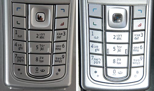
Like many handheld devices these days, the keyboard on this phone is backlit. The numbers are translucent, and a strong white light can shine through. Seemingly a great idea, for night time use. Now in bright daylight this works fairly well. The backlight gets washed out in the sunlight and although the transparent digits are of a lower contrast than a black ink would have provided, you can see them well in dark gray on silver (since the keys are silver and reflect ambient light in unpredictable ways, the contrast admittedly varies, as seen in the photos; I’ve already commented on the advisability of plain black on white for optimal viewing). But once evening starts to fall…

Nokia 6230i backlit keys in low ambient light
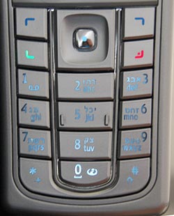
The third photo shows what happens in lower ambient light. There is an intermediate light level when the transition from dark numerals on bright silver to white backlit numerals on dark silver just evens out, and the numbers become almost invisible. In fact, since the backlight source is localized, different keys reach this point at different light levels; in the photo the “7” is in day mode, the “0” is in night mode, and the 5 is barely visible – just like the oil spot on those old books.

Now imagine trying to distinguish these keys while driving, with the phone in a hands-free cradle, where you can’t touch-type and you need your attention on the road.

So, what can we do about this? Well, we could prefer black keys with white digits – then the day and night contrast would be the same so there would be no crossover point of invisibility. Another good idea (which I recall seeing on some devices) is to make the backlight come on only in truly low light conditions. And of course, we should test the devices we buy in all situations, not just in the bright showroom where we normally make buying decisions…

If you need to speak to someone, live…

I’m getting to like the Lenovo blogs more and more. Consider this sentence, from an early version of an About page they had:

Finally, if you need to speak to someone, live, give David Churbuck, Lenovo’s Global VP of Marketing a call, his cell phone is 508 360 6147.

This was regrettably removed later from their main About page, but it’s still accessible in the archives, so we can see this Mirabile Dictu: a VP in a large corporation who shares his cellphone with his customers – us – on the blogosphere. Definitely wayda go!