Tag Archive for 'usability'

Sygnet handsfree design flaws, part 1: Control cloaking

Sygnet Bluetooth HandsfreeWhen I got my Nokia E71 smartphone, I also bought a hands-free device for it: the Sygnet Bluetooth Handsfree Carkit model BTS600. This actually works quite well – it wirelessly identifies the phone on my belt when I get in the car, and until I leave the car all calls are routed to this device. Throw in voice recognition based dialing, and it’s convenient indeed.

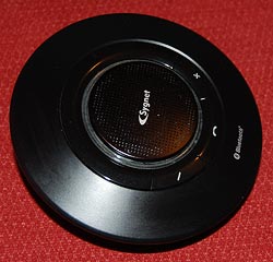
Still, the controls of this elegant space age device – it really looks like a miniature flying saucer, doesn’t it? – embody some basic human engineering errors, ones that are all too common in other products; we can call them control cloaking and control overloading.

By control cloaking I mean making controls that are all but invisible and indistinguishable from each other. The BTS600 has only four controls: a power switch, and the three marked with +, – and a handset symbol. The user needs to identify the last three rapidly, at a glance, while driving a motor vehicle. So what would you do to make this easy?

I know what I would do: I would design large, obvious buttons, each differing markedly from the others in color (for daytime use) and in shape (for night time driving). Something like the three skyscrapers in the Azrieli Center in Tel Aviv – one round, one triangular and one square, and all impossible to miss…

Not so the good engineers at Sygnet. They made the three buttons flat, and blended them into the device’s surface so elegantly that you can barely make them out – with tiny labels that are hard to read even when parked. And the device’s perfect circular symmetry makes it impossible to locate the buttons by their positions relative to its edges.

Sygnet Handsfree controls

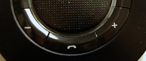
And then there’s the matter of indicator lights. The device has two lamps: blue and red. You’d expect these to be visible from all angles; which would be the case if they protruded outside the casing. But instead they are sunk deep inside, under the clear plastic ring around the speaker grille. Again, very elegant – but quite invisible unless you look straight in.

Don’t miss the control overloading post coming up next!

Multi-device remote controls

Used to be, a TV set had a remote control (used to be, farther back, it didn’t; but that’s prehistory). These days, however, everything has a remote control; indeed, I can’t wait for someone to create a tiny remote control for the larger remote control itself! 🙂

Three Remote Control units
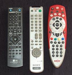
The proliferation of these gadgets has created a real problem, and home electronics makers are responding by creating R/C units that can control more than one item; most typically, a TV set and the DVD, PVR or VCR feeding it.

Which is all very well, but how do you make one control work on many devices without confusing the user? There are different ways, and they vary in their usability a great deal. Let me illustrate with three units from my home: the remotes for (left to right) our LG recording DVD, our old Sony VCR, and the HOT cable company’s PVR. The first two can also control our Sony TV; the red one controls the cable box, the TV and a DVD or VCR. And each goes about the choice of function in a different manner, seen in the close-up photo.

Remote Control close ups

The R/C on the left simply has a section at the right dedicated to controlling the TV, with its own On/Off switch and channel and volume controls. This results in some redundancy with the controls of the DVD (which also has power and channel controls) but it completely eliminates any possibility of confusion.

The VCR controller in the middle incorporates a disappearing species – a mechanical slide switch at the top that determines what device is being controlled. The buttons on this unit change their role depending on the position of the switch, and have color coded dots to indicate whether they apply to the TV. Having to slide the switch is a bit more of a hassle than with the black R/C but at least you get definite visual feedback of which position you’re in.

The red unit works like this: you have to press the button (in the second row) corresponding to the device you wish to control; then, until you press another of these buttons, the unit controls that device. This is for sure the cheapest to produce; it’s all in the electronics. The price you pay is that there is no visual feedback at all; if you forget what you pressed, you will find yourself changing channel or cycling the power on the wrong equipment. There is also no labeling of which buttons work with which device.

All of these units do their job, but to my mind their user friendliness goes down from left to right. Not surprisingly, so does the cost to produce them…

World Usability Day 2008

Today, Nov. 13, is World Usability Day, sponsored by the Usability Professionals’ Association.

World Usability Day

This has been running since 2005; each year, on the second Thursday of November, over 225 events are organized in over 40 countries around the world to raise awareness for the general public, and train professionals in the tools and issues central to good usability research, development and practice.

This year the theme is Transportation, with various practitioners and organizations addressing the impact of transport methods and practices on people and on the environment we live in. And while browsing some of this, I found this interesting research report from the UX Alliance on Parking Meters around the world, with a focus on their ease (or not) of operation. Turns out that “… no two parking meters … are completely the same and that the complexity of operating the parking meters varies considerably. There is a world of difference between the auto-detecting parking meter in Tokyo and the complex and error-prone parking ticket dispenser in Amsterdam.” The report, with numerous photos,  is quite interesting and insightful about proper design (or otherwise) – recommended reading!

Snagit 9 vs. FastStone 6: Simpler is better!

I needed a screen grabber, and based on recommendations from a friend downloaded the trial version of Snagit 9. I was impressed and disappointed.Impressed, because this is one potent package. It can do everything you may ever want to do about image grabbing. I particularly liked the “Scrolling window” option, for capturing a web page longer than one screenful. BUT… this program has an extremely complex and ornate user interface, giving you access to countless possibilities; and these are presented in the most colorful UI I’ve seen since my kids graduated from Fisher-Price. Take a look :

Snagit 9 User Interface

Compare this to Photoshop: powerful and feature rich, but its UI is simple, with minimalist icons in monochrome…

FastStone user interface
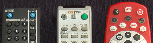
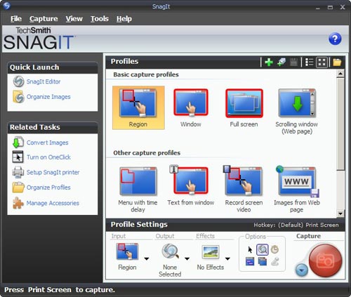
I found this so distracting that I went and downloaded another shareware product, FastStone Capture (Ver. 6). Check the utterly simple UI to the right:

Note that 99% of the time, these few icons (including “Scrolling window”) cover all you need; the rest is accessible but unobtrusive in a drop down menu at the right, where it can’t distract you. Click a button on this tiny floating toolbar and the capture begins. The same icons exist in the Snagit window, but actually, once you click one there you then need to click the big red round button – which may make you feel powerful, but is a redundant action. Of course it’s a single extra click, but it’s also double the number of clicks required  in FastStone.

Interestingly, the development team at Snagit have a blog where they share their thoughts (commendable!) and there I read that “… we felt that the interface shouldn’t be competing for attention, but should fade away and allow people to focus on their content”. Sorry… good thought, but I can’t endorse the execution on it. Nothing about the baroque UI they built brings the word “Fade” to mind. Just compare it to the tiny toolbar of the FastStone tool.

Simpler is better, nowhere more so than in tools you use daily.

Something is wrong with our Notebook LCD screens, part 3

And now, following Parts 1 and 2, here is the last installment…

These days, more and more Notebooks come with displays branded by the makers as VibrantView, or CrystaslBrite, or OptiClear… exciting names indeed. What they all refers to is glossy LCD screens, which would be much better described as GlareMirror, or UglyReflector, or maybe just RazzleDazzle

Glossy screen on a Notebook computer

Photo source: Marco Wessel, under Creative Commons license.

The underlying idea is to remove the matte anti-glare layer on the older screens, a change which results in better definition and more vibrant colors, plus better outdoors visibility. All commendable attributes, except that the price you pay is a mirror-like surface that reflects windows, light fixtures and other bright objects, a problem that motivated the original matte layer to begin with. Solutions? Work in a totally dark room, or try to yank the screen around until you find a reflection-free angle. Note that the last works for a single viewer – these screens are most annoying when someone shows you something on their screen: maybe they found the glare-free position, but you, looking from the side or over their shoulder, will get the full blast of annoying reflections.

Now if the matte screens were bad – if their colors really sucked, or their focus was totally fuzzy, I can see the possible value of a trade-off; but TFT LCD’s have reached maturity years ago, and are a delight to use. So what got into the vendors’ heads, to throw in the glossy finish – not as a  rare option, but as a mainstream technology?

Something is wrong with our Notebook LCD screens, part 2

We discussed the recent trend that is eliminating the optimal resolution in notebook computer screens. Another undesirable trend is the move to widescreen displays. These days it is almost impossible to buy a notebook PC with the traditional 4:3 screen form factor; all new models boast a “wide” screen with a 16:10 form factor such as WXGA (1280×800) and WSXGA (1680×1050). In fact Lenovo, makers of the Thinkpad I use, have just proudly declared that they’re dropping all 4:3 screens in their new line of notebooks.

And what are they proud of? What’s so cool about giving us less effective screens?

Xerox Alto system
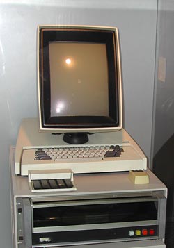
16:10 is a perfect choice if you want to watch movies, which come increasingly in wide formats. However, business notebooks are not intended primarily for this enjoyable purpose. They are meant to do business on, primarily word processing, email, presentations, and the like. And for this purpose, widescreen is totally inadequate. Documents are invariably taller than they are wide, like the paper pages they emulate; even presentation slides have a 4:3 aspect ratio. That’s why the venerable Xerox Alto (at right), sporting the granddaddy of all of today’s Personal Computer interfaces, had a “portrait” form factor screen: because you could process a whole page at once.

Now ideally, a wide screen might accommodate two pages side by side; and that works fine with a large external monitor. But Notebook screens are kept small for portability, and there is no way you can comfortably read two pages on a 14″ or even a 15″ screen. So you have to use the screen for one page, and since these screens are shorter (top to bottom) for a given diagonal size than the 4:3 type, you end up seeing less lines on a document at a given page width. You get more area at the edges of the screen, which you don’t need, and less height, which you do.

Like I already said, something is very wrong…

Something is wrong with our Notebook LCD screens, part 1

Something very odd is happening to the LCD screens on the Notebook computers that play such a major role in our existence.
386 notebook with monochrome LCD scrreen

The first aptly named “laptops” had small, low-contrast monochrome screens that had “eye strain” written all over them (well, not all of them did – the Grid Compass, in 1982, had a lovely bright orange-on-black display). Then came the first color screens, like Passive Matrix and DSTN, which were also pretty poor; and the  screen grew slowly in size, though there was still much plastic surrounding it. And finally Active matrix TFT screens achieved affordable prices and became the standard, and their size attained the width of a the keyboard while resolutions reached 1024×768. We were at a sweet spot, with notebooks whose keyboard and screen were so good that one could use them ergonomically without even wanting an external screen. For anyone who grew through the earlier clunky technologies, this was notebook nirvana.

And then…

… In the last few years, we are drifting away from that bliss. New notebooks have screens that make less and less sense. In this post series I’ll look at a number of issues with these.

For starters: Native resolution.

As I said, a sweet spot for screen resolution was (IMHO) 1024×768 pixels (XGA) on a 14″, 4:3 screen. The trend in the last 4 years is to go ever higher: 1400×1050 (SXGA+), for instance, and beyond. Obviously, the higher the resolution, the more things you can show – more spreadsheet columns, larger unscaled hi-res images, more windows, more emails… but then, at a given screen size (say, 14″) these things are smaller in absolute size; text and icons become small enough to cause significant eye fatigue, especially for anyone over forty.

Now, in principle you can try to fix this problem by driving the screen at a lower resolution. Some users actually try that, with sorry results, because one thing about LCD screens (as opposed to CRTs) is that you must use them at their native resolution. This is because an LCD, unlike a CRT, can’t increase the physical pixel size. Reducing resolution from 1400×1050 to (say) 1024×768 means that each pixel must now span a square of approximately 1.37 by 1.37 physical pixels; but this is a physical impossibility in an LCD, where each pixel is a discrete physical electronic device. The display driver now attempts to solve the problem by shading the “half pixels” in intermediate colors and shades, and this results in an unacceptable degree of fuzziness of the entire screen.

A better solution is to set applications to use larger fonts, and/or to change the overall DPI setting in the display properties in Windows. This will indeed cause text and other elements on screen to become larger. However, it will not get you back to where you were with the 1024-wide screen, because not all elements will scale – for example, icons will become blocky, and images on web pages will remain tiny while text grows, badly distorting the layout of many pages. Basically, you’re jumping through hoops to make a hi-res screen simulate a lower-res screen – poorly.

Of course, some users may need the added pixels – programmers, graphic artists, even accountants… but they would be better off using a physically larger screen, either by buying a 15″ or 17″ notebook, or by using a large external screen. Ordinary users, however, are better off with the portability of 14″ (or less) and the unscaled text and crisp focus of the XGA screen. Not that anyone’s asking them… new notebooks have screens of 1400 or even 1680 pixels across. Since these must cost more to produce, while being harder on the eyes, it’s unclear why the vendors don’t offer low res screens as at least an option; but in fact XGA notebooks are now rarer than hens’ teeth. Go figure…

A brush with Ford’s Human Machine Interface (HMI)

We rented a Ford Galaxy minivan for a day. Nice car, if you need the space. And such sophisticated controls… way too sophisticated for its own good, or for its users’, if you ask me.

Ford is very proud of its latest Human Machine Interface:

Human Machine Interface (HMI) -An upgraded instrument cluster plus a new steering wheel including toggle switches … take vehicle ergonomics to a new level. …
HMI is standard on all Ford S-MAX and Galaxy models. It is simple and intuitive to operate. It follows strict, straightforward and logical rules and combines critical areas of ergonomic development to optimize the interaction of the driver with the comfort and entertainment systems. …
The system enables a controlled dialogue between the driver and various support systems – radio, navigation system, Adaptive Cruise Control, and mobile phone.

Ford Galaxy minivan

So, my experience as a new user (remember, “intuitive” means a new user can figure it out without recourse to a manual): I wanted to zero the trip kilometer counter readout. After looking in vain for the standard push-rod near the odometer, I tried the 5-button toggle pad on the steering wheel hub, which turned out to control a multi-level menu system that eventually – after drilling maybe 3 levels down – let me clear the readout (not before forcing me through an ‘are you sure?’ confirmation). Pushing a standard button while driving is one thing; operating a complex multi-step interface, one which is different from car to car, is as silly as it is unsafe. I haven’t located the cruise control submenu, but the standard buttons on the wheel would certainly have been faster to use…

I suspect I may have figured it out wrong, and maybe there is a faster way to achieve this result via a different sub-menu. But then, I’m an experienced technologist; if I couldn’t do better at first try, your average driver would likely have done worse.

Another case in point: in this car, if you switch on the turn signal and change your mind, clicking the lever back to the center position will leave the signal on for 2-3 extra cycles. Not sure whether this is due to some ill-conceived “strict, straightforward and logical rule” the Ford designers applied, or whether the car’s computer is so busy doing other feats (polling the trip counter reset action?…) to respond faster. Either way, we were better off when the lever simply actuated a switch that directly controlled the blinking lamp.

Take note, Ford: you make excellent cars – please keep them simple to use!

Photo source: Wikimedia commons

Mazda 3 evolution, take 1: Sometimes they listen!

Recently I replaced my old Mazda 3 with the new model. The two are practically identical – why mess with a good thing? it’s a fine car! – but there are some minor differences, and I’ll be blogging them now and then… they afford us a peek into the design team’s thinking processes.

Here is the trunk door on the previous model. The problem is, it is not spring loaded; to open it you had to press the lock button and then claw it open by trying to pry up the bottom edge, which is a tight fit to the bumper below it (on most cars the door at least has some depression, perhaps for the license plate, where you can grasp it; this door is smooth and lacks any such grab point).

Old Mazda 3 trunk door

Quite annoying, and a lovely bit of poor usability. In fact, I saw one of these cars on the road whose enterprising owner had screwed a handle – from a kitchen drawer, by the looks of it – onto this door!

So here is the same door on the new model. Same door – one key difference: now there is a depression in the bumper to allow you to grasp the door.

New Mazda 3 trunk door

People must have been complaining – and the design team at Mazda had been listening. Better late than never!

Ode to a round knob

“O knob, thou whose perfect roundness doth . . .”

Nah. A poet I’m not. Still, I would if I could, because the round knob is a fast disappearing species, a trend well worthy of lament.

Round control knobs on an oscilloscope

Throughout the 20th century the round control knob was a mainstay of human interface design for electronic devices. With good reason: it was perfectly suited to humans’ major feature, the opposable thumb. You grasped the knob between that thumb and forefinger and you had superb fine control of the knob’s angular position. If the function called for finer control, you just used a fatter knob. At the machine end of this human/machine interface the knob could rotate a switch, a variable capacitor, or a potentiometer – there were many analog devices back then that lent themselves well to rotary control.

Today most of our input components have gone digital, and are either computer controlled or handled by pushbutton switches. This makes sense in some cases, but there are still many situations when a function is intrinsically analog (say, a volume control on a car radio) yet the designers are making the controls digital (say, by using a pair of + and – pushbuttons). This is pure evil from a human engineering perspective: the round knob is much more intuitive, convenient, and faster to boot. And it really was worthy of the name control: it gave the user a sense of controlling the instrument, instead of fighting it…

I’m sure the electronics driving the volume these days are fully digital, but even so a round knob with some D/A conversion is the correct choice. It must also be more expensive to make, because the radio makers – preferring low cost to user experience – increasingly shy away from it. 🙁