I was sitting in the lobby of the Shaare Zedek hospital in Jerusalem, and I noticed on the chair next to me a small booklet someone had discarded there. An idle look turned to admiration as I examined it and realized what it was.
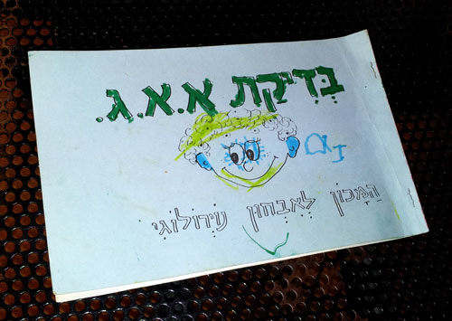
The cover reads “EEG test – the Institute for Neurological Diagnosis“, hardly exciting. But the thing is, obviously, a coloring book. Here are two pages from it:
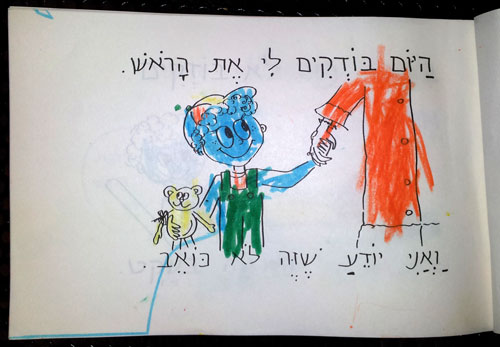
“Today they examine my head. And I know this does not hurt“.
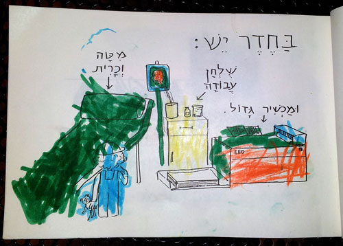
“In the room there are: A bed and pillow / A working table / And a large apparatus“.
Get the idea? The booklet explains everything clearly, dispelling the strangeness of the intimidating examination room, and of course mitigates the child’s fear; all in a coloring book that takes its mind off the scary goings on ahead.
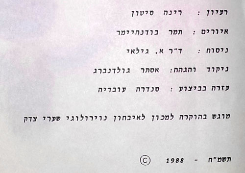
The last page gives us the names of the good people who developed this wonder and gave it to the hospital. Well done!
Form follows function!
Here is a row of anchors, which I photographed in Greenwich in the UK. You’ll note the one in the foreground has a single fluke (as the pointy ends of an anchor are called). The sign says this anchor is from around 1820.
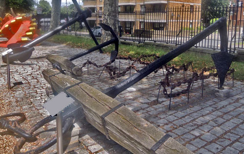
So why would they produce an anchor with only one fluke, when most of them have two? For a very good reason.
This model was used in permanent ship moorings in shallow waters. Think of the ship floating above the anchor. Think of the falling tide. Think what will happen if the ships comes down too close to an upward-pointing fluke…
That’s why!
See the hilarious street sign.
Why is it hilarious? Well, if you can read Hebrew you don’t have to ask. For the rest of you, here is the story.

Palermo, where this sign hangs, was home to a large and lively Jewish community in the middle ages. Then, in 1492, the Catholic Monarchs (Ferdinand and Isabella, those of Columbus fame) found the time on their busy schedules to decree that all Jews be expelled from all their dominions, Sicily included, and that was that – even today the only Jews to be seen on this lovely island are tourists. Moslems didn’t fare much better, having been expelled in the 13th century.
And it is to this history that we owe the sign, which marks one of the streets of the medieval Giudecca – the Jewish Ghetto. Someone had the neat idea of adding Hebrew and Arab names to streets in that area, in acknowledgement of their history. So far so good.
The joke, however, is that with not a single Jew living there, the Sicilian sign makers evidently relied on someone sending them the Hebrew version of the street name – which they then diligently proceeded to copy, without any idea of how to read the Hebrew script. The result is a hilarious mess of typos, most notable the replacement of the letter Yod with an apostrophe, no less than six times in this example.
I have no idea if the Arabic is any better…
Here is a street sign from Tel Aviv’s Ramat Hachayal area, a vibrant hi-tech hub. The sign hangs on a building at Hanechoshet st., as stated in English.
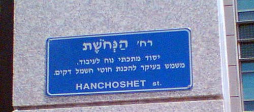
The Hebrew is more detailed: it has the street name at the top, followed by the fine print, which explains the name. Nechoshet in Hebrew means copper, and so the text on the sign educates us:
Copper st. / An easily worked metallic element. Serves primarily to make thin electric wires.
Well, Duh!…
The origin of this utterly unneeded explanation can probably be traced to the commendable practice of adding explanations to street names referring to little known persons or events, such as
Rafael Weiss st. / Biblical scholar, 1940-1974.
Not every passerby can be expected to know every biblical scholar, or politician, or artist from bygone generations, so this is somewhat useful.
Knowing when to break a standard mold and leave a field empty in a template is a sign of intelligence…or perhaps a sort of mini Turing Test?
Beauty can sometimes appear in the most unusual places.
I snapped this photo on a sidewalk near my home:
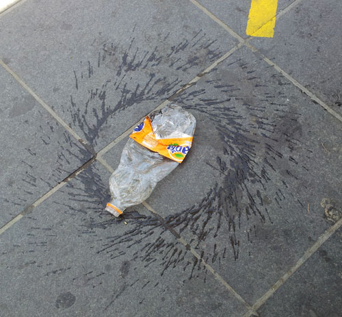
As I was watching, a passerby kicked the bottle, and it started spinning, giving me a good idea of what we’re seeing: someone had discarded and squashed the bottle, and someone else set it spinning and splashing its remaining content.
Whatever the details, it’s a lovely pattern!
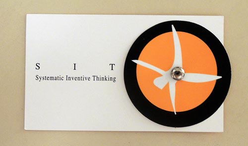
Unusual business cards are not rare; many companies and individuals try to deviate from the traditional white rectangle design in the hope of standing out from the crowd. But today I was handed a card that goes far beyond this. Here it is:
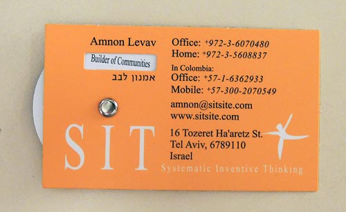
This card has a rotating wheel that allows different short phrases to be viewed through a cutout in the cardboard. The wheel carries the phrases “SIT International”, “Father and Uncle”, “Facilitator”, and “Builder of Communities”.
Unusual, but at first glance this seemed just one more gimmick. You see metal cards, wooden cards, cards with laser engraving… so this one has a wheel. Nice, but…
And then it hit me: there is a deeper purpose to this design! You see, once the recipient gets the idea that rotating the wheel will reveal more information, it is inevitable that they’ll rotate it in anticipation of each new snippet of insight about the card’s owner. As they do that, their interest goes beyond the mere form of the card; they engage with its content instead. Most information on a business card just slides past you; but through this tiny experience you can’t help internalizing what the phrases say about the person: the fact that he is a father and proud of it; the fact that he values his skill as facilitator; the fact that he does not care about formal titles. The wheel trick gets this knowledge across in a far more engaging manner than just reading a static card would do.
Incidentally, Amnon is the co-founder and manager of a company specializing in innovation methodology, and he told me the design for this card was undertaken as an exercise in applying that methodology; you can read about that in this article.
And here is the back side of the card – it’s quite cool that the stylized man of the company logo actually turns somersaults when you rotate his wheel!
Something caught my attention in this children’s playground in our neighborhood, where my kids used to play long years ago.
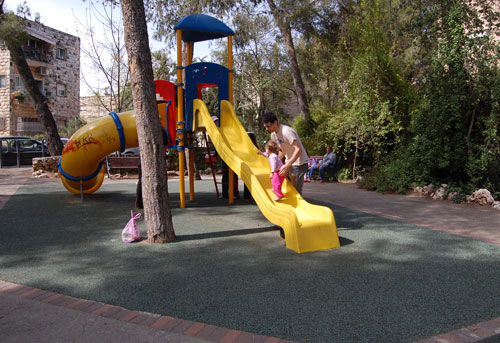
Back then the slide was made of metal, but the new one works just fine. However, back then the slide ended in a large sandbox, which was a major attraction in its own right. Kids would dig, build sand castles, mess around and have fun.
Not any more, as you can see: the sand has been replaced with some green rubbery material. This must have seemed a great idea – clean, easy to maintain, resilient and safe. However, consider this line from Wikipedia:
Sandpits encourage the imagination and creativity of children by providing materials and space to build several structures such as sandcastles; use toy trucks, shovels, and buckets to move the sand around; dig holes and bury objects, etc. In other words, the sand provides a medium in which children can pretend to explore, construct, and destroy the world in three dimensions.
With this ersatz version, kids can do none of these things. They can stay clean and hygienic, certainly; and safe, so nobody gets sued.
Still,my kids, and my own generation, and countless others before it, have managed quite well with the sand.
Sigh…
Check out this humble black marker pen.

What about it, you ask? Well, look at the close up: this marker marks most surfaces, is waterproof, practically odorless, safe… and has a cap off time of up to two weeks without drying up.
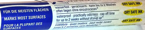
What about it, you ask? Just think of the hi-tech perfection that this list describes. What more could anyone ask for in a marker? Not long ago, you couldn’t get this for money or love. In particular, consider the 2-week cap off time. That was the one shortcoming of felt tip markers: they’d dry out if you forgot to cap them. Not any more, it seems – those boffins at the marker factory have figured a way to make ink that doesn’t dry until you actually mark with it.
That’s progress for you!
I’ve written before about the use of tactile sidewalk strips to help the blind, as seen in Japan. Well, now we have them in Israel too! I was walking under the Calatrava bridge in Jerusalem, and saw this:
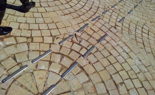
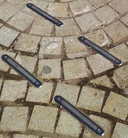 At first I was puzzled, but then I noticed this led towards the Jewish institute for the blind that is located nearby. So, these are raised strips forming a path – in fact, there were a number of paths going in different directions – that the blind can feel with their sticks or even their feet.
Well done!
This is the Ashtanur pencil case. Once you see it, you can’t help wanting one: it is simply too cool!
So I got one, and here it is.

These are made by two designers, my friend Ido Mohar and Baruch Mogilevsky, in mimicry of the local flat pita bread – called Ashtanur in Jerusalem, but Laffa in Tel Aviv (Ahh… what do those Tel Avivians know?!…) They’re made of printed fabric, but the similarity to a folded flat pita with fallafel inside is uncanny. You can get one at Etsy.


