Well, many friends asked to stay current on my adventures outside the cubicle farms, and though it’s early days, here is one thing I’ve been up to: I spend one day each week working with a start-up called Semantinet.
It is an attribute of start-ups that they both empower and expect every person in their small team to contribute directly to the main thing, which is the application of innovative technology to create magic. You work hard, but you can really make a difference, as explained by Paul Graham in his insightful book Hackers and Painters. I like it a lot.
 So, what magic do we make there? Semantinet, as the name hints, applies leading edge semantic search technology to enable a whole new manner of experiencing the web. Its product, headup, is a Firefox add-on that identifies on pages you browse names of entities like people, places, events, books, musical artists, videos, and more; and it shows you on demand a small window with additional information on any of these.
The additional information can be general – like financial data for a company, or albums and tracks for a band. But things get interesting once you personalize headup by pointing it at your accounts in social sites like Facebook, FriendFeed, or Last.fm. Then, headup starts surprising you with information like “your friends that work at this company”, or “upcoming concerts by a band you like in this city”, or “books that both you and this person like”, or “mutual friends you both know”. I call it a “Serendipity Engine”: you never know what it will discover. How does it know? By correlating information that you and others had published in any of numerous social sites. And because Semantinet is a start-up and works at the pace that this enables, new capabilities are added to the product literally every day.
If you use Firefox, give it a try – the application just went out of stealth mode and into public beta last week so you can download it at headup.com. And do share with me any comments and critique – at this early stage you, too, can make a real difference in the evolution of this magical product!
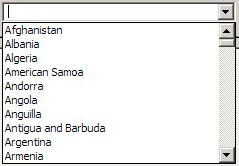 Take the image at right, the list you have to go through to select a country for a new contact in Outlook and other applications: it opens on a list of ten countries, of which one – Argentina – may be even remotely likely to be inhabited by business contacts of yours. You can scroll down, of course… and in the next ten you find even greater concentrations of business partners, like the entry for the
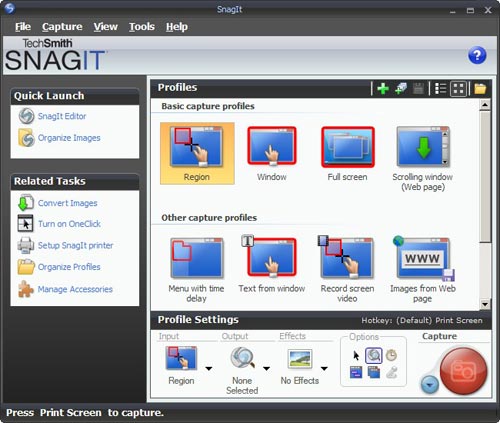
 I found this so distracting that I went and downloaded another shareware product, FastStone Capture (Ver. 6). Check the utterly simple UI to the right:
 which fast became the standard on that venerable 16-bit platform. It would typically handle 32-color images at up to 640×400 resolution. Sure, you could do things in it that no other personal computer could do at the time – like the King Tut image that became the hallmark of this program – yet in today’s terms it was utterly weak and primitive. So what’s the big deal?
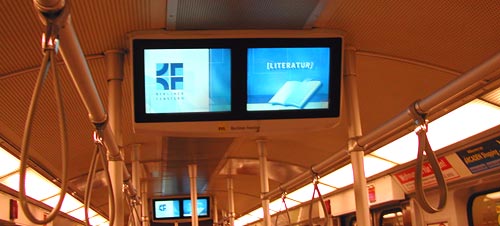
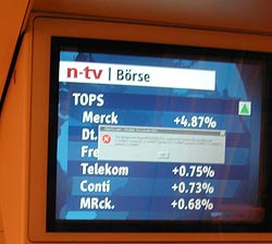 more serious lesson here. If they figured Windows was the best tool to use on a public transport system, they’re welcome to use it; though Windows is, by definition, a system for the PC, and that stands for Personal Computer, not for Public Conveyance. However, when a dialog like this appears on my Personal Computer, as it does on occasion, I can take action, if only to hit the Vulcan Nerve Pinch key combination. But on a train there is no keyboard with Ctrl-Alt-Del, nor a Reset button. So why show us this useless gobbledygook? The system in this case ought NOT to show the dialog about the DLL; it should instead erase the screen and display a humorous image related to the situation and a message such as “We’re sorry, there is a malfunction. This is being addressed. Thank you for your patience”. Alternatively, the screen might simply switch itself off on program malfunction. Anything but the incongruous error message box.
