Check out the new article in the History of Computing section of my Possibly Interesting Web site: Five Intel chips that changed the world.
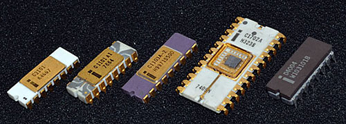
These are the five “Firsts” that Intel introduced during its first four years as a small start-up: the first chip in each of four key memory types, and the first microprocessor. Between them they made the personal computing revolution possible, ushering in the world we know today.
Enjoy!
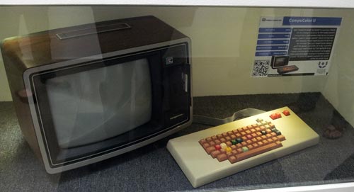
While taking in the wonderful Israel Perosnal Computer Museum in Haifa I came face to face with the Intelligent Systems Compucolor II, a bizarre 1977 home computer built into a repurposed 13″ TV set.
What drew my attention was the strange keboard layout: the arrow keys were clustered at the top right corner. This is in contrast to what you will see on every keyboard in the present century, where these keys are invariably at the bottom right of the keyboard.
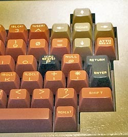 So, here we see a layout that has disappeared without any living descendants: an extinct primordial denizen of the keyboard universe. And for good reason: the standard location puts the arrows nearest the user, where the CompuColor II had them farthest away. It’s bad enough that the mechanical issues of old typewriters forced on us the QWERTY layout, with the most used keys out on the top letter row; since those typewriters did not have arrow keys, there is no reason to apply the same counter-ergonomic approach to them too!
It is interesting to note that unlike today’s notebooks, where space is at a premium, the keyboard in these photos has lots of free space around it, and is no doubt made of individual switches; so there was no reason to put the arrows in this awkward position. Someone just hadn’t thought it through. And of course those were early years for home computing, with each manufacturer trying their own ideas, resulting in an Ediacaran Fauna of weird form factors (remember the venerable Commodore 64, whith only two arrow keys that you SHIFTed to move in the remaining directions?). Small wonder, then, that most of these experiments – like this one – left no trace except as museum fossils!
A while ago I took HP to task for their tendency to fill your hard disk with hundreds of Megs of software when all you need is a printer driver. I am happy to report that they’ve improved their ways… sort of.
Back then, I wrote:
It is not good manners to sell someone a printer, and then to blast hundreds of megabytes of software onto their hard disk, without so much as a pretty please.
So now I bought a new HP printer and this time it did say pretty please. It asked me whether I wanted a full installation or a minimal installation. Hooray! Of course I opted for the minimal one… I would report happiness, except that the minimal installation – the bare essentials, according to HP – filled 461 Megabytes of my hard drive. Want to guess what a full install would have required? 🙁
What would they need 461MB for? Well, I haven’t even begun to explore the content of this unwanted bloatware, but I can report that the installation process included animated videos showing how to plug the darn machine into the power socket, and so forth (and these are still on my drive, in case I might forget how that is done…)
Plus ça change, plus c’est la même chose, I guess…
In a world of rapidly advancing technology it is the fate of any given product to go down from the latest and greatest to a commodity in a few years. The fancy box my first electronic calculator came in probably cost more to make than an entire calculator costs today – and today’s unit, though far more powerful, is sold in an ignominious blister package…
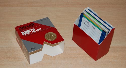
I found a good illustration of such a trend when putting in order some of the accumulated techno-junk in my basement. A load of old software backups allowed me to view a history of the packaging of a once excellent innovation, the soon to be forgotten 3.5-inch micro-floppy disk.
When these rigid diskettes hit the market in the early eighties, popularized by the original Mac and Amiga computers, they were a great improvement over their flimsier 5.25-inch predecessors. They were also expensive enough to warrant packaging in very nice cardboard boxes, ones that would double as easy to browse diskette libraries. Like this elaborate package by Maxell:
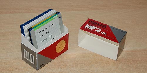
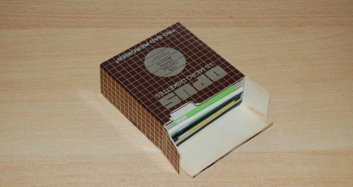
Then prices inched lower, and by the nineties Maxell made the same product in this box, which was a tad harder to flip the disks in but was made of two cardboard parts instead of the earlier three:
And lastly, in the previous decade and up till their gasping breath when flash sticks drove them out entirely, floppies were downgraded to the cheapest one-piece box type possible, as seen below.
Thus passes the glory of the world…
I was shopping at Office Depot, and next to the checkout line they had this bin full of cheap items on sale. And in it, thrown carelessly with less decorum than potatoes get at the grocer’s, were blister-packaged Flash memory cards.
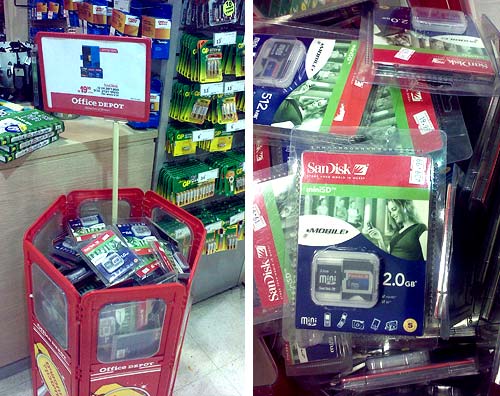
They had 2.0 GB units selling for a pittance. That’s two billion bytes, or 16 Billion bits. I remember Thirty years ago, when a solid state memory board of 16K Bytes would come very carefully packaged – rightly so, as it cost thousands of dollars. The unit in the blister pack shown has a Million times as much capacity and costs 10 bucks. Of course we all know how Moore’s law is driving densities up and price per bit down, but this infamy of selling Gigabytes like peanuts brings it home with some poignancy.
And Below is a similar case, this from our neighborhood general store. Here the Flash Disk-on-key packs are hanging from a shelf alongside Energizer batteries, chocolates, candy and chewing gum packages.
You can bet the core memory stack I show here was not sold with chewing gum…

Engrish is all around us; here is a recent sighting that made my day.
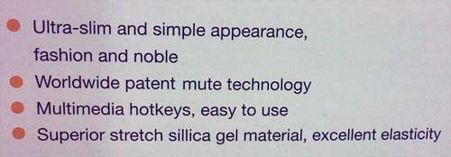
This is from the box of a Teac Media Systems slim multimedia keyboard, model TK-5108. One can’t help but wonder whether this item is noble by birth, being descended from a long line of aristocratic peripherals, or is its praise the result of some outstanding feat demonstrating strong nobility of character. 🙂
Today I had the pleasure of attending the opening of the Computing and Communications museum of the Israel Electric Company. The IEC has been around for almost a century and has kept pace with computing advances since its early days; curator Dlila Shapira did a great job rounding up some lovely vintage pieces from the “big iron” era and later.
No less interesting than the equipment on display were the speeches of some veteran managers of the computing division. One gentleman told us how when he first arrived on board as a programmer his first task was to glue shut holes that had been punched in error onto punched cards; a bottle of the liquid used was on display, and here it is.

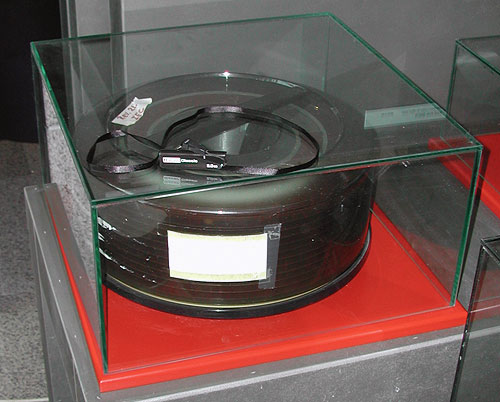
Also on display were storage devices of yesteryear. In the photo below you see a removable hard disk pack from a Prime computer system of the 1980’s; the dozen 12-inch platters together hold 300MB. For comparison, you see on the glass case another removabe storage unit, namely a 2.0 GB – 2000MB – Disk-on-key from today. We’ve come a long way…
I have a desktop and a docked notebook on the same desk, which I never use concurrently, so I decided to reclaim precious desk surface by keeping only one screen, keyboard and mouse and switching them between the two machines with a KVM switch.
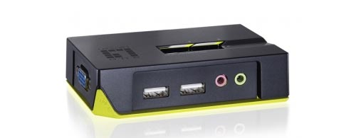
An online check discovered the cute KVM-0221 2-Port USB KVM Switch from LevelOne. It does what I need, it looks good, and – crucial for my desk reclaim purpose – it is tiny at a 100 x 65 mm footprint. So I ordered it.
And when I wired it, lo and behold: its footprint area was maybe 4 times the above. You can see why in the next photo:
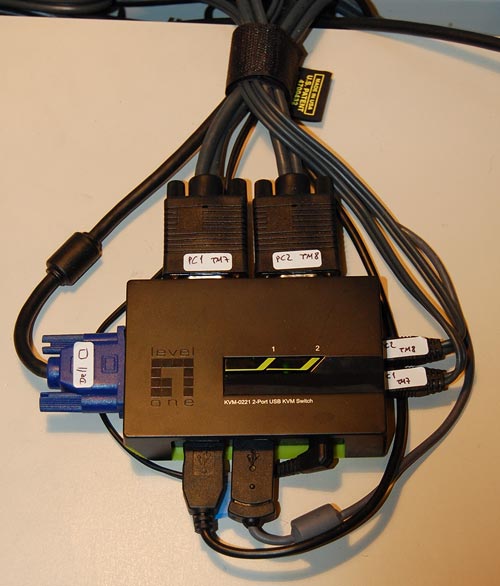
Here is the problem: in a day and age where small devices have the form factor we see in routers, i.e. a low box with all connectors at the back and all controls at the front, this device has the controls on the flat top and the connectors on all four sides! There is no way you can stash it neatly away at the edge of your desk, or fix it to the wall, or stack it under some other equipment. This cute little switch wants to have its own place in the sun, and let no other object dare to come close!
The two biggest plugs, by the way, also come from LevelOne – they are specially made to contain both video and USB lines – but I can’t imagine that they couldn’t have been made at half their length. Apparently, footprint was not on the LevelOne designers’ mind…
I went to shop for a widescreen LCD monitor. I went from one large store to another; each had at least half a dozen candidates, and it was amazing to see how poor the images on them looked!
Of course, in most cases the immediate cause was that they were being driven at the wrong resolution. As I explained before, a liquid crystal screen must be driven at its native resolution to avoid fuzziness. Since all the screens in a store were driven by one computer, yet had different resolutions, many were mismatched.
Of course one should never buy a monitor sight unseen… so I had the foresight to lug my notebook with me, and the store guys were willing to let me hook it to the screens on display after setting its output to the appropriate mode. But even then, most screens were fuzzy, so much so that it just didn’t make sense. I then discovered that in their complicated OSD menu system, there is usually a “Factory Reset” option. Guess what – in maybe half the cases doing this improved the display quality considerably!
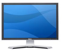 I the end I settled on a Dell 2208WFP, a nicely designed 22 incher. And when I got it hooked up at home, lo and behold, the text was just a little bit fuzzy. I did the Reset thing but to no avail. I played with the brightness and contrast – still no use. And then I explored the menus further and guess what? They had a setting called Sharpness! It was at 50%; I jacked it up and the monitor achieved that exquisite crispness I’d come to expect of Dell monitors.
Now, my experience is that a significant fraction of users spend their time in front of fuzzy displays. Many don’t even realize there’s a problem; in many cases a glaring resolution mismatch causes extreme fuzziness but they have no idea they could fix it in seconds. And then, I’m sure, there must be many who haven’t even bothered to adjust the display’s own controls (being hidden in the OSD makes them easy to miss).
So, look at the screen you’re reading this on and ask yourself: can you do better?
Was at Office Depot and noticed a keyboard on sale that was touted as the Anti-RSI keyboard from A4Tech. 
This, according to their web site, has an innovative “Natural A shape” layout that allows you to type ergonomically with your wrists held in their natural position, rather than bent at a strained angle. The site shows this convincing-looking diagram:
So I examine the keyboard, and it’s the exact same layout as on a normal one, but the keys are diamond-shaped so the lines between their edges have that “A” shape.
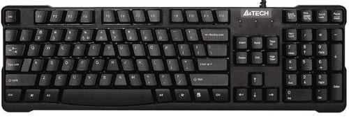
Which is nice, except that when I type I hit the tops of the keys, not their edges, who for all I care can have any shape at all. In fact, I hold my wrists at the correct angle when using any keyboard, and would do the same on this one.
So… either I’m missing something, or this is nothing but hype.
Any insight, anyone?

