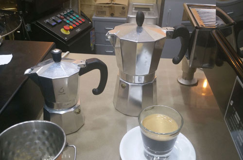
I was at this coffee shop and saw the two machinettas. Of course I didn’t buy one – as coffee lovers, we have all the machinettas we need at home – but I did notice how the pair represents two different solutions to a small but important design bug that the classic machinetta had subjected coffee drinkers to for ages.
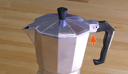
The problem is seen below. The original design from Bialetti, who invented this useful little coffeemaker, had the metal block that the handle is bolted to, marked by the red arrow in this photo. This block was just the right size and place to scald your finger when you grab the handle.
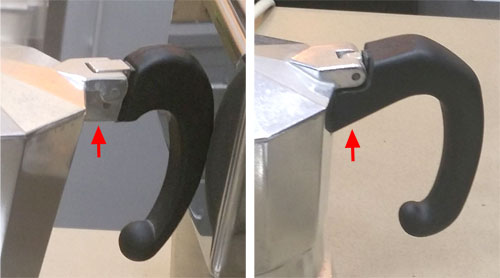
The two machines I’ve sighted solve this problem in two different ways frequently seen these days: the one at the left below leaves the offending hot block in place but provides a dent in the plastic to keep the finger away from it; the one on the right covers the metal with plastic all the way.
I can’t think how many times I got burned before someone at the factory decided to spare the users this pain…
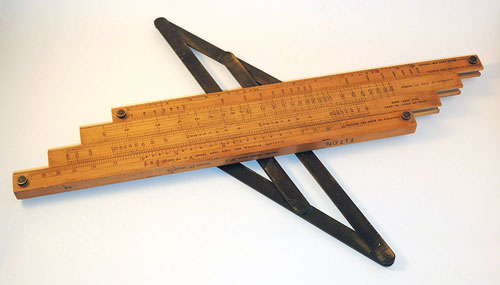
The Baines slide rule is one of the most unusual ones in my collection, because of the metal contraption on its back that moves all its parts in unison. Here it is:
This slide rule was designed by a British civil engineer from the Punjab; it is used to calculate water flows and pressure drops in cast iron water pipes.
You can see the full details, and a sample calculation demonstrating the device’s function, in this new articleon my history of computing site.
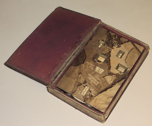
Some of the most fascinating items in my History of Computing collection are the one-of-a-kind, undocumented ones. The latest such addition to the collection is a calculator hidden in a book-like case, that has no mention anywhere that I could find.
This is Charles Cornell’s F.24 aerial photography planning calculator, and you can read all about it in my latest article. Enjoy!
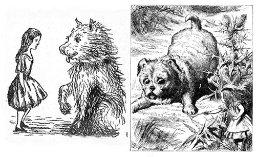
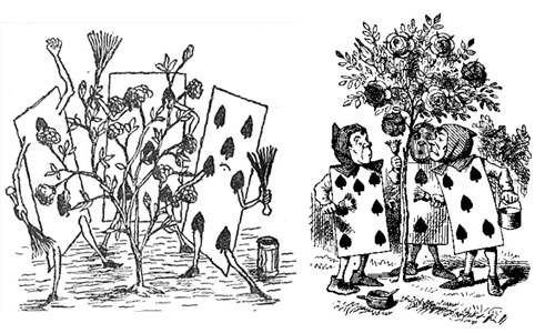
Say “Alice in wonderland”, and the image that comes to mind (well, at least in the generations that used to read books) is a little girl in a tidy Victorian knee-length puffed sleeve dress with a pinafore, and long blond hair – the girl in the image at right. This comes from the famous illustrations by John Tenniel, a successful professional illustrator that Carroll retained to illustrate the book. The illustrations by Tenniel became iconic, although they bear no resemblance to Alice Liddell, the lead character’s namesake, who was not blonde in the least.
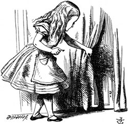
And then there is a different Alice altogether, the one envisioned by Carroll himself and found in the illustrations he drew by his own hand for the handwritten draft of the book, “Alice’s adventures underground”. I have a book showing these, and the comparison is interesting. Here, for example, is the same picture of Alice holding the golden key to the tiny door behind the curtain at the bottom of the rabbit hole. No blond hair, no fancy clothing.
So here, for your enjoyment, are some comparisons of the Carroll and Tenniel realizations of some scenes in the book:
As we can see, Tenniel was definitely a more capable illustrator; but he followed Carroll’s lead — indeed, Carroll supervised him closely, since he was paying him a hefty fee.
And although most of the Tenniel drawings are based on Carroll’s, there are some of the latter that did not make it into the printed book. Like these two:
Robert Owen Wynne-Roberts, MICE (Member of the Institution of Civil Engineers), FRSI (Fellow of the Royal Sanitary Institute), was a talented civil engineer. He passed away in 1935, but at least one result of his engineering talent abides: the Wynne-Roberts hydraulic calculator, a specialty circular slide rule for computing flow in water pipes and sewers.
You can read about this elegantly packaged device in a new article on my history of computing site.
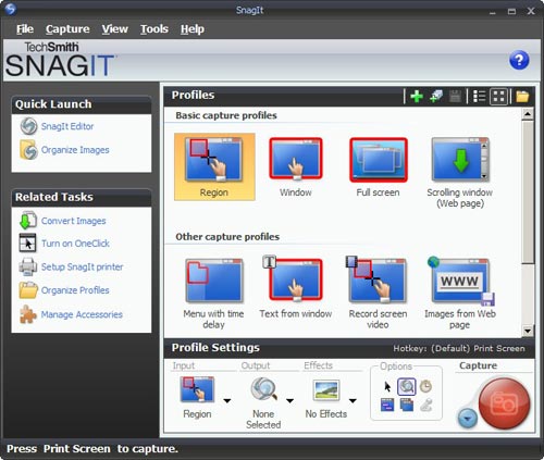
I needed a screen grabber, and based on recommendations from a friend downloaded the trial version of Snagit 9. I was impressed and disappointed.Impressed, because this is one potent package. It can do everything you may ever want to do about image grabbing. I particularly liked the “Scrolling window” option, for capturing a web page longer than one screenful. BUT… this program has an extremely complex and ornate user interface, giving you access to countless possibilities; and these are presented in the most colorful UI I’ve seen since my kids graduated from Fisher-Price. Take a look :
Compare this to Photoshop: powerful and feature rich, but its UI is simple, with minimalist icons in monochrome…
I found this so distracting that I went and downloaded another shareware product, FastStone Capture (Ver. 6). Check the utterly simple UI to the right:
Note that 99% of the time, these few icons (including “Scrolling window”) cover all you need; the rest is accessible but unobtrusive in a drop down menu at the right, where it can’t distract you. Click a button on this tiny floating toolbar and the capture begins. The same icons exist in the Snagit window, but actually, once you click one there you then need to click the big red round button – which may make you feel powerful, but is a redundant action. Of course it’s a single extra click, but it’s also double the number of clicks required in FastStone.
Interestingly, the development team at Snagit have a blog where they share their thoughts (commendable!) and there I read that “… we felt that the interface shouldn’t be competing for attention, but should fade away and allow people to focus on their content”. Sorry… good thought, but I can’t endorse the execution on it. Nothing about the baroque UI they built brings the word “Fade” to mind. Just compare it to the tiny toolbar of the FastStone tool.
Simpler is better, nowhere more so than in tools you use daily.
While touring the Spreewald in Germany we came upon the strange device in the center of this photo. In fact we saw many of them while punting in the canals of this “Germany’s Venice”.
This is a leaky wooden box hanging on chains with a mechanism to raise and lower it relative to the water level. What the residents of this canal-riddled valley use it for is to store live fish that they’d caught in the river, thus keeping them fresh until they want to eat them. Not sure what the fish think about this temporary lease on life, but one has to admit it’s an ingenious idea, and well suited for daily use when your house’s front lawn terminates in a riverfront!
The constant roar of traffic makes many a city center noisy. Then you drive home to your quiet suburb, where traffic is less of a problem… but cars still make their presence known there. Apart from the infamy of car alarms , each time a neighbor parks a car, or gets into one, you hear the multiple bleeps of the remote controlled electric locking system.
Let’s avoid the question of why a car needs to beep when you lock or unlock it (surely blinking the lights would be informative enough); but if they gotta beep, at least the designers should try to make the beeps quiet! In reality some cars are considerate, and give off pleasant, melodious peals of unnecessary sound; but there are many that squawk like a hen that had its tail stepped on. If you have a neighbor that works late night shifts, or otherwise needs to drive when others are asleep, this can become a real nuisance.
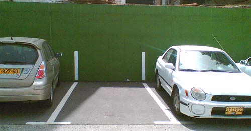
Parking lots try to cram as many cars in as they can (the ones that charge you to park do, anyway) and so it often happens that you exit the car only to find you’ve overstepped the white line. If you’re conscientious like me, you get back in, restart the motor and wiggle the car the few inches required to fit in your own space. The problem is that you can’t really see the lines in the last stages of the parking maneuver…
So I was in Tel Aviv the other day and saw a simple fix to this problem. Look in the photo: they extended the white line up onto the wall! That way you can see the boundaries in front of you (or back, through the mirror) as you move in.
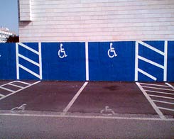
While they were at it, they also did the handicapped spaces – now no one can say (honestly or not) that they didn’t notice the faded symbol on the pavement; if you park in one of these spaces, it stares you right in the face.
 Say “Alice in wonderland”, and the image that comes to mind (well, at least in the generations that used to read books) is a little girl in a tidy Victorian knee-length puffed sleeve dress with a pinafore, and long blond hair – the girl in the image at right. This comes from the famous illustrations by John Tenniel, a successful professional illustrator that Carroll retained to illustrate the book. The illustrations by Tenniel became iconic, although they bear no resemblance to
 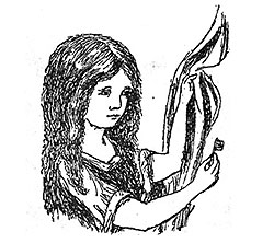 And then there is a different Alice altogether, the one envisioned by Carroll himself and found in the illustrations he drew by his own hand for the handwritten draft of the book, “Alice’s adventures underground”. I have a book showing these, and the comparison is interesting. Here, for example, is the same picture of Alice holding the golden key to the tiny door behind the curtain at the bottom of the rabbit hole. No blond hair, no fancy clothing.
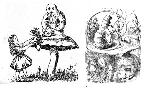

 I found this so distracting that I went and downloaded another shareware product, FastStone Capture (Ver. 6). Check the utterly simple UI to the right:
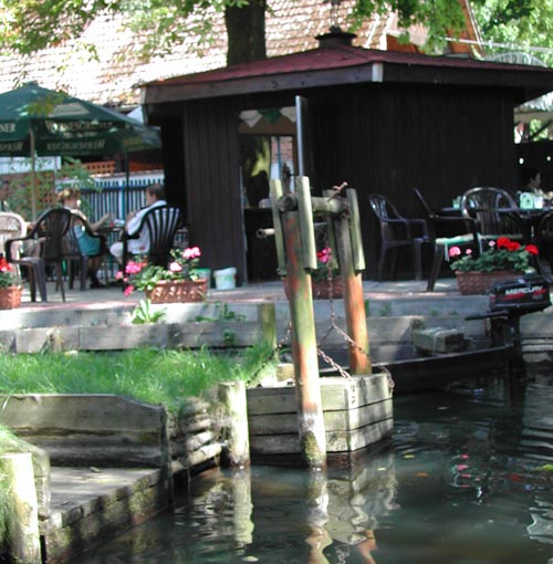
 While they were at it, they also did the handicapped spaces – now no one can say (honestly or not) that they didn’t notice the faded symbol on the pavement; if you park in one of these spaces, it stares you right in the face.
