Archive for the 'Improvement' Category

Making LCD monitors crisp

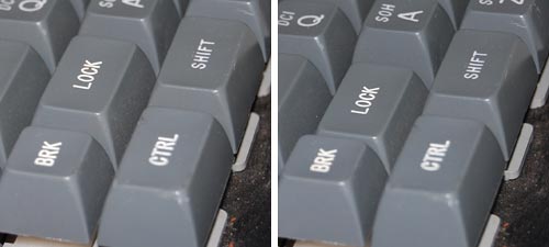
I went to shop for a widescreen LCD monitor. I went from one large store to another; each had at least half a dozen candidates, and it was amazing to see how poor the images on them looked!

Of course, in most cases the immediate cause was that they were being driven at the wrong resolution. As I explained before, a liquid crystal screen must be driven at its native resolution to avoid fuzziness. Since all the screens in a store were driven by one computer, yet had different resolutions, many were mismatched.

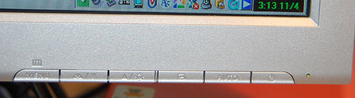
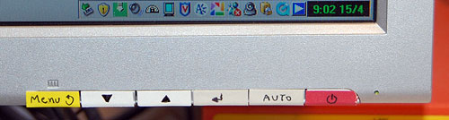
Of course one should never buy a monitor sight unseen… so I had the foresight to lug my notebook with me, and the store guys were willing to let me hook it to the screens on display after setting its output to the appropriate mode. But even then, most screens were fuzzy, so much so that it just didn’t make sense. I then discovered that in their complicated OSD menu system, there is usually a “Factory Reset” option. Guess what – in maybe half the cases doing this improved the display quality considerably!

Dell 2208WFP 22 inch LCD monitor
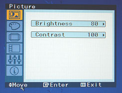
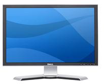
I the end I settled on a Dell 2208WFP, a nicely designed 22 incher. And when I got it hooked up at home, lo and behold, the text was just a little bit fuzzy. I did the Reset thing but to no avail. I played with the brightness and contrast – still no use. And then I explored the menus further and guess what? They had a setting called Sharpness! It was at 50%; I jacked it up and the monitor achieved that exquisite crispness I’d come to expect of Dell monitors.

Now, my experience is that a significant fraction of users spend their time in front of fuzzy displays. Many don’t even realize there’s a problem; in many cases a glaring resolution mismatch causes extreme fuzziness but they have no idea they could fix it in seconds. And then, I’m sure, there must be many who haven’t even bothered to adjust the display’s own controls (being hidden in the OSD makes them easy to miss).

So, look at the screen you’re reading this on and ask yourself: can you do better?

Polycom under siege

The triangular Polycom conference phone is a familiar device; in many companies there is one in every conference room. It is so familiar that few give thought to its miraculous ability to transmit high quality sound from one roomful of jabbering humans to another. In fact, this involves some pretty sophisticated technology for echo cancellation and noise filtering; to quote the Polycom site, “Automatic Gain Control intelligently adjusts the microphone sensitivity based on where participants are seated in the conference room”!

Polycom conference telephone

Image: Wikipedia, by Sweetness46, under Creative Commons license

A telephony engineer I once met explained to me that the microphones at the three ends of the Polycom are exquisitely optimized so the sound enters them just right, glancing off the table surface at the optimal angle, to achieve the best possible sound quality. Isn’t that smart design?

So what do we do, then? Why, we put the poor thing at the center of a round conference table and surround it with an impregnable wall of Notebook screens, as all attendees read their email during the meeting. There goes the exquisite design, the adjustment based on where participants are seated, the echo processing…

One can almost imagine a future generation of phones that can raise themselves on a robotic stalk to peer above the notebooks (OK, so this is more like an R2D2 kind of response than a likely reality). But in fact, I once visited a company where they mounted the Polycom on top of a 12 inch pole in the center of the table. It looked weird, but I’m sure it sounded great…

The infamous Caps Lock key

Caps lock key on a modern PC keyboardEveryone knows that the QWERTY keyboard layout sucks, because it carries a legacy from the early typewriter days; still, we’re all locked into its use and live in oblivion of what we’re missing. But we have another legacy from mechanical typewriters that is hard to forget because it bites us daily. i REFER TO THE cAPS lOCK KEY.

It is interesting to trace the history of this design infamy. Originally, it made a lot of sense: in a mechanical typewriter the Shift keys did just that: they shifted the type mechanism vertically so the type bars would hit the paper with the uppercase letters; and the Shift Lock key would keep the keys locked in this position. This key had to sit right above the Shift key, because it physically latched it in a depressed position; hitting Shift again would release the lock. It was very easy to see (and feel) whether Shift was locked or not, because both keys would be depressed when the lock was engaged. The photos below are from an antiquated Royal typewriter; you can see how the Lock key holds down the Shift key on the right (and note the quaint caption on the latter key – Shift / Freedom, in allusion to releasing the Lock).

Shift Lock in an old typewriter

Early computer keyboards carried this idea forward, with a Shift Lock or Caps Lock key that had two physical positions: depressed for Lock, and flush with the other keys when released. You could therefore tell when you were in Caps mode, and would notice immediately if you hit the lock accidentally while touch typing. The delightful Commodore 64 had this feature, among others; the photos show a keyboard that came with the collection of homebrew boards described here, from the late 70s.

Two-position Caps Lock in a 1970s keyboard

Later, as keyboard makers sacrificed quality for cheap manufacturing, the more complex and different two-state key was replaced with a momentary key like all the others, with electronics to implement toggle action. Gone was the tactile feedback. Now a simple brush of the finger could accidentally lock you in Caps mode. Worse still, the position of the Lock key next to the left Shift key, which made sense a century ago, was retained – placing this relatively little used key right in harm’s way.

I don’t see manufacturers giving us back the 2-position key (it would cost them a few cents, after all), but the least they could do is move this stupid key to the top row, next to the Scroll Lock, where it will remain unused, unnoticed, and harmless.

So, what can we do about this? Well, one thing we can do is disable the offending key. No need to tear it out – I used KeyTweak, a free key remapping utility, to disable it on my Windows XP system. Good riddance!

Also, if you use MS Word, you may be unaware that depressing Shift+F3 repeatedly will change any selected text to lowercase, uppercase, and sentence case; a very useful feature after YOU’VE ACCIDENTALLY HIT sHIFT lOCK AND CONTINUED TYPING.

A crash on the U-bahn: Windows and Non-PC applications

I was in Berlin, where they have a subway system that, though it dates back to 1902, is as effective as it is pleasant (part of this last may have to do with the fact that the tunnels are close to the surface, so there is less of the “going down to the bowels of the earth” feeling you get in systems like that in London; you descend a few steps down – or, in some cases, up, as some areas have the train above street level – and you are ready to travel).

Berlin U-bahn Monitor

Anyway, on the carriages they have ceiling-mounted screens that show a variety of local news and entertainment. Good idea. And then, one day, I look at the screen and I see that most recognizable of computer entities: the Windows error message dialog box. It stayed there for the entire trip, informing the fascinated travelers that it was “Unable to locate DLL”.

This of course elicited a few sniggers from the crowd, but there is a Berlin U-bahn Monitor with Windows error message
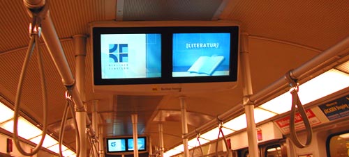
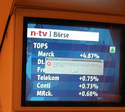
more serious lesson here. If they figured Windows was the best tool to use on a public transport system, they’re welcome to use it; though Windows is, by definition, a system for the PC, and that stands for Personal Computer, not for Public Conveyance. However, when a dialog like this appears on my Personal Computer, as it does on occasion, I can take action, if only to hit the Vulcan Nerve Pinch key combination. But on a train there is no keyboard with Ctrl-Alt-Del, nor a Reset button. So why show us this useless gobbledygook? The system in this case ought NOT to show the dialog about the DLL; it should instead erase the screen and display a humorous image related to the situation and a message such as “We’re sorry, there is a malfunction. This is being addressed. Thank you for your patience”. Alternatively, the screen might simply switch itself off on program malfunction. Anything but the incongruous error message box.

Using Windows for non-PC applications may or may not be a good move, but it is happening in many places; at least there should be a version of Windows optimized for such non-interactive situations!

Communicative alarms

I already shared my animosity towards car alarms. Since these are not going away anytime soon, the question becomes, how can we improve them to reduce the pain they cause the general populace? Same thing for house burglar alarms, that have the tendency to trigger – rigthly or wrongly – when the owner is on vacation in Hawaii…

The key problem is that when one of these monstrosities starts wailing, there is no one to call. Some house alarms have a sign indicating a security company that is in charge; in these cases you can try their number. But a sensible general solution would be to require all alarms to bear a “here’s what you can do to get me to shut up” indication. A name and cellular number of the owner would be a good starting point; a second, backup contact number would be useful as well. This is a matter for legislators; serious fines on owners of alarms failing to share this information would be useful. Until then, people can do it on a volunteer basis…

Mazda 3 evolution, take 1: Sometimes they listen!

Recently I replaced my old Mazda 3 with the new model. The two are practically identical – why mess with a good thing? it’s a fine car! – but there are some minor differences, and I’ll be blogging them now and then… they afford us a peek into the design team’s thinking processes.

Here is the trunk door on the previous model. The problem is, it is not spring loaded; to open it you had to press the lock button and then claw it open by trying to pry up the bottom edge, which is a tight fit to the bumper below it (on most cars the door at least has some depression, perhaps for the license plate, where you can grasp it; this door is smooth and lacks any such grab point).

Old Mazda 3 trunk door

Quite annoying, and a lovely bit of poor usability. In fact, I saw one of these cars on the road whose enterprising owner had screwed a handle – from a kitchen drawer, by the looks of it – onto this door!

So here is the same door on the new model. Same door – one key difference: now there is a depression in the bumper to allow you to grasp the door.

New Mazda 3 trunk door

People must have been complaining – and the design team at Mazda had been listening. Better late than never!

Water cooler improvement – just don’t cool!

Many times, a small change in a design makes a product a lot better.

You know the modern version of the office water cooler: a vertical unit that dispenses cold (and in many models, also hot) water into disposable cups. Well, I’ve just seen one that made my day. The unit in the photo, a new model from Tami (a.k.a. Tana Water), has a small but smart addition: the button marked “Room Temp”.

Tami Bar 4 water cooler

What’s the big deal? Well, in most models, you push the button and get ice-cold water. This must be very attractive if you’ve just jumped off a camel at a desert oasis on a scalding summer day; but in most offices, which are air conditioned, you don’t need it to be ice-cold, and some prefer it not to be. Their solution in the past was to either try to add a little boiling water, or to sip slowly. So now Tami have added the Room Temp button – you can get the same clean, filtered water, without the extra cooling. A tiny redesign, leading to a better product.

Polymer banknotes are here!

Until now, we had paper money, and we had plastic – which meant credit cards. Well, now the distinction is blurred: as of April, Israel joined a growing list of countries that have plastic paper money!

Polymer Banknotes

See the two 20 Shekel banknotes above. The one on the right is the trusty ol’ paper banknote, showing the late Moshe Sharet. The other showed up in April, amazing many citizens and confounding countless vending machines. It is made of a tough polymer, and looks exactly the same except for the transparent window in the star of David at top left – a transparent area that is continuous with the paper itself, a superb anti-forging device. Polymer Banknote detail

There is also a watermark of Mr. Sharet below the star, but in a resolution unheard of in ordinary paper watermarks. This did not scan well, but you can get the idea in the detail from a Romanian polymer note that fell into my hands – note how the transparency feature here is interleaved with opaque lines in the eagle, and see the bearded man in the watermark, visible only because the scanner shone a light through the thickness of the plastic paper.

These Polymer banknotes were originally developed in Australia, and have the advantage – in addition to making forgers miserable – of resisting the severe wear and tear that paper money must endure far better than their predecessors. They are entering service in a lengthening list of countries, and although at first they complained that they are strange to the touch, I already see people getting used to their unaccustomed smooth texture.

Bialetti’s Brikka: only one extra piece!

All coffee lovers know the classic Italian “Machinetta“, or Moka pot, that 3-piece stovetop espresso maker: not a competition to the professional espresso machine of a coffee shop, but good for a fast, concentrated caffeine fix at home. These have been around since their invention in 1933 by Alfonso Bialetti, and we have a number of them at home in various sizes (hint: go for the stainless steel ones, they don’t corrode and last forever if you don’t burn the plastic handle).

But on a trip to Italy we were served by some friends with tiny portions Bialetti Brikka coffeemaker
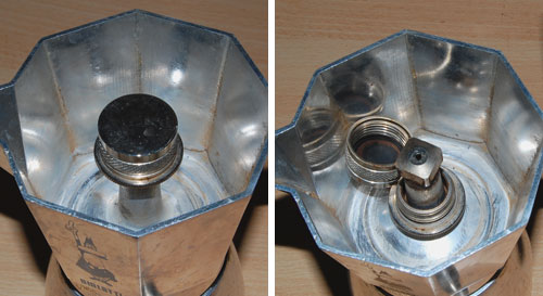
of a much stronger, foamy brew; and upon inquiring how they could produce it at home we were shown the Brikka, the machinetta with the “sbuffo” (the dictionary says “gust of wind; puff“, but a fiery snort sounds more appropriate to convey this word’s feel).

The amazing thing about the Brikka is that it is practically identical to the old Moka, except that it has one additional piece: a heavy steel cup, padded with a rubber gasket, that sits atop the tube from which, through a hole at its top, the hot coffee issues. This means that before the steam in the bottom half can push the water through the coffee powder, it has to achieve a high enough pressure to lift the steel weight; essentially the arrangement you find in a pressure cooker’s regulator valve. Once the correct pressure is reached the valve lifts and the coffee suddenly blasts through in a matter of seconds, accompanied by a loud puffing noise, much stream and bubbling foam. Sbuffo!

Brikka Sbuffo

The photos above capture the moment – mere seconds separate the two.

The Brikka, which Bialetti makes in 2-cup and 4-cup sizes (we’re talking Italian cups – about half a demitasse each), makes far stronger coffee than the Moka, and with some foam to boot. And all by adding one piece to an age-old design!

Brikka mechanism

Note the hole at the top of the tube, exposed with the weight dismantled.

Brikka compared to ordinary Moka

Brikka (right) compared to the open tube in a regular Moka style machine.

What will they think of next, you say? Don’t get me started about Bialetti’s “Mukka Express”, which seems to apply similar ideas to produce Cappuccino in one go (I’m still resisting the temptation to buy one of those).

LCD Monitor adjustment blues

So we’ve made the move to flat computer screens, which have many advantages over their bulky CRT ancestors; but the vendors pulled a fast one on us when it comes to the controls for adjusting the screen’s image.OSD on Samsung SyncMaster 913N monitor

In the good ol’days, every monitor had at least two round knobs, one for contrast, one for brightness. This is as good as it gets from a human engineering perspective. You just twiddle the knobs back and forth until your eyes tell your brain to tell your fingers to stop right there. Today, we have instead an On-screen Display (OSD), which some vendors tout as a good thing; in reality it is slow, unfriendly and confusing. The idea is that you use a line of pushbuttons the navigate a hierarchy of menus just to get to the function you need, and then you need to click a good deal more to effect the adjustment. To make sure this is easy, the buttons are often labeled by cryptic symbols in near-invisible relief (as in the photo below, of my Samsung SyncMaster 913N); and the logic they use, though simple, is far from intuitive. This may be justified – indeed inevitable – for accessing the numerous advanced functions that did not exist in the CRT days; but couldn’t they have left alone those more basic controls?

That’s progress for you (sigh)…

Control buttons on Samsung SyncMaster 913N monitor

So, what can we do about this? Adding analog controls is not realistic on these super-integrated monitors. The only thing left, which actually removes much of the confusion, is to do what the vendor should have done – mark the controls with visible labels, as I’ve done:

Labbeled Control buttons on Samsung SyncMaster 913N monitor