Two of the least pleasant-to-use GUI controls are the scrollable list box and its cousin the drop-down list, especially when they have many items listed. Of course, that’s exactly when they are indispensable… you can’t use radio buttons for 50 choices, so if you need to let the user choose a state of the union, a drop down list is inevitable. Likewise for countries of the world, or for their currencies.
But the way these geographic-oriented controls are implemented in software and web sites is really annoying.
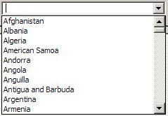 Take the image at right, the list you have to go through to select a country for a new contact in Outlook and other applications: it opens on a list of ten countries, of which one – Argentina – may be even remotely likely to be inhabited by business contacts of yours. You can scroll down, of course… and in the next ten you find even greater concentrations of business partners, like the entry for the Ashmore and Cartier Islands, which are a group of small uninhabited tropical islands in the Indian Ocean!
Not that I have anything against the inhabitants of Ocean islands, or of Angola, Antigua, or Anguilla, but given the statistics, why should I have to scroll past them – and past Cook Islands, and Namibia, and Nauru, and Palmyra Atoll, for that matter – on my way to find the US, or the UK, where I really have many more contacts and affairs?
Or look at the next screen grab, from a web site for computing currency exchange rates. Do I really need to have Equatorial Guinea’s CFA Franc, the Eritrean Nakfa, and the Ethiopian Birr pushing down the Euro and the US Dollar farther away from the British Pound, just because of the accident of alphabetic order?
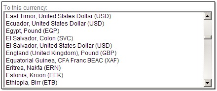
Obviously, the people of Estonia do care about the Kroon (and I care about the Israeli Shekel, also far from the heart of global finances). But what is needed is a list that gives the most common choices – the Dollar, the Pound, the Euro – by default at the top of the list, where 99% of users will benefit. And then we need personalization, so each of us in the rest of the world can put their country, or those they deal with, at the very top.
This can be done in many ways. One’s home country can be extracted from Windows Regional settings and put up front. Web sites may use cookies to remember which currencies you converted last time. Local software tools can keep my choices in the Windows registry. Smarter tools may learn from your past choices and bump them up the list in future. The techniques exist; it’s just that someone should step out of the silly box and dump the alphabetic order in favor of what makes users more productive and less annoyed!


 “He carefully cleaned out his active volcanoes. He possessed two active volcanoes; and they were very convenient for heating his breakfast in the morning. He also had one volcano that was extinct. But, as he said, “One never knows!” So he cleaned out the extinct volcano, too. If they are well cleaned out, volcanoes burn slowly and steadily, without any eruptions. Volcanic eruptions are like fires in a chimney.”
 This would be easy to do at the factory, but when I checked it out today I discovered that it exists as a retrofit: the charmingly named web company iwoot.com (the name stands for I Want One Of Those) sells a “
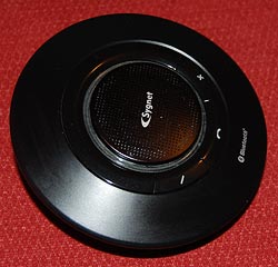 Back to my Sygnet Bluetooth Handsfree Carkit model BTS600. We
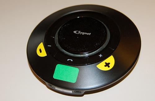


The demise of Tinkering, Take 2
I’ve lamented before the disappearance in our time of the Tinkerer, that fix-everything general technology expert of ages past. I ran into a demonstration of how far he’s gone the other day when shopping online for a new bluetooth hands-free cellphone car kit (my old one conked out, and fixing it would of course have cost more than buying new – another sign of our times).
I found on Amazon the Motorola T305 Bluetooth Speaker, and dug into its customer reviews. Turns out it has excellent audio quality, but there was a recurring complaint: people hated its big, intense blue light, which at night would blink very distractingly at the edge of the driver’s field of vision.
The discussion among reviewers was about whether the blue light was terribly distracting, mildly distracting, or maybe you could get used to it after a while. What amazed me is that none of the reviewers I read (admittedly, only a sample of almost 300 of them) had done the obvious thing – solve the problem by tinkering with the device. This could be done in two minutes, tops: all you’d need is to cover the light with a sticker, which can be cut to measure from paper, or some masking tape, or – if you’re so inclined – a thin gold foil with inlaid silver patterns. Anything opaque to light would do. Or if you still want to see the light, but at lower intensity, you could punch a small hole in the sticker, or use a semi-transparent dark material instead of tape. Once you did that you’d have the great sound quality and none of the annoyance.
The fact that this obvious idea never occurred to anyone is disturbing indeed. We’ve become so accustomed to ready made products that the notion of improving them to serve us better is entirely gone! 🙁