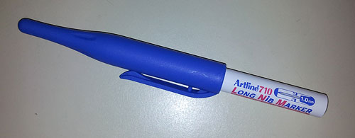
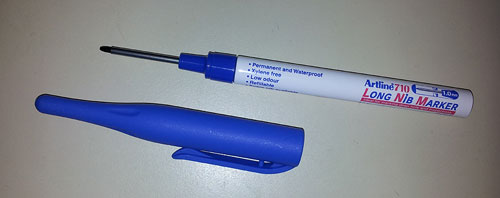
So here is a wonderfully useful tool from Shachihata: the Artline 710 Long Nib Marker.
What’s the big deal, you ask? Not if you’re a handyman, you don’t!
This funky looking tool is designed to fill a very specific need: marking through deep holes, as when you have to drill holes in the wall to hang some bulky object. Without this tool, you must bend over backwards to find a way to do this, for instance by trying to scractch the wall with a nail inserted through the object, while trying to keep it level. With this marker, this frustrating challenge becomes a piece of cake.
Good idea, Shachihata!
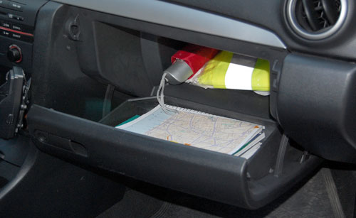
Here we have two glove compartments. The one on the left is from the Renault Clio; the other from a Mazda 3. They serve the same simple function and – not surprisingly – look pretty much the same, if you ignore the nice touch in the Mazda’s, that places the latch closer to the driver.
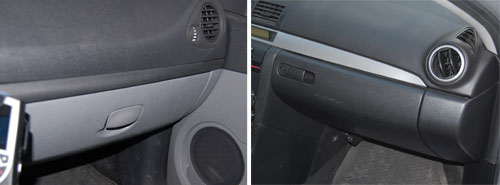
To be precise, they look pretty much the same from the outside. When you open them you see a world of difference.
Here is the one from Renault:
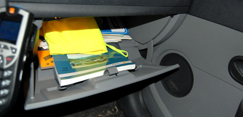
It goes pretty deep under the dashboard, so you can stick a lot of stuff in there – an advantage for sure. But the angles and the door design are such that the moment you open it, everything is liable to spill out in a mess.
And here is Mazda’s design:
Here, there is a deep section behind, and a door designed like a separate deep tray; and the geometry ensures what you put in the inside part stays there, and what you put in the door remains in the door, ready for you to reach in and take what you need.
Two designs for the same function: a poor one and a superb one. And they cost the same to produce, no doubt…
Here is an item I saw on the wonderful Nostalgia Online site. They have a large collection of vintage kitchen utensils, most of which I do recall from my childhood, and many of which I run into as I rummage in flea markets in search of computing history items. However, this one I’ve never seen before, and the ingenious way it solves a real problem simply blew my mind.
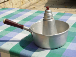 This, folks, is a milk heater. The problem it solves is that whereas a watched pot doesn’t boil, the moment you turn your back on it it’s liable to boil over, which in the case of milk makes a real mess.
The solution is this: you put the milk in the outer pan, and a little water in the central cylinder. Since the water will boil a little before the milk (remember your chemistry!), it will activate the steam whistle at the top and alert you that the milk will boil in a moment.
I remember when raising a baby I also wanted to solve the boiling problem for baby formula, but as an electro-optics student my thoughts were along lines of detecting the steam above the liquid by its optical absorption (I never realized that over-complicated scheme). But the whistling pot seen here is way better, I think – and it did get used, evidently!
You can see this, and lots more retro items, here. If you can read Hebrew you can even read all about them! 🙂
Unusual business cards are not rare; many companies and individuals try to deviate from the traditional white rectangle design in the hope of standing out from the crowd. But today I was handed a card that goes far beyond this. Here it is:
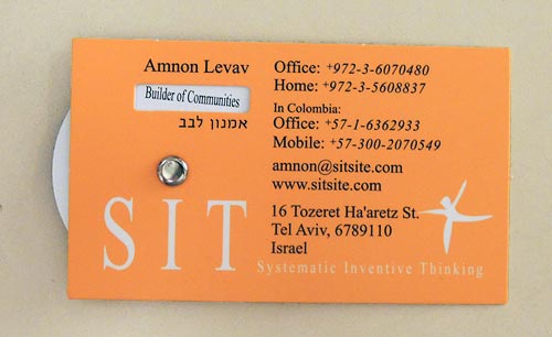
This card has a rotating wheel that allows different short phrases to be viewed through a cutout in the cardboard. The wheel carries the phrases “SIT International”, “Father and Uncle”, “Facilitator”, and “Builder of Communities”.
Unusual, but at first glance this seemed just one more gimmick. You see metal cards, wooden cards, cards with laser engraving… so this one has a wheel. Nice, but…
And then it hit me: there is a deeper purpose to this design! You see, once the recipient gets the idea that rotating the wheel will reveal more information, it is inevitable that they’ll rotate it in anticipation of each new snippet of insight about the card’s owner. As they do that, their interest goes beyond the mere form of the card; they engage with its content instead. Most information on a business card just slides past you; but through this tiny experience you can’t help internalizing what the phrases say about the person: the fact that he is a father and proud of it; the fact that he values his skill as facilitator; the fact that he does not care about formal titles. The wheel trick gets this knowledge across in a far more engaging manner than just reading a static card would do.
Incidentally, Amnon is the co-founder and manager of a company specializing in innovation methodology, and he told me the design for this card was undertaken as an exercise in applying that methodology; you can read about that in this article.
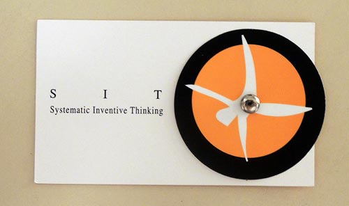
And here is the back side of the card – it’s quite cool that the stylized man of the company logo actually turns somersaults when you rotate his wheel!
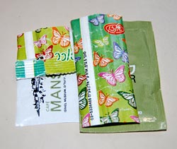
One seldom gives much thought to the humble sugar packet seen in coffee shops (unless one is a sucrologist, at any rate) but there’s an interesting observation related to its design.
A few years ago the age-old form factor of these packets – a rectangle some 7 by 5 cm in size – was supplemented by a new format, a long paper tube about the size of a finger:
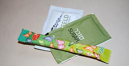
So – which of these is a better form? At first glance, it hardly matters. But actually the new tubular packaging is superior to the old.
Here’s why:
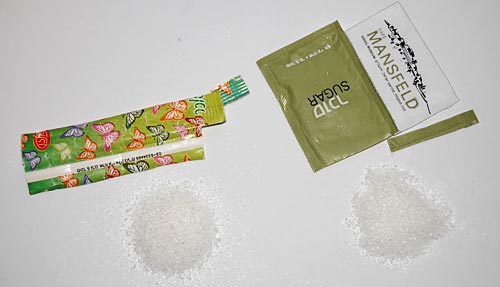
Taken apart and flattened out, you can see that while both packets carry the same 5 grams of sugar, the new form uses about 40% less paper!
This is clearly visible at the right where the two exploded packets overlay each other. Admittedly it’s only a tiny scrap of paper, but multiplied by the volume of packets used around the globe this can save quite a few trees for sure.
Oh, and the tubular packet has a bonus advantage: it can be used, in a pinch, to stir the coffee!
A century ago Gilbert Small, of Waltham, Massachusetts, invented a compact pocket calculator that is small, effective, and designed with special attention to usability.
Read the new article on my History of Computing site to see what he’d crafted!
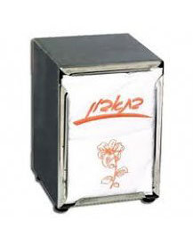 We’re all familiar with the spring-loaded paper napkin dispenser to the right. Every low-priced restaurant and diner has these; you’d think it has hit a sweet spot of stable cost and performance. After all, it works, doesn’t it?
And yet, recently I’ve run into a major improvement on the theme: a competing design that has a better user experience by far.
Here it is:
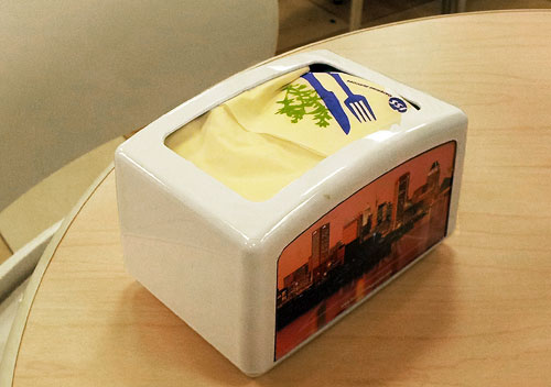
The main change is that the older design dispenses paper napkins at two opposite ends, and this one issues them at the top. Why is this important? Because in the more common design you need two hands to pull a napkin, holding the dispenser with your left and pulling at the paper with your right. In the top-loader you pull the napkin up and gravity (and a heavy bottom plate) holds the dispenser down. This not only allows one handed operation, but also makes the dispensing action far more repeatable, so you’re less likely to end up holding a large bunch of multiple napkins.
Sure, there are more important design challenges out there… but in a world full of sloppily made products, no clever design should go unpraised!
Most cafeterias sell water to their thirsty customers in plastic bottles full of mineral water. The water is no better than the tap water in most countries, its environmental impact is dubious, and of course it turns a tidy profit for the business. As a customer I find it annoying to pay for one of the most common molecules on my planet, but hey, there are bigger problems and like all of you I pull out my wallet and forget about it.
So you can understand my delight when, while visiting the Science Museum in London, I saw this in their cafeteria:
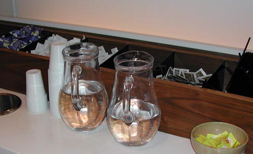
Self-serve, free and simple… what a delightful practice!
And then there is the wonderful museum itself… 🙂
I’ve written before about the use of tactile sidewalk strips to help the blind, as seen in Japan. Well, now we have them in Israel too! I was walking under the Calatrava bridge in Jerusalem, and saw this:
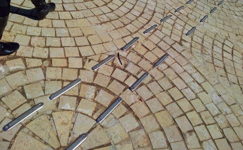
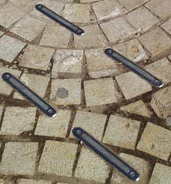 At first I was puzzled, but then I noticed this led towards the Jewish institute for the blind that is located nearby. So, these are raised strips forming a path – in fact, there were a number of paths going in different directions – that the blind can feel with their sticks or even their feet.
Well done!
Here is the Physics and Mathematics faculty building in Bashkir State University, in the city of Ufa, capital of the Republic of Bashkortostan, Russia.
See what it looks like?

Depends on your age or your affection for the history of computing, I suppose. This building looks like a logarithmic slide rule, the icon of the exact sciences before the arrival of electronic calculators in the mid-seventies.
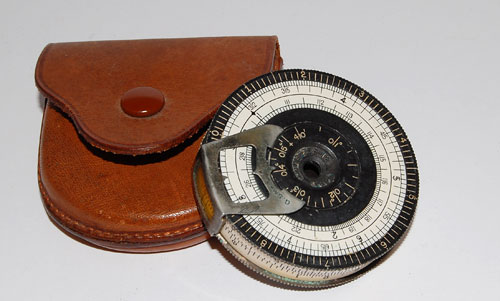
If you have no idea what those lovely devices were, here is a pocket model. Or check my collection.

The big question is whether this was intentional? Fellow collector David Rance, who presented it in a collectors’ meeting in Bletchley Park in September, says it was. If so, what a perfect design for a Physics and Math building!
You can read more in David’s article here.

