Something caught my attention in this children’s playground in our neighborhood, where my kids used to play long years ago.
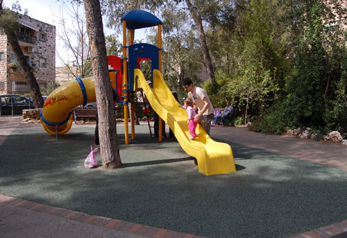
Back then the slide was made of metal, but the new one works just fine. However, back then the slide ended in a large sandbox, which was a major attraction in its own right. Kids would dig, build sand castles, mess around and have fun.
Not any more, as you can see: the sand has been replaced with some green rubbery material. This must have seemed a great idea – clean, easy to maintain, resilient and safe. However, consider this line from Wikipedia:
Sandpits encourage the imagination and creativity of children by providing materials and space to build several structures such as sandcastles; use toy trucks, shovels, and buckets to move the sand around; dig holes and bury objects, etc. In other words, the sand provides a medium in which children can pretend to explore, construct, and destroy the world in three dimensions.
With this ersatz version, kids can do none of these things. They can stay clean and hygienic, certainly; and safe, so nobody gets sued.
Still,my kids, and my own generation, and countless others before it, have managed quite well with the sand.
Sigh…
Check out this humble black marker pen.

What about it, you ask? Well, look at the close up: this marker marks most surfaces, is waterproof, practically odorless, safe… and has a cap off time of up to two weeks without drying up.

What about it, you ask? Just think of the hi-tech perfection that this list describes. What more could anyone ask for in a marker? Not long ago, you couldn’t get this for money or love. In particular, consider the 2-week cap off time. That was the one shortcoming of felt tip markers: they’d dry out if you forgot to cap them. Not any more, it seems – those boffins at the marker factory have figured a way to make ink that doesn’t dry until you actually mark with it.
That’s progress for you!
I happened to look up and noticed this against the evening sky:

These skewed towers with the broken antennas on top used to densely decorate every city rooftop when we were kids; every apartment needed an antenna, and the taller its tower, the better the reception – less “snow” and other interference in receiving the paltry 2-3 stations we could pull in then.
 Then came cable TV, and 300 crisply digital channels, and antennas became a thing of the past… but nobody bothered to pull down the existing ones. New houses have clean roofs, but this older apartment building still carries these skeletal corpses of earlier technology. Not that anyone notices…
Note how the delicate once-regular structures of these precisely designed directional beam antennas slowly erode and shrivel, losing a rod here, half a rod there, until in the end only the tower will remain – and finally it too will disintegrate. That’s entropy for you…
The art of Gauging and Ullaging, i.e. assessing the quantity of liquor, beer or malt in a barrel in order to tax it properly, used to be an important application of mathematics, and resulted in the development of some intricate computing devices over the last few centuries.
 Check the new article on my History of Computing site to see a lovely Everard-style gauging slide rule dating back to the 18th century, and learn how to apply it in case you ever need to ullage a cask of ale!
Here are the headlamps of two Mazda cars. On the left, a Mazda 323 from the first half of the past decade, the other a Mazda 3 from the second half. Both fine family cars.
See the difference in design strategy?
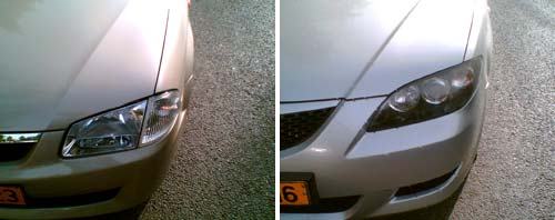
The car on the left has the headlamp split into two parts. The one on the right uses a single assembly.
Why do I care? Because when either lamp gets broken in an accident – and for the outer, the turn signal, this can be even a minor scrape – you need only replace one small cover in the older car, and the entire large assembly in the new one. An assembly they will charge you a ridiculously high sum for.
And yes, some may find the newer design more aesthetic; but the modern highway is a battlefield, not an art museum. We’re better off with cars designed with repair cost in mind. But then, it’s easy to conjecture that that’s what they are – just not in the owner’s interests…
New article on my History of Computing site: Elisha Kally’s water flow calculator, a sophisticated network calculator based on the Hazen-Williams formula.

This ingenious slide rule can calculate flows and hydraulic head losses in complicated networks comprising up to six different pipes, all at once.
Check it out!
Not all cool ideas are actually good.
Back in 1983, around the time the IBM PC made its debut, my boss at Intel had acquired a very innovative personal computer: the Hewlett Packard 150.
I remember it well; it was a really cool machine – at least in the context of its day: it had an 8MHz (yes, 0.008 GHz) CPU and 256KB (0.000256 GB) memory, as well as two floppy disks of 270KB each. It also had that solid look and feel that the better companies gave their machines when they could charge thousands of dollars for them. But what made it super cool was the screen, and the ad here shows you how proud HP was of developing it:
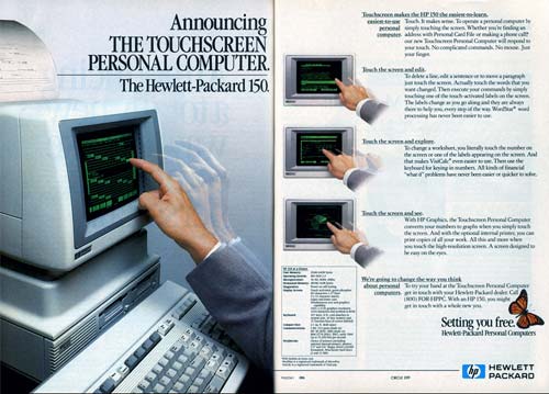
The HP 150 had the first Touch Screen I’ve ever seen on a commercial computer. It was actually a regular nine inch green CRT, with a bezel that had holes all around it with IR emitters and detectors in them; sticking a finger at the screen would block some IR rays and tell the computer where you were pointing. And this is where the designers had failed: they forgot that the human arm is not designed to be held in the air, poking at a surface in front of one’s face. The resultant muscle fatigue was known as Gorilla Arm…
That alone was enough to relegate this screen to the junk heap of failed ideas, and touch screens would have to wait for tablets and devices that can lie flat on a tabletop or be held in one’s hand.
Still, you have to admit it was a good looking machine!

Photo source: Computer museum, Stuttgart University.
While taking in the wonderful Israel Perosnal Computer Museum in Haifa I came face to face with the Intelligent Systems Compucolor II, a bizarre 1977 home computer built into a repurposed 13″ TV set.
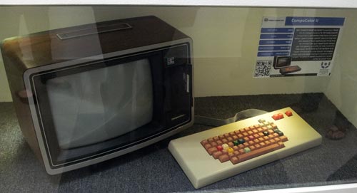
What drew my attention was the strange keboard layout: the arrow keys were clustered at the top right corner. This is in contrast to what you will see on every keyboard in the present century, where these keys are invariably at the bottom right of the keyboard.
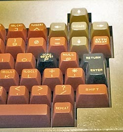 So, here we see a layout that has disappeared without any living descendants: an extinct primordial denizen of the keyboard universe. And for good reason: the standard location puts the arrows nearest the user, where the CompuColor II had them farthest away. It’s bad enough that the mechanical issues of old typewriters forced on us the QWERTY layout, with the most used keys out on the top letter row; since those typewriters did not have arrow keys, there is no reason to apply the same counter-ergonomic approach to them too!
It is interesting to note that unlike today’s notebooks, where space is at a premium, the keyboard in these photos has lots of free space around it, and is no doubt made of individual switches; so there was no reason to put the arrows in this awkward position. Someone just hadn’t thought it through. And of course those were early years for home computing, with each manufacturer trying their own ideas, resulting in an Ediacaran Fauna of weird form factors (remember the venerable Commodore 64, whith only two arrow keys that you SHIFTed to move in the remaining directions?). Small wonder, then, that most of these experiments – like this one – left no trace except as museum fossils!
A new article on my History of Computing site traces the evolution of the straight slide rule over its 3 centuries of service.
 From a design perspective this progress is an interesting one to follow because the same basic principle evolves through a sequence of progressively more effective designs, culminating in the familiar form that had helped put a man on the moon in the sixties.
Check it out here!
Something weird is happening to car designers.
Back in the mid-seventies there was one car in my home town that someone had imported from the US, and I remember how futuristic it had looked to us then.
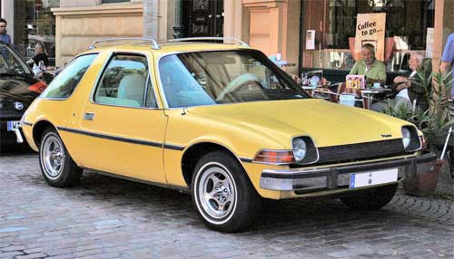
Photo source: Wikimedia Commons.
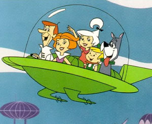
This was the remarkably innovative AMC Pacer, and it had those huge wrap-around windows that made it look almost like a glass bubble. It was clear that in the future cars will have windows like this: you only had to think of the aircar of the Jetsons family, the future analog to the Flintstones.
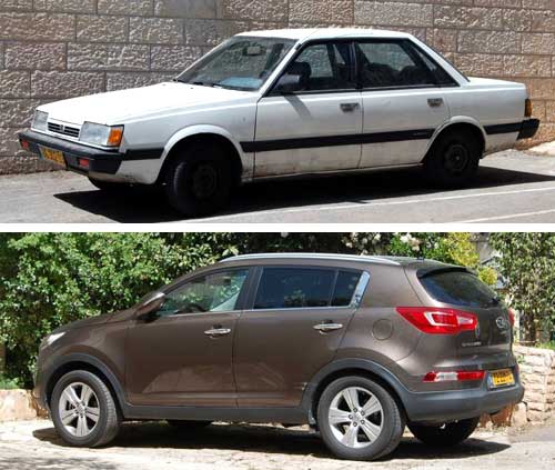
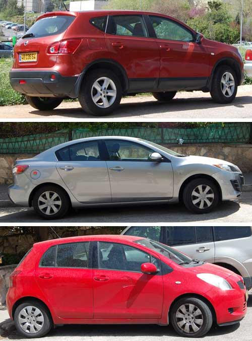
So now the future is here, and not only are bubble cars nowhere to be seen – the windows on our ordinary cars are shrinking at an alarming rate. Compare the two family cars below, an older Subaru and a new Kia. Look at those windows. See the difference?
This trend is everywhere. Makers the world over design cars with small windows; if this goes on we will soon have cars with tiny slits to look out through, like in a tank. Here are three more examples:
Now, compare the rear end of the Chevrolet in the photo below to the AMC Pacer’s behind in the next photo. See how far the designers have veered off the “future” we had expected?
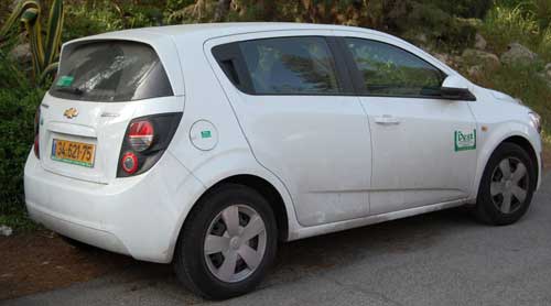
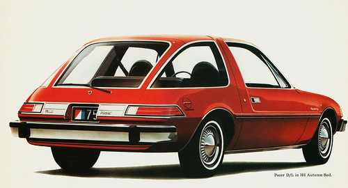
Photo courtesy aldenjewel, shared on flickr under CC license.
And what I can’t figure out is, what’s gotten into these designers? Why enclose people in lumpy metal boxes without a good view out? Or is it that car owners prefer it this way – and if so, why? Have they lost interest in the outside world (consider in-car entertainment systems!) – or are they afraid of it, and prefer to hide in their air conditioned cars, with small tinted-glass windows to make them invisible to other people?
Do you have an explanation?

